
3

HarmonyOS - 基于ArkUI (JS) 实现图片旋转验证
source link: https://os.51cto.com/article/715742.html
Go to the source link to view the article. You can view the picture content, updated content and better typesetting reading experience. If the link is broken, please click the button below to view the snapshot at that time.

基于ArkUI (JS) 实现图片旋转验证-51CTO.COM
HarmonyOS - 基于ArkUI (JS) 实现图片旋转验证
作者:王少丽 2022-08-05 19:27:22
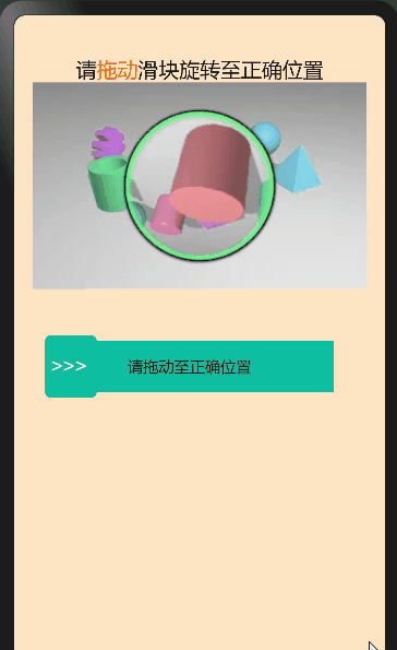
本文主要结合HarmonyOS官网上的相关组件以及通用API,来实现一个图片的旋转验证 – 需拖动滑块将图片旋转还原为正确,方可验证通过。

通过学习其他人的slider滑块组件衍生出的小组件, 本文主要结合HarmonyOS官网上的相关组件以及通用API,来实现一个图片的旋转验证 – 需拖动滑块将图片旋转还原为正确,方可验证通过。
- 触发条件
基于HarmonyOS通用事件touchstart和touchmove,touchend,通过手指刚触摸屏幕时触发、手指触摸屏幕后移动时触发事件,手指触摸屏幕后结束时触发事件; - 实现slider滑块效果
通过touches触摸事件的属性集合,返回屏幕触摸点的信息数组,拿到localX距离被触摸组件左上角横向距离,动态计算出子元素的宽度来实现slider滑块效果。 - 实现图片旋转效果
初始化随机生成360°以内的角度,设置图片原点,360°除以100就得到圆的步长比上滑动距离除滑块总长度,最后加上图片原点就等于旋转后的角度。
使用到的官方API
getBoundingClientRect()
获取元素的大小及其相对于窗口的位置。
width | number | 该元素的宽度。 |
height | number | 该元素的高度。 |
number | 该元素左边界距离窗口的偏移。 | |
number | 该元素上边界距离窗口的偏移。 |
是否支持冒泡 | |||
touchstart | 手指刚触摸屏幕时触发该事件。 | ||
touchmove | 手指触摸屏幕后移动时触发该事件。 | ||
touchend | 手指触摸屏幕后结束时触发该事件。 |
touches | Array<TouchInfo> | 触摸事件时的属性集合,包含屏幕触摸点的信息数组。 |
globalX | number | 距离屏幕左上角(不包括状态栏)横向距离。屏幕的左上角为原点。 |
globalY | number | 距离屏幕左上角(不包括状态栏)纵向距离。屏幕的左上角为原点。 |
localX | number | 距离被触摸组件左上角横向距离。组件的左上角为原点。 |
localY | number | 距离被触摸组件左上角纵向距离。组件的左上角为原点。 |
1、htm部分
<div class="slider-wrapper" style="flex-direction: column;">
    <div style="width: 100%;padding-top: 40px;">
        <text class="title" >
            <span>请</span>
            <span style="color: #F56A00;">
                拖动
            </span>
            <span>滑块旋转至正确位置</span>
        </text>
    </div>
    <div for="{{ item in imagesArr }}" tid="id" class="imagesArr">
        <div class="img">
            <image src="{{ item.src }}"></image>
       </div>
        <div class="pic">
            <image src="{{item.duan}}" style="transform: rotate({{numdeg}});"  id="rotatepic"></image>
        </div>
    </div>
    <div class="content" style="width: 300px;flex-direction: row;" >
        <div id="slider"  @touchstart="boxChoose" @touchmove="boxChoose" @touchend="Chooseend" style="width: 280px;background-color: #0fbda0;">
            <div class="slider-main" style="width: {{ width }};background-color: #73E9C5;" ></div>
            <text class="text" show="{{ done }}">
                请拖动至正确位置
            </text>
            <text class="success text" show="{{ success }}">
               验证通过
            </text>
            <text class="fail text" show="{{ fail }}">
                验证失败,请重试
            </text>
        </div>
        <div class="dot" style ="left : {{dotLeft}};background-color: #0fbda0;height: 60px;" show="{{ textblock }}"  >
            <text style="color: white;font-size: 20px;">
                >>>
            </text>
        </div>
        <div class="dot" style ="left : {{dotLeft}};height: 60px;background-color: #10A68D;" show="{{ textblock2 }}">
            <text style="color: white;font-size: 20px;">
                >>>
            </text>
        </div>
        <div show="{{ imageblock }}" class="imageblock" >
            <image src="../../common/images/succes.jpg"></image>
        </div>
    </div>

</div>
2、css部分
.slider-wrapper {
    width: 100%;
    display: flex;
    align-items: center;
    flex-direction: column;
    background-color: bisque;
    position: relative;
}
.title{
    width: 100%;
    font-size: 20px;
    text-align: center;
}
.imagesArr{
    width: 90%;
}

.img{
    height: 200px;
}
.pic{
    height: 200px;
    width: 200px;
    position: absolute;
    left: 62px;
    top: 0;
}
.content{
    width: 360px;
    display: flex;
    align-items: center;
    flex-direction: row;
    position: relative;
    margin-top: 50px;
    position: relative;
}
#slider {
    width: 300px;
    height: 50px;
    background-color: #0fbda0;
    display: flex;
    justify-content: center;
}
.text{
    font-size: 15px;
}
.fail{
    color: red;
}
.success{
    color: black;
}
.slider-main {
    background-color: #73E9C5;
    width: 0;
    height: 100%;
    position: absolute;
    left: 0;
    top: 0;
    border: 1px solid #d9f3ef;
}
.dot{
    width: 50px;
    height: 50px;
    background-color: #0fbda0;
    position: absolute;
    bottom: -5px;
    border-radius: 5px;

}
.dot text{
    text-align: center;
    padding-left: 5px;
    color:#A69E9E;
}
.imageblock{
    height: 50px;
    width: 50px;
    position: absolute;
    right: 10px;
}
3、js部分
export default {
    data: {
        progress:0,
        width: 0,
        step1: 1,
        dotLeft:0,
        img:'../../common/images/succes.jpg',
        imageblock:false,
        textblock:true,
        success:false,
        fail:false,
        done:true,
        numdeg:Math.round(Math.random()*360),// 初始化的随机角度
        startNumdeg: 0,
        textblock2:false,
        imagesArr:[
            {src:'common/images/ro.jpg',duan:'common/images/ro.png'},
        ],
    },
    onInit(){
        this.startNumdeg = this.numdeg;
    },
    //控制点击结束后的样式
    Chooseend( ){
        if(this.success && this.imageblock) {
            return
        }
        if (!this.textblock ) {
            this.disable = true
        }
        console.log('Chooseend==this.startNumdeg ==' + this.startNumdeg + '===this.numdeg===' + this.numdeg)
        if (this.width &&Math.abs(this.numdeg-360)<=5) {
            this.width = 240;
            this.progress = 100;
            this.textblock = false;
            this.fail = false;
            this.success =true;
            this.done =false;
            this.textblock2 =false;
            this.dotLeft = 0;
            this.numdeg = 0
            this.imageblock = true;
        }else{
            this.width = 0;
            this.progress = 0;
            this.fail = true;
            this.success =false;
            this.done =false;
            this.textblock2 = true;
            this.textblock = false
            this.dotLeft =0
            this.numdeg = this.startNumdeg + (360/100) * (this.width / 240)*100
        }
    },
    boxChoose(e) {
        if(this.success && this.imageblock) {
            return
        }
        let slider = this.$element('slider')
        let width = e.touches[0].localX // 获取点击时距离容器左边位置
        this.dotLeft = width
        let elementWidth = slider.getBoundingClientRect().width //元素的宽度
        // 正方形的偏移量临界值
        if ( this.dotLeft >= elementWidth ) {
            this.dotLeft = 240
        }
        let compare = elementWidth / (100 / this.step1) // 根据步长计算每一步宽度 2.4
        this.width = Math.ceil(width / compare) * compare   //滑动距离
        this.width = this.width < 0 ? 0 : (this.width > 240 ? 240 : this.width)
        this.numdeg = this.startNumdeg + 360 * (this.width / 240) //图像处理
        this.progress = Math.abs(this.width / elementWidth *100)   //slider滑块
        if (this.width>0) {
            this.fail = false;
            this.done = true
        }
        if (this.width>=240) {
            this.width = 280
        }
    },
}
这篇文章是我通过对slider滑块的一个延伸练习,也算是一个比较常用的组件,后续部分功能还需完善,比如在样式、功能及代码优化方面等等!
Recommend
About Joyk
Aggregate valuable and interesting links.
Joyk means Joy of geeK