
9

一篇带给你ETS自定义导航栏组件
source link: https://os.51cto.com/article/714154.html
Go to the source link to view the article. You can view the picture content, updated content and better typesetting reading experience. If the link is broken, please click the button below to view the snapshot at that time.

一篇带给你ETS自定义导航栏组件-51CTO.COM
一篇带给你ETS自定义导航栏组件
作者:木棉花潘颖琳 2022-07-15 16:39:46
这次给大家带来的是ETS自定义导航栏组件,以仿淘宝的导航栏为案例Demo来讲解。

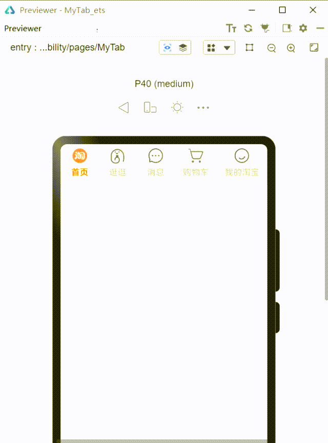
效果图如下:
当被选中时,字体样式和图片都会相应变化。
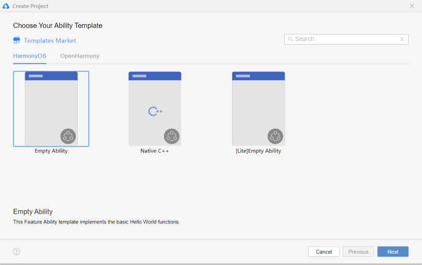
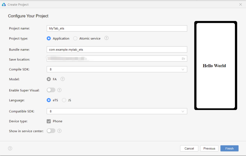
新建空项目
SDK选择7以上,language选择ets。
初始化导航栏
在media文件夹下存放所需的图片,初始设置导航栏选中的页签index为0,同时定义一个静态数组存放导航菜单的数据——标题名称、选中与未选中状态的图片。案例Demo代码如下:
@State selectedIndex: number = 0
  @State menuData: any[]= [{
                             "text": " 首页 ",
                             "inActiveImg": $r('app.media.shouye'),
                             "activeImg": $r('app.media.taobao')
                           },
                           {
                             "text": " 逛逛 ",
                             "inActiveImg": $r('app.media.guangguang'),
                             "activeImg": $r('app.media.guangguang_on'),
                           },
                           {
                             "text": " 消息 ",
                             "inActiveImg": $r('app.media.msg'),
                             "activeImg": $r('app.media.msg_on'),
                           },
                           {
                             "text": "购物车",
                             "inActiveImg": $r('app.media.gouwuche'),
                             "activeImg": $r('app.media.gouwuche_on'),
                           },
                           {
                             "text": "我的淘宝",
                             "inActiveImg": $r('app.media.wode'),
                             "activeImg": $r('app.media.wode_on'),
                           },
  ]
单个页签由图片和文本组成,为纵向布局;整体导航栏为水平布局;利用ForEach循环遍历导航菜单栏的数据,并通过判断是否选中来确定所显示的图片及文本样式(边框可根据喜好添加),案例代码如下:
build() {
    Flex({ direction: FlexDirection.Row, alignItems: ItemAlign.Center, justifyContent: FlexAlign.SpaceAround }) {
      ForEach(this.menuData.map((item1, index1) => {
        return { i: index1, data: item1 };
      }),
        item => { // Parameter 2: item generator
            Column({ space: 5 }) {
              Image(this.selectedIndex === item.i ? item.data.activeImg : item.data.inActiveImg
              ).width(30).height(30).objectFit(ImageFit.Cover)

              Text(item.data.text)
                .fontSize(15)
                .fontWeight(FontWeight.Bold)
                .fontColor(this.selectedIndex === item.i ? '#FC7D0C' : '#bfbfbf')

            }.height('60').onClick(() => {
              this.selectedIndex = item.i;
            })
        }, item => item.i.toString()
      )
    }
    .borderColor(Color.Gray)
    .borderWidth(0.2)
    .width('100%')
    .height('9%')
  }
到此步,可预览效果如下:
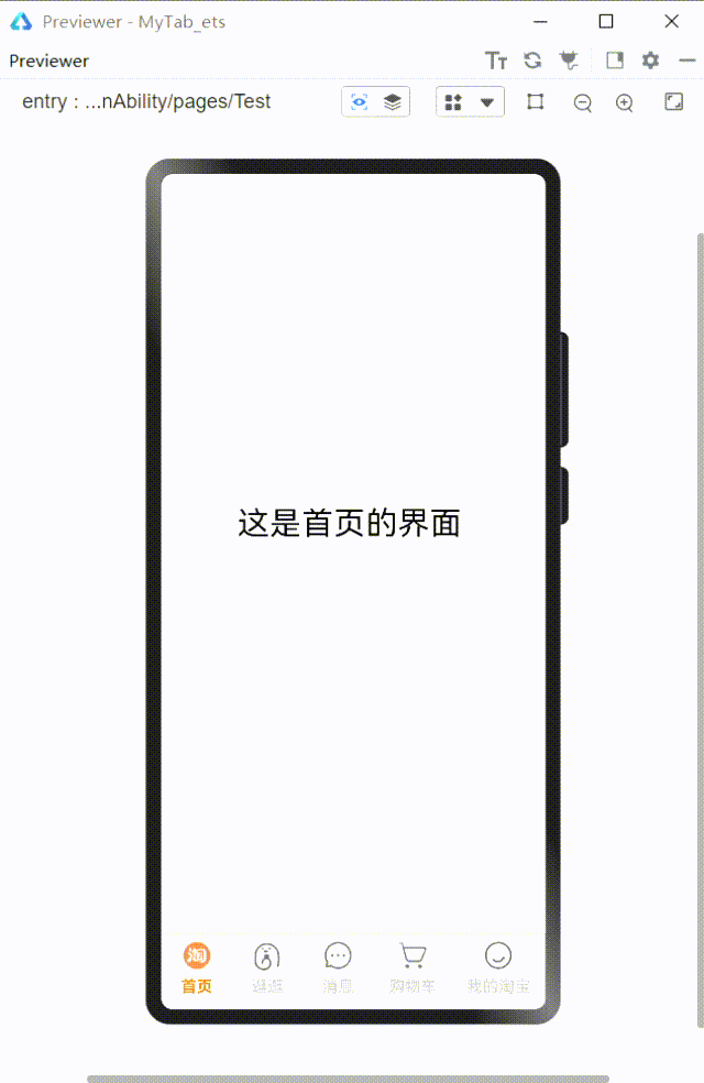
1、可以新建一个etsPage,将MyTab组件设置为export,然后在新页面import来使用
@State selectedIndex: number = 0@Link selectedIndex: number这是为了双向数据绑定:
案例Demo新建的页面Test.ets,代码如下:
import { MyTab } from './MyTab'
@Entry
@Component
struct Test {
  @State selectedIndex: number = 0
  build() {
    Flex({ direction: FlexDirection.Column }) {
      Flex({ direction: FlexDirection.Column }) {
        if (this.selectedIndex == 0) {
          Flex({ direction: FlexDirection.Column, alignItems: ItemAlign.Center, justifyContent: FlexAlign.Center }) {
            Text('这是首页的界面').fontSize(30)
          }.height('92%').width('98%')
        } else if (this.selectedIndex == 1) {
          Flex({ direction: FlexDirection.Column, alignItems: ItemAlign.Center, justifyContent: FlexAlign.Center }) {
            Text('这是逛逛的界面').fontSize(30)
          }.height('92%').width('98%')
        } else if (this.selectedIndex == 2) {
          Flex({ direction: FlexDirection.Column, alignItems: ItemAlign.Center, justifyContent: FlexAlign.Center }) {
            Text('这是消息界面').fontSize(30)
          }.height('92%').width('98%')
        } else if (this.selectedIndex == 3) {
          Flex({ direction: FlexDirection.Column, alignItems: ItemAlign.Center, justifyContent: FlexAlign.Center }) {
            Text('这是购物车的界面').fontSize(30)
          }.height('92%').width('98%')
        } else if (this.selectedIndex == 4) {
          Flex({ direction: FlexDirection.Column, alignItems: ItemAlign.Center, justifyContent: FlexAlign.Center }) {
            Text('这是我的界面').fontSize(30)
          }.height('92%').width('98%')
        }
      }
      .width('98%')
      .height('91%')
      MyTab({ selectedIndex: $selectedIndex })
    }
    .width('100%')
    .height('100%')
  }
}
2、也可以在同一Page将其作为子组件来使用
作为子组件来使用的话就直接将MyTab移至同一ets文件,无需添加export和import模块,不过同样需要将选中的索引selectedindex类型改为双向数据绑定@Link。
以上就是我这次的小分享啦!
文章相关附件可以点击下面的原文链接前往下载:
https://ost.51cto.com/resource/2179。
Recommend
About Joyk
Aggregate valuable and interesting links.
Joyk means Joy of geeK