
7

OpenHarmony JS UI小型系统自定义控件之一—Tab页签容器
source link: https://os.51cto.com/article/705562.html
Go to the source link to view the article. You can view the picture content, updated content and better typesetting reading experience. If the link is broken, please click the button below to view the snapshot at that time.

使用小型系统支持的基础控件实现tab页签容器。
OpenHarmony 标准系统中有tabs容器,在标准系统中tabs是一种常见的界面导航,通过页签容器,用户可以快捷地访问应用的不同模块,但在小型系统中没有提供tab页签容器,目前的需求是在L1设备上实现类似于tabs页签容器的功能。
设备:君正x2000开发板。
系统:OpenHarmony 3.0.0.0(LTS)。
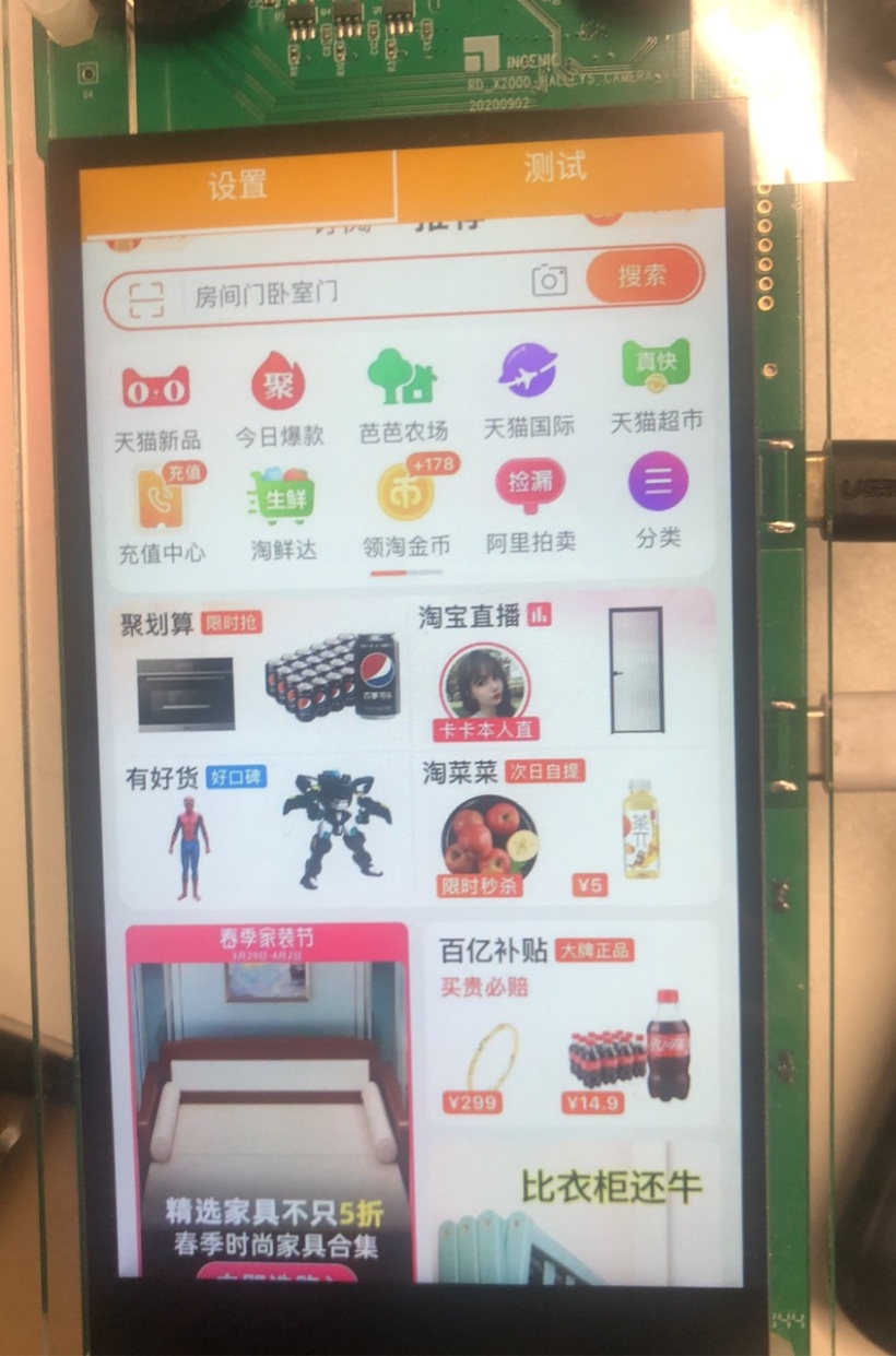
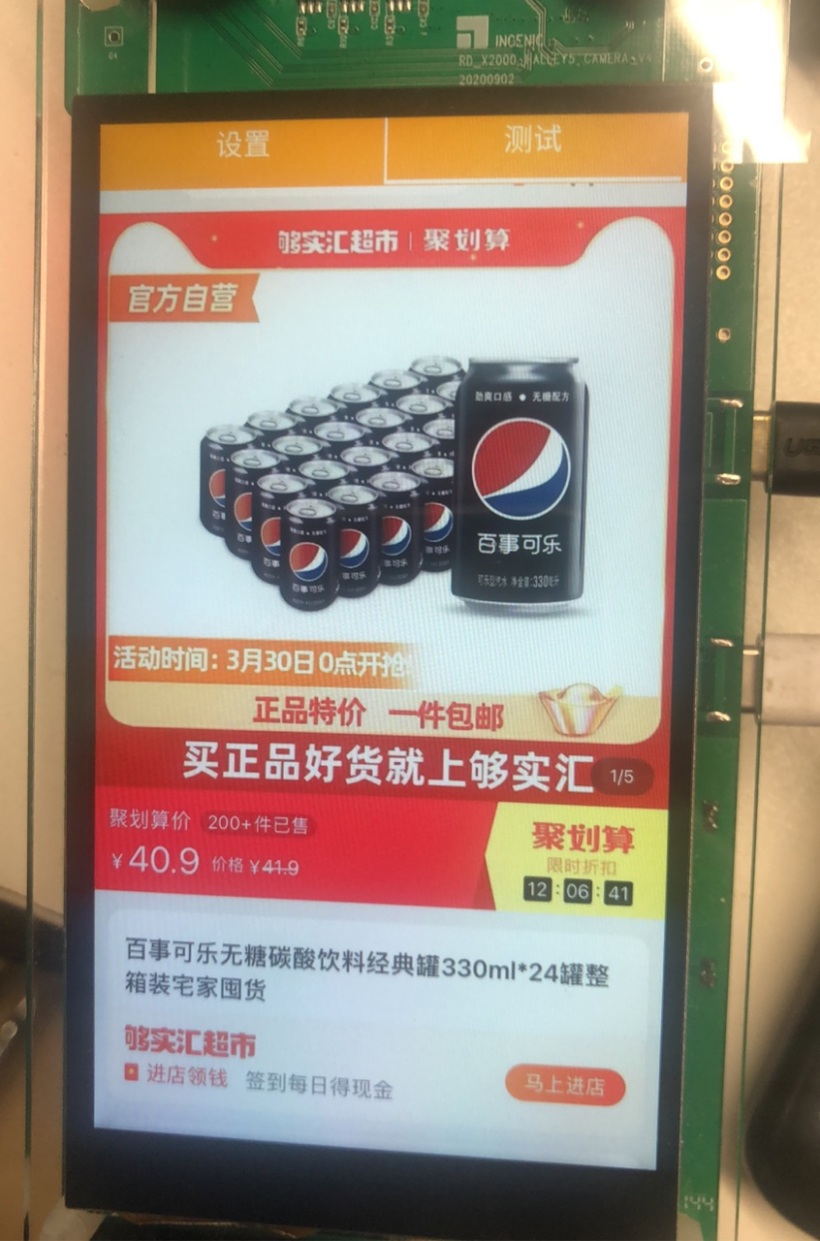
(1)视频效果
(2)效果截图
五、实现思路
从效果图中我们可以看出,tab页签容器包括:
- 可切换的菜单。
- 可切换的内容容器。
分析:小型系统所支持的基础容器中,菜单可以通过基础容器(div)+文本容器(text)组合实现;可切换的内容容器可以通过滑动容器(swiper)实现;在将菜单容器的点击事件click与滑动容器切换时的回调事件change事件结合互联就可以实现一个自定义的tab页签容器。
备注:如果你对上面提到的容器API还不熟悉,可以参看以下内容:
六、完整代码
说明:组件的代码包括三个部分:hml、css、js,因为代码比较简单,所以没有写注释,如果有不明白的地方可以留言。
<!-- tabsView.hml -->
<div class="container">
    <div class="tabs-title">
        <div class="tabs-item" onclick="onSelectSetting">
            <div class="tabs-item-menu">
                <text class="tabs-menu-text">设置</text>
                <div class="tabs-menu-line-white" show="{{menuSettingStyle}}"></div>
            </div>
        </div>
        <div class="tabs-item-line"></div>
        <div class="tabs-item" onclick="onSelectTest">
            <div class="tabs-item-menu">
                <text class="tabs-menu-text">测试</text>
                <div class="tabs-menu-line-white" show="{{menuTestStyle}}"></div>
            </div>
        </div>
    </div>
    <div class="tabs-content-line"></div>
    <swiper class="tabs-content" index="{{index}}" loop="false" duration="0" vertical="false" onchange="onSelectChange">
        <div class="swiper-item primary-item">
            <image class="img" src="/common/images/1.jpg"></image>
        </div>
        <div class="swiper-item warning-item">
            <image class="img" src="/common/images/2.jpg"></image>
        </div>
    </swiper>
</div>
/*tabsView.css*/
.container {
    display: flex;
    flex-direction: column;
    align-items: center;
    width: 100%;
    height: 100%;
    background-color: orange;
}
.title {
    font-size: 76px;
    text-align: center;
    width:100%;
    height: 100px;
}
.tabs-title{
    width: 100%;
    height: 80px;
    flex-direction: row;
    justify-content: center;
    align-items: center;
/*    border-width: 1px;*/
/*    border-color: red;*/
/*    border-style: solid;*/
}
.tabs-item{
    width: 49%;
    height: 80px;
    background-color: orange;
}
.tabs-item-line{
    width: 0.5%;
    height: 80px;
    background-color: white;
}
.tabs-item-menu{
    display: flex;
    flex-direction: column;
    align-items: center;
    width: 100%;
    height: 80px;
}
.tabs-menu-text{
    color: white;
    font-size: 35fp;
    height: 75px;
}
.tabs-menu-line-white{
    width: 100%;
    height: 5px;
    background-color: white;
}
.tabs-menu-line-orange{
    width: 100%;
    height: 5px;
    background-color: orange;
}
.tabs-content-line{
    width: 100%;
    height: 0.2%;
    background-color: orange;
}
.tabs-content{
    width: 100%;
    height: 100%;
    margin-left: 0.75%;
    margin-right: 0.75%;
}
.swiper-item {
    width: 100%;
    height: 100%;
    justify-content: center;
    align-items: center;
}
.primary-item {
    background-color: #785698;
}
.warning-item {
    background-color: #ff7500;
}
.img{
    width: 100%;
    height: 100%;
}
//tabsView.js
export default {
    data: {
        menuSettingStyle:true,
        menuTestStyle:false,
        index:0
    },
    onInit() {
    },
    /**
     * 选择设置菜单
     */
    onSelectSetting() {
        this.menuSettingStyle = true;
        this.menuTestStyle= false;
        this.index = 0;
    },
    /**
     * 选择测试菜单
     */
    onSelectTest() {
        this.menuSettingStyle = false;
        this.menuTestStyle= true;
        this.index = 1;
    },
    /**
     * 滑动组件页面变化
     */
    onSelectChange(num) {
        this.index = num.index;
        console.log("change curIndex:" + this.index);
        switch(this.index) {
            case 0: {
                this.menuSettingStyle = true;
                this.menuTestStyle= false;
                break;
            }
            case 1: {
                this.menuSettingStyle = false;
                this.menuTestStyle= true;
                break;
            }
            default :
                break;
        }
    }
}

Recommend
About Joyk
Aggregate valuable and interesting links.
Joyk means Joy of geeK