

17 Design Details Reveal Your Expertise in UI/UX Design
source link: https://blog.prototypr.io/16-design-details-reveal-your-seniority-in-ui-ux-design-6fd07b500491
Go to the source link to view the article. You can view the picture content, updated content and better typesetting reading experience. If the link is broken, please click the button below to view the snapshot at that time.

17 Design Details Reveal Your Expertise in UI/UX Design
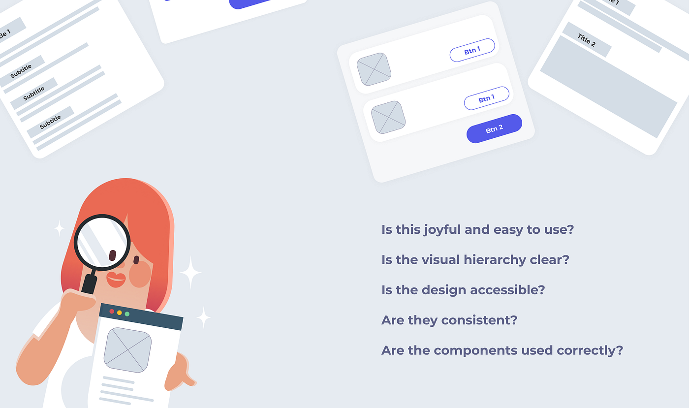
How can you tell if a design is good or poor? You can see the difference in many ways, but I think one of the keys is the designer’s attention to design details.
From a client project, I learned that paying attention to design details makes your service more authentic and trustworthy. Here, I summarise four steps to improve details for the interface design:
- Enhance Usability
- Refine Visual Hierarchy
- Improve Accessibility
- Align Consistency.
Let’s dive in!
Enhance Usability
Make sure your design is easy and enjoyable to use.
1. Choose the best loading design based on the context.
The loading state has many variations, and it’s important for designers to choose the right one.
For example, when a user clicks the ‘Continue’ button and the backend hasn’t responded yet, disabling the button and displaying a loading animation is a good idea. The change is minor but effective — after users click the button, the animation will catch their attention right away.
When a user enters a blank new page, skeleton loading can make the waiting time feel shorter.
In short, instead of leaving a blank page, choose a loading animation that suits the scenarios.
2. Use a model screen when you need a user to focus on completing one task.
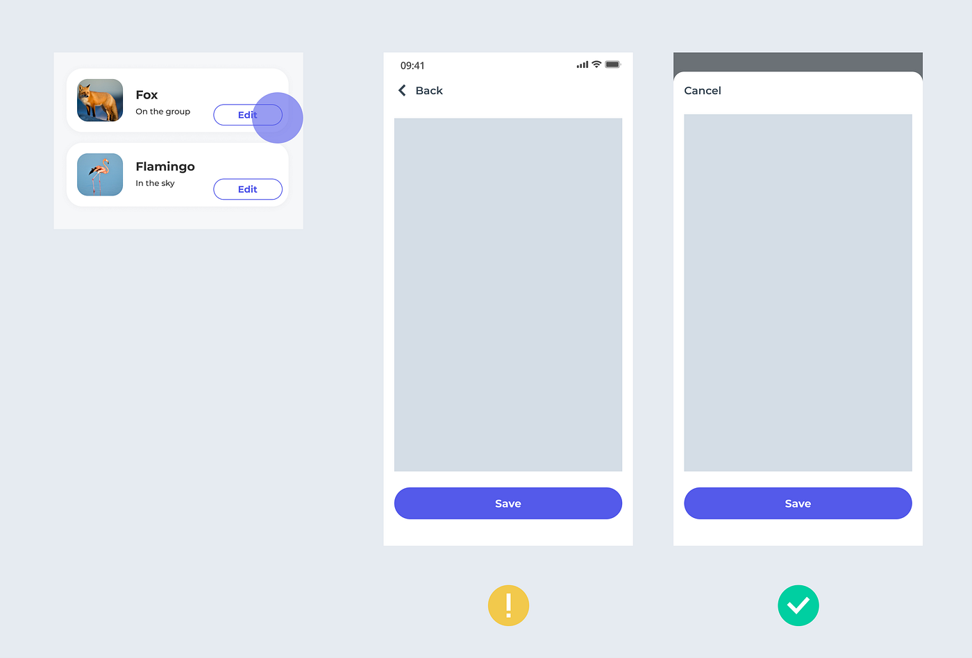
Screens come in two types — modal and non-modal — and it’s good to know when to apply them to your design. For example, a modal screen can help users focus on a single task, while the full screen is good for users to explore options.
3. Be consistent about the cancel button location.
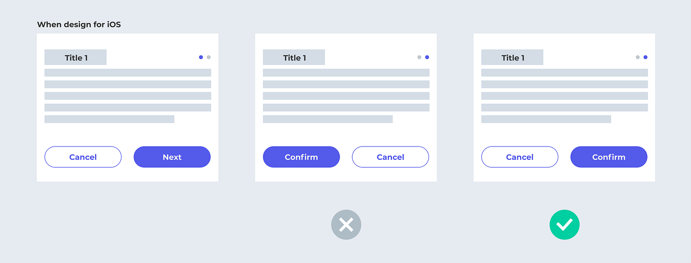
‘Ok’ and ‘cancel’ buttons can be placed differently depending on the context. For example, in iOS, the cancel buttons are always on the left, while in Windows, it’s on the right. You need to understand your users from the data or user test to make a decision. Then, remember to keep the button logic consistent throughout your service. The right design will best prevent users accidentally selecting the wrong option (Primary & Secondary Action Buttons).
4. Don’t misuse selectors.
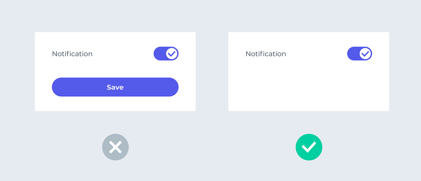
Toggle switches don’t need to work with a “confirm” or “save” button. Sometimes selectors such as toggles, checkboxes, and radio buttons, are easily misused.
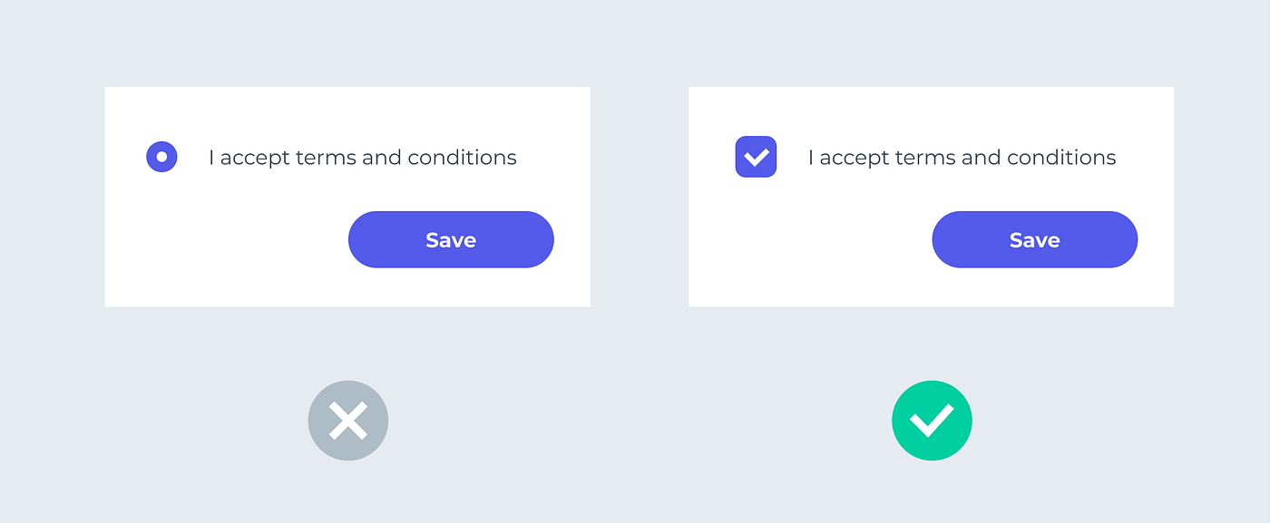
For example, a radio button is different from a checkbox. A radio button is for a single choice, and users can’t deselect it unless they choose another option. A checkbox is for multiple-choice, and it could be deselected.
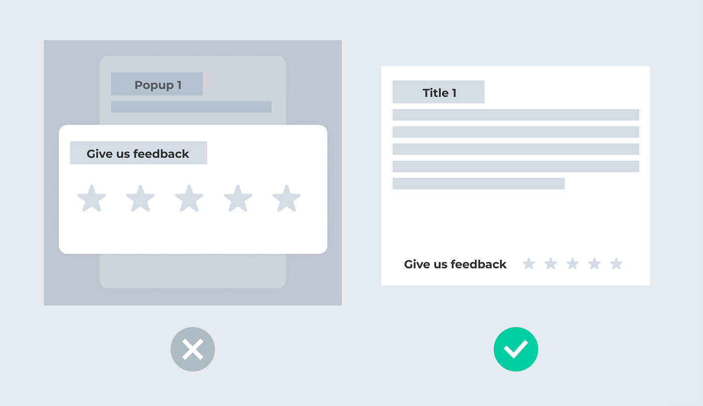
Sometimes, I see people use popup over popup, which is a no-no. You don’t need to use a popup in very many scenarios. You can easily replace it with a tooltip or a banner, based on the context.
6. Break down your long articles.
People can’t read long articles nowadays. According to Microsoft’s research, they lose concentration after 8 seconds. In one of our user tests, we found that users are more likely to skip reading when an article is long. Therefore, I’ve developed a habit of breaking down long texts to a few key points. That way, users can see at a glance if the content is relevant or not.
7. When you have to use disabled elements, think twice.
A clear explanation can often replace a disabled component. When you find disabled elements in your design, ask yourself if they can be replaced by a tooltip or some explanatory text.
“I have never seen a disabled element that could not be more clearly and universally explained with text.” — Chris Atherton
If you find it difficult to eliminate, keep your disabled button. But remember to provide enough information for users to activate it. Disabled buttons don’t have to suck.
Refine Visual Hierarchy
Make sure the essential information can attract the user’s attention right away.
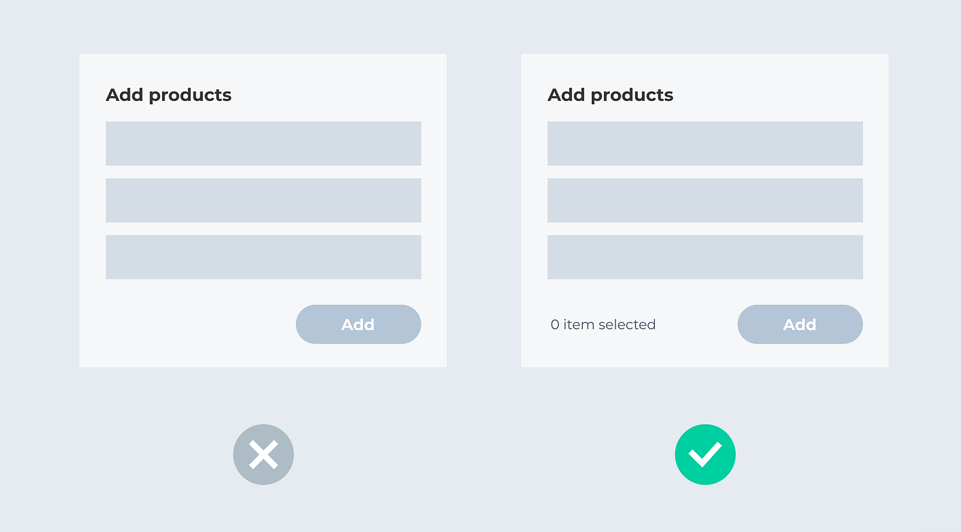
- One main call-to-action (CTA) per page
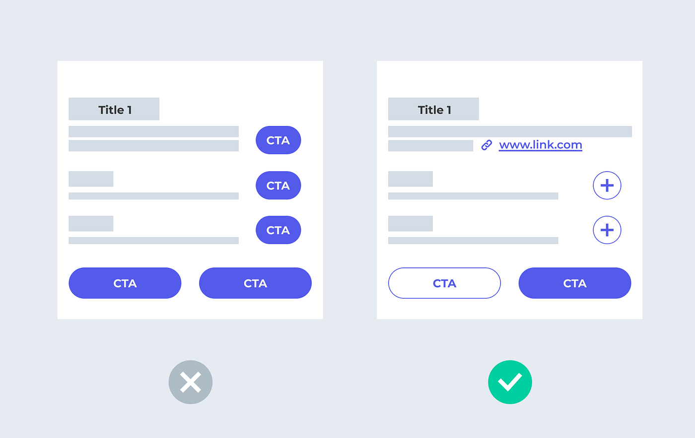
Too many main CTAs confuse people, especially those with cognitive disabilities. You can display less-important CTAs as a secondary CTA, a clickable icon, or a link. It will clarify the main task for users.
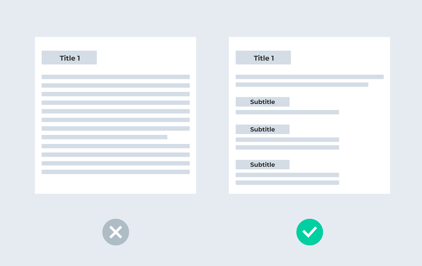
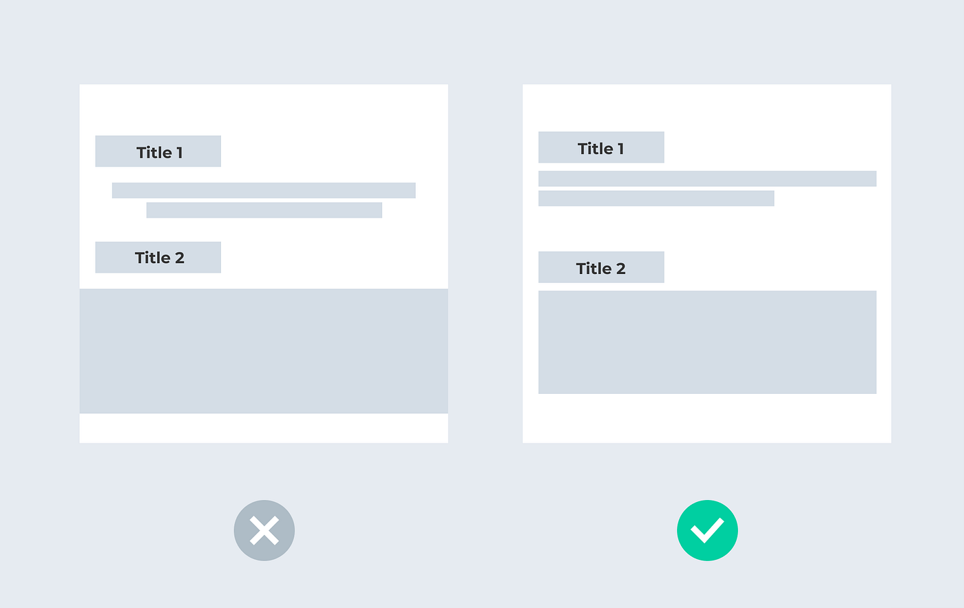
2. Utilise white spaces to clarify your structure.
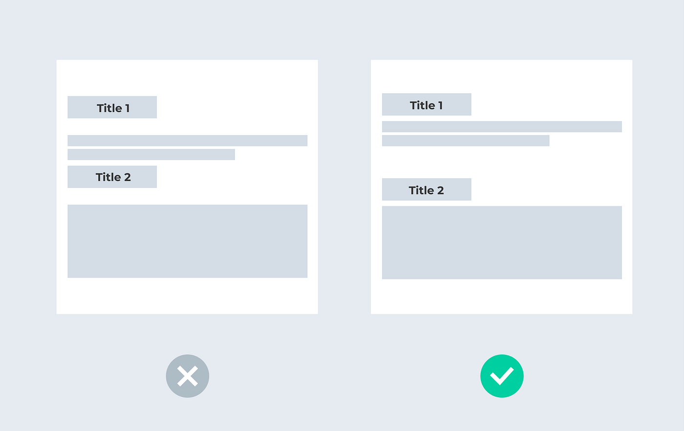
According to the Gestalt principle — proximity, we usually consider items close to each other as a group of items. If you have several sections in your design, make sure you have enough space between each section to clarify the structures. You can achieve this clarity by creating a consistent space logic for your design (e.g., 48px between each section, 4px between title and body text, use only 8, 16, 24, 32, 40, 48px…for spacing).
3. Don’t use the default shadow if it is not a wireframe.
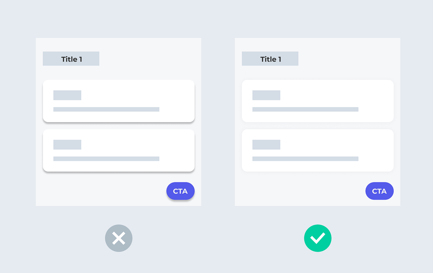
Shadow does improve your design’s authenticity and clarity. However, it’s not so easy to use it right. Using default shadows may make the design look dirty. You would need to know when to use shadow and how to create one properly.
Improve Accessibility
Make your design more inclusive to everyone.
- Check the colour contrast of your text.
Many designers love using the brand colour for text. However, sometimes the brand colour might not be accessible, especially colours such as yellow and orange.
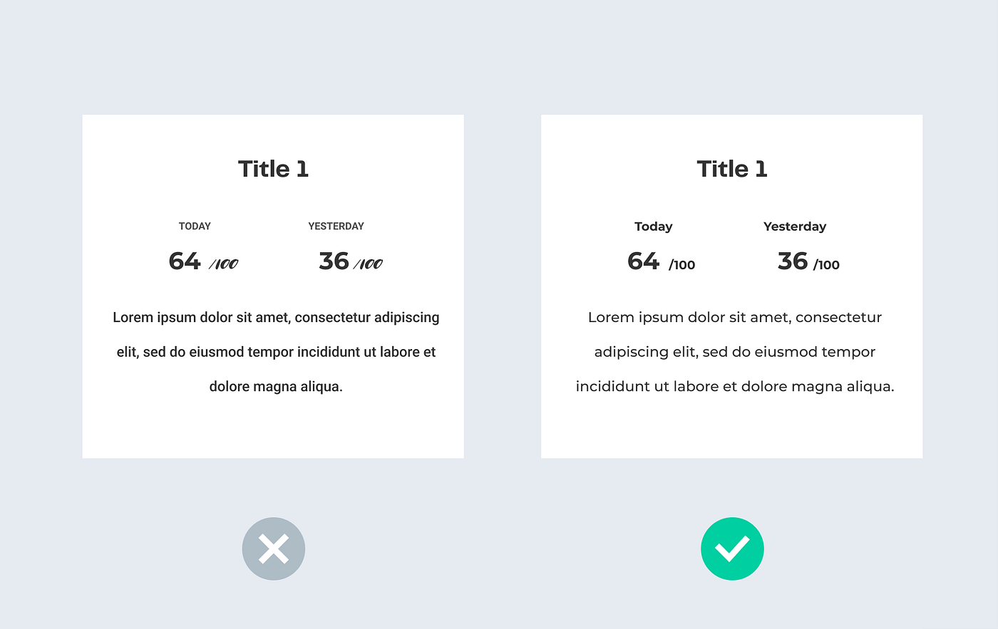
2. Use readable font sizes.
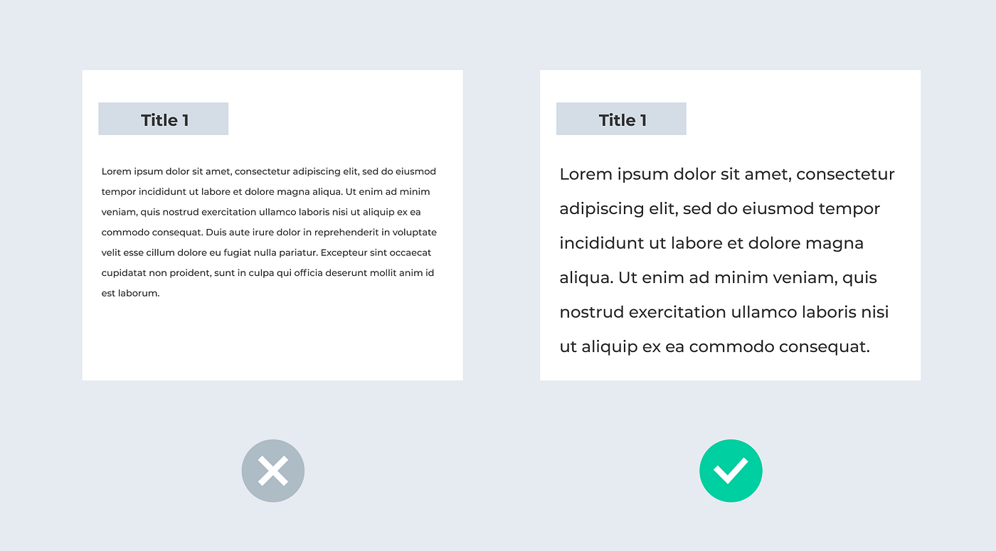
One time, my colleague reviewed some candidates’ design portfolios. Some used a 9px font size in the design, which lost them the chance to get an interview right away.
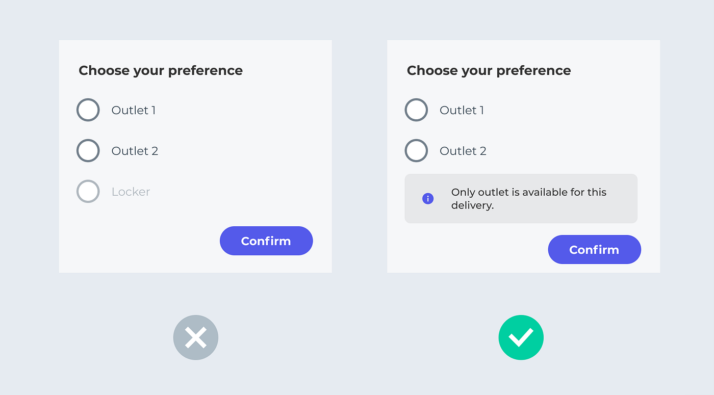
3. Provide a clickable list of errors when a user needs guidance.
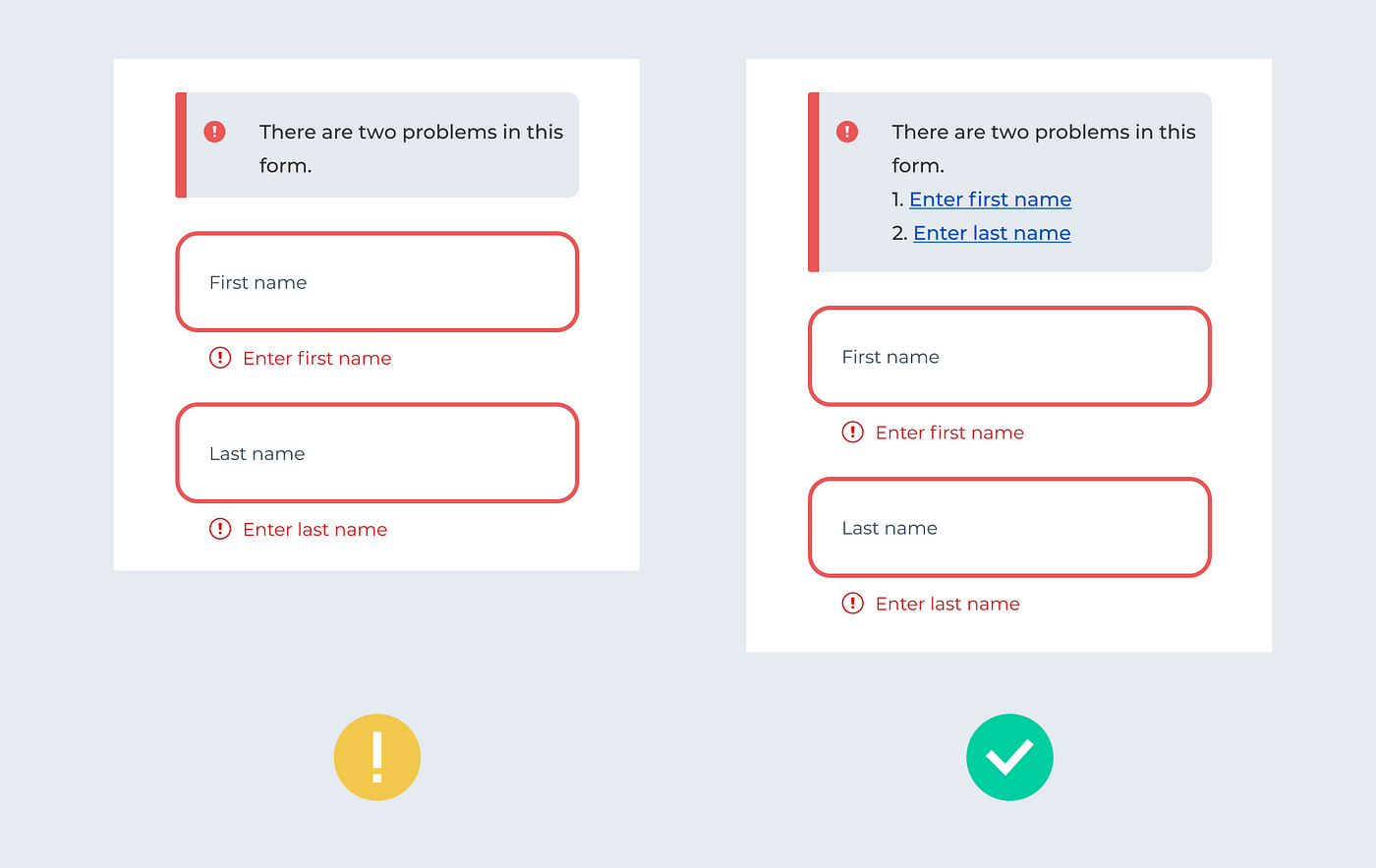
Error boxes with clickable links help users locate where the mistake occurred. This tip is especially helpful for people who use screen readers and are trying to fill out a long form.
Additionally, remember: 1) Don’t use colour alone to provide information. 2) Make sure the clickable area is big enough. 3) Don’t use the inactive button in a long form, etc. (What are the Don’ts and Do’s when creating accessible designs?)
Align Consistency
- Harmonise the elements’ roundness.
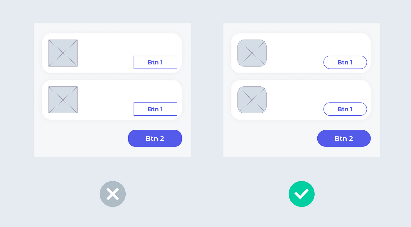
If you use round shapes, apply them to cards, buttons, and as many other elements as you can. It is preferred not to mix sharp and rounded items, as it makes it hard to distinguish a brand’s style (Material design).
2. Know how to pair fonts and don’t overuse font style
Your font choice matters. More experienced designers learn how to pair their fonts for title and body text. For example, many serif fonts work well pairing with san serif.
Avoid using more than three different kinds of font styles. Instead of using multiple fonts, you can differentiate the look by altering the same font’s weight and size.
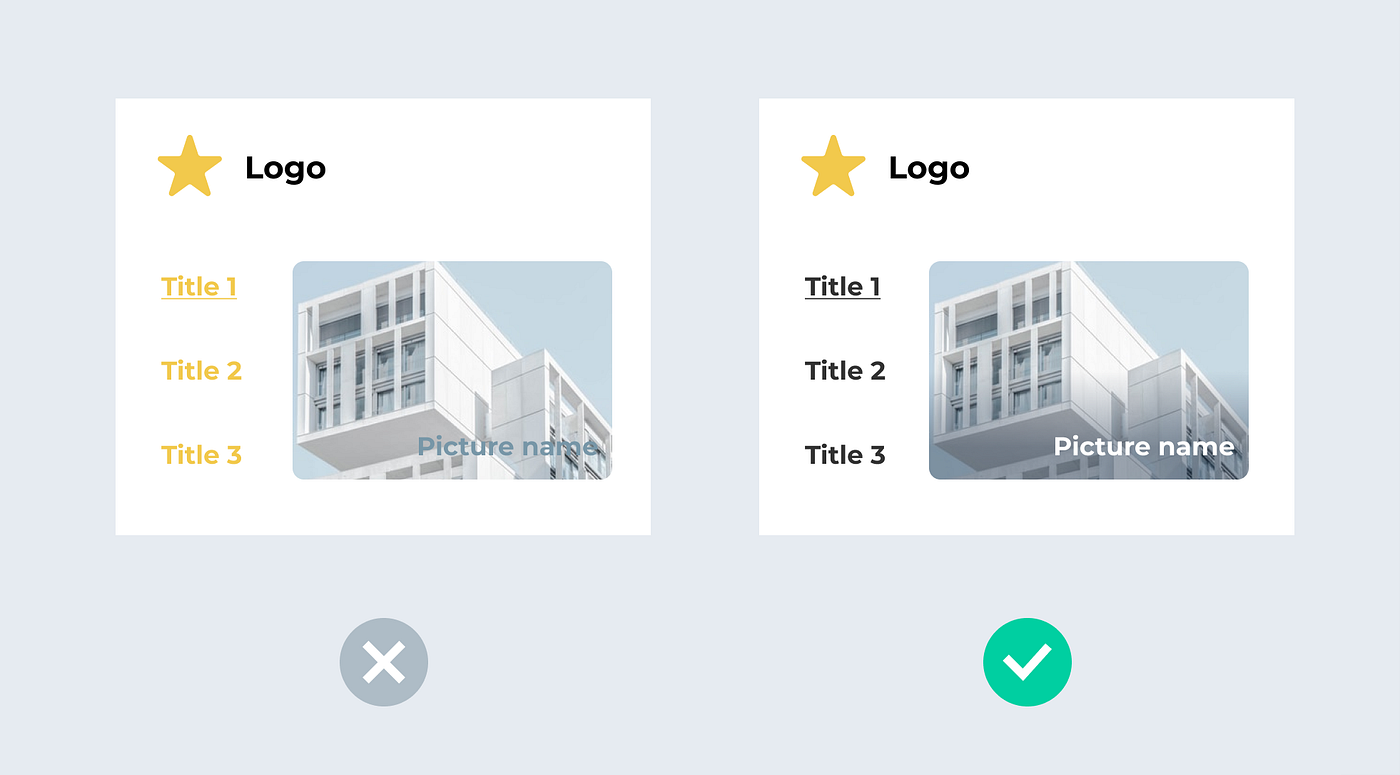
3. Provide a consistent logic to the alignment.
Avoid having some items aligned to the centre and some to the left. Ensure consistent alignment logic.
Bonus tips for high-fidelity designs:
- Avoid using placeholders in your design for high-fidelity designs.
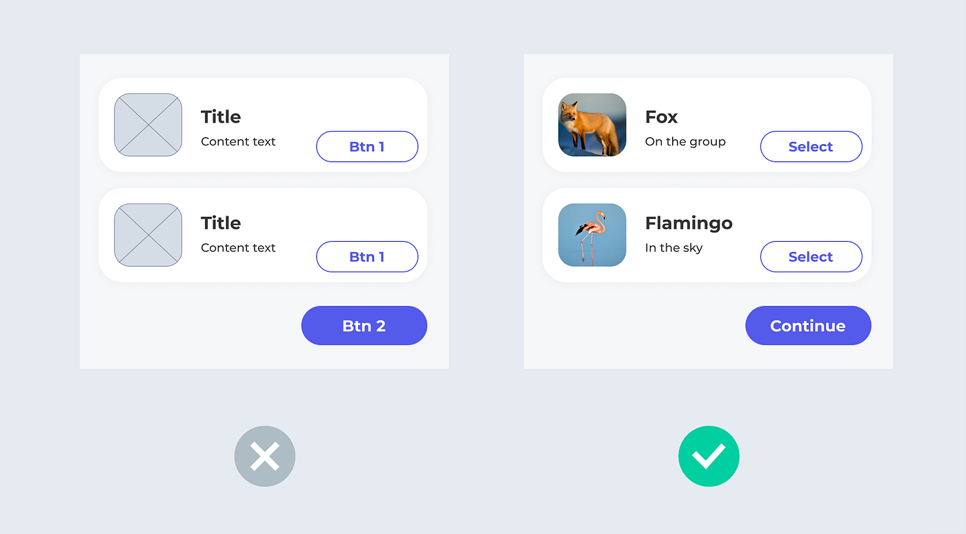
Using actual content makes your design more tangible. At the same time, you can showcase your UX writing skills.
2. Be pixel perfect.
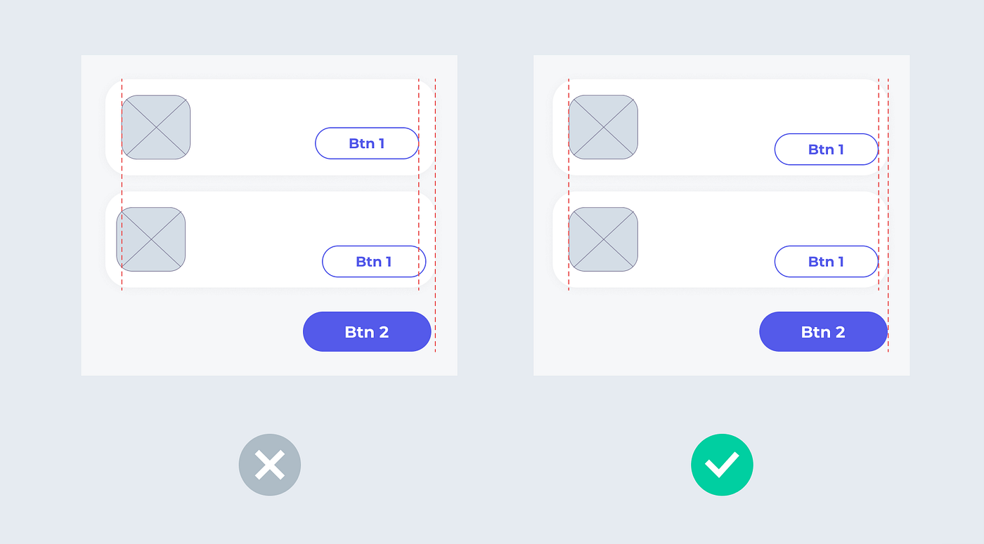
One way to gauge a designer’s expertise is to look at how they manage the pixels. Pixel perfect makes your design cleaner. Moreover, it saves a lot of time communicating with the developers.
Summary
Here are 17 tips to improve your design details:
Enhance Usability
- Choose the best loading design based on the context.
- Use a modal screen when you need a user to focus on completing one task.
- Be consistent about the cancel button location.
- Don’t misuse selectors.
- Don’t overuse popups.
- Break down your long articles.
Refine Visual Hierarchy
- Incorporate one main call-to-action (CTA) per page.
- Utilise white spaces to clarify your structure.
- Don’t use the default shadow if it is not a wireframe.
Improve Accessibility
- Check your text’s colour contrast.
- Use readable font sizes.
- Provide a clickable list of errors when a user needs guidance.
Align Consistency
- Harmonise the elements’ roundness.
- Know how to pair fonts and don’t overuse font style.
- Provide a consistent alignment logic.
Bonus tips for high fidelity designs:
- Avoid using placeholders in your design.
- Be pixel perfect.
Success is in the details. I hope you start seeing the difference and improving design details in your work.
Thanks for reading. Feel free to comment if you have any feedback. : -)
Recommend
About Joyk
Aggregate valuable and interesting links.
Joyk means Joy of geeK