

Implementing Cool Animations and Transitions in D3 Charts.
source link: https://dzone.com/articles/implementing-cool-animations-and-transitions-in-d3
Go to the source link to view the article. You can view the picture content, updated content and better typesetting reading experience. If the link is broken, please click the button below to view the snapshot at that time.

Implementing Cool Animations and Transitions in D3 Charts.
In this D3 Animations tutorial, learn about one of the most popular JavaScript charting libraries and how to enhance charts.
Join the DZone community and get the full member experience.
Join For FreeHere, I would like to talk about one of the most popular JavaScript charting libraries and the way we can enhance charts implementation with cool animations and transitions. For my example, I picked two charts: bar and pie.
First, I have created a small demo project, which includes simple markup and styling. Here is what it looks like:
<!doctype html>
<html lang="en">
<head>
    <meta charset="UTF-8"/>
    <title>D3 charts</title>
    <link rel="stylesheet" href="styles.css">
    <script src="https://d3js.org/d3.v7.min.js"></script>
    <script type="module" src="charts/bar-chart.js" defer></script>
    <script type="module" src="charts/pie-chart.js" defer></script>
</head>
<body>
<header>
    <span>D3 charts</span>
</header>
<section>
    <div class="bar-line-charts">
        <div class="chart-widget">
            <div class="widget-header">
                <span>The most selling car models</span>
            </div>
            <div id="bar-chart" class="chart"></div>
        </div>
    </div>
    <div class="pie-chart">
        <div class="chart-widget">
            <div class="widget-header">
                <span>Most popular cars</span>
            </div>
            <div id="pie-chart" class="chart" style="padding: 90px"></div>
        </div>
    </div>
</section>
</body>
</html>
body {
    padding: 0px;
    margin: 0px;
    background-color: #f5f4f4;
}

header {
    width: 100%;
    background-color: #1c4e80;
    text-transform: uppercase;
    padding: 15px;
    color: white;
    font-weight: bold;
    font-family: 'Roboto', sans-serif;
    box-sizing: border-box;
}

section {
    width: 100%;
    display: flex;
    justify-content: space-between;
    align-items: flex-start;
    padding: 40px;
    box-sizing: border-box;
}

.bar-line-charts {
    width: 49%;
}

.pie-chart {
    width: 49%;
}

.chart-widget {
    margin-bottom: 30px;
    box-shadow: rgba(0, 0, 0, 0.1) 0px 4px 12px;
    background-color: #fff;
}

.widget-header {
    background-color: #1c4e80;
    text-transform: uppercase;
    padding: 15px;
    color: white;
    font-weight: bold;
    font-family: 'Roboto', sans-serif;
}

.chart {
    display: flex;
    justify-content: center;
    align-items: center;
}
Everything is ready to start implementing the first chart. For that, I've created a separate js file that will contain chart implementation. Here is what it looks like:
// Importing some demo data
import barData from '../data/bar-data.js'

// Selecting the element
const element = document.getElementById('bar-chart');

// Setting dimensions
const margin = {top: 40, right: 20, bottom: 50, left: 50},
    width = 900 - margin.left - margin.right,
    height = 480 - margin.top - margin.bottom;

// Setting X,Y scale ranges
const xScale = d3.scaleBand()
    .range([0, width])
    .padding(0.1);

const yScale = d3.scaleLinear()
    .range([height, 0]);

// Appending svg to a selected element
const svg = d3.select(element).append("svg")
    .attr("width", width + margin.left + margin.right)
    .attr("height", height + margin.top + margin.bottom)
    .attr("viewBox", `0 40 ${width + 80} ${height}`)
    .append("g")
    .attr("transform",
        "translate(" + margin.left + "," + margin.top + ")");

// Formatting the data
barData.forEach(function (d) {
    d.value = +d.value;
});

// Scaling the range of the data in the domains
xScale.domain(barData.map(function (d) {
    return d.name;
}));
yScale.domain([0, d3.max(barData, function (d) {
    return d.value;
})]);

// Appending the rectangles for the bar chart
svg.selectAll(".bar")
    .data(barData)
    .enter().append("rect")
    .attr("x", function (d) {
        return xScale(d.name);
    })
    .attr("width", xScale.bandwidth())
    .attr("y", function (d) {
        return yScale(d.value);
    })
    .attr("height", function (d) {
        return height - yScale(d.value);
    })
    .style("fill", "#ff6f3c");

// Adding the x Axis
svg.append("g")
    .attr("transform", "translate(0," + height + ")")
    .call(d3.axisBottom(xScale));

// Adding the y Axis
svg.append("g")
    .call(d3.axisLeft(yScale));
Let's take a look at what the result of the code above is:
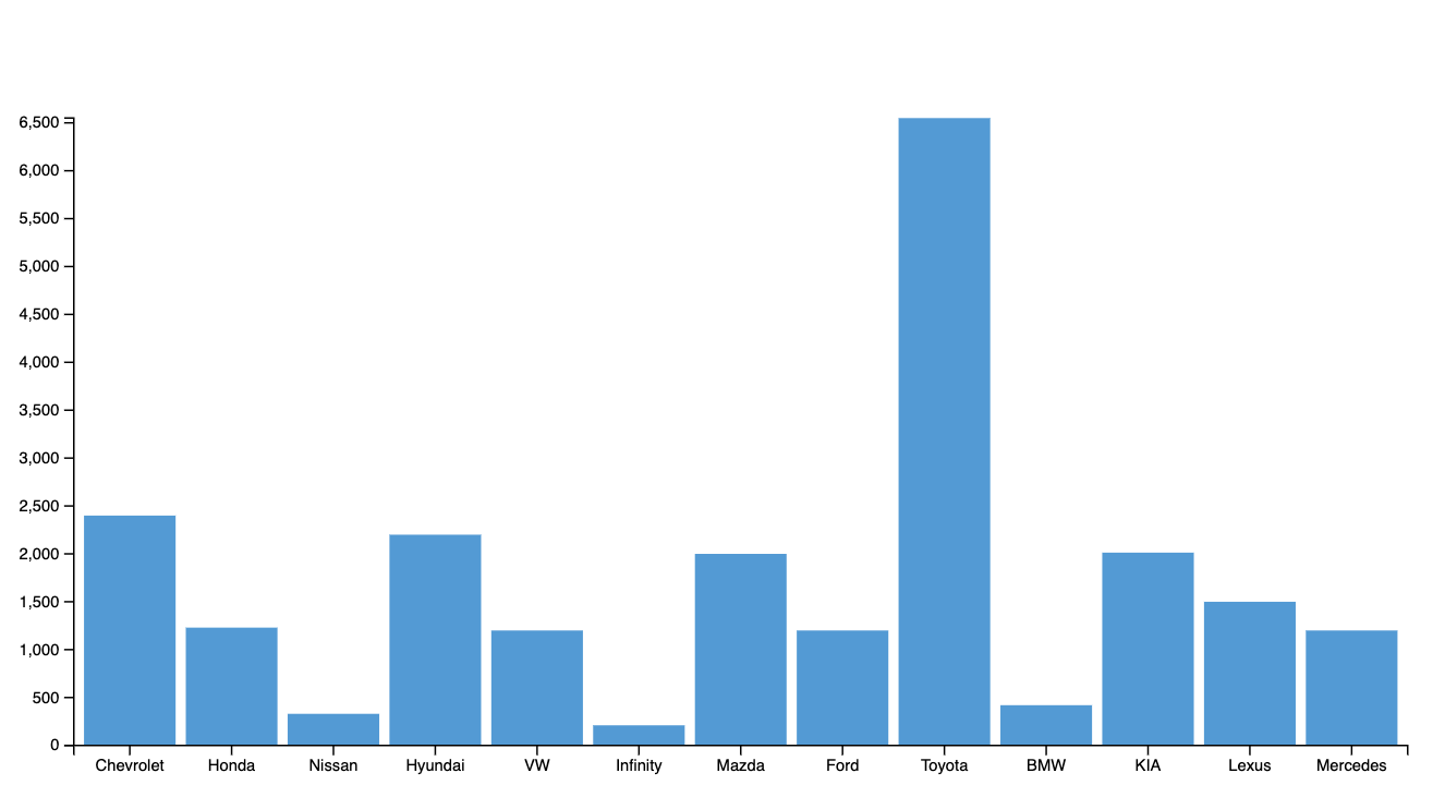
Now, I will show how to add an animation to the chart. The point is to animate the chart on load, so each bar will be painted one by one from 0 value to the current value of a bar. To do that, we need to update the code responsible for appending the bars. It requires only several lines of code to be added.
svg.selectAll(".bar")
.data(barData)
.enter().append("rect")
.attr("x", function (d) {
return xScale(d.name);
})
.attr("width", xScale.bandwidth())
.style("fill", "#339cd9")
// Setting bar height to 0 initialy
.attr("y", function () {
return height;
})
.attr("height", 0)
// Adding methods which will do the animated transition of a bar
// from 0 value, to its current value
// Also durattion of transition is set to 800 ms
.transition()
.duration(800)
//Here the value of bar is set
//Besides that we can set delay to make bar to load one by one
.attr("y", d => yScale(d.value))
.attr("height", d => height - yScale(d.value))
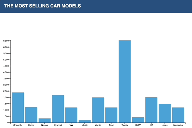
.delay((d,i) => {return i*100});Here is how it looks after the changes:
As you see, just several lines of code made the chart look much better. So, let's take a look, at what can we do to animate the pie charts. First, we need to implement the pie chart.
import data from '../data/pie-data.js'

// Selecting the element
const element = document.getElementById('pie-chart');

// Setting dimensions
const margin = 10,
  width = 400,
  height = 400;

// Setting the radius of the pie
const radius = Math.min(width, height) / 2 - margin;

const svg = d3.select(element)
  .append("svg")
  .attr("width", width)
  .attr("height", height)
  .attr("style", "margin-top: -32px !important")
  .append("g")
  .attr("transform", "translate(" + width / 2 + "," + height / 2 + ")");

// Setting the color scale
const color = d3.scaleOrdinal()
  .domain(data)
  .range(["#ef7758", "#1c4e80", "#a5d8dd"]);

// Setting the position of each group on the pie
const pie = d3.pie()
  .value(function (d) {
    return d[1].value;
  });

const data_ready = pie(Object.entries(data));

// Building arcs
const arcGenerator = d3.arc()
  .innerRadius(0)
  .outerRadius(radius);

// Building the pie chart
svg.selectAll('slices')
  .data(data_ready)
  .enter()
  .append('path')
  .attr('d', arcGenerator)
  .attr('stroke', '#fff')
  .attr('fill', function (d) {
    return (color(d.data[1].name))
  })

// Adding titles to pie slices
svg.selectAll('slices')
  .data(data_ready)
  .enter()
  .append('text')
  .text(function (d) {
    return d.data[1].name;
  })
  .attr("transform", function (d) {
    return "translate(" + arcGenerator.centroid(d) + ")";
  })
  .style("text-anchor", "middle")
  .style("fill", "#fff")
  .style("font-size", 20)
;
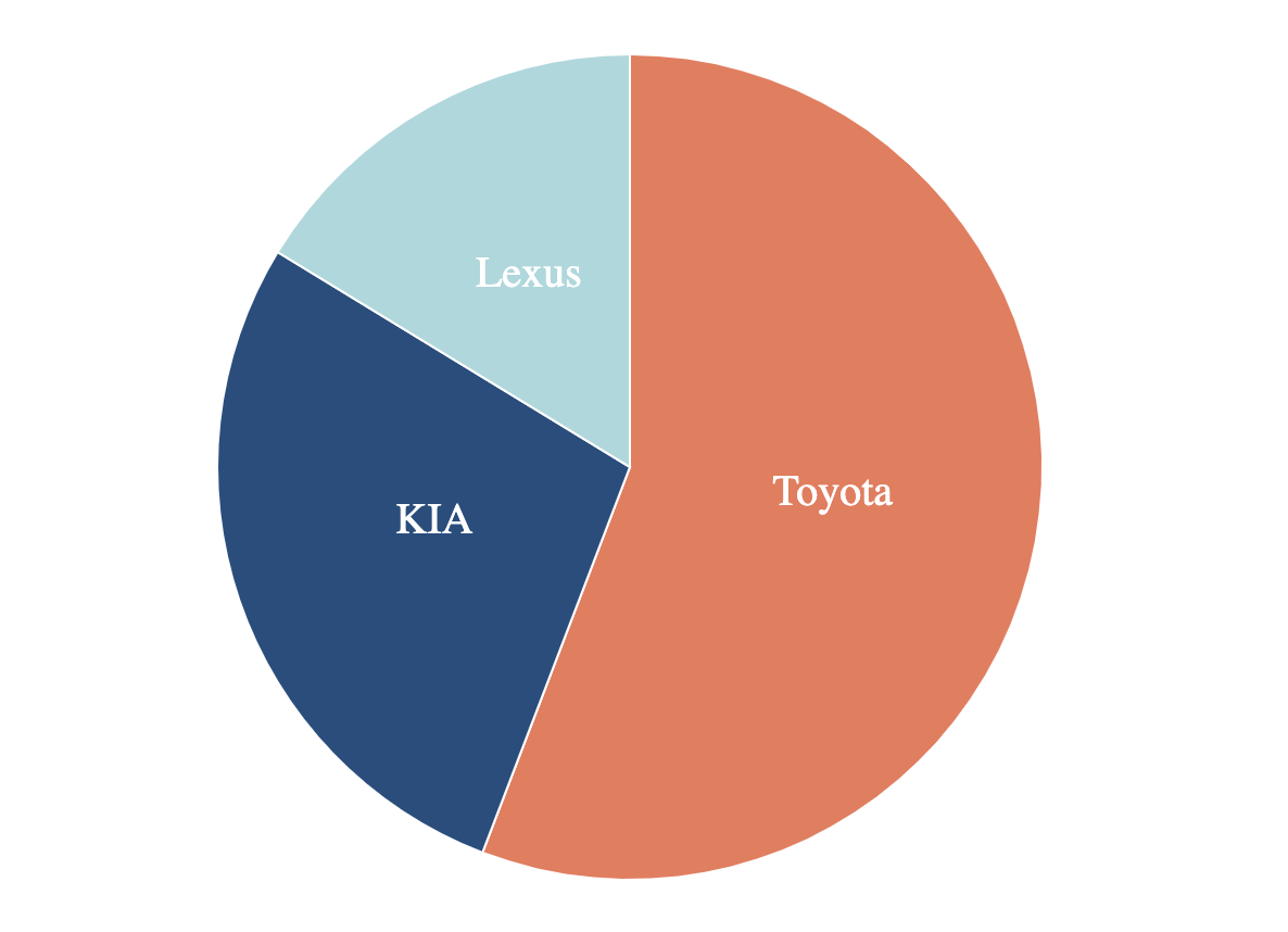
This is how it looks:
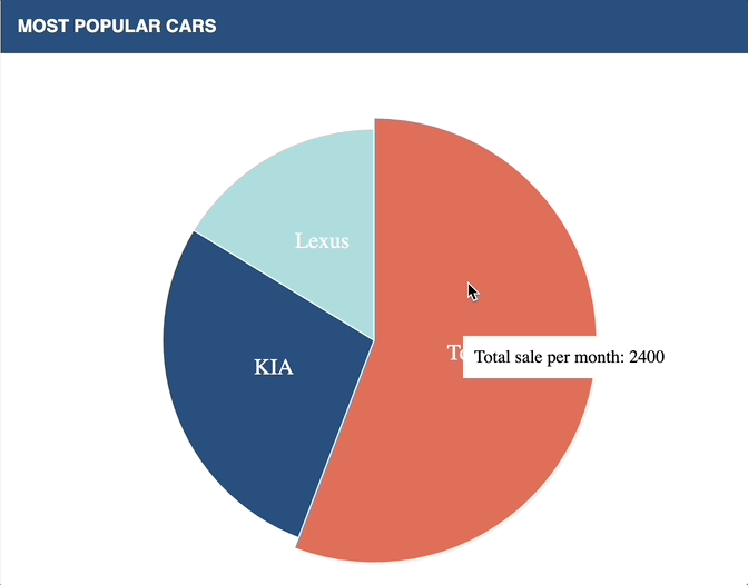
For the next step, I will show how to add cool transitions to a pie chart on slice hover. Moreover, we will show how can we add a tooltip to each of the pie slices. To achieve that, we need to add a tooltip to the HTML file and implement some basic stylings, and then, we need to adjust a bit of pie chart code. Let's take a closer look:
    <div class="pie-chart">
        <div class="chart-widget">
            <div class="widget-header">
                <span>Most popular cars</span>
            </div>
            <div id="pie-chart" class="chart" style="padding: 90px"></div>
          	//Adding tooltip
            <div id="tooltip" class="hidden">
                <p>Total sale per month: <span id="value">0</span></p>
            </div>
        </div>
    </div>
#tooltip {
position: absolute;
width: 200px;
height: auto;
padding: 10px;
background-color: white;
box-shadow: 4px 4px 10px rbga(0, 0, 0, 0.4);
}
#tooltip.hidden {
opacity: 0;
}
#tooltip p {
margin: 0;
font-size: 16px;
}//Code bellow should be added to to a pie-chart implementation
// Building arcs for hover
var arcHover = d3.arc()
.innerRadius(0)
.outerRadius(radius + 10);
// Updating functionality where we append slices
svg.selectAll('slices')
.data(data_ready)
.enter()
.append('path')
.attr('d', arcGenerator)
.attr('stroke', '#fff')
.attr('fill', function (d) {
return (color(d.data[1].name))
})
// Adding hover effect
.on("mouseover", function (event, d) {
d3.select(this)
.transition()
.attr("d", arcHover)
.duration(200);
// Adding tooltip
d3.select("#tooltip")
.transition()
.duration(200)
.style("left", event.pageX + "px")
.style("top", event.pageY + "px")
.style("opacity", 1)
.select("#value")
.text(d.value);
})
//Handling mouse out
.on("mouseout", function () {
d3.select(this)
.transition()
.attr("d", arcGenerator)
.duration(500);
d3.select("#tooltip")
.style("opacity", 0);
});This is what we have as a result:
As you see in the examples above, it takes only several lines of code to implement those transitions and animations. It is quite quick and easy and your charts look much better. Try it yourself, add animation to your charts, or experiment with functionality using my example. Here, is a link to the project at Github.
Recommend
About Joyk
Aggregate valuable and interesting links.
Joyk means Joy of geeK