

4D Data Visualization with Kepler.gl
source link: https://towardsdatascience.com/4d-data-visualization-with-kepler-gl-b6bd6dd90451
Go to the source link to view the article. You can view the picture content, updated content and better typesetting reading experience. If the link is broken, please click the button below to view the snapshot at that time.

DATA VISUALIZATION
4D Data Visualization with Kepler.gl
Tutorial — Kepler.gl for Visualizing Temporal Data with an example of COVID-19 Dataset

Kepler.gl is is a powerful open source geospatial analysis tool for large-scale data sets introduced by Uber since 2018. It is an awesome tool for data scientists to explore and analyze geospatial data.
In this article, I will show a very short tutorial on how to prepare and visualize data in 4 dimensions: Positions (Lat, Long, Height) and Time. For example, the figure below shows an example of visualizing the number of new confirmed COVID-19 cases overtime in Germany:

Step 1. Data Preparation 📝
To visualize the data on the 2D/3D map, we need to make sure that our data contains the geospatial fields in Latitude, Longitude to map each row of data. If the data source is in a geospatial format like shapefile, geojson, then we don't need to worry about it. But if it is in a table format and does not have the geospatial fields then we may run the geocoder in GIS software or using some geocoder script like Python with the geocoder library as the following example:
import geocoder
g = geocoder.google('Stuttgart', key="<Your Google API Key>")
print(g.latlng)
>> [48.7758459, 9.1829321]
Or, you may run use the GeoPandas to make it done as well. The Date/Time column in your dataset is optional and allows the application to display timely data. For example, I download the German COVID-19 dataset from RKI. (Download from here) And then prepare the dataset looked like the following:

Step 2. Load Dataset to the Kepler.gl 🔃
This step is very simple. we can simply drag and drop our prepared dataset in .csv, .json, or .geojson into the Kepler.gl application. Or, if you are a fan of Python and Jupyter, then you can load your easily load dataset with Pandas before loading them to the Kepler map.
from keplergl import KeplerGl
import pandas as pdmap = KeplerGl(height=500)
df = pd.read_csv(f'<your dataset>')
#...........................................
#... pandas data manipulation if needed ....
#...........................................map.add_data(data=<df_cleaned>, name='<data_named>')
Step 3. Kepler Map Setting 🔨
Now, let’s have some funs with the Kepler Map! 😊
- Selecting the map type you want (In the first gif example above, I used Hexbin)

- Define the position (lat/long) column.
- Assign Color Theme, Scale, Aggregation method on a select column, Filter, and Opacity.

- Adjust the grid size, the Kepler will automatically aggregate the data for you!

- Enable Height based on selected column. In this example, I select to aggregate the data by summation of the COVID-19 case number.
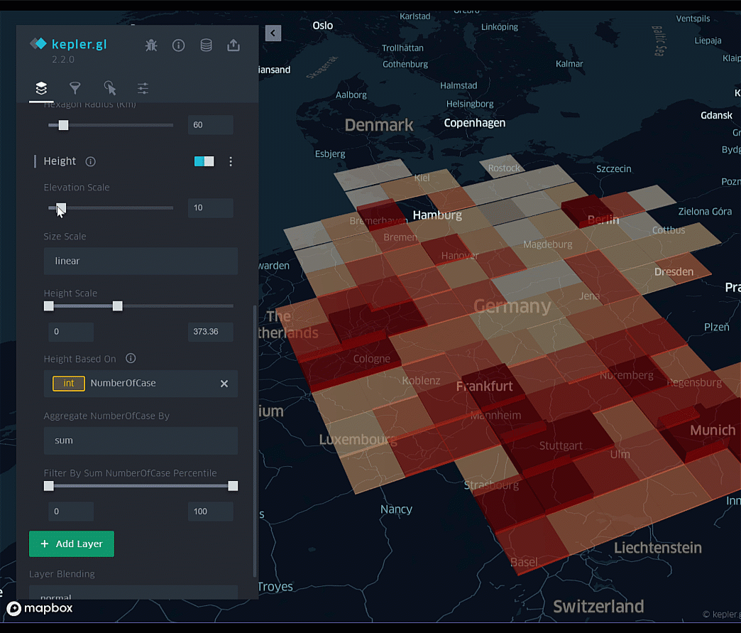
- Finally, let’s enable the temporal visualization by adding a layer filter and select the date/time column. Then, we will get the animation map showing the COVID-19 cases by grid height over time. 🎉🎉

Conclusion:
This article shows a step-by-step tutorial on how to visualize and explore the dataset in 4D with Kepler.gl. There are a lot of features you can play around with the Kepler.gl such as heatmap layer, trip layer, and many more. Check them out at https://kepler.gl/. I hope you enjoy this article.
Thank you for reading📚!
Take care, and stay healthy. ✌
Recommend
About Joyk
Aggregate valuable and interesting links.
Joyk means Joy of geeK