

Introducing “Shadow Palette Generator”
source link: https://www.joshwcomeau.com/css/introducing-shadow-palette-generator/
Go to the source link to view the article. You can view the picture content, updated content and better typesetting reading experience. If the link is broken, please click the button below to view the snapshot at that time.

Introducing “Shadow Palette Generator”
A few weeks back, I shared some of the tricks I use to come up with lush, realistic shadows:
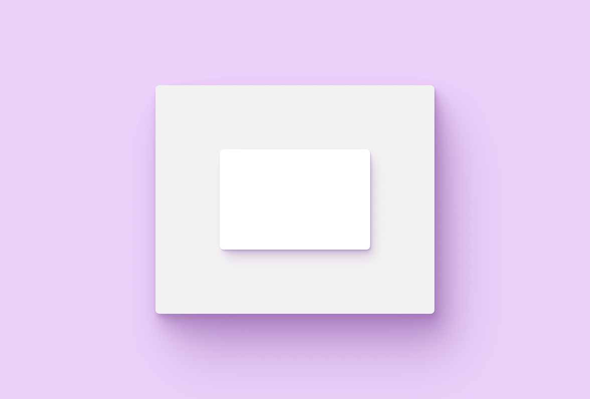
Typical Shadow
Optimized Shadow
There are a few strategies being deployed here, but the most critical one is layering. Instead of a single shadow, we stack 5 or 6 individual shadow layers. Each layer has been customized with different values for x/y offset, blur radius, spread, color, and opacity.
Even if you understand all of the theory, it's still quite difficult to figure out which numbers to plug into all of those settings. Today, I'm launching a new tool to help.
It's called “Shadow Palette Generator”:
There are other (fantastic!) shadow generators out there, but I think there are two things that make this project unique:
- Instead of generating a single shadow, it outputs a trio of cohesive shadows, an entire palette for your application
- It operates at a higher level of abstraction
In modern web development, we rely heavily on design tokens. When we want to change the color of a particular element, we don't typically open up a color picker and search for a brand-new color. We select the most appropriate color from our palette, a set of pre-configured complementary colors.
Shadow Palette Generator operates on a similar principle. It produces a set of 3 shadows, representing 3 different elevations. When you wish to apply a shadow, you'll pick the best value based on how elevated you want the element to appear.
Shadows exist to give our application a sense of depth, but that illusion is spoiled if the shadows aren't consistent. When we use a cohesive set of shadows, our app will feel more realistic and tangible.
The box-shadow API is a very low-level API. You control things like the raw x/y offsets, the blur radius, and the size of the shadow.
When I want to create shadows, I don't generally think in terms of these values. Instead, I focus on the "feel" of the shadow. Should it be deep and prominent, or light and subtle? Should it be tight and crispy, or soft and blurry?
The controls in Shadow Palette Generator are designed to make it easier to come up with shadows that have a particular vibe. For example, the “Oomph” parameter controls how emphasized the shadow should be, by changing many of the underlying box-shadow values.
Experimentation is encouraged! Play with the controls until you come up with a shadow you like.
After you've customized a nice set of shadows, you'll be given a CSS snippet that looks like this:
This output uses CSS Custom Properties to make it easy to reuse shadow values throughout your application.
You can copy this chunk of CSS into a global CSS file, and then apply shadows like this:
One of the CSS variables in this snippet is --shadow-color, and it holds a value like 123deg 45% 67%.
You might be wondering: how the heck is 123deg 45% 67% a color??
Shadow Palette Generator uses the HSL color format. Typically, an HSL color looks like this:
The shadows produced by Shadow Palette Generator will render across all modern browsers, on desktop and mobile (Chrome, Firefox, Safari, and Edge).
The shadows will not show up in older browsers like Internet Explorer. This is because the output relies heavily on CSS Custom Properties, which are not supported in IE.
Even if your site/application needs to support Internet Explorer, I'd encourage you to use this tool anyway. Shadows can be thought of as a progressive enhancement; the product should still be fully usable even without shadows, after all!
Shadow Palette Generator allows you to select a custom background color. It then generates a shadow tint based on that background color. This helps the shadow "blend in" with the background, producing a more-natural effect.
There's a problem, though: this assumes that every single shadow will be in front of a purple backdrop! In most applications, that just isn't true.
For example:
The outer box has a purple-tinted shadow, which makes sense, because it sits in front of a purple backdrop. But our smaller inner box also casts a purple shadow.
This effect is interesting, but it may not be what you want. In general, the shadow color should change depending on the backdrop.
We'll need to re-define all of the CSS variables whenever the shadow should change colors:
Code Playground
Result
.inner-box sets a new shadow color of 0deg 0% 50%, which is a medium gray color.
We repeat the --shadow-elevation-medium definition. In both cases, it's equal to this value:
It isn't very DRY to have to keep copy-pasting this value whenever we want to change the shadow color. Vanilla CSS doesn't really give us the tools to solve for this, but if you use a CSS preprocessor or a CSS-in-JS library, you can avoid this duplication.
For example, here's one way to solve it with styled-components:
(This is just one possible way to solve this problem. You could also use ThemeProvider.)
I realized while writing this blog post: even when you use generative tools like my Shadow Palette Generator, it really helps if you have a rock-solid understanding of CSS.
I know so many talented JS developers who have gotten stuck at a beginner-intermediate level with CSS. They know enough to get by, but their understanding is shallow. As a result, the language often feels surprising and inconsistent.
This has been my primary focus over the past year. I recently released a comprehensive, interactive online course called CSS for JavaScript Developers.
If you find CSS frustrating or counter-intuitive, I hope you'll check it out! Over 8000 developers have picked up the course so far, and the feedback has been overwhelmingly positive.
I took a ton of inspiration from Philipp Brumm's wonderful Smooth Shadow tool.
The idea of layering shadows comes from Tobias Ahlin's seminal blog post on the subject.
Happy shadow-crafting!
Recommend
About Joyk
Aggregate valuable and interesting links.
Joyk means Joy of geeK