

When to refactor a large Blazor component into separate, smaller ones?
source link: https://jonhilton.net/refactor-to-components/
Go to the source link to view the article. You can view the picture content, updated content and better typesetting reading experience. If the link is broken, please click the button below to view the snapshot at that time.

When to refactor a large Blazor component into separate, smaller ones?
November 11, 2021 · 8 minute read · Tags: blazor | components | UI design
I just spent a few days updating Blazor by Example to .NET 6 and Visual Studio 2022.
As I reviewed one of the examples (a Slack-style message list) it struck me how my approach to building web applications has fundamentally changed since I originally wrote the walkthrough.
In the original version I advocated taking the UI (design, or mockup) and breaking it down into smaller components.
From there the approach was to diligently build each tiny component, make them accept whatever data they needed, then compose them together to form something which resembled the original requirement.
I now realise this might be a mistake.
Here’s the specific example:
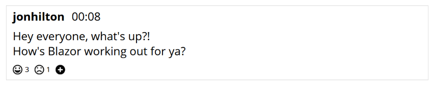
In reality this mockup already represents a pretty small, focused part of the UI.
But it’s not the size or complexity that has me avoiding the urge to “componentise” too soon.
Like a painter putting down their first few tentative brush strokes, this process requires a clear idea of what you’re aiming for and the ability to iterate your way towards that design.
In practice, iterating a design is a messy process of adding HTML elements, tweaking them, removing them then adding them back in again when you realise you did need them after all.
This is much harder to do when you split the markup up into a thousand pieces and scatter it, like confetti, about your application.
Given this requirement, I would now start by ‘sketching’ out the key elements in situ.
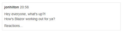
Here’s an initial rough ‘sketch’ of the key HTML elements.
<span>jonhilton</span>
<span>@DateTime.Now.ToString("HH:mm")</span>
<p>
    Hey everyone, what's up?! <br />
    How's Blazor working out for ya?
</p>
<div>
    Reactions...
</div>
Now clearly this isn’t going to look anything like the mockup, but the key structural elements are all there.
My next step would be to use a little CSS to make these elements look a little more respectable.
In Blazor by Example we use Bootstrap 5 (and its utility classes).
In a lot of my projects I’m using Tailwind CSS, here’s a simple Tailwind CSS version.
<div class="border p-2">
    <span class="font-bold">jonhilton</span>
    <span>@DateTime.Now.ToString("HH:mm")</span>
    <p class="my-2">Hey everyone, what's up?! <br />
    How's Blazor working out for ya?
    </p>
    <div>
        Reactions...
    </div>
</div>

@code {

}
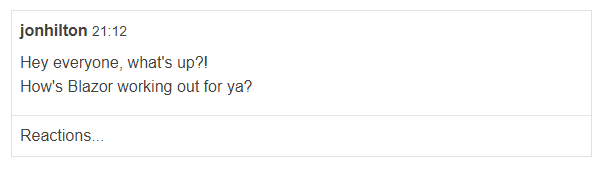
At this point (admittedly minus the Reactions part, which would warrant a little more work) we have a functional version of the UI which does a reasonable job of approximating the mockup.
Rapidly iterate the design
From here I can rapidly iterate the UI, add a little more ‘pizzazz’ or, you know, just make it suck a little less.
Here’s a tweaked version…
<div class="border text-base">
    <div class="p-2">
        <span class="font-bold">jonhilton</span>
        <span class="text-sm">@DateTime.Now.ToString("HH:mm")</span>
        <p class="my-2">Hey everyone, what's up?! <br />
        How's Blazor working out for ya?
        </p>
    </div>
    <div class="p-2 border-t">
        Reactions...
    </div>
</div>
Notice how I had to add an extra div here (to put a border above ‘Reactions’ and still preserve padding for the message details and reactions).
With the markup all in one place this was easy to do (and tweak).
To refactor or not to refactor?
Now we’re not going to be troubling any frontend/design pros with this UI, but we have, very rapidly, created something functional with plenty of scope to iterate as we move forward.
But when should we refactor?
This all comes down to two things for me:
- The relative complexity of the markup/UI logic
- Any requirement to re-use part of the UI
If I look at some markup and it’s hard to read, or tricky to figure out which part is which, then that’s a sign that a refactor may be in order.
In this example we have very little markup, and even when we implement code to render the message details from a C# model, we’re not in much danger of ending up with a complex, bloated component (yet).
But as we continue to add features, and markup, that can change.
Take, for example, this Kanban board…
<div class="flex h-screen">
    <div class="p-2 w-56 bg-gray-100 border-r">
        <h3 class="mx-2 mb-3 font-medium">Boards</h3>
        <ul class="space-y-1 px-2">
            <li>Default Board</li>
            <li>Household Chores</li>
        </ul>
    </div>
    <div class="flex-1 flex flex-col">
        <div class="p-2 h-12 border-b bg-purple-400 text-white">
            <h3 class="text-2xl">Default Board</h3>
        </div>
        <div class="p-4 flex-1 flex gap-x-4">
            @foreach (var column in columns)
            {
                <div class="p-2 bg-gray-100 w-56 rounded-md border">
                    <h3 class="mb-2 text-gray-600">@column.Name</h3>
                    <ul class="py-3 flex flex-col gap-y-3 border-t">
                        @foreach (var card in cards.Where(x => x.ColumnId == column.Id))
                        {
                            <li>
                                <div class="rounded-md bg-white p-2 flex shadow">
                                    <div>
                                        <span class="block mb-4">@card.Text</span>
                                    </div>
                                    @if (!string.IsNullOrEmpty(card.Initials))
                                    {
                                        <div class="flex-none ml-2 w-8 h-8 rounded-full flex justify-center items-center bg-purple-400">
                                            <span class="text-sm text-white">@card.Initials</span>
                                        </div>
                                    }
                                </div>
                            </li>
                        }
                    </ul>
                </div>
            }
        </div>
    </div>
</div>
@code {

    private List<Column> columns = new List<Column>
    {
        new Column { Id = 1, Name = "Todo" },
        new Column { Id = 2, Name = "Doing" },
        new Column { Id = 3, Name = "Done" },
    };

    private List<Card> cards = new List<Card>()
    {
        new Card { ColumnId = 1, Text = "Create Kanban Board Layout" },
        new Card { ColumnId = 2, Text = "Refactor Card into separate component", Initials = "RW" },
        new Card { ColumnId = 2, Text = "Implement new UI for home page", Initials = "JH" },
    };

    public class Column
    {
        public int Id { get; set; }
        public string Name { get; set; }
    }

    public class Card
    {
        public int ColumnId { get; set; }
        public string Text { get; set; }
        public string Initials { get; set; }
    }

}
View this online (via the Telerik REPL).
Clearly this is a lot of markup to read, understand, and modify as requirements change.
Moreover, if this were a real component I’d be willing to bet there’d be an awful lot more ‘UI logic’ in that @code block.
At this point I would be inclined to start looking for logical parts of the markup to extract into separate components.
Look for the seams
One sure-fire way find those pesky “hiding in plain sight” components, is to look for curly brackets and/or indentation.
In this case we have two @foreach loops which jump off the page.
It seems reasonable we might have a go at extracting Column and Card components from this markup.
Consider (but don’t rush to) re-use
The other factor to weigh up for a potential refactor is if you believe a part of the markup is going to be used in multiple places.
That’s true for our potential Card component here. The fact that we’re rendering these in a loop means we’re already technically re-using this same markup multiple times.
The other compelling reason to make a re-usable component is so you can extend it.
In Blazor by Example we build an application dashboard with panels. From there we add variations of panel (for example, an important panel which looks red).
This is a great use-case for taking a component and spinning up several, interchangeable versions of it (there’s no end to the number of different panel types you can end up with!)
But… here be dragons.
Resist the urge to make re-usable ‘generic’ components too soon.
As soon as you start using a component in multiple places it has multiple reasons to change and those changes can ripple out and affect your app in unpredictable ways.
If you find yourself adding conditional logic to a component to handle multiple use cases, then you might have a component which is trying to be too clever and wear too many hats!
A little bit of duplication and multiple, separate, components is often easier to work with and reason about than one, super clever, multi-faceted component.
Context Matters
When you start creating components you’re effectively creating an abstraction.
You’re taking some part of the UI and giving it a name.
The problem comes when you see something else, over there, which looks a bit similar and could also share the same name.
Say you’ve a Card component for the Kanban board and now you need something similar for an application dashboard.
It’s tempting to think, well we called the Kanban component Card, it displays something which looks roughly the same as the thing we’re now trying to build for the application dashboard, how about we just re-use that and tweak it a little.
This is nearly always a bad idea; Just because they both have a border around them and look a bit ‘rectangularish’ doesn’t mean they’re the same thing.
In this case I’d avoid any temptation to re-use ‘Card’ and focus instead on building a simple version of the application dashboard.
If, once I have that, I decide to refactor some of the markup into a separate component I can, and it might even end up with the same name for this component, but it’s the dashboard’s Card, not the Kanban board’s Card.
They differ by purpose, appearance, and context. They just happen to have the same (or similar) name.
At this point it’s important to have a strategy for how to organise the components in your application.
Build in situ then refactor
In summary, next time you start work on a new feature, consider sketching the initial markup in situ first.
It’s much easier to iterate the structure, look and feel of your UI when you can see it all in one place.
But don’t forget to refactor. Sooner or later you’ll run into maintenance issues if all your code is in massive components.
Consider re-use but keep context in mind and only make re-usable components if they’re truly small, focused and make sense to be used in multiple places.
A little ‘duplication’ is fine, especially when the context means it’s not really duplication, just similar looking markup.
Build better ASP.NET web applications, faster
I email every week with hints, tips and advice on how to push through all the noise to get your ASP.NET applications built.
Drop your email in the box below and I'll send new articles straight to your inbox.
I respect your email privacy. No spam.
Next up
How I organise my Blazor componentsRecommend
About Joyk
Aggregate valuable and interesting links.
Joyk means Joy of geeK