

“Dark Mode” vs “Inverted”
source link: https://bradfrost.com/blog/post/dark-mode-vs-inverted/?ref=sidebar
Go to the source link to view the article. You can view the picture content, updated content and better typesetting reading experience. If the link is broken, please click the button below to view the snapshot at that time.

One thing we run into a fair amount in our design system work is the need to clarify the difference between “dark mode” and “components rendered on a dark background”.
What is actual dark mode?
prefers-color-scheme is a CSS media feature that listens to a user’s preference for dark or light mode at an operating system or user agent level.
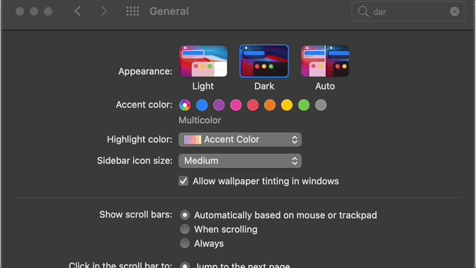
Configuring this updates the appearance of the operating system UI as well as individual websites and apps that are built to listen to this configuration.
In our work we’ve found it helpful to explicitly define that dark mode means prefers-color-scheme="dark".
Inverted
There’s another thing that sometimes gets called “dark mode”, but really means “this component when rendered on a dark background”. This might be a passage of text, headings, text links, tabs, or really any component that happen to be sitting on a dark background. Here’s a crude example:
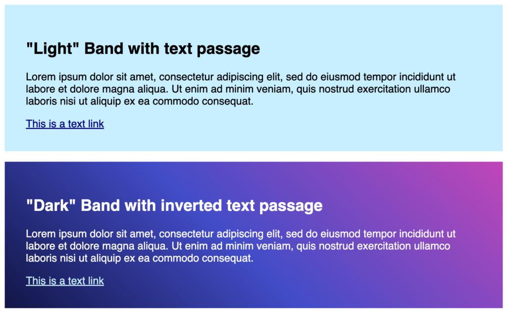
To ensure components work on a dark background, we’ve established a naming convention called inverted. This means the API for all necessary component has an inverted boolean, like <TextLink inverted={true}>, <TextPassage inverted={true}>, <Tabs inverted={true}>, and so on.
What does this mean for design systems?
Design systems can make the call whether or not to officially support dark mode (which again means accommodating prefers-color-scheme="dark"). In our work we’ve accomplished this as part of a themeable design system architecture, where tokens specific to dark and light mode are established and mapped to the proper usage. Here’s a rough demo of that token architecture in practice.
Irrespective of whether a design system officially supports dark mode, it’s very likely certain components will need to be rendered on dark backgrounds. So an inverted convention may be in place even if true dark mode isn’t supported.
This is one of those things that we’ve run into enough times to warrant a blog post. Hope this provides some clarity!
Recommend
About Joyk
Aggregate valuable and interesting links.
Joyk means Joy of geeK