

Refactoring Facebook Profile UI in Xamarin Forms
source link: https://askxammy.com/refactoring-facebook-profile-ui-in-xamarin-forms/
Go to the source link to view the article. You can view the picture content, updated content and better typesetting reading experience. If the link is broken, please click the button below to view the snapshot at that time.

Refactoring Facebook Profile UI in Xamarin Forms
A few years ago, I made a post called “Replicating Facebook Profile UI in Xamarin Forms” which I loved to do  and I was thinking that over time languages, Frameworks have new functionalities which are designed to make our Apps more effective, for this reason, it’s important to keep them updated. In the following paragraph I give you some important points to keep in mind:
 Schedule the refactoring of your code: It’s great that you update your code, but keep in mind the unforeseen events that may occur when making these changes. By integrating / modifying / eliminating new functionalities you can face different unforeseen events triggered by some conditions that your App currently needs and that you did not contemplate at the time, for this reason, you must create a schedule to do it.
 Make a little analysis first: Part of the previous point of the planning, is based on an estimate of time, and that’s why I recommend you to make an information survey, to see the opportunities for improvements that your App needs (For example: Which Nuget Package you must update, which other you can remove updates in layouts (as with the Grid
  )).
)).
Last but not least important, we will be breaking down the code step by step. At the time of the previous publication, we focused on the definition of general points and uploading the repository, without covering the step-by-step. That’s why we will be covering it in this post!
 Before starting, to get the best out of the post, I’ll leave you some instructional notes so that you have a better experience reproducing the UI:
 At the beginning, you will see an image with the original UI where you will see divided into blocks as we’ll be working on each part of the design. Each block presents the image with the design explicitly that we’ll be working on that block, they are highlighted in a box. In each of the code blocks, you can see a comment that says: “Here add the code that is being explained in the next block“. To keep you as focused as possible, this part indicates to you that the next block code explanation goes right where the comment line is added. I will not be using styles so that the properties added to the various components can be seen and understood faster in the explanation process.
Let’s start!
Let’s divide the original design into blocks
To better understand, I have divided the original design into blocks, which are listed in the order in which we will be reproducing each one, these are:


 Let’s start with the Header block, we are going to divide this block into different sub-blocks, which will be the following:
- Main layout: As the main layout we will use the Grid. One of the most important changes that we will make in the code in general, is to replace the Grids with “Long structure” with the simple structure, making our code cleaner and reduced, without affecting the final result.
<!-- Main layout--> <ScrollView VerticalScrollBarVisibility="Never" BackgroundColor="WhiteSmoke"> <Grid RowSpacing="0" RowDefinitions="Auto,Auto,Auto,Auto,Auto,Auto,Auto,Auto,Auto"> <!-- Here add the code that is being explained in all the blocks (starting with Block 1)--> </Grid> </ScrollView>
- Timeline: To add the TimeLine, I used the PancakeView which helps me round the corners!

<!-- Timeline--> <PanCake:PancakeView Grid.Row="0" CornerRadius="20,20,0,0" IsClippedToBounds="true" HorizontalOptions="FillAndExpand" HeightRequest="{OnPlatform iOS='220', Android='200'}" Margin="20,10,20,0"> <Image Source="SunflowersTL.jpg" Aspect="AspectFill"/> </PanCake:PancakeView>
<!-- Here add the code that is being explained in the next step -->
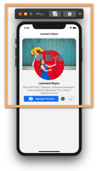
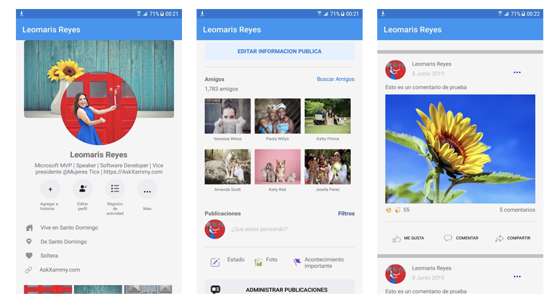
- Profile picture, name and description: To make the image rounded I used a small Tip using a Frame to achieve the circular shape!
 I previously used the FFImageLoading, you can continue using this Nuget without problems! I only give you an additional option to do it!
<!-- Profile picture--> <Frame Grid.Row="0" Margin="100,0,100,20" TranslationY="90" BorderColor="White" VerticalOptions="Start" HorizontalOptions="End" WidthRequest="220" HeightRequest="220" HasShadow="False" CornerRadius="110" Padding="0" IsClippedToBounds="True"> <Image Source="ProfileImage.jpg" Aspect="AspectFill"/> </Frame>
<!-- Name & Description--> <Label Grid.Row="1" Text="Leomaris Reyes" Style="{StaticResource StProfileName}" /> <Label Grid.Row="2" Text="Microsoft MVP | Speaker | Software Developer | Vice presidente @Mujeres Tics | https://AskXammy.com" Style="{StaticResource StProfileDesc}"/> <Label Grid.Row="2" Text="Microsoft MVP | Speaker | Software Developer | Vice presidente @Mujeres Tics | https://AskXammy.com" Style="{StaticResource StProfileDesc}"/> <!-- Here add the code that is being explained in the next block -->
- Styles by platform: As you have noticed, some buttons like “Add history” have different styles for both Android and iOS, let’s see how to do it in a simple way!
<!--iOS Buttons--> <StackLayout Grid.Row="3" Style="{StaticResource StIOSBottons}"> <Button Text="Agregar Historia" Style="{StaticResource StIOSAddHistoryBtn}" /> <Button Style="{StaticResource StIOSSettingBtn}"/> <Button Text="..." Style="{StaticResource StIOSMoreBtn}"/> </StackLayout> <!--Android Buttons--> <Grid Grid.Row="3" ColumnDefinitions="50,50,50,50" RowDefinitions="50,Auto" Padding="0,10" IsVisible="{OnPlatform iOS=False, Android=True}" HorizontalOptions="CenterAndExpand" ColumnSpacing="30"> <Button Grid.Row="0" Grid.Column="0" WidthRequest="50" CornerRadius ="30" BackgroundColor="#ebedf0" Text="+" TextColor="Black" FontSize="Medium" /> <Label Grid.Row="1" Grid.Column="0" Text="Agregar a historia" Style="{StaticResource StAndroidLabel}"/> <Button Grid.Row="0" Grid.Column="1" CornerRadius ="30" ImageSource="EditContactIcon" BackgroundColor="#ebedf0"/> <Label Grid.Row="1" Grid.Column="1" Text="Editar perfil" Style="{StaticResource StAndroidLabel}"/> <Button Grid.Row="0" Grid.Column="2" CornerRadius ="30" ImageSource="MoreIcon" BackgroundColor="#ebedf0" /> <Label Grid.Row="1" Grid.Column="2" Text="Registro de actividad" Style="{StaticResource StAndroidLabel}"/> <Button Grid.Row="0" Grid.Column="3" CornerRadius ="30" Text="..." BackgroundColor="#ebedf0" TextColor="Black" FontSize="Large" FontAttributes="Bold"/> <Label Grid.Row="1" Grid.Column="3" Text="Mas" Style="{StaticResource StAndroidLabel}"/> </Grid>
<!-- Here add the code that is being explained in the next block -->


As this is a set of user information that depends on the amount of registration, it means that you can also reduce or increase the position of the layout, which is why I chose to work with BindableLayout! It’s super cute, if you want to know more information, check it out here!
<!--Personal Information --> <StackLayout Grid.Row="4" Padding="20,0,0,30" VerticalOptions="CenterAndExpand" BindableLayout.ItemsSource="{Binding personalInformation}"> <BindableLayout.ItemTemplate> <DataTemplate> <Grid ColumnDefinitions="Auto,Auto"> <Image Grid.Row="0" Grid.Column="0" Source="{Binding Picture}" Style="{StaticResource StPersonalInformationImage}"/> <Label Grid.Row="0" Grid.Column="1" Grid.ColumnSpan="2" Text="{Binding Description}" Style="{StaticResource StPersonalInformationDesc}" /> </Grid> </DataTemplate> </BindableLayout.ItemTemplate> </StackLayout>
<!-- Here add the code that is being explained in the next block -->

And now, let’s create the photo album, to do it, we are going to use a CollectionView. (If you want to know more information about it, you can enter here.)

<!-- Photo album --> <StackLayout Grid.Row="5" Padding="20,0" HorizontalOptions="FillAndExpand"> <CollectionView ItemsSource="{Binding photoRoll}" HeightRequest="250"> <CollectionView.ItemsLayout> <GridItemsLayout Orientation="Vertical" Span="3" /> </CollectionView.ItemsLayout> <CollectionView.ItemTemplate> <DataTemplate> <StackLayout Padding="0,0,5,5"> <Image Source="{Binding Picture}" Style="{StaticResource StPhotoRollImage}"/> </StackLayout> </DataTemplate> </CollectionView.ItemTemplate> </CollectionView> <Button HorizontalOptions="FillAndExpand" Text="Editar informacion publica" Style="{StaticResource StPhotoRollEditInfo}" /> <BoxView HorizontalOptions="FillAndExpand" Style="{StaticResource StLine}" /> </StackLayout>
<!-- Here add the code that is being explained in the next block -->

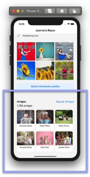 Let’s continue with the Friends block, and also using the CollectionView!
<!-- Friends --> <StackLayout Grid.Row="6" Padding="20,10,20,0">
<StackLayout Orientation="Horizontal" Padding="0,10,0,0"> <Label Text="Amigos" Style="{StaticResource StFriendLbl}"/> <Label Text="Buscar Amigos" Style="{StaticResource StFriendSearch}"/> </StackLayout>
<Label Text="1,783 amigos" Style="{StaticResource StFriendQuantity}"/>
<CollectionView ItemsSource="{Binding friends}" VerticalScrollBarVisibility="Never" HeightRequest="280"> <CollectionView.ItemsLayout> <GridItemsLayout Orientation="Vertical" Span="3" /> </CollectionView.ItemsLayout> <CollectionView.ItemTemplate> <DataTemplate> <StackLayout WidthRequest="80" HeightRequest="140"> <PanCake:PancakeView Grid.Row="2" Grid.Column="0" CornerRadius="10" IsClippedToBounds="true" Margin="0,0,10,0" Padding="0,0,0,20" BackgroundColor="{OnPlatform iOS=White, Android=Transparent}" HorizontalOptions="FillAndExpand"> <StackLayout> <Image Source="{Binding Picture}" Style="{StaticResource StFriendsImage}"/> <Label Text="{Binding Name}" Style="{StaticResource StFriendsDesc}" /> </StackLayout> </PanCake:PancakeView> </StackLayout> </DataTemplate> </CollectionView.ItemTemplate> </CollectionView> </StackLayout>
<!-- Here add the code that is being explained in the next block -->


<!--Add comment-->
<Grid Grid.Row="7" ColumnDefinitions="Auto,*,Auto,*,Auto,*" RowDefinitions="Auto,Auto,Auto,Auto,Auto" Padding="20,15"> <Label Grid.Row="0" Grid.Column="0" Grid.ColumnSpan="2" Text="Publicaciones" FontAttributes="Bold" /> <Label Grid.Row="0" Grid.Column="6" Text="Filtros" FontAttributes="Bold" TextColor="#385897" HorizontalTextAlignment="End"/> <Frame Grid.Row="1" Grid.Column="0" IsClippedToBounds="True" CornerRadius="25" HasShadow="False" WidthRequest="50" HeightRequest="50" Padding="0"> <Image Source="ProfileImage.jpg" Aspect="AspectFill" /> </Frame> <Label Grid.Row="1" Grid.Column="1" Grid.ColumnSpan="6" HorizontalOptions="FillAndExpand" VerticalOptions="CenterAndExpand" Text="¿Que estas pensando?" Margin="10,0,0,0" TextColor="Silver" /> <BoxView Grid.Row="2" Grid.Column="0" Grid.ColumnSpan="7" Style="{StaticResource StLine}" />
<Image Grid.Row="3" Grid.Column="0" Source="StatusIcon" WidthRequest="25" /> <Label Grid.Row="3" Grid.Column="1" Text="Estado" />
<Image Grid.Row="3" Grid.Column="2" Source="PhotoIcon" WidthRequest="25" /> <Label Grid.Row="3" Grid.Column="3" Text="Foto" />
<Image Grid.Row="3" Grid.Column="4" Source="EventIcon" WidthRequest="25" /> <Label Grid.Row="3" Grid.Column="5" Grid.ColumnSpan="2" Text="Acontecimiento importante"/>
<Button Grid.Row="4" Grid.ColumnSpan="7" Grid.Column="0" HorizontalOptions="FillAndExpand" Margin="0,20,0,30" ImageSource="CommentIcon" Text="Administrar publicaciones" BackgroundColor="#ebedf0" TextColor="Black" /> </Grid>
<!-- Here add the code that is being explained in the next block -->

 Finally, let’s add the comments, here we will also use a BindableLayout to achieve it!
<!-- Comments --> <StackLayout Grid.Row="8" BindableLayout.ItemsSource="{Binding principalComents}"> <BindableLayout.ItemTemplate> <DataTemplate> <StackLayout> <BoxView HorizontalOptions="FillAndExpand" HeightRequest="9" Color="Silver"/> <Grid RowSpacing="0" ColumnSpacing="0" Padding="20,10" RowDefinitions="Auto,Auto,Auto,Auto,Auto,Auto,Auto,Auto"> <!-- Rounded image--> <Frame Grid.Row="0" Grid.RowSpan="2" Grid.Column="0" HorizontalOptions="Start" IsClippedToBounds="True" CornerRadius="25" HasShadow="False" WidthRequest="50" HeightRequest="50" Padding="0"> <Image Source="{Binding UserIcon}" Aspect="AspectFill" /> </Frame> <!-- Basic information--> <Label Grid.Row="0" Grid.Column="1" Text="{Binding Name}" FontSize="Small" Padding="10,0,0,0"/> <Label Grid.Row="1" Grid.Column="1" Text="{Binding Date}" TextColor="Silver" FontSize="Small" Padding="10,10,0,0"/> <Label Grid.Row="0" Grid.RowSpan="2" Grid.Column="2" Text="..." Style="{StaticResource StCommentMore}"/> <Label Grid.Row="2" Grid.Column="0" Grid.ColumnSpan="3" Text="{Binding Comment}" Margin="0,10"/> <!-- Comment image--> <Image Grid.Row="4" Grid.Column="0" Grid.ColumnSpan="3" Source="{Binding PictureComment}" Style="{StaticResource StCommentPicture}"/> <!-- Reactions--> <StackLayout Grid.Row="5" Grid.Column="0" Style="{StaticResource StCommentActions}"> <Label Text="🙌" IsVisible="{Binding Like}" /> <Label Text="😍" IsVisible="{Binding Love}" /> <Label Text="😲" IsVisible="{Binding Funny}" /> <Label Grid.Row="5" Grid.Column="1" Text="55" /> </StackLayout> <!-- Comment actions & informacion--> <Label Grid.Row="5" Grid.Column="2" HorizontalOptions="End" Text="5 comentarios" Margin="0,6"/> <BoxView Grid.Row="6" Grid.Column="0" Grid.ColumnSpan="3" Style="{StaticResource StLine}" /> <Button Grid.Row="7" Grid.Column="0" ImageSource="LikeIcon" Text="Me gusta" HorizontalOptions="StartAndExpand" Style="{StaticResource StCommentActBtn}" /> <Button Grid.Row="7" Grid.Column="1" ImageSource="CommentPostIcon" Text="Comentar" HorizontalOptions="CenterAndExpand" Style="{StaticResource StCommentActBtn}"/> <Button Grid.Row="7" Grid.Column="2" ImageSource="SharePostIcon" Text="Compartir" HorizontalOptions="EndAndExpand" Style="{StaticResource StCommentActBtn}"/> </Grid> </StackLayout> </DataTemplate> </BindableLayout.ItemTemplate> </StackLayout>
 .
.

Recommend
About Joyk
Aggregate valuable and interesting links.
Joyk means Joy of geeK