

Case study: An app that teaches you how to multiply your money!
source link: https://bootcamp.uxdesign.cc/case-study-an-app-that-teaches-you-how-to-multiply-your-money-2e7dae2b9c4
Go to the source link to view the article. You can view the picture content, updated content and better typesetting reading experience. If the link is broken, please click the button below to view the snapshot at that time.

Case study: An app that teaches you how to multiply your money!
📍In this case study, I explain and take you through my process of designing an ed-tech app called Invest-ED. I will share my process, design decisions, and rationale behind the decisions.
💰 Invest-ED
Designing a Masterclass platform for working Indian people who want to accomplish their financial goals.
👉🏽 Project Brief
The pandemic has moved the life of people indoors. This has affected the way people approach education. It has fast tracked the shift from offline to online. People are on the look out for quality education to acquire new skills and knowledge. With Invest-ED, I have attempted to bring forth an educational platform that focuses on providing high quality financial education.
📋 Note
This project that I worked on has been done as a part of 10K Designers Masterclass cohort. Invest-ED is not a real app. It is an app concept that was conceptualized and designed to hone my skills as a Product designer.
🔆 Overview
Designing an ed-tech app dedicated to Finance niche solves many finance related problems that has manifested over the years. It aims to provide relevant and updated financial guidance to the people of India. It is important for all of us to become financially aware and independent.
🛑 Core Experiences
Here’s a look at the final flows of some of the app’s core experiences. For a more in-depth discussion of my creative process, scroll down!
1️⃣ Onboard with ease
Onboarding flow- Onboarding helps in establishing a great first impression. By pointing up benefits(features) of the app, user will feel encouraged to continue to explore the app.
- Asking important questions to the user, helps in explaining what the app is for. Setting up preferences, and adding a few interests to start, user will be starting their experience from a few steps beyond zero.
2️⃣ Browse all content categories at Home
Home Experience- Home Screen marks the start point of a user journey.
- Important navigation elements are included providing access to the various content sections within one click.
3️⃣ Learn Investing through relevant video courses
Video Course Experience- Video courses has been included to build a solid foundation of the basics of investing.
- Quick navigation among overview, lessons and doubts enables user to focus on course content.
4️⃣ Learn virtually with others
Live Session Experience- In addition to video courses, the app conducts few live sessions every week with Invest-ED mentors to teach larger audiences at once.
- This helps in building a more personal connection between the mentor and students.
The navigation experience for live sessions is similar to video courses because :
- The navigation tabs (overview, lesson and doubts) has the ability to display live session experience effectively.
- Familiar experience (with video courses) will boost user’s confidence to navigate the app effortlessly.
5️⃣ Invest-ED stories provide free value
Invest-ED Story- Daily story on important financial topics will be uploaded daily on the app.
- Free content provide value to all the users which helps in developing user engagement with the app.
6️⃣ Quickly Search the requirements
Search Experience- Access to course categories on Search page facilitates quick search by the user with just one tap.
- Useful data such as recent searches and suggestions improve the overall search experience.
- Filters provide advanced search option to narrow down the app’s content to quickly provide user with their requirements.
👦🏻The Problem
Let me explain you the problem with the help of a short story. Below is a story of an Indian boy named Rohan who discovers his need to acquire financial knowledge and how he eventually solves his problem.

🧑🏻🤝🧑🧑🏼🤝🧑🏻 Are there more people like Rohan among us?
It is clear from Rohan’s story why there is a need for an ed tech app on Finance. However to validate this even more, I decided to explore this further by doing secondary research.
This is what I found out
- Firstly, only 24% of Indians are financially literate according to a survey conducted by S&P Global FinLit Survey.
- Secondly, personal finance is not a part of our curriculum in school or college. Our education system failed at preparing students for financial crises in adulthood.
- Thirdly, financial education is a basic life skill that has a direct impact on personal well-being. Without financial literacy, the actions and decisions one make or do not make with respect to savings and investments would lack a strong foundation.

The foundation of one’s happiness depends upon the financial independence of an individual. It is of paramount importance to be able to invest the finances earned so that it multiplies over time.
😧 Comments collected from Youtube to validate the lack of financial education

🧠 Mental models
Here, I showcase mental model of 2 individuals.
- One is financially educated. He is able to manage his finances in a well informed manner.
- Second is not financially educated. He is not aware of the principles that one should abide by in order to establish financial stability.
✅ Financially educated

❎ Not Financially educated

There is a remarkable difference in the quality of life of the two individual. Being financially sound plays a huge part in the confidence, relationships and mental health of an individual.
👍🏼 A huge shout-out to Amrit Pal Singh for the demo bundle of the toy faces.
➡️ To sum it all up, here is a precise tweet by my friend Rohan
Source : https://twitter.com/rohanxdesign✳️ Design Process

➕ Note
Design process, in this particular case, has been divided in above mentioned significant steps. However, sub-steps such as ideation(ideas for the app), establishing user flows and sketching maps(when needed) are also part of design process.🪜🪜🪜
🕵🏻♀️ Identifying Problem Space — Competitive Analysis
To identify problems that exist within ed-tech apps and the process of learning online, I conducted secondary research to discover user’s pain points.
These are some of the user reviews taken from Udemy and Skillshare. As a product designer, it is important to deeply understand and empathize with the user’s needs and problems.
 User reviews on Skillshare and Udemy
📌 Summary of the Pain Points (key takeaways from competitive analysis)
- Only video based learning which explores the surface level of the concepts.
- Unresolved doubts among the students since most of the doubts posted are not answered by the instructors.
- Course content is outdated.
- Some of the courses are sponsored and are made with purpose of advertising tools/investment options.
- Lack of guidance (feedback).It can be daunting for a beginner to invest their money with confidence.
- Theoretical based courses with little to no exposure to practical space.
- Courses does not impart “Investing confidence” because the videos are pre-recorded with no follow ups.
🎯 Target Audience

- Invest-ED is currently focusing on Indian audience in the age bracket of 15 to 40 years of age who are mostly students, working professionals, or home makers, having decent income and a reasonable way of living.
- Users from both urban cities and rural areas are targeted because it is important to focus on Indian financial literacy as a whole.
- To overcome language barrier, video courses have the option of switching between both Hindi and English.
- Approx. 70% of Indian population is formed by rural areas.
👁️🗨 ️Design Inspiration
I took inspiration from the following applications to understand common design patterns. It is important for a designer to analyse and identify factors which are making other applications in the market effective.

I have taken inspiration for Invest-ED from categories other than ed-tech. It helps to broaden the perspective and gives fresh ideas that can be implemented in the app.
🧪 Research for Important Categories
I analysed following apps to pick out important finance categories which the users of Invest-ED should learn to become updated with financial instruments that are relevant in today’s time and age. Since Invest-ED is a new app, more categories that are relevant can be added for a strong financial foundation.

Categories finalized for Invest-ED app : —
- Stock Market
- Mutual Funds
- Real Estate
- Cryptocurrency
- Commodities
- Insurance
- US Stocks
- Bonds
Some new categories that will be added in future : —
- Retirement Plans
- Government Schemes
- Taxation Policies
💡 Ideation for Invest-ED
Here, I have noted down some of my ideas for the app and the reasons behind them. Ideas have been based on user needs and pain points discovered in the early stages of the process.

📐 Information Architecture

📝 Wireframing

🔵 Branding
Creating an ed-tech app concept required me to think about what the app’s look and feel would be based around, and how the visual language of the app would tie into its purpose to create a user friendly experience.
1️⃣ Icon / Logo

- Logo reflects the brand identity and is easily recognizable. Simplicity is key for a memorable logo.
- The piggy bank reminds people of their childhood, where they used to put money for future emergencies. Hence, the logo quickly associates with financial aspect of an individual.
- Bulb symbol at the centre of the piggy bank represents enhancement in knowledge and wisdom.
- Since it’s an emoji, it can easily be shared digitally.
2️⃣ Name

- It covers the core subject matter of the application which is Investing. Users can immediately understand that the application is connected to Investing.
- ED is a clipped term used for Education.
- Invested also means devoting time, energy and money in a particular activity or a thing. For eg. I am invested in my personal growth.
By combining the above interpretations, a person who wants to learn Investing and is willing to involve in a learning activity, can download and learn from the application.

3️⃣ Colours

- I chose Primary color as Blue because it indicates trust, comfort and professionalism. Blue is also the go to color for finance brands. Blue color has been used for all buttons, splash screen, selected state and highlighting a text or an icon.
- Green is one of the colors that have always been connected with wealth and money. Green symbolizes growth, nutrition and a bright future. Green color has been used to denote progress, movement, expansion and active state.
- Tertiary color (orange) has been used to denote live guest sessions and discount offer button.
- Neutral colors of grey were used for disabled states, borders, texts, lines and backgrounds.
Some examples of finance and ed-tech brands who have used Blue or Green as their brand colors :

4️⃣ Typographgy

- Inter is a variable font family carefully crafted & designed for digital screens.
- The ed-tech app is targeted towards a younger age group (15–40) years. The font has an clean, simple and modern look which the target users will be able to connect with. It offers optimal readability for smaller font sizes as well making it appropriate for use in mobile applications.
- The typeface can be used for both headline and body copy. Hence, the the typeface Inter is appropriate to communicate the finance education which is its primary objective.
I have used one typeface i.e Inter for the complete Masterclass application.
5️⃣ Iconography

- I decided to use material icons because it ensures readability and clarity at both large and small sizes.
- Material design system icons are simple, modern, friendly, and sometimes quirky.
- These icons have been optimized for beautiful display on all common platforms and display resolutions.
6️⃣ Illustrations
 Source : Blush design
- I used illustrations from Blush by Pablo Stanley.
- The illustration pack matched with the youthful and vibrant look of the app.
- It is designed and illustrated by Vijay Verma and illustration pack is Allura. A collection inspired by people in everyday situations, from days at the office to walks in the park.
🎨 Visual Design (outcome)
I will explain my design thinking around each user flow as to how I decided to solve the problem and communicate value to the user.
1. Splash Screen
- When designing the splash screen, I focused on keeping the screen simple, bold and minimal.
- By keeping the design minimal, elements present on the screen are getting its due attention.
- The idea behind designing splash screen was to introduce (or remind) the user with the brand logo, brand name and brand colors.
Spacing, legibility and simplicity were considered important while designing Invest-ED.
2️. Onboarding
- Onboarding is a great means to highlight the values and features that the app provides in a nutshell.
- The most important advantages of the app are shown to users convincing them to try the app.
- Relevant illustrations add context and substance to the text. Text become easily understandable with the help of a pictorial representation.
- Onboarding forms the basis of the visual style that is yet to be unfolded by a new user.
I have tried to limit the no. of words in the copy for onboarding flow. I don’t want to overload the user with long sentences which can give an impression of the core app being difficult.
- Copy is short, crisp, direct and in simple language.
- The no. of screens in onboarding flow can be picked up by the user from progress indicator at the bottom. The user at every stage should be provided relevant details so as to make the experience of using the app smooth.
🗒️ Note
👉🏼 The app wants all the users who installed the app from apple store to browse actual content of the app. By reducing number of steps in onboarding stage, more users will sign up and ultimately subscribe to the app. With each new step added, drop off rate will be higher.
3️. Sign up/Log in
Phrases “Sign Up” and “Log in” have been used intentionally. It is easier to mix “Sign Up” and “Sign In”.
- Option to proceed ahead with social media accounts along with traditional form fill up will simplify user experience which will make them much more willing to use the product.
- In case the user has selected the wrong option (Sign up or Log in), they can correct their mistake by selecting the right option (Sign up or Log in) available on both screens.
4️. Walk-through
- After the user has signed up to the app, a small 3 step question-answer is included in walk-through section.
- This enables the app to understand user on a more personal level. With better understanding, a curated personalized feed will be provided to the user.
- Personalized feed will feel like the app is specifically made to meet user’s needs and wants.
- Once, a personal bond between app and user is established, it becomes easier to establish a long term connection with the user.
- A simple tap on any of the options will instantly highlight the border of the selected option (please refer prototype video).
Clear visual indicators helps the user to understand and use the app effectively.
- Users needs to know where they are and how long is the whole process. Progress indicator helps in achieving that.
- I also made sure that the user has freedom to skip the walk-through section and directly jump to homepage.
- Walk-through questions are optional. They are provided to enhance the overall experience of the app by personalizing the content for the user.
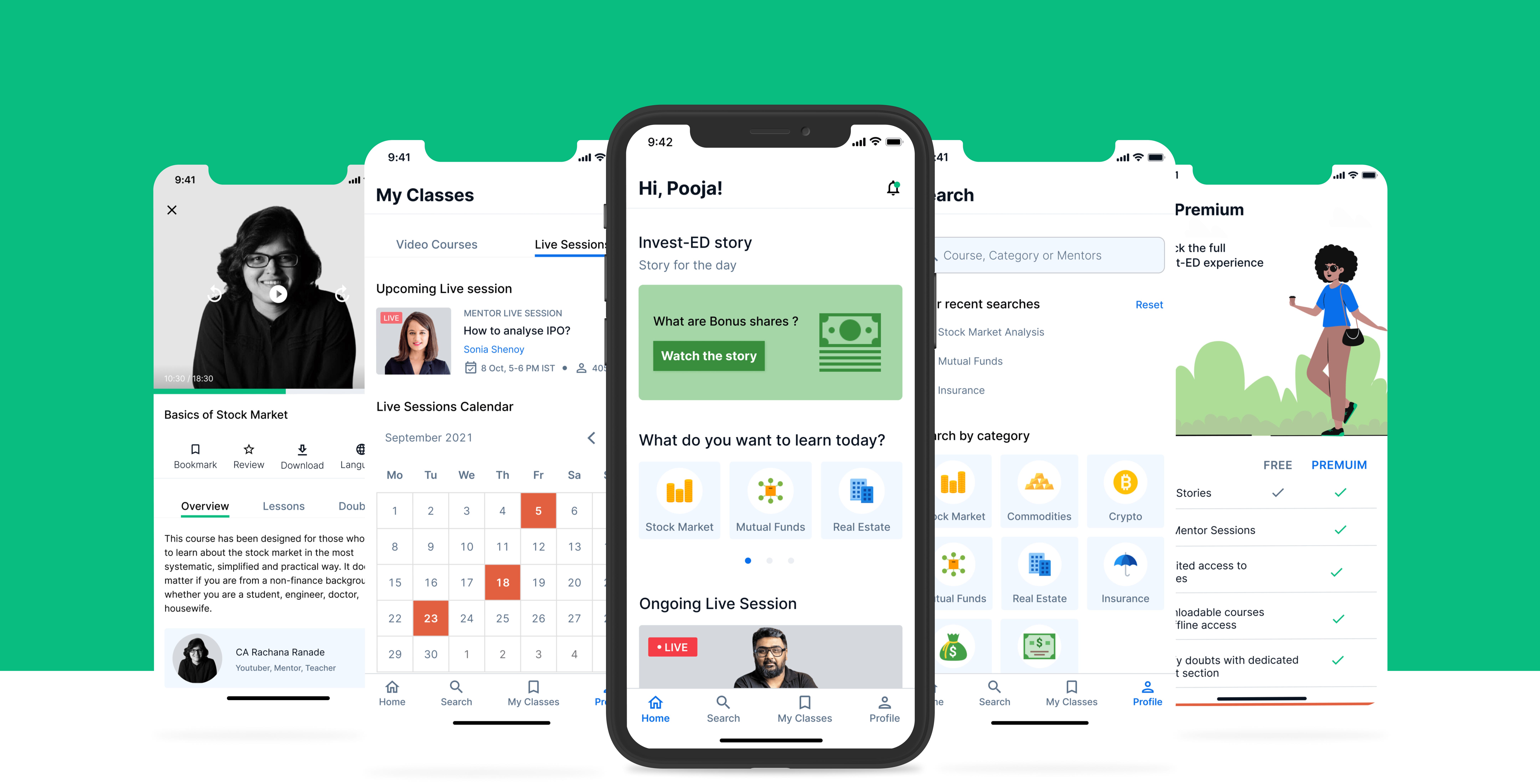
5️. Home
- Let me introduce you with some of the limitations and accessibility with respect to Invest-ED.
- As a free user, the user can access the app for free for a limited time period of seven days.
- After 7 days trial period of the app is over, the user will be able to access only the first lesson in a video course. There will be no access to live sessions.
- As a premium user, all the free and paid features ( which I will introduce you with in checkout section) are available for use (limited to time period for which premium subscription has been taken).
Hierarchy in home screen showcases content in order of importance and placing those sections first in which the user is most likely to interact with.
- Call to the user to subscribe to the platform is at the end so as to showcase the value first. When an urge and motivation is instilled in the user, the probability to subscribe is higher.
6️. Invest-ED Story
- The concept behind Invest-ED Story is to put forward a section from the app which absolutely free for all users.
- Stories provide value to the user in less than 5–7 mins. Quick, value driven and relevant content related to finance will be uploaded on the app daily.
- A user who has not subscribed to the app, has unknowingly developed a practice to visit the app to check the story for the day.
Contributing consistent value will persuade the user to become a premium member to reap all the benefits of the app.
- This has been developed keeping in mind that the conversion rates of all the users are different.
- Patience and consistency are the factors which leads to long term gains (loyal users) for any business platform.
7️. Search flow
Simple UI with responsive UX is what I have aimed at while designing each section.
- Search experience is no different. Apart from home screen (and walkthrough), another entry point to categories section is from search. Having a quick glance to categories on search page will enable the user to directly jump to the category of their interest with a single tap.
- Recent searches and suggestions (based on text searched on search bar) helps in making the search experience faster and more effective for the user.
- On search results screen, a balance between mentor image and course information has been attempted. One should not overpower another. Both (image and course info.) content format are relevant for decision making by the user.
- Sorting and filter actions are activated after the user has performed the search action. Its following a step by step approach to reach the ultimate goal. Providing all actions from the start might intimidate or confuse the user.
8️. Content Details Experiences
- Video course experience
- Live session experience
Video course : —
- ✔️ When the user has subscribed to Invest-ED
- ❌ When the user has not subscribed to Invest-ED
Live session experience :—
✔️ When the user has subscribed to Invest-ED
- Content details are of two types on the app. One is for pre — recorded video courses and another is for live sessions conducted by mentors.
Spacing, simplicity and responsiveness are the core principles I have tried to follow while designing Invest-ED.
- Secondary actions such as review, download and bookmark are clearly visible at the top. They are all placed at one location so as to avoid confusion and make usage of the app smooth.
- Language is available in two options, Hindi and English. It is very important for the app to include both the options because financial literacy in rural areas in very low. They also need equal opportunity to learn and grow in their lives.
- For pre — recorded courses, first lesson can be watched for free. Live sessions are locked and available only for subscribed students.
- Lesson being taught currently is shown active using a play bar at the bottom of the lesson.
A dedicated doubt section is added to an bring an essence of real life scenarios on the app.
- Live sessions cannot be downloaded. Language options is also available only for pre-recorded courses. Hence, only an option to review the session is available for users.
- The no. of students currently learning from live session inspire the user to be a part of the live session.
9️. My Classes
- In order to simplify classes a user watches, My Classes has been divided in two sections.One is Video courses and another is Live Sessions.
- Video courses relates to pre — recorded content on the app which the user has interacted with before.
- Video courses has been further segregated in Bookmarks, Downloads and Watch history to narrow down and simplify user task.
- Live sessions relates to upcoming lives by the mentors.
- A monthly calendar provides information of all the live sessions in that month at a glimpse.
10. Profiles
- Two types of profile are there on the app. One is student profile and another is mentor profile.
- On Student profile, users can quickly decipher their activity on the app with the help of numerical data (total hours on video courses and no. of live sessions attended)
- Similar to My Classes, mentor profile is also divided in two sections. One is Video courses and another is live sessions.
- If a user wants to explore more content of a particular mentor on the app, mentor profile provides the means to serve this purpose.
1️1. Notifications
- A picture of the mentor in whose respect the notification has been sent is displayed for quick understanding.
- Copy is mostly direct and in easy to understand sentences to cater to a large group of users.
Similar to apps like Zomato and Swiggy, I have used emoticons for notification. Emoticons has the power to communicate messages quickly and more precisely. It is always a good option to use them for our advantage.
- By highlighting few most important words by adding blue colour, the user can quickly browse only the highlighted words to get a grasp of the subject matter.
1️2. Feedback
- An experience can only evolve and iterate based on valuable feedback from the users.
- Regular feedback will be taken from users regarding their experience of using Invest-ED.
- It will be shown as a pop up on home screen.
- It is 2 step process. First step requires the user to move along the dotted row. Second step requires user to manually input words (or sentences) to provide more clarity regarding their experience.
- Giving feedback is optional for the user.
1️3. Checkout
- On premium screen, distinction in the offering between free and premium features is clearly visible. This helps the user in decision making.
- A 20% discount options for “24 hours only” will trigger a sense of urgency in the user to subscribe to the app.
- It is more profitable for the app to onboard users with annual subscription. Hence, annual subscription button is given more emphasis using color (brand color blue) and placement (top).
- Call to Action buttons will act as floating buttons on the screen. Here, it is placed at the bottom for clarity and complete view of the screen.
After the user has completed the payment procedure, an illustration which depicts happiness instills a sense of accomplishment in the user.
🎦 ️Final Prototype
🔍 Retrospective
After I completed working on this assignment, I took some time away to reflect on what went well and what did not go so well and how would I improve the product or process the next time.
🥇 So, what went well ?
- Working on a problem statement which I felt deeply passionate about. Achieving financial independence should be the top most priority of any individual.
- Improving on my visual design skills. This project contributed immensely to push myself to work and improve on visual design.
- I enjoyed being able to work both as a UX researcher and UI designer.
- Creating an app from scratch gave me the experience to compile research, think about app features, branding, user flows, prototyping and overall feel of the app.
🥈 That’s nice, but what needs improvement ?
- Paying more attention to wireframing step. Creating both low-fidelity and high-fidelity wireframes forms the ground on which imagery and colors are added in visual design step.
- Creating a community where users could communicate about their experiences in investing.
- Visual design skills needs improvement, something I will keep working on.
- Adding animation to explore deeper into the flow of the app would have added another layer to the design.
😀 That’s all, folks!
If you’re reading this, thank you for your time. Hope you found this interesting to read. I had an awesome experience conceptualizing and designing Invest-ED
🙏🏼 Gratitude
I thank Abhinav Chhikarafor giving me this assignment as a part of the 10k Designers Masterclass.
Special thanks to Rama Krushna, Agrata Patel, Sagar Bhardwaj, Salonee Nandkarni, Simran TankandVishal Krishnafor providing helpful insights and feedback throughout the project.
👏 Claps
It would mean a lot to me if you could long press on the clap icon, drop a few claps & show your support.
🌐 Let’s get connected here
👀 Check out my other case study on Medium
This was a team based research project worked in collaboration with Papori Sharma.
Recommend
About Joyk
Aggregate valuable and interesting links.
Joyk means Joy of geeK