

Enterprise UX: essential resources to design complex data tables
source link: https://stephaniewalter.design/blog/essential-resources-design-complex-data-tables/?ref=sidebar
Go to the source link to view the article. You can view the picture content, updated content and better typesetting reading experience. If the link is broken, please click the button below to view the snapshot at that time.

Enterprise UX: essential resources to design complex data tables
I’m working in Enterprise UX. Which means that I often work on dashboards, internal tools and web apps with a LOT of complex data to display. Most of the time, that data is displayed in different forms and variations of tables. From basics and specific table patterns to designing tables for enterprise apps and fitting big tables with a lot of content in any screen, I put together a list of resources and blog posts that will help you design complex tables with a lot of data and interactions.
Start by understanding what users need to do with those tables!
Before we dig in, I wanted to remind you that all those articles give generic advice and some design ideas of patterns. At the end of the day, your users have specific needs. My number one advice when you need to design tables: do your user research. Understand exactly what users need in those tables. What they use those table for. Maybe in those 20 rows, 3 are never used by anyone and you can remove them? Or maybe you really want to remove 10 of those rows, but you discover that this is used by the core banking system and users need all of those indicators. Don’t take any table design decisions without really understanding how this table is going to be used. And who knows, maybe a table is not even the right design element choice anymore and you might end up display all that data in a complete other way/component!
I current work on an enterprise web app for project management. In my case, a mix of user interviews, observation and task analysis here. But you can also check “Solving Design Problems: Finding UX Tools, Methods & Activities” to help you find more research methods and tool to investigate those needs.
Table design basics and specific table patterns
UX Booth’s Designing User-Friendly Data Tables
UX Booth is usually a good source of information. This article is a good introduction to table design and covers all the basics: cell padding and height, adjustable columns size (trust me, when you have a lot of data those can become handy), how to deal with big headers, zebra stripes and row freezing, alignment tips, how to link data, pagination, sort, filter, search, etc.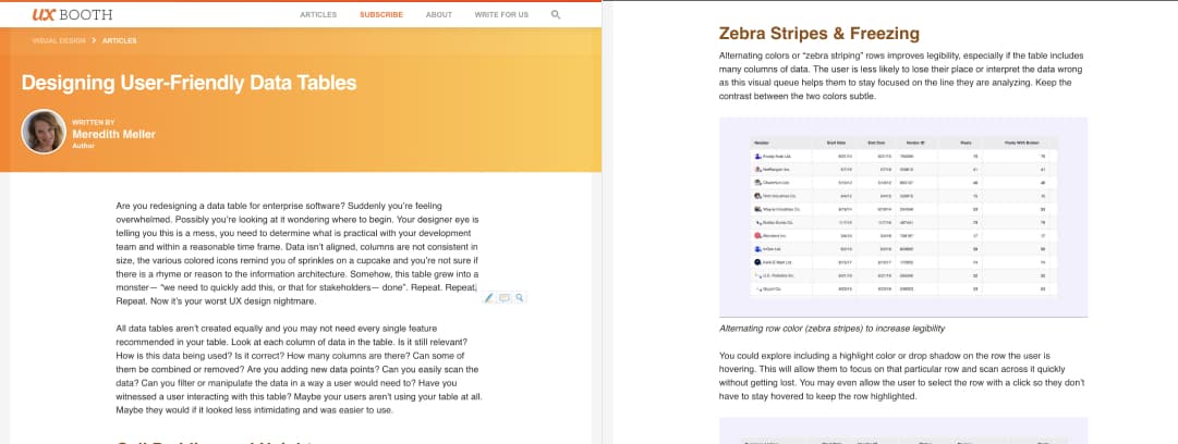
Ultimate guide to table UI patterns
And oldy (2010) but still goody! This article goes back to the basics of table UI patterns: alternating rows (stripes), full row selection, table selection, sorting, filtering, pagination, continuous scrolling, fixed headers, headerless tables, expandable rows, row actions, etc.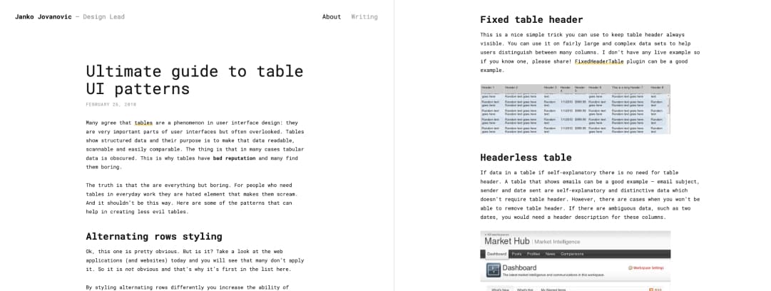
Design better data tables
This article provides small GIFs of different types of tables (fixed header, horizontal scroll, resizable columns, row style, etc) and then goes deeper into specific patterns like display density, visual table summary, pagination, hover actions, inline editing, expandable rows, quick view, modals, multi modals, row to details, sortable columns, filtering, searching, adding column, etc.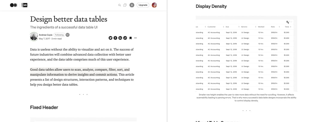
Designing Tables for Reusability
This is a detailed use-case of table design with the main challenges of tables and a lot of visual examples again: pagination, edit modes, actions, customisation, truncation, usage of imagery and iconography, view indicators, expanded view, etc.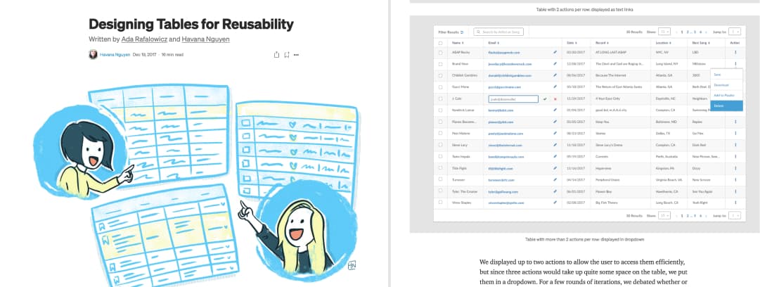
How To Architect A Complex Web Table
I like that this article starts with user research (obviously) and user needs around those tables. It then goes into more technical details and brings an atomic approach to designing table components like cells, headers, filters, columns, top bars, etc. The article also gives some advice on some specific types of tables, interactions and responsive web design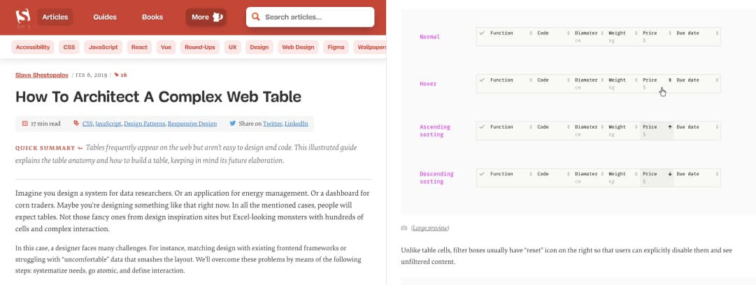
Data Tables Design Basics
It starts with an introduction on how and when to use tables , what information to display and then gives details tips on text alignments, sizing, typography duplication and commons table patterns like bulk actions, group and sorting, pagination again, fixed columns.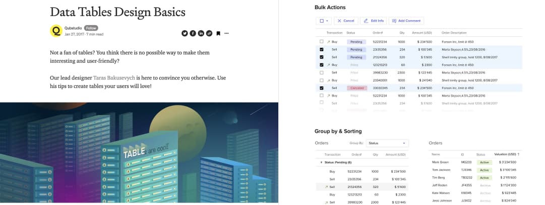
Designing data tables specifically for enterprise apps
Designing better tables for enterprise applications
This one offers a lot of interesting examples on how to handle links on tables, actions, pagination and search. It it specifically targeted towards complex enterprise web applications.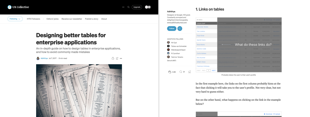
Modern Enterprise UI design — Part 1: Tables
This post breaks down common enterprise application UI patterns, problems and solutions regarding tables: basics, responsive tables, how to deal with a lot of data (pagination, lazy loading, searching, sorting, data summaries, etc.), how to design for the unknown future data, dealing with actions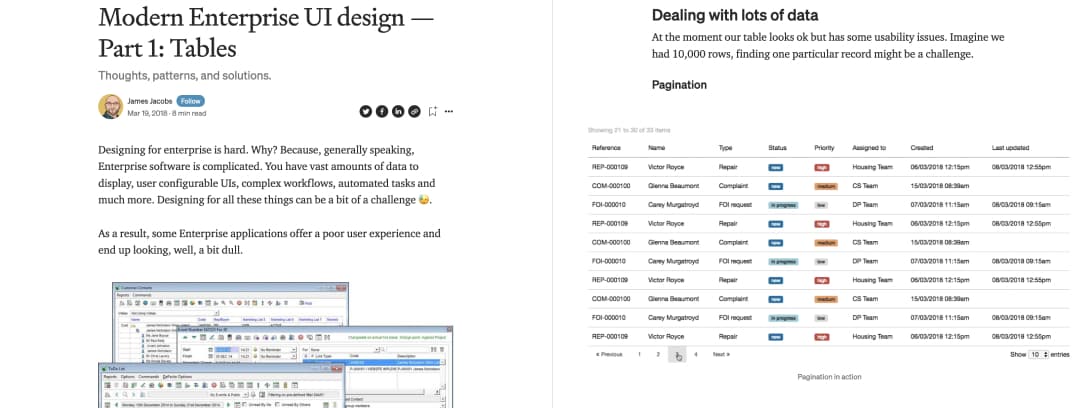
Designing better data tables for enterprise UX
This article gives a lot of visual examples of how to design tables for enterprise products: simple data, data with images (like avatars), with a link, headers, search in column, tables that can be customized, sorted, tables with a large number of columns with column freeze, editable datas, errors and actions, data alignment, grouped data and resizable columns.
How to fit big tables with a LOT of content in any screen size
Apart for the generic case of “how should a table” work, my biggest challenge while working in enterprise UX is “what am I going to do with all that data”. I told you in the introduction, the first step is to really understand user needs here, what they try to do with that data. There’s a few interesting resources online as well to help you.
How to Fit Big Tables on Small Screens – video
Raluca Budiu recordedfor NNGroup this awesome 4 minutes videos where she walks you through different strategies. It (again, shocking?) again comes down to understanding what people want to do with those tables and trying to design ways to help them accomplish this: hiding columns, vertical scroll, re-ordering columns, etc.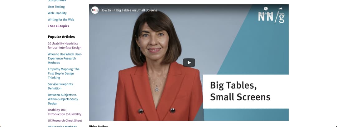
A few UX Stackexchange threads on displaying too much data in tables
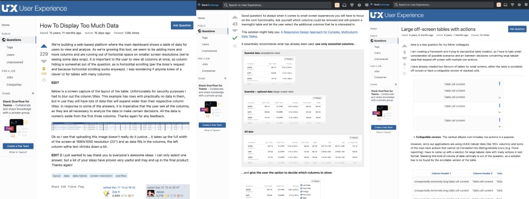
UX Stackexchange is a nice place where you can go and ask questions to other UX practitioners. Here are a few threads that you might want to read and follow:
- How To Display Too Much Data from 2010 but still relevant with a lot of interesting answers
- Large off-screen tables with actions some design patterns if you need to have some actions in your super big tables
- How should large table columns be handled on a responsive design? this thread gives you a few interesting design patterns if you are specifically looking for responsive solutions
A few extra for the road
The following articles are a little bit older and give general tips to design user-friendly tables:
Are they any interesting resource I’m missing? Please share in the comments and I’ll add them to the article.

Sign up for new articles
Don’t miss any new content: get notified directly in your mailbox when I publish a new articles or share new freebies.
I won’t share this email, and you can unsubcribe anytime.
Please note that gmail sometimes puts the confirmation in spam.
Recommend
About Joyk
Aggregate valuable and interesting links.
Joyk means Joy of geeK