

Case study: POD.io- Masterclass to learn ‘Podcasting’.
source link: https://medium.muz.li/ux-case-study-pod-io-masterclass-to-learn-podcasting-3eefe9163bfd
Go to the source link to view the article. You can view the picture content, updated content and better typesetting reading experience. If the link is broken, please click the button below to view the snapshot at that time.

Case study: POD.io- Masterclass to learn ‘Podcasting’.
A personal project on an app that helps you learn podcasting from the best in business.

Hey folks! 👋. You can call me Zab, and I am going to walk you through a handout of my thoughts on this case study which is a project I did during my time learning with 10KDesigners✨.
The Duration of this solo project was roughly around 3 weeks.
The ‘Problem’ statement 👊
To begin with, I was presented with the task of designing an Ed-tech & Media App as an assignment course I had enrolled in. Eventually, that should result in people accessing content with the minimum of effort and which would be a source of lifelong learning and a ‘go-to’ place for any doubts that might be a hurdle in the path of learning.
The dedicated ‘Masterclass’ approach would be the best possible way to lay it out. But then, the problem was open-ended as the ‘niche’ was up to our very own interests. For obvious reasons, I have a soft corner for podcasts and that's where it ❤️ took me.
Problem brief:
- Design a Masterclass App for ‘Learning how to make a podcast’.
- I named it POD.io, it’s 🆒. That's why.
What was I thinking ?? Why a Dedicated app to learn how to Podcast right? 🙇
Existing Platforms
For the case of this project, Youtube and Udemy courses were considered
- From research, I found that the content is generally just recorded videos.
- The structure was missing, in the sense that the user had to do a lot of running around to find the right fit.
- The interactive element was missing, which in my opinion is essential to whether a learner has understood what they have consumed.
Remote Learning
- For some time now, remote was around the corner.
- The Covid situation has only acted as a catalyst to people accepting remote as the reality.
- More time with oneself has led to people picking up hobbies.
Opportunities
- Structured, quality content is an asset anyone will be willing to pay for.
- Most people are hesitant to start their journeys because they do not know where to ‘start’ from.
- Credibility coming out of content created by an established/known personality has relatively more value and demand.

Approach
For the secondary research, I had to dive deep into a few sites and sources to understand their current offerings and how people were responding to them. After reading the comments, reviews, and the trouble that a user has to go through to find the right course, I got 💯 convinced that having a standalone app is worth a shot idea.

Summary:
- Not enough justification or structuring is done to the available content on the internet.
- COVID has given rise to more and more people picking up new hobbies
- Learning from a known personality has its own perks as the platform gets credibility.
PS: I’m a sucker for podcasts myself 😜
Let’s dive into the ‘Past Experiences’ 😐
Browsing is not easy. Let’s admit it, it’s confusing 😕 to search for the right thing, and even if you do, it's hard to decide between the wave of so many options.
The problem with our generation is not the lack of information, but rather the abundance of it.
For this project, Youtube playlists and Udemy courses were looked upon to understand the current practices in the industry.
Summing up by what I found, the following points can be laid out:
- Just Googlingfor the sentence ‘Learn how to podcast’ around 15 resources pop up on the first page alone.
- Users are going through the trouble of manually checking most resources, read comments, check reviewsand go with the most bought or reviewed course.
- Usually, these courses don't give access to content unless paid in full( what if I don't like the course, right? 😥).
- The courses are pre-recorded🔴 and monotonous. Makes it very boring.
- The ‘Paid’ courses do not justify theprices.
- No follow-up and feedback systems that enable course purchasers to improve.
The ‘Ideation’ marathon 🉐
My favorite part after every research, randomly pulling ideas out of thin air ❕ Obviously, I had to narrow down to few things by the end, but the possibility of many ideas that can come to the mind all at once is what excites me about being human and in a space that solves problems. 🙌
Since the problem statement was very open-ended, I had to choose an approach that would be making a statement in its own way and add credibility to the App. An approach that would encourage users to sign up for a course from our platform rather than the competitor.
So having the ‘sharks’ of the space launch content on our platform was the best way to do it. Now, who wouldn’t want to learn from Joe Rogan? say? 😁
After doing a lot of Secondary research, found sources that also personally introduced me to the various genres and components that form a podcast. The one article by Pat Flynn gave me a deeper understanding of what it is that a podcast must have that will make it delight for its users to consume. I learned that it’s not only good communication skills, but also the understanding of tools is what makes a successful podcast.

What goes onto the app ?? AKA sitemaps & Information Architecture 🎭
Sitemaps are a visual jot down of what goes on each page of the app. In the sense that what happens when one the user clicks on any of the features on the page. For example: clicking on the course card on the main page will take the user to another page that includes course details.
Whereas, Information Architecture(IA) is all about how the above information is presented and prioritized.

An overlay of what might be the possible pages on the app was put down and later after making a few additions and deletion, the final sitemap is what the above image looks like.
To the best extent, after taking feedbacks from mentors, the designs were made simple and hassle-free enough for any learner to sign up with ease and start learning.

I wouldn’t lie, a lot and a lot of iterations and decisions later, the IA still seems incomplete. But it gave me a clearer idea every time of what I should be paying attention to. The entire agenda for me was to help the subscribers to make a satisfactory choice. Let’s see if I’ve been able to do that 😛
Wireframes to the rescue 🚁
Wireframes are my friends who save me a lot of time and the trouble of being clueless about the aesthetics of design. For starters, I always go with B&W wireframes and add a little(very minimal) color as I progress. Personally, B&W is pale. But it is what saves designers a lot of mess so I was going to do it anyway.
After seeking a lot of inspiration from many sites and apps, likely: ‘Masterclass’, ‘TED’, ‘ Spotify’ and ‘Soundcloud’.
Seriously, there is nothing better than to arrange design elements on a frame and see how they look for the first time, even though it’s still black and white. From practice, one thing got clear, spacing and using white space to our advantage is beautiful.
“Good design is all about filling elements in between the whitespace”
Here’s a little peek into what happens behind:

Adding colors to Wireframes: Visual design 🎨
We think in colors, we dream and we create in colors. That is exactly why we yearn for colors in our lives as well. For this project, I had to limit myself to as minimum colors as possible. The reason being, it’s not an artwork, it’s an app that will be used by everyday people. Also, I had to maintain a ‘premium’ look to the app, therefore adding minimal color was the right balance.
Onboarding

In my opinion, onboarding has to be very simple and to the point. At the same time should gather all the necessary information from the user. Anyhow, the user isn’t forced to sign up on the first go as I intended to keep up the quality and trust of the app by letting the user have a glimpse of the content.
Summary:
- when the app launches, the logo of the app pops up speaking of the branding and quality.
- The sign-up options are basically sign-ups via social media platforms and another option of phone 📴 sign-up.
- The idea behind it is to make sign-ups have minimum reluctance.
- The courses are based on a subscription model, therefore before making a monetary commitment, it was fair to give the users a glimpse of what they were getting into.
Explore Courses/Home page

The entire approach for the platform is mentor-based. As in, the way a user makes a choice is by the likeability or style that appeals to them.
Upfront itself, the idea behind making the ‘Top chart courses’ visible to the users is to help them make a quick decision based on validation given by other learners who have bought the subscription before them.
Even before buying the subscription, the users are given an option to explore the courses and watch the first episodes.

- Giving users access to the entire to have a look around gives them a sense of belonging which helps in establishing trust.
- As much as we’d want to make profits from the platform, retaining that customer base and giving them more in terms of quality is a top priority.

Search filter
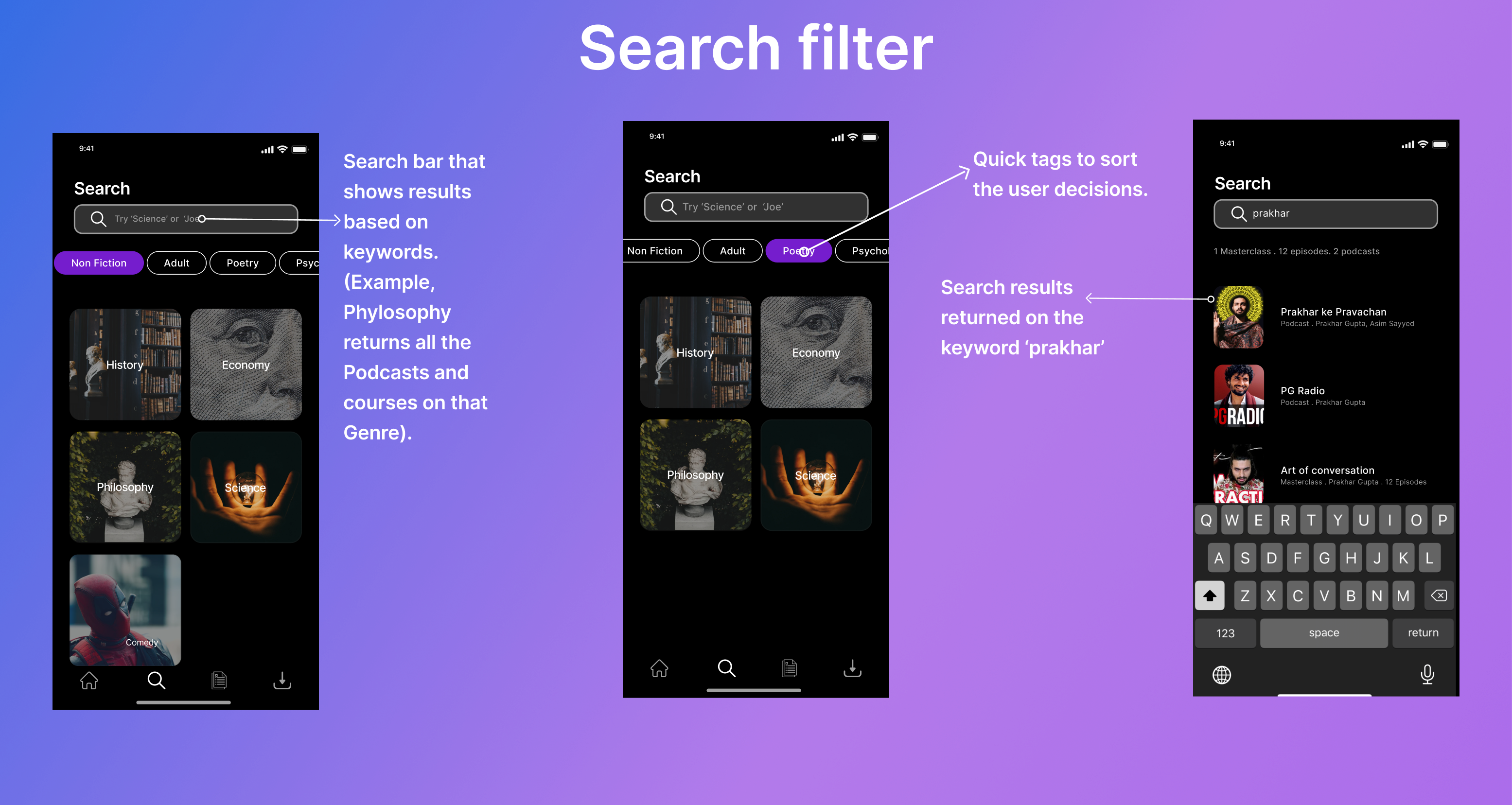
The inspiration for the working of the search filter was taken from the Zomato app. The sorting is done on a Genre and category basis where a keyword is entered and search relative to that is shown as a result.
- From observation, it's seen that providing ‘tags’ on the search pages reduced the user effort.
- Also, showing genres gives the users a brief idea of what are their options to explore as well.
Some Genres that show on the search page:
- History
- Science
- Philosophy
- Economy
The purpose of giving the Genre cards is to make the searching hassle-free and give the user the freedom of jumping to content directly. Also, it gives the users a clear sense of all the available categories and genres.
Checkout flow

Finally, when the user has decided to go on a learning spree, they can go to the payment section by clicking on the ‘Premium button’ that serves as the main action on every page that requires users to take an action.
However, the subscription plan is going to offer users access to all the content on the platform. Plans are either yearly, monthly, or 6 months long.
- From the observations, it is seen that users compare all the plans based on per month cost. However, the yearly plan makes the most sense as a sufficient amount of money is saved on that plan.
- These days, payments through the UPI method are more in fashion. Hence the UPI options are given a priority.
Conclusion 🙏
This brings us to the end of our case study. It has been absolutely fun talking about my way of work on this project. I’d have to thank Abhinav Chhikara for lending me this opportunity and platform to showcase my skills in designing a product. I enjoyed every minute I spent doing this work as it gave me the freedom to explore my own possibilities and limits and work on things that can be made evidently better. Isn’t that the process? you begin, you commit mistakes, take feedbacks, and you grow. Truly, as a UX designer, I have learned and grown a lot more than I thought from this project. Makes me more confident and consistent at the skill that I acquired merely as a way of gut feeling and exploration.
Cannot wait to be doing more such work which puts me in the driving seat and teaches me how seamlessly a well-thought product can solve a problem.
Please feel free to get in touch with me, would love to talk to you amazingly inspired people. 😄
I am on every platform there is but for starters let’s keep Twitter, Instagram, and Email: [email protected]
Did I tell you? you can hold the clap button for a long time to give this case study more claps and appreciate my effort so that I can be glad about it and only make more case studies ?? 😆
Thank you for sticking throughout, see you on the other side. 👋
Recommend
About Joyk
Aggregate valuable and interesting links.
Joyk means Joy of geeK