

照猫画虎,分分钟学会的Matplotlib技巧:反转轴、绘制双轴和定制刻度
source link: https://blog.csdn.net/xufive/article/details/115540318
Go to the source link to view the article. You can view the picture content, updated content and better typesetting reading experience. If the link is broken, please click the button below to view the snapshot at that time.

作为Python生态中应用最广泛的绘图库,Matplotlib用起来非常简单,也很容易上手。不过有些细节想要做得尽善尽美,就需要仔细阅读它的文档了。对于初学者来说,反转坐标轴、绘制双轴(将两个动态范围不同的数据绘制在一张图上,分别使用两个不同的坐标轴)有一定难度,改变坐标轴刻度的样式或内容,更是无从下手。
本文汇总了和轴、刻度相关的七个Matplotlib使用技巧,并给出了实例代码。
1 反转坐标轴
使用axes.invert_xaxis() 函数和axes.invert_yaxis() 函数可分别反转x轴和y轴。这两个函数均不需要任何参数。下面的例子使用图像绘制函数 imshow() 来演示反转轴。imshow() 函数通过origin参数实现y轴反转,这里将其固定为“lower”。
import numpy as np
from matplotlib import pyplot as plt

plt.rcParams['font.sans-serif'] = ['FangSong']
plt.rcParams['axes.unicode_minus'] = False

y, x = np.mgrid[-2:2:200j, -3:3:300j]
z = np.exp(-x**2-y**2) - np.exp(-(x-1)**2-(y-1)**2)

fig = plt.figure()
ax1 = fig.add_subplot(221)
ax2 = fig.add_subplot(222)
ax3 = fig.add_subplot(223)
ax4 = fig.add_subplot(224)
ax1.imshow(z, cmap='jet', origin='lower')
ax2.imshow(z, cmap='jet', origin='lower')
ax3.imshow(z, cmap='jet', origin='lower')
ax4.imshow(z, cmap='jet', origin='lower')
ax2.invert_xaxis()
ax3.invert_yaxis()
ax4.invert_xaxis()
ax4.invert_yaxis()
ax1.set_title("正常的X、Y轴")
ax2.set_title("反转X轴")
ax3.set_title("反转Y轴")
ax4.set_title("反转X、Y轴")
plt.show()
反转轴后的效果如下图 所示。

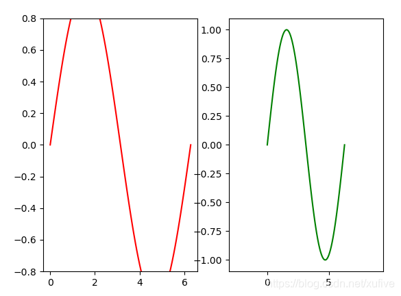
2 绘制双轴
Matplotlib支持在一个子图上显示两个x轴或两个y轴。使用axes.twinx()函数可显示双x轴,使用 axes.twiny() 函数可显示双 y 轴。以下代码演示了使用 axes.twiny() 函数显示双 y 轴。
import numpy as np
from matplotlib import pyplot as plt

plt.rcParams['font.sans-serif'] = ['FangSong']
plt.rcParams['axes.unicode_minus'] = False

x = np.linspace(-2*np.pi, 2*np.pi, 200)
y1 = np.square(x)
y2 = np.cos(x)

fig = plt.figure()
ax = fig.add_axes([0.1, 0.1, 0.8, 0.8])
ax_twinx = ax.twinx()
ax.plot(x, y1, c='r')
ax_twinx.plot(x, y2, c='g', ls='-.')
plt.show()
效果如下图所示。
3 设置坐标轴范围
使用axes.set_xlim(left, right) 和axes.set_ylim(bottom, top) 函数设置x 与y轴的显示范围。函数参数分别是能够显示的最小值和最大值,如果最大值或最小值为 None,则表示只限制坐标轴一端的值域范围。
import numpy as np
from matplotlib import pyplot as plt

x = np.linspace(0, 2*np.pi, 100)
y = np.sin(x)

fig = plt.figure()
ax1 = fig.add_subplot(121)
ax1.plot(x, y, c='r')
ax1.set_ylim(-0.8, 0.8)
ax2 = fig.add_subplot(122)
ax2.plot(x, y, c='g')
ax2.set_xlim(-np.pi, 3*np.pi)
plt.show()
以上代码重新设置了子图坐标轴范围,效果如下图所示。左图缩小了 y 轴的范围,右图扩大了 x 轴的范围。
4 设置主副刻度
主副刻度常用于日期时间轴,如主刻度显示年份,副刻度显示月份。非线性的对数轴往往也需要显示副刻度。Matplotlib提供了4个函数来设置x轴和y轴的主副刻度。
- ax.xaxis.set_major_locator(locator) :用于设置 x 轴主刻度。
- ax.xaxis.set_minor_locator(locator) :用于设置 x 轴副刻度。
- ax.yaxis.set_major_locator(locator) :用于设置 y 轴主刻度。
- ax.yaxis.set_minor_locator(locator) :用于设置 y 轴副刻度。
函数的locator参数实例有两种,分别是来自ticker和dates两个子模块中有关刻度的子类实例。下面的代码演示了在x轴上设置日期时间相关的主副刻度。
import numpy as np
from matplotlib import pyplot as plt
import matplotlib.dates as mdates

x = np.arange('2019-01', '2019-06', dtype='datetime64[D]')
y = np.random.rand(x.shape[0])

fig = plt.figure()
ax = fig.add_axes([0.1, 0.1, 0.8, 0.8])
ax.plot(x, y, c='g')
ax.xaxis.set_major_locator(mdates.MonthLocator())
ax.xaxis.set_major_formatter(mdates.DateFormatter('\n%Y-%m-%d'))
ax.xaxis.set_minor_locator(mdates.DayLocator(bymonthday=(1,11,21)))
ax.xaxis.set_minor_formatter(mdates.DateFormatter('%d'))
plt.show()
效果如下图所示。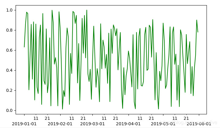
5 设置刻度显示密度
Matplotlib的ticker子模块包含的Locator类是所有刻度类的基类,负责根据数据的范围自动调整视觉间隔以及刻度位置的选择。MultipleLocator是Locator的派生类,能够控制刻度的疏密。
import numpy as np
from matplotlib import pyplot as plt
from matplotlib.ticker import MultipleLocator

plt.rcParams['font.sans-serif'] = ['FangSong']
plt.rcParams['axes.unicode_minus'] = False

x = np.linspace(0, 4*np.pi, 500)

fig = plt.figure()
ax1 = fig.add_subplot(121)
ax1.plot(x, np.sin(x), c='m')
ax1.yaxis.set_major_locator(MultipleLocator(0.3))
ax2 = fig.add_subplot(122)
ax2.plot(x, np.sin(x), c='m')
ax2.xaxis.set_major_locator(MultipleLocator(3))
ax2.xaxis.set_minor_locator(MultipleLocator(0.6))
ax1.set_title('X轴刻度自动调整,Y轴设置刻度间隔0.3')
ax2.set_title('X轴设置主刻度间隔3副刻度间隔0.6,Y轴刻度自动调整')
plt.show()
以上代码创建了两个子图,绘图结果如下图所示,左图演示了如何设置 y 轴的主刻度密度,右图演示了如何设置 x 轴主刻度和副刻度的密度。
6 设置刻度文本样式
设置刻度文本的颜色、字体、字号或旋转文本等样式,需要使用axes.get_xticklabels() 或axes.get_yticklabels() 函数获取x轴或y轴的文本对象列表。文本对象中包含设置文本大小、颜色、旋转角度的函数,使用对应函数即可完成设置。
import numpy as np
from matplotlib import pyplot as plt
import matplotlib.dates as mdates

x = np.arange('2019-01', '2020-01', dtype='datetime64[D]')
y = np.random.rand(x.shape[0])

fig = plt.figure()
ax = fig.add_axes([0.1, 0.3, 0.8, 0.6])
ax.plot(x, y, c='g')
ax.xaxis.set_major_locator(mdates.MonthLocator())
ax.xaxis.set_major_formatter(mdates.DateFormatter('%Y/%m/%d'))

for lobj in ax.get_xticklabels():
    lobj.set_rotation(35)
    lobj.set_size(12)
    lobj.set_color('blue')

plt.show()
以上代码设置 x 轴的刻度文本字号大小为 12 号、颜色为蓝色,并将刻度文本逆时针旋转35°,效果如下图所示。
7 设置刻度文本内容
在有些应用场景中,需要将 x 轴或 x 轴刻度上的文字设置为更有标识意义的内容。使用set_xticklabels( ) 和 set_yticklabels( ) 函数可以替换刻度文本,不过只适用于所有可能的取值都已经显示在坐标轴上的情况。例如,x 轴对应的是列表[0,1,2,3],共4个取值,显示的刻度也是4个,此时可以使用 [’ 一季度 ‘,’ 二季度 ‘,’ 三季度 ‘,’ 四季度 '] 替换对应的数值。
Matplotlib 提供了强大的刻度文本格式化功能,ticker.Formatter 作为基类派生出了多种形式的格式化类,FuncFormatter就是其中之一。使用FuncFormatter可以更加灵活地设置刻度文本内容。
import numpy as np
from matplotlib import pyplot as plt
from matplotlib.ticker import FuncFormatter

plt.rcParams['font.sans-serif'] = ['FangSong'] # 设置字体以便正确显示汉字
plt.rcParams['axes.unicode_minus'] = False # 正确显示连字符

x = np.linspace(0, 10, 200)
y = np.square(x)

def func_x(x, pos):
    return '%0.2f秒'%x

def func_y(y, pos):
    return '%0.2f°C'%y

formatter_x = FuncFormatter(func_x)
formatter_y = FuncFormatter(func_y)

fig = plt.figure()
ax = fig.add_axes([0.1, 0.1, 0.8, 0.8])
ax.plot(x, y, c='r')
ax.xaxis.set_major_formatter(formatter_x)
ax.yaxis.set_major_formatter(formatter_y)
plt.show()
以上代码将x轴和y轴的刻度文本格式化为百分之一的精度,并附带度量单位,绘图结果如下图所示。
Recommend
About Joyk
Aggregate valuable and interesting links.
Joyk means Joy of geeK