

Petco and the cold, lifeless modern brand
source link: https://systemstheory.substack.com/p/petco-and-the-cold-lifeless-modern?ref=sidebar
Go to the source link to view the article. You can view the picture content, updated content and better typesetting reading experience. If the link is broken, please click the button below to view the snapshot at that time.

Petco and the cold, lifeless modern brand
50,000 people used to live here. Now it’s a ghost town.
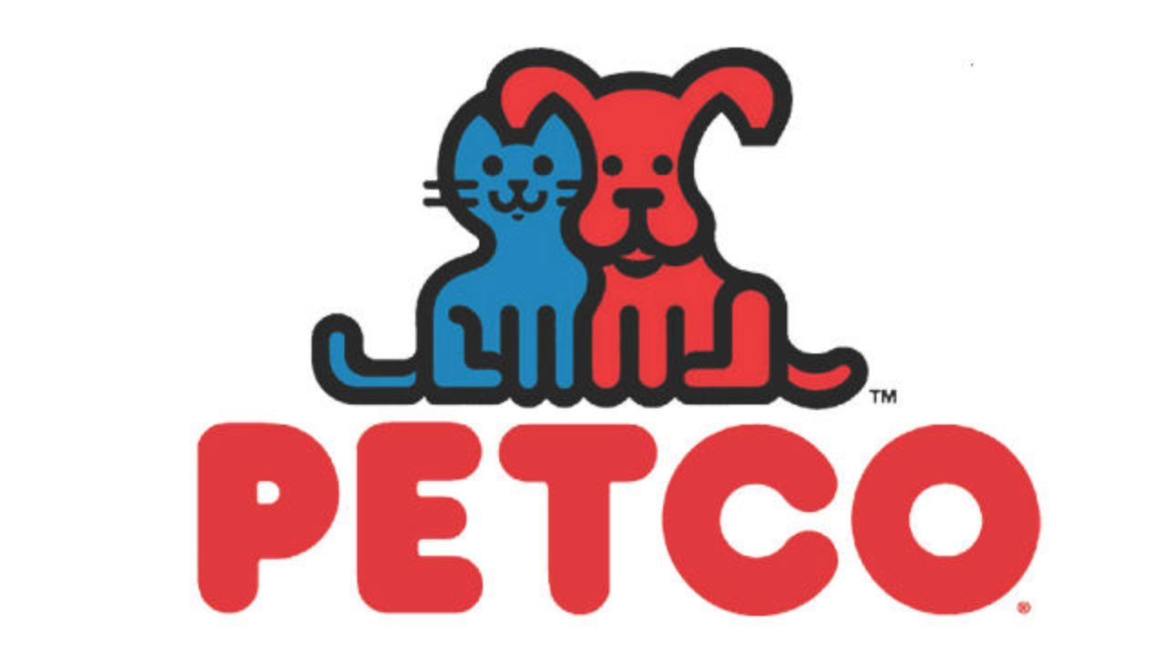
If I were to write a review of this logo, I would give it high marks. It’s nice that the cat and dog are smiling. It’s nice that they’re friends. Not many other logos have animals in them, let alone blue cats and red dogs, let alone blue cats and red dogs whose ears happen to cleverly interlock. Maybe it reminds you a little bit of Clifford, or the decor in a pediatrician’s office, but for a pet store—a place people shop with very little personal investment—are those such bad things?
But logos are the outward face of brands, and brands are distinct from the companies behind them. A brand is an intangible asset that lives not in our hearts, but on a company’s balance sheet. It can’t be allowed to rest. In a world of perpetually changing tastes it must not fail to catch the consumer’s eye, build their trust, win their loyalty. A brand must anticipate the movements of its rivals and counteract them. Even the poster child of successful marketing today can be just another case study of stagnation and insolvency tomorrow.
And so, brands change. In 2011 Petco moved from the big jelly letter font to a thinner, more angular one, adjusted a few colors, and reworked their slogan slightly.
In this minor facelift we can already see the change in heart that Petco’s executives were having about their brand. The jelly letters were outdated because they were too warm, too congenial, and needed to be replaced by something more sleek. Effortlessness, sophistication, savoir faire, these are the qualities of a truly modern brand. They advertise that a company is both sexy enough to deserve your loyalty, and untroubled by its competitors. But effortlessness and sophistication are also hard to distinguish from apathy. Post-2011 Petco decided they were above capitalizing the first letter of their slogan or putting a period at its end—they became less invested in being friendly than in differentiating themselves. This is where the healthy pets go. You miss the old font because your pets are obese, aren’t they?
In all fairness, maybe the jelly letters were outdated because they were just outdated, and nothing about the company was really different. Time marched on, and consumers got used to the new look (if they had even noticed it in the first place). In June 2019 Chewy, the pet-industrial complex’s greatest competitor, went public successfully. Petco’s owners took notice and decided to have their own IPO. They also decided to spruce up their brand in advance of it. This time, people reacted negatively.
Nostalgia is enough to make us resist anything that upsets the world we’ve grown accustomed to. What do we know about marketing? What do we know about selling dog food? It’s none of our business what Petco does with their brand; the owners of a business can drive that business as deep into the ground as they’d like to. They could hold an auction where the highest bidder gets to rename Petco after themselves. They could cut costs by firing all their cashiers and going on the honor system. They don’t owe the general public anything. But the new logo really is bad.
Cold and lifeless is a fair description, isn’t it? There are absolutely no friendly animals, the font is somehow even more sterile than it was before, and in place of the already watered-down red there is the inanimate blue of Marshalls and USPS. The jokes about the health and wellness part write themselves, but I will say that even the CEO doesn’t seem to think that it’s true. “We’re transitioning from being a company that asks, ‘Can I help you put that big bag of dog food into your cart?’ into a full health and wellness company,” he told Fortune. “Today, Petco is the ONLY complete health and wellness company for pets,” he wrote in the opening letter of the IPO filing. A few more times and he’ll be convinced.
There were obviously business pressures behind this rebrand, and competition means that things inevitably change. Still, it’s worth asking: at what cost did Petco reinvent themselves? At what cost did they become effortless and sophisticated overnight?
At the cost of their identity, I would argue, because what else does a brand have to lose. The new Petco logo, wordmark, whatever it is, is not very different from the logos of thousands of other companies. It’s almost identical to the logo for Casper mattresses. It’s a lower case version of the logo for Merrill Lynch. It has nothing to do with pets, nothing to do with the company’s history, nothing to do with anything. It’s just letters in a sea of identical letters. It puts Petco one step closer to being the effortless, sexy, IPO-darling company that it must dream of being. For the sake of Petco’s integrity, that’s regrettable, and will probably have repercussions down the road. But Petco was not the first, and that is regrettable for everyone.
Y Combinator is a famous startup accelerator; this is not a cherry-picked list of companies they’ve invested in, but a screenshot from the front page of their website. Except for three or four, they are uniformly one- or two-word names (if two, no space) with sans-serif fonts and minimal other decoration. Gusto. Mixpanel. Flexport. Scale. There is Front, with a circle-ish thing, and Segment, with a different circle-ish thing. SendBird and MessageBird both look like GTA V Twitter parodies (BAWSAQ: MBRD). At the middle bottom is Standard, their logo literally just the word Standard in black capital letters.
There is a heavy skew towards tech companies in this sample, and tech companies are especially guilty of this kind of blandness. At some level, many of them aren’t consumer-facing, so they can get away with having logos that are more sleek than meaningful.
But tech companies, across all sectors, are also some of the most culturally relevant firms. Uber, Venmo, Tinder and Fitbit are the companies that come up in casual conversation, not Johnson and Johnson or Marathon Petroleum. Their minimalist names and branding have become deeply engrained in our landscape. The Mastercard logo has become two overlapping circles, no accents, no outlines, no gradients whatsoever. Madewell, Everlane, Depop and Poshmark have brought the two-word, no-space name to fashion notoriety. The websites of healthcare companies have become indistinguishable from the websites of financial service providers. Merrill Lynch, mentioned before, is actually now just Merrill, as if it were a brand of hiking boots and not a brokerage founded in 1914.
There’s undoubtedly dark corporate science behind all of this minimalism and sleekness, the results from many hundreds of focus groups and studies. It makes perfect sense that Apple is no longer the Apple Computer Company, that time has passed and no one is naming their tech startup Hartford Cloud Computing and Intelligent Machines, Ltd. or the American Electric Vehicle Manufacturing Concern. Good logos should be simple, names should be memorable, the two together should keep consumers coming back.
But I also can’t help but feel that there’s a consequence to such intense homogenization, such unsightly modernity. Every day more brands decide to shed their skins and reemerge as a casual but alarmingly hollow shell. That transformation, from business with founders, a history, an identity developed over many years, to featureless corporate entity, surely entails a loss of life. It’s undesirable but true that brands are important to who we are as a society. The more color drains out of the brands, the more color drains out of the corporatized parts (and they are many) of our little world.
To revisit a previous point, companies don’t owe the general public anything—if their owners approve they can run themselves into the ground, spend every dollar they receive on pizza parties for the staff, get sued into oblivion for copyright infringement. More realistically, they can be as bland and profit-driven as their owners want them to be. But large corporations are also a depressingly large constituent of the fabric of our lives. I don’t think it would be asking too much to expect a bit more originality out of them, enough to stop every corner of the world from feeling the same.
There are good examples to point out despite this—Y Combinator shares blame in the monotony, but does have an original and interesting name. NVIDIA has stuck to their eye logo and gamer juice lime color (I mean this in a good way) for almost 30 years. A minimalist rebrand might make a company appear more effortless and sexy, but maintaining the same identity over decades gives brands the kind of confidence that can’t be conjured overnight.
That said, I don’t see the trend reversing itself anytime soon. The more I read, the more obvious it seems that in advance of their IPO, Petco was trying to reinvent themselves as a pet-tech company and not a traditional retailer. They wanted investors to think their business was about more than selling pet food—it was an ecosystem, a platform, a network of pet products and services. To convince those investors, they took on the garb of a modern brand. I said the loss of identity would probably be regrettable for them, and in a few years, when their core business has collapsed and they resort to minting a pet-insurance cryptocurrency to pay the bills, I maintain that they will regret getting rid of the smiling cat and dog. But for now, the change hasn’t suited them so badly. On January 14th Petco went public, and (as has tended to happen recently) their stock price closed 63% higher at the end of the day. Who wouldn’t sell their soul for a valuation like that?
Systems Theory is a newsletter. Why not subscribe?
Recommend
About Joyk
Aggregate valuable and interesting links.
Joyk means Joy of geeK