

css3实现一个div设置多张背景图片及background-image属性
source link: https://www.haorooms.com/post/css3_bg_multi
Go to the source link to view the article. You can view the picture content, updated content and better typesetting reading experience. If the link is broken, please click the button below to view the snapshot at that time.

以前做网页布局的时候,一个div只能设置一张背景图片,设置多个背景的话,要用多个div嵌套才能实现,这样兼容性比较好。若您的网站要求兼容浏览器低版本,建议用这种方法。css3的出现,解决了一个div只能设置一个背景的问题,使一个div可以设置多个背景图片。background-image还可以设置线性渐变,等效果。
关于css3的background,功能很强大,有很多属性,像background-size等等,这些属性都可以写一篇博客来讲述。关于css3background的其他属性,后面会出博客来单独讲述!
CSS3/CSS1 background-image 属性
background-image:<bg-image> [ , <bg-image> ]*
<bg-image> = none | <url> | <linear-gradient> | <radial-gradient> | <repeating-linear-gradient> | <repeating-radial-gradient>
默认值:none
none:无背景图。
< url >:使用绝对或相对地址指定背景图像。
< linear-gradient>:使用线性渐变创建背景图像。(CSS3)
< radial-gradient>:使用径向(放射性)渐变创建背景图像。(CSS3)
< repeating-linear-gradient>:使用重复的线性渐变创建背景图像。(CSS3)
< repeating-radial-gradient>:使用重复的径向(放射性)渐变创建背景图像。(CSS3)
设置或检索对象的背景图像。
如果设置了background-image,同时也建议作者设置background-color用于当背景图像不可见时保持与文本一定的对比。
对应的脚本特性为backgroundImage。

IE8及更早浏览器不支持CSS3 background-image,即不支持多背景和使用渐变作为背景图像。
IE9不支持CSS3新增参数值:< linear-gradient > | < radial-gradient > |< repeating-linear-gradient > | < repeating-radial-gradient >作为背景图像。
Opera11.50-11.51不支持CSS3新增参数值:< radial-gradient > |< repeating-radial-gradient >作为背景图像。
css3设置多张背景图片
css3设置多张背景图片,可以如下写:
background:url("haoroomsCSS1_s.jpg") 0 0 no-repeat,
                     url("haoroomsCSS2_s.jpg") 200px 0 no-repeat,
                     url("haorooms.jpg") 400px 201px no-repeat;
也可以这么写:
background-image:url("1.jpg"),url("2.jpg"),url("3.jpg");
background-repeat: no-repeat, no-repeat, no-repeat;
background-position: 0 0, 200px 0, 400px 201px;
css3背景渐变
标准写法
background-image: linear-gradient( [ <angle> | <side-or-corner> ,]? <color-stop> [, <color-stop>]+ );上面这种CSS语法我们经常见到,可能有人看不懂具体的意思,其实上面的些符号含义与正则表达式有很多一致之处:
[]在正则中表示一个字符类,这里,你可以理解为一个小单元。
|表示候选。也就是“或者”的意思,要么前面的,要么就后面的。
?为量词,表示0个或1个,言外之意就是,你可以不指定方向,直接渐变色走起。例如:
background:linear-gradient(red, yellow);就是从上往下的红黄条纹效果。
+也是量词,表示1个或者更多个。因此,终止颜色是不可缺少的。例如:linear-gradient(red)是酱油命,白板。
<>中的是关键字,主要是让开发人员知道这里应该放些什么内容。
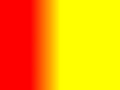
水平渐变
{background-image:linear-gradient(left, red 100px, yellow 200px);}效果如下图:
左上角渐变
那从(100px, 100px)到(200px, 200px)应该就是从左上角开始,写法如下:
{background-image:linear-gradient(left top, red 100px, yellow 200px);}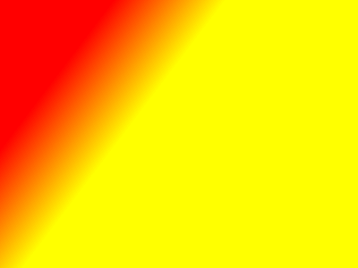
渐变方向写法组合:
left, right, top, bottom, left top, left bottom, right top, right, bottom
分别表示,从左往右,从右往左,从上往下,从下往上,从左上往右下,从……(都懂的,不全写了)
当然,也可以用angle角度来写!
{background-image:linear-gradient(-45deg, red 100px, yellow 200px);}具体的样式大家可以尝试着写一下,看一下!很多情况下,用了才知道!
注意:有不少效果加了-webkit前缀以及-moz前缀会展现的不一样!
例如:
background-image:-webkit-linear-gradient(-45deg, red, yellow)background-image:linear-gradient(-45deg, red, yellow)在Chrome浏览器下的渐变方向居然是相反的!但是45deg是正常的。Firefox浏览器下也是如此,有前缀和没有前缀方向相反!咋回事?
原因很简单,CSS3目前还是草案阶段!
从浏览器去掉前缀前后的变化可以推测,之前,W3C的渐变坐标是与photoshop中一致的,但是,后来,由于某些原因,修改了。
至于什么原因,根据我草草的查找,可能与下面几个关键字之一有联系:animation/transition动画、write-mode书写方向、flex box模型、以及radial-gradient渐变等。在这里就不深入研究了!
基本的写法如下:
background-image: linear-gradient(top, #fff, #dededc);但是为了兼容,有时候要写多个前缀,变成如下:
 background-image: -ms-linear-gradient(top, #fff, #dededc);
    background-image: -moz-linear-gradient(top, #fff, #dededc);
    background-image: -webkit-gradient(linear, left top, left bottom, from(#fff), to(#dededc));
    background-image: -webkit-linear-gradient(top, #fff, #dededc);
    background-image: -o-linear-gradient(top, #fff, #dededc);
    background-image: linear-gradient(top, #fff, #dededc);
关于”css3实现一个div设置多张背景图片及background-image属性“今天就写到这里,有问题可以相互交流,加油!
Recommend
About Joyk
Aggregate valuable and interesting links.
Joyk means Joy of geeK