

css的div垂直居中的方法,百分比div垂直居中
source link: https://www.haorooms.com/post/css_div_juzhong
Go to the source link to view the article. You can view the picture content, updated content and better typesetting reading experience. If the link is broken, please click the button below to view the snapshot at that time.

我们都知道,固定高宽的div在网页中垂直居中很简单,相信大家也很容易的写出来,但是不是固定高宽的div如何垂直居中呢?我们在网页布局,特别是手机等web端网页经常是不固定高宽的div,那么这些div如何垂直居中呢?这篇文章,我总结一下。
固定高宽div垂直居中
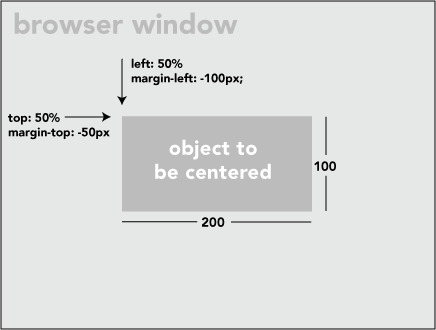
如上图,固定高宽的很简单,写法如下:
 position: absolute;
 left: 50%;
 top: 50%;
width:200px;
height:100px;
margin-left:-100px;
margin-top:-50px;
不固定高宽div垂直居中的方法
方法一:
用一个“ghost”伪元素(看不见的伪元素)和 inline-block / vertical-align 可以搞定居中,非常巧妙。但是这个方法要求待居中的元素是 inline-block,不是一个真正通用的方案。
html如下:
<div class="block" style="height: 300px;">

    <div class="centered">
        <h1>haorooms案例题目</h1>
        <p>haorooms案例内容,haorooms案例内容haorooms案例内容haorooms案例内容haorooms案例内容haorooms案例内容haorooms案例内容haorooms案例内容haorooms案例内容</p>
    </div>

</div>
css如下:
/* This parent can be any width and height */
.block {
  text-align: center;
}

/* The ghost, nudged to maintain perfect centering */
.block:before {
  content: '';
  display: inline-block;
  height: 100%;
  vertical-align: middle;
  margin-right: -0.25em; /* Adjusts for spacing */
}

/* The element to be centered, can
   also be of any width and height */
.centered {
  display: inline-block;
  vertical-align: middle;
  width: 50%;
}
可以用table布局方法,但是这种方法也有局限性!
写法如下:
<table style="width: 100%;">
  <tr>
     <td style="text-align: center; vertical-align: middle;">
          Unknown stuff to be centered.
     </td>
  </tr>
</table>
由于table写法比较费时,你也可以用div代替table,写法如下:
html:
<div class="something-semantic">
   <div class="something-else-semantic">
       Unknown stuff to be centered.
   </div>
</div>
.something-semantic {
display: table;
width: 100%;
}
.something-else-semantic {
display: table-cell;
text-align: center;
vertical-align: middle;
}方法三,终极解决方法:
以上2中方法可能都有其局限性,我介绍的第三中方法是比较成熟的不是固定高宽div的垂直居中的方法!但是方法是css3的写法,想兼容IE8的童鞋们,建议用上面的方法!
方法和我们固定高宽的差不多,但是不用margin我们用的是 translate()
demo如下:
<!DOCTYPE html PUBLIC "-//W3C//DTD XHTML 1.0 Strict//EN" "http://www.w3.org/TR/xhtml1/DTD/xhtml1-strict.dtd">
<html xmlns="http://www.w3.org/1999/xhtml" xml:lang="en">
<head>
    <meta http-equiv="Content-Type" content="text/html;charset=UTF-8">
    <title>haorooms不固定高度div写法</title>

    <style>
.center {
  position: fixed;
  top: 50%;
  left: 50%;
  background-color: #000;
  width:50%;
  height: 50%;
-webkit-transform: translateX(-50%) translateY(-50%);
}


    </style>
</head>
<body>
    <div class="center"></div>
</body>
</html>
我上面的css只是针对webkit内核的浏览器,其他内核浏览器写法如下:
-webkit-transform: translateX(-50%) translateY(-50%);
-moz-transform: translateX(-50%) translateY(-50%);
-ms-transform: translateX(-50%) translateY(-50%);
transform: translateX(-50%) translateY(-50%);关于每个浏览器的写法,可以看看我之前的一篇文章:http://www.haorooms.com/post/css_common
有些弹出层的样式,也可以用这个方法居中
position: fixed;
top: 50%;
left: 50%;
width: 50%;
max-width: 630px;
min-width: 320px;
height: auto;
z-index: 2000;
visibility: hidden;
-webkit-backface-visibility: hidden;
-moz-backface-visibility: hidden;
backface-visibility: hidden;
-webkit-transform: translateX(-50%) translateY(-50%);
-moz-transform: translateX(-50%) translateY(-50%);
-ms-transform: translateX(-50%) translateY(-50%);
transform: translateX(-50%) translateY(-50%);
css3不定宽高水平垂直居中
只要三句话就可以实现不定宽高水平垂直居中。
justify-content:center;//子元素水平居中
align-items:center;//子元素垂直居中
display:-webkit-flex;
在父级元素上面加上上面3句话,就可以实现子元素水平垂直居中。
利用vertical-align属性,实现水平垂直居中弹窗
这个方法兼容性比较好,实际运用效果也很好,代码如下:
html 代码
   <div class="container">
     <div class="dialog">haorooms博客</div>
   </div>
css代码
.container{
   position:fixed;
   top:0;
   left:0;
   right:0;
   bottom:0;
   background-color:rgba(0, 0, 0, .5);
   text-align:center;
   font-size:0;
   white-space: nowrap;
   overflow: hidden;
 }
 .container::after{
   content:'';
   display: inline-block;
   vertical-align: middle;
   height:100%;
 }
 .dialog{
   display: inline-block;
   vertical-align: middle;
   text-align: left;
   font-size:14px;
   white-space: nowrap;
 }
实现不固定宽高垂直居中
运用margin:auto进行垂直居中
margin的值设置为auto,可以让我们对剩余空间进行分配!我们知道,块级元素设置为margin:0 auto;可以左右居中显示!那有没有办法让margin设置为margin:auto之后,上下左右都居中呢?上下左右都居中,就可以实现我们的垂直居中了!
答案是有的,只要我们让上下有足够的空间,就可以让margin的auto来分配上下空间。
我们可以利用定位的方式,让margin上下左右都有足够的空间!那么就可以用margin:auto来实现垂直居中了!
实现html如下:(做一个简单的垂直弹框)
<div class="father">
    <div class="son"></div>
</div>
css代码如下,很简单,兼容性也蛮好,支持IE8+
.father{position:fixed;width:100%;height:100%;top;0;left:0;background-color:rgba(0,0,0,.7);}
.son{position: absolute;top:0;left:0;bottom:0;right:0;width:50%;height:50%;margin:auto;background-color:red;}
这样就可以实现垂直居中了,是不是很简单?!!
Recommend
About Joyk
Aggregate valuable and interesting links.
Joyk means Joy of geeK