

The Queen's Gambit
source link: https://www.artofthetitle.com/title/the-queens-gambit/?ref=sidebar
Go to the source link to view the article. You can view the picture content, updated content and better typesetting reading experience. If the link is broken, please click the button below to view the snapshot at that time.

The Queen’s Gambit (2020)
—Harry BeltikAnger’s a potent spice. A pinch wakes you up. Too much dulls your senses.
In times of uncertainty and upheaval — which 2020 certainly was — people tend to gravitate towards that which is comforting. The voice of a loved one, a favourite food, a familiar song, warmth, television.
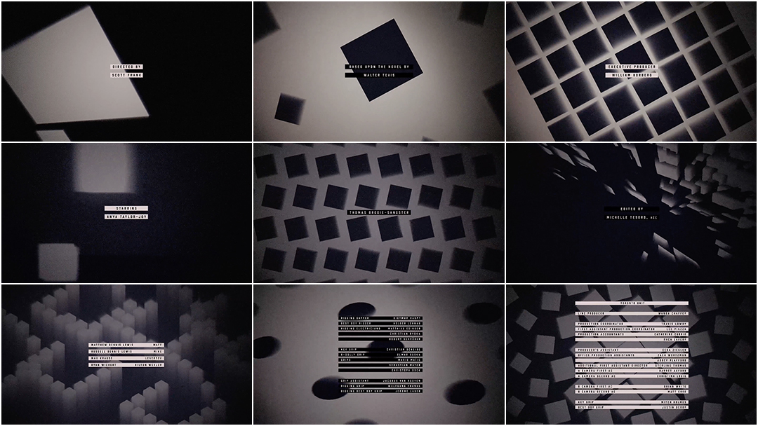
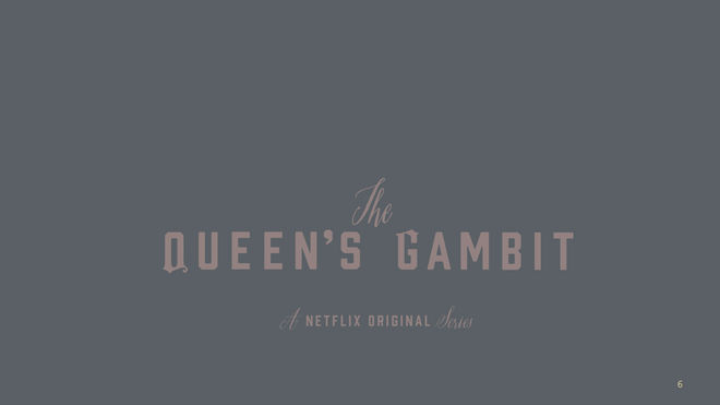
In 2020, the scripted series that Netflix subscribers turned to the most, with a whopping 62 million views in its first month, was The Queen’s Gambit, according to the streaming service. The tight seven-episode mini-series created by Scott Frank and Allan Scott is an adaptation of a 1983 novel by Walter Tevis and stars the enigmatic and wide-eyed Anya Taylor-Joy as Beth Harmon, an orphaned chess prodigy struggling with abandonment, addiction and other demons as she works her way up the ranks. Remarkably, the show bears no opening title sequence — just a simple title stamp during the beginning of each episode.
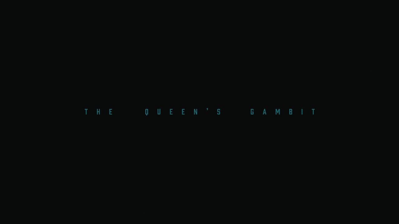
The Queen’s Gambit (2020) main title card
But in chess, opening moves are everything. It’s a beguiling bit of direction, allowing viewers to focus on Beth — and perhaps enjoy an uninterrupted binge experience — while saving some dazzle for last.
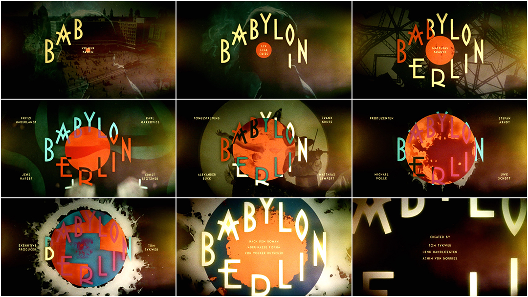
When the title sequence does arrive — a surprising closer capping off the show’s seventh and final episode — it’s a demonstration of skill, a celebration of Beth’s journey and a visual delight. The checkerboard abstractions are the brainchild of designer Saskia Marka (most well known for her titles work on Babylon Berlin, which earned the top spot in Art of the Title’s Top 10 Title Sequences of 2018) and physicist-turned-animator David Whyte (aka Bees and Bombs), who created the hypnotizing patterns using the coding language Processing. The imagery, framed by dark vignetting and doused in dusty particles, is lifted to joyful heights thanks to the elegant, triumphant theme by composer Carlos Rafael Rivera. Watching the swagger of shapes in black and white transform, shift and dance, one can’t help but hear the warm echo of Beth’s last word: сыграем. Let’s play.
A discussion with Title Designer SASKIA MARKA and Animator DAVID WHYTE.
Congratulations on your work this year, Saskia! It’s been a difficult year to get anything done but you managed to work on three titles projects — Deutschland 89, the update to the Babylon Berlin titles and The Queen’s Gambit. How have things changed for you, given the pandemic and everything that’s going on?
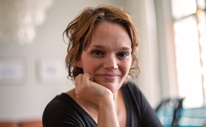
Title Designer Saskia Marka
SM: Thank you so much! I’m very thankful for the great projects I was still able to work on but it was definitely a challenge during lockdown and throughout the year, working, with the kids running around, homeschooling and everything. I have to recover from it one day.
Dave, tell me a little bit about your work as an animator. How did you get into this mode that you’re in now where you create these patterned, animated GIFs?
DW: Before I was an animator, I was a physicist and I was doing a PhD in physics. I was playing around with software to visualize data and I realized you can create these geometric and quite interesting looking forms out of just geometric patterns and so during my PhD I was hanging on Tumblr, just as a hobby. When I finished the PhD I knew that I didn’t really want to continue in academia but I didn’t know what I wanted to do professionally. I was getting a few freelance offers and I said, you know, I’ll try this out, see if I’m able to do it full-time. It’s been about three years now.
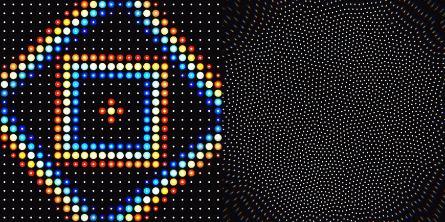
Examples of GIFs created by David Whyte aka Bees and Bombs
Has your work been on film or TV before? What shape does it usually take?
DW: No, in fact, this is the first piece of TV work I’ve had. A lot of my commissions are from start-ups looking for a cool animation of their logo, things like that. I’ve done visualizations for music videos or mini music videos. This is my first time in the TV sector.
Saskia, how did this project for The Queen’s Gambit come to you?
SM: Scott Frank liked the Babylon Berlin title sequence, so Mick Aniceto, one of The Queen’s Gambit producers, asked if I could pitch for their titles.
SM: He knew from the start that he wanted a title card in the beginning and an end title sequence for the very last episode. Scott mentioned the tonality of German Expressionism and the mood of that time period but in general he was open to anything new — and what could be better than that?
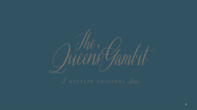
Initial title typography sketch by Saskia Marka
Slide of initial title typography sketches for The Queen’s Gambit by Saskia Marka
Initial title typography sketch by Saskia Marka
Did you present multiple directions for the title — the opening and closing?
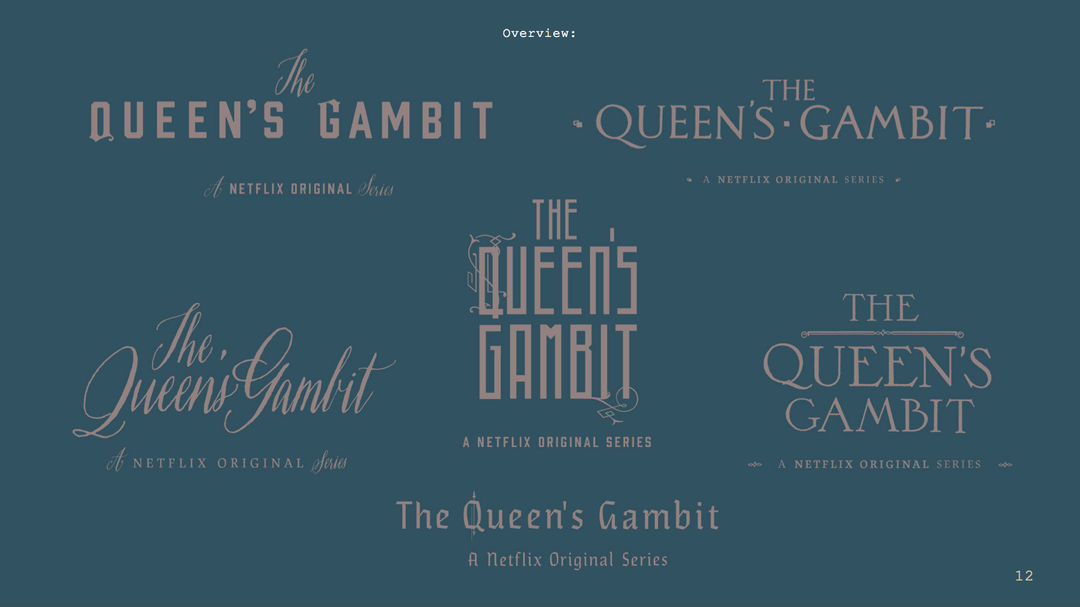
SM: For the opening card I had multiple layouts with different fonts and colors. I also designed all location charts for the show, which was also a topic on our Zoom meetings.
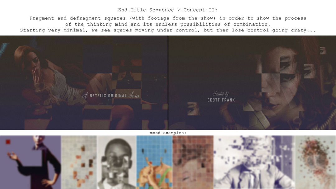
For the end titles there were two concepts. A short animated layout of the abstract concept — that made it — and another one that worked with the footage of the show in stills. After the presentation of the abstract concept, Scott didn’t really look at the second idea. He was already hooked to the first one.
End titles of Babylon Berlin episode 1, featuring original footage from the Opus films created between 1921–1925 by Walter Ruttmann
These end titles reminded me of our conversation about your work on the end titles to Babylon Berlin. The German Absolute film movement and the Walter Ruttmann Opus films from the 1920s.
SM: Yes, these were definitely inspirations. I wanted to relate to that but also create something with a modern approach. That’s why I thought processed animations would be the right choice. Dave’s work came up during my research about Processing. He’s known for his looping GIF animations, which he designs by writing codes. For the first internal presentation I used his GIFs just as a layout to show what is possible.
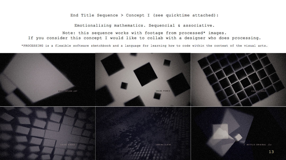
Pitch Concept #1
Pitch Concept #2
Dave, tell me about Processing and how you make your GIFs.
DW: Processing is like, I would say, a slimmed-down version of the Java programming language with a load of in-built stuff that makes graphics much quicker to get off the ground. For designers who would like to learn to code it’s a great first step because it abstracts away a lot of the more awkward aspects of coding. So it’s got the perfect balance for me of rigour and being able to get going quickly.
For someone who’s interested in looking into programming or generative design, Processing is a great place to start because it’s got so many in-built things. With other languages it can be an ordeal even to get a triangle on the screen, whereas with Processing it’s got in-built functions like square, circle, line. You can use hex codes for colours. There’s a lot of really user-friendly interactive tutorials out there, as well.
GIFs created by David Whyte using Processing

GIF created by David Whyte using Processing
SM: Processing is creative programming. Designing by writing codes. It is a rule-following, logic system like chess. If Dave’s work wasn’t available, I would have found somebody else, or I may have come up with something myself. Dave sells licenses of his GIFs, which I bought. Except for one, they all existed before the show. I’m very thankful he was into it, though. His work is very special and a lot of it just fit so well with what I had in mind for the title sequence.
My aim was to turn this status into an emotional experience, like you feel for protagonist Beth Harmon. The look is 1920s with a warm fuzziness but the credits are very modern in style and typography. My intent was to create opposites on different levels. The presented concept was meant to be a first rough internal mood layout — just to give an idea.
After the concept was bought I reached out to him and asked if he was okay if I “messed around with his work.”

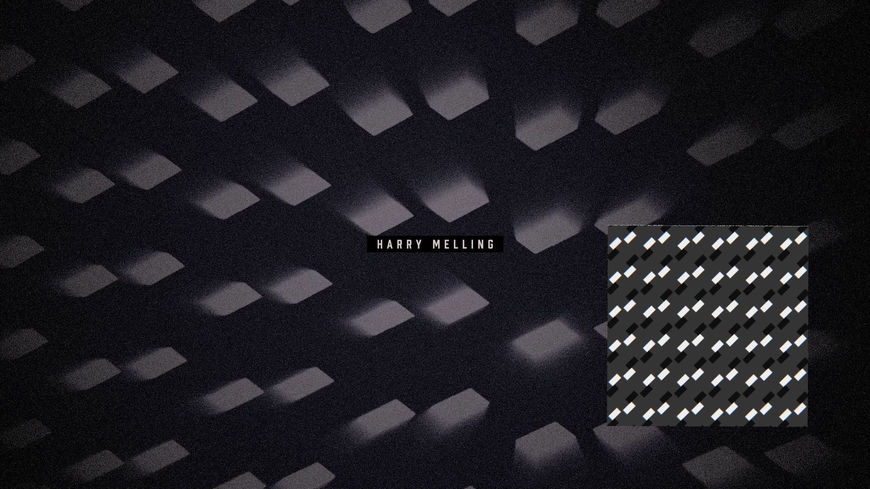
Comparison image showing the final look of the sequence and the original GIF by David Whyte (bottom-right inset)
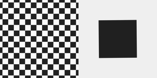
DW: She said since this is all about chess, she was thinking that a checkered animation might make sense as something to include in the credits sequence.
SM: I was able to choose from a big pool of existing GIF animations that he created, like stock footage, which was great.
DW: Saskia dug through my quite extensive archives on Tumblr, just grabbing anything that was chess- or chessboard-adjacent and some of them were going quite far back, so I had lost the original source files. On Tumblr they’re quite small and they’re quite colour-limited whereas for the credit sequence, of course, you need high-def stuff.
Comparison image showing the final look of the sequence and the original GIF by David Whyte (bottom-right inset)
SM: Some needed to be adjusted, because GIFs are very small in resolution and the title sequence had to be in 4K. So he wrote some of them into a larger scale or slowed them down for me.
DW: Some of them I re-rendered in high-def and some of them, where I’d lost the source files, I had to cast my mind back and remember how I’d made them in the first place and remake them from the ground up, which was quite fun. I typically work in a square format so some of them I reconsidered to look better in 16:9 or widescreen aspect ratio. All the nice particular and glow and dust effects, they are all on Saskia’s end.

Comparison image showing the final look of the sequence and the original GIF by David Whyte (bottom-right inset)
On your end, the graphics are all crisp.
DW: Yes, exactly. Saskia did a great job in making the graphics look almost physical, it almost felt like the light was shining through in real life which I thought looked really compelling behind the titles.
SM: After Scott greenlighted the concept, he just let me work on the sequence and he did not change one thing. We were only talking about the credits but I had total freedom of the background. As soon as the heads of the show or film give me their trust and some freedom, I’m at my best. That’s when I’m able to reach the best results. Thank you, Scott!
Comparison image showing the final look of the sequence and the original GIF by David Whyte (bottom-right inset)
Given how the series ends, the closing titles feel like a treat, a celebration. How did you make decisions about the graphics to create this atmosphere and mood?
SM: Overall, the sequence is an abstract and emotional visualization — and yes, a celebration — of playing and enjoying chess. It should be as abstract as possible to leave it up to the audience for individual interpretation.
In terms of editing and composition I just did what felt right to me. There were parts in the music where I knew for myself that animations should be flowery, or very heavily graphic with impact, or no impact at all. I decided intuitively and moved them out of focus, off center, unbalanced them. But there are also symmetrical moments to break this pattern. There is no rule. Opposite to the game.
Comparison image showing the final look of the sequence and the original GIF by David Whyte (bottom-right inset)
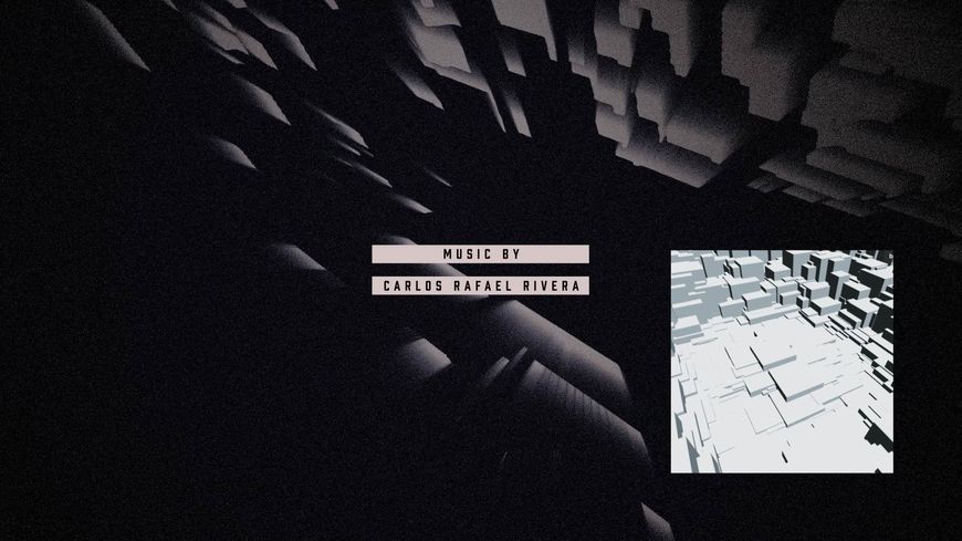
How did you work with the music by Carlos Rafael Rivera?
SM: I was very enthusiastic about the main title track. To me, the music sets the tone to moving forward, to a positive future. It has such great energy and is so complex, just fantastic. I tried to cling the visuals to the score. Until the last version of the main title music I kept readjusting animations. I wanted to visualize the relief of overcoming, enjoying the game and going with the flow without any strings attached. Freedom.
Dave, has this project opened up a new world to you? Is this something you’d want to do more?
DW: Oh, I’d absolutely love to! It was a really enjoyable process and to see my work come up at the end of that final episode was lovely as well. I had gotten so engrossed watching the show that I’d forgotten that I would see my own animations.
Saskia wasn’t aware when she reached out to me but I’m like, totally addicted to online chess! [laughs] It was really nice to get a project that was based on something that is a big hobby of mine, as well.
Saskia, what kinds of projects are you looking to work on now, moving forward?
SM: If I would be able to choose I’d choose to create title sequences that go new ways. I don’t know the new ways yet and that’s the challenge. With Babylon Berlin and the typography — it was creative problem solving, because there were so many credits. And that’s how new things can happen. It was a great experience to work for an international production. I want more!
View the credits for this sequence
Support for Art of the Title comes from

CINEMA 4D BY MAXON
Featuring an Unmatched Live 3D Pipeline with Adobe After Effects CC.
Recommend
About Joyk
Aggregate valuable and interesting links.
Joyk means Joy of geeK