

Mighty Morphin’ Power Morphism
source link: https://uxdesign.cc/mighty-morphin-power-morphism-93e1f2160022
Go to the source link to view the article. You can view the picture content, updated content and better typesetting reading experience. If the link is broken, please click the button below to view the snapshot at that time.

Design Trends
Mighty Morphin’ Power Morphism
Because at the end of the day it’s all about the fun of exploring the new and picking the right solution.


2020 was a disaster of a year. Now, closer to the year’s end I wanted to share some positive vibes with you. Don’t worry, this will not be another -morphism trend. Accessibility advocates’ tears won’t cause a flood anywhere. Not this time.
Today I want to look at the two “morphisms” that I started, but with a different attitude.

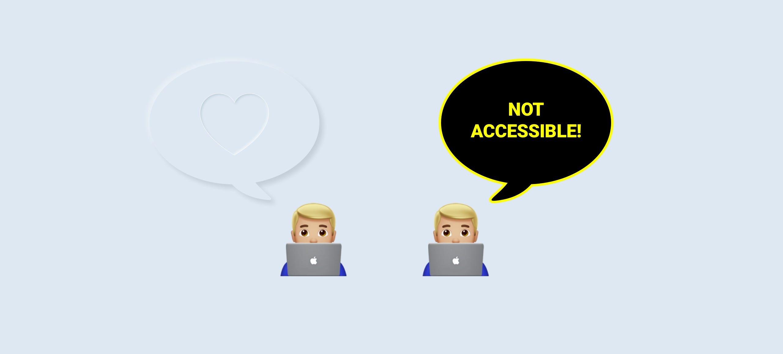
Whether you were from the “I love it!” or the “NOT ACCESSIBLE!” team, leave all of that behind and hear me out. If you haven’t read them already, start here:
Combined, these two articles topped 600K views and spawned their own, popular hashtags on portfolio sites + plenty of articles.
Exploration
When I started in web design, back in 1998, we had no educational resources. No books, no YouTube tutorials. Nothing. Only a handful of already existing websites. And as digital pioneers, we were simply experimenting all the time.
Those experiments were constrained by low-resolution displays, laggy input methods, and slow internet. But it was a ton of fun. My first website had an animated, 3D rotating @ sign next to my email. And while it’s laughable now, I was very proud of that back then.

We’re all great
Now, many years later looking at what junior designers create in Figma I’m happy to say that digital product design has gone forward in an incredible way. The resources, the sharing, feedbacking — we’re living in a world where you can always find some nice designers to share your work with. And that helps with your growth.
We’re doing amazing things. Building products used by thousands or millions of people. Stop and appreciate that! You deserved it!
Where did the fun go?
But there’s very little “fun” in it anymore. It’s like Material Design “consistency fiasco” all over again. Sure — it’s pretty accessible. But those MD apps are boring. They’re safe but uninspiring.
And in a way that’s good too — design should be useful first, beautiful second. But the problem with many of these super-high-contrast, useful interfaces is that they’re ugly.
So while they serve their purpose, they’re not something most people use with any joy.

Let’s explore! Neumorphism.
When I first noticed Skeuomorphic elements (in actual UI, not icons) coming back in 2019, I wanted to name that new style, because it was a great way to “open it to others”.
If it has a name, you can find it easier.
If it has a name, you can discuss it. And yes — also cry about the lack of accessibility.
Some called Neumorphism a “Dribbble only trend” with contempt in their voices. It’s almost as if it was a waste of time to try and recreate the look of a soft, extruded plastic in your UI.
Now, even if it doesn’t make much sense in real products (and it doesn’t) that wasn’t the point of it.
Nobody was pushing it at you, it was all about exploration. Because from these explorations great things emerge and we won’t get stuck with another safe-but-boring Material Design product.

We need to try new things and we need to have fun with them. That’s the whole point of exploration, design, and also it’s a cornerstone of loving what you do. Because that’s the only way to excel at it. And as a bonus, loving what you do makes you happy while doing it.
So don’t worry (about accessibility). Be happy. Explore. Make some extruded cards, post it online, and create a buzz! Then, on a real project find a way to combine what you’ve learned with good contrasts and readability.
And you — accessibility folks — chill out. The fact that people are making these is not an assault on accessibility. It’s them testing the limits of their imagination and having fun. So don’t be so grumpy and try it sometime!

Glassmorphism
The frosted glass effect has been around for a long time. Honorable mentions should include Mac OS X, Windows Vista, iOS 7, and Mac OS Big Sur. But the problem with this effect is that every company using it had a different name for it. Some didn’t even bother to name it.
The goal of naming it was the same as before. To create a trend, a hashtag, a way to find other designs done in this style. To have fun, experiment, grow, and try new things.

Glassmorphise!
Mix a frosted glass panel with a soft, blurred color splash and enjoy the way it looks. Chances are, that you’re not going to use any of this in your daily work after a while.
But knowing it and doing it at least once, opens you up to something new. Something exciting, even if flawed. And once again many designers took to Dribbble, Behance, and Twitter and shared their explorations on it.
They’re stepping outside their comfort zones and making cool things. That’s great! Let’s do more of this!

Mighty Morphin’ Power Morphism
And in 2021, I wish you all that excitement. I wish you to experience that exploration and your own “A-ha moments” while trying out new things. Don’t lock yourself in the safe zones of what’s already accepted.
If Twitter did that, you’d still refresh your feeds by clicking on a round arrow instead of pulling the screen down. They explored, nailed it, and hopefully had fun along the way.
But even if you don’t revolutionise a design pattern, don’t worry. The goal in making beautiful UI’s is all about merging different techniques.
People buy with their eyes, so when a good, valuable product is beautiful they will love it even more. And that directly influences success.
So make what you design match the product vision, but also make it stand out. Design it in a way that it will be remembered. Add some nice quirks to it, so it’ll be instantly recognisable. UI trends are going to evolve, change and new ideas will emerge. But for that to happen you need to follow one simple rule:
Don’t explore the boring. Explore the new!
And at the end of the day that power will morph you into one happy and fulfilled designer.
All the best in 2021! You rock!
🦄 I wrote the biggest UI ebook in the world CHECK IT OUT! My design course on YouTube ✅ Design Basics. By day I lead hype4.comand work on www.thatstartupbook.com / www.frontendunicorn.com / 🐦@michalmalewicz
Recommend
About Joyk
Aggregate valuable and interesting links.
Joyk means Joy of geeK