

Improved navigation for better feature discovery.
source link: https://blog.appsignal.com/2019/03/06/navigation-improvements.html
Go to the source link to view the article. You can view the picture content, updated content and better typesetting reading experience. If the link is broken, please click the button below to view the snapshot at that time.

One of the challenges we set ourselves is to get customers to use more features of AppSignal. Our previous navigation changes had a big impact on the adoption of features. This latest navigation change is another way to help developers discover and use our features with more ease.
The impact of navigation changes
When we improved our navigation structure last year, we achieved a > 20% increase in the amount of teams that set up custom dashboards and triggers for anomaly detection. This success excited us to keep searching for opportunities to improve current features, and the way you navigate those features.
We realized that making a product better is not just about adding features, but also about looking into how they are discovered. Our vision is to create “Amazing Insights” for you as a developer. Getting more developers to discover and use our features brings us closer to that goal.
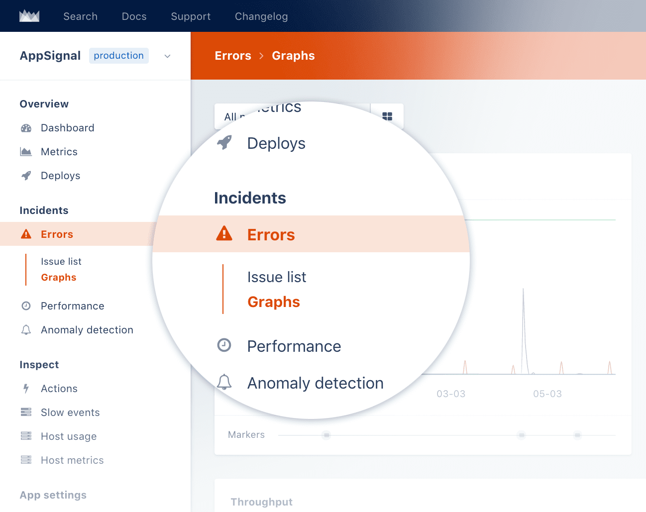
Helping you find valuable graphs
We found out there was something else that did not get used as much as we think it should. The tabs within page headers were being overlooked. For example, the screen with error graphs or performance issues was sometimes discovered late, or not at all. This was our tab bar before:

We researched different visual styles and navigation structures and found a more intuitive solution. The tabs were removed from the title bar, and are now shown in the navigation on the left. They expand when you open the feature to keep the navigation clean.
It’s a small change, but we are confident that it will help developers discover more of AppSignal.
We weren’t going to blog about it, until we got a message from Grzesiek Kolodziejczyk saying:
“Hey, just wanted to let you know that the latest UI change is awesome! Makes so much more sense to have the list/graphs switcher as a submenu. The app also feels much faster.”
We realized we should explain (and be proud of) small changes like these as well.
What we are working on now
Improving existing things to have more developers discover them is not all we are working on. We recently shipped beta support for StatsD and a standalone agent. Right now our product team is working on the next iteration of dashboards, with more insights coming your way, requiring less effort.
If you have feedback about missing features, want to suggest changes or share something you like, please let us know. Your input is extremely valuable to us!
Recommend
About Joyk
Aggregate valuable and interesting links.
Joyk means Joy of geeK