

Is ⌘ + C the new design process?
source link: https://uxdesign.cc/is-c-the-new-design-process-e6fc11394a6b
Go to the source link to view the article. You can view the picture content, updated content and better typesetting reading experience. If the link is broken, please click the button below to view the snapshot at that time.

Is ⌘ + C the new design process?. For the last couple of years, the field…
Is ⌘ + C the new design process?
For the last couple of years, the field of Design has witnessed an invisible decline in impact, trust, and ambition.
Wait what? Please keep reading.
We’ve worked hard to get a seat at the imaginary table and for many, it’s been hard to demonstrate the business impact behind design.
Good artists borrow, great artists steal.” — Pablo Picasso.
We’ve heard it all before and if you’re like me, you’re starting to question if the internet is drowning in a sea of stolen, uninspired design.
A Review of — Steal Like An Artist | Olive Blossom Designs
One website gets crazy conversion rates, and all of a sudden, every other website uses the same structure and simply replaces its colors.
Apple introduces bento boxes…
→ the internet goes wild using it everywhere.
Airbnb brings back skeuomorphic design…
→ the following week we see it all over Twitter design.
Your favorite designer on Twitter posts his new website design…
→ everyone replicates it for their own.
As Mat Venn pointed out in his article, we’ve seemed to hit a critical roadblock in product design evolution, characterized by predictability, stagnation, and looming sameness.
Listen, I get it.
We replicate what works.
We learn from observing from others.
The design space, which was once a haven for creative diversity, has evolved… the design landscape is changing.
Technology is changing. The world is changing.
Where did the wild things go?
Don’t get me wrong… I dislike websites, apps, and products that are extremely creative yet, which makes it so hard for me to know what I’m supposed to be doing next.
Did unique and eclectic designs get traded in for dull and homogenized ones?
Have we gotten so good at understanding users?
Has pure creativity been replaced by data?
Has auto layouts killed explorations?
So many questions…
We don’t all have the same end-users and yet, most products look alike.
Let’s step outside our user interface world for a second here and look at it from a different angle.
If we look at shower heads, they may vary primarily in shape and colour, but the fundamental design remains unchanged across brands and models. Arguably, the same things happen with light switches with minimal functionality and appearance variations, making them virtually indistinguishable from one another. This “similarity” reflects a broader trend where innovation or creativity can sometimes take a backseat to familiarity and convention.
The culprit?
Efficiency… maybe? Because it works… maybe?
Perhaps it's just simple human nature or, perhaps it’s our new design obsession with measuring the impact behind every pixel pushing us to prove we belong at that “table”. Or maybe, just maybe, it’s the combination of the internet and the inspiration becoming globalized.
Should we be questioning things?
When every designer uses the same sources for inspiration, we are bound to create the same things over and over again.
It sometimes feels like:
- we are afraid of trying…
- we’re afraid of breaking free…
- we’re afraid of colouring outside the lines.
- we stopped digging deep within ourselves for bold, original ideas.
Is this progress or a creative crisis?
Can we break free?
Is this even a problem?
😵💫🫥🫣😶🌫️🧐🙃😱
The internet needs a shot of uniqueness and a dash of weirdness.
The end of design report — Suff Syed & Daiyaan Syed
Is this the future of design?
The above thoughts will probably poke the bear, ruffle some feathers and make people feel uncomfortable.
Because it challenges the current state of design and it challenges our comfort zone.
After 17 years in the design field navigating my way around agencies, agency owner, startups, and enterprise software, I’ve seen design both evolve and stagnate.
Design isn’t weak, it’s misunderstood.
We’ve become overly obsessed with what we call ourselves (UI/UX/content/product designer…) and methodologies (user journeys anyone, stakeholder mapping, design thinking…).
We’ve fallen in love with our tools and processes probably more than we should of…
We’ve drowned in a sea of tools and fallen in love with process over purpose.
We may have created more confusion than clarity in our craft.
We often over-design things to impress our fellow designers and chase likes.
You’ve all seen this. Someone creates a button, animates it and all of a sudden his tweet goes viral and it gets thousands of likes and comments.
Someone sees this… and replicates it. ♻
Don’t get me wrong, I’m all for designing and being creative, but I feel that sometimes we can easily get caught up in the weeds of over-designing things just because.
Does the user really see the difference? Does it really convert more? Should you really have spent one week designing and animating one single button?
Have we lost sight of what matters?
Vitaly Komar and Alexander Melamid ran an interesting experiment on 1,001 US citizens and the results are fascinating.
We’ve learned that:
- Humans want to be comfortable.
- Humans all want the same thing.
- Humans all want to “fit in”.
As Vitaly Komar stated:
“We have been travelling to different countries, engaging in dull negotiations with representatives of polling companies, raising money for further polls, receiving more or less the same results, and painting more or less the same blue landscapes. Looking for freedom, we found slavery.”
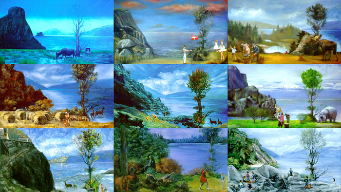
Komar and Melamid, People’s Choice
There are many different reasons why this might have happened over time, such as:
- Humans seek the safety of the familiar.
- We’ve been obsessing about quantification and optimization.
- We’ve inevitably been influenced by inspiration becoming globalized.
When I started in design, inspiration came from observing the world, nature, art museums, and magazines. Now, we turn to the 1,000s of inspiration sites online… And back then, don’t recall having to measure the impact behind every single pixel this heavily.
Is design weak? Not inherently.
But it’s certainly misunderstood. We’ve become obsessed with processes, jargoning ourselves into oblivion with titles like “content designer of designers” while forgetting the core mission: solving problems.
Interiors all look the same
Recommend
About Joyk
Aggregate valuable and interesting links.
Joyk means Joy of geeK