
4

马上就要元宵节了,这里给大家用go端上一碗汤圆
source link: https://studygolang.com/articles/36524
Go to the source link to view the article. You can view the picture content, updated content and better typesetting reading experience. If the link is broken, please click the button below to view the snapshot at that time.

马上就要元宵节了,这里给大家用go端上一碗汤圆
itpublijojo · 大约4小时之前 · 31 次点击 · 预计阅读时间 5 分钟 · 大约8小时之前 开始浏览「更多福利资讯查看:2024首次大厂挑战」。
马上就要元宵节了,这里给大家端上一碗汤圆😁
首先放一个div(bowl_wrap),把我们要包裹的内容放在里面,需要它的原因是可以方便移动整体的位置,我这边将它放在页面的居中位置,以及对里面的元素进行位置调整(position)
<div class="bowl_wrap">
    ....
</div>
.bowl_wrap{
    width: 200px;
    height: 220px;
    margin: 100px auto;
    position: relative;
 }
 先画一个碗,这个碗呢我是分3个部分组合起来的,在一个圆的上半部分放一个椭圆,下面放一个div,都是通过
border-radius进行形状的改变
        <!-- 碗底 -->
        <div class="bowl_bottom"></div>
        <div class="bowl_body_wrap">
            <!-- <div class="text">汤圆节快乐!</div> -->
        </div>
        <!-- 碗口 -->
        <div class="bowl_rim">
            ...
        </div>
        .bowl_rim{
            position: absolute;
            top: 0px;
            width: 200px;
            height: 135px;
            background-color: rgb(247, 242, 235);
            border: 2px solid black;
            border-radius: 50% / 50%;
            overflow: hidden;
        }
        .bowl_bottom{
            position: absolute;
            top: 196px;
            left: 65px;
            width: 70px;
            height: 15px;
            background-color: rgb(247, 242, 235);
            border-radius: 0% 0% 80% 80%;
            border: 2px solid black;
            border-top: 0px solid black;
        }
        .bowl_body_wrap{
            position: absolute;
            width: 200px;
            height: 200px;
            background-color: rgb(247, 242, 235);
            border: 2px solid black;
            border-radius: 67% 68% 61% 62% / 48% 45% 86% 88% ;
        }
        .text{
            margin-left: 60px;
            margin-top: 160px;
            color: w;
        }
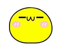
然后我们就开始制作汤圆,把它放进碗里(bowl_rim),超出的地方隐藏起来,汤圆的表情与很多,可以把每一个汤圆的表情都改变,我这个偷了个懒,都用的同一个
这里展示一下单个汤圆
       <div class="bowl_rim">
            <div class="two">
                <div class="left_eye"></div>
                <div class="right_eye"></div>
                <div class="mouth">
                    <div class="circle1"></div>
                    <div class="circle2"></div>
                </div>
                <div class="left_blusher"><div class="blu1"></div><div class="blu2"></div></div>
                <div class="right_blusher"><div class="blu1"></div><div class="blu2"></div></div>
            </div>
       </div>
汤圆的背景颜色可以根据自己的喜好更改,这里是黄色的(大黄豆皮~)
这个嘴巴就是用两个椭圆div旋转后,隐藏上半部分得到的
        .one, .two, .three, .four{
            position: absolute;
            top:45px;
            left: 0px;
            width: 95px;
            height: 80px;
            border: 2px solid black;
            background-color: #fff;
            border-radius: 67% 68% 52% 56% / 67% 79% 55% 57%  ;
        }
        .two{
            background-color: yellow;
            top: 0px;
            left: 60px;
            z-index: 10s;
        }
        .left_eye, .right_eye{
            position: absolute;
            top: 20px;
            left: 20px;
            width: 16px ;
            height: 3px;
            background-color: black;
        }
        .right_eye{
            left: 60px;
        }
        .left_blusher, .right_blusher{
            width: 20px ;
            height: 15px;
            background-color: pink;
            border-radius: 50% / 50%;
            position: absolute;
            top: 30px;
            left: 5px;
        }
        .right_blusher{
            left: 68px;
        }
        .blu1, .blu2{
            width: 2px;
            height: 8px;
            background-color: #fff;
            position: absolute;
            left: 6px;
            top: 4px;
            transform: rotate(20deg);
        }
        .blu2{
            left: 12px;
        }

        .mouth{
            position: absolute;
            top: 20px;
            left: 38px;
            width: 20px;
            height: 20px;
            overflow: hidden;
        }
        .mouth .circle1, .mouth .circle2{
            margin-top: -10px;
            width: 6px;
            height: 16px;
            border-radius: 50% / 50%;
            border: 2px solid black;
            transform: rotate(10deg);
        }
        .mouth .circle2{
            margin-left: 8px;
            margin-top: -20px;
            transform: rotate(-10deg);
        }
有疑问加站长微信联系(非本文作者))

入群交流(和以上内容无关):加入Go大咖交流群,或添加微信:liuxiaoyan-s 备注:入群;或加QQ群:692541889
Recommend
About Joyk
Aggregate valuable and interesting links.
Joyk means Joy of geeK