

The KTM Logo History, Colors, Font, and Meaning
source link: https://www.designyourway.net/blog/ktm-logo/
Go to the source link to view the article. You can view the picture content, updated content and better typesetting reading experience. If the link is broken, please click the button below to view the snapshot at that time.

The KTM Logo History, Colors, Font, and Meaning
You’ve seen it. A bold, striking emblem that often catches your eye on motorbikes zipping past or showcased in a showroom window. Yep, I’m talking about the KTM logo. It’s not just any logo; it’s like the North Star for motorcycle enthusiasts.
Now, as a web designer, you might wonder, “Why would I care about a motorcycle logo?” But stay with me.
Branding. Recognition. Passion.
These aren’t just buzzwords, these are the tools of my trade. And if there’s anything that the KTM brand has nailed down, it’s exactly these.
Here’s why you should lean in:
- Every curve, every color, every choice in that logo has a story.
- It sets the tone for how the world perceives the KTM brand.
- And honestly, there’s a ton we can learn from it.
By the time we get to the bottom of this, you’ll have a solid grasp of what makes the KTM emblem stand out, how it got its place in the motorcycle hall of fame, and how to draw inspiration from it for your next design gig.
We’ll dive into its history, design elements, and yes, even the psychology behind it. Because let’s face it, every great logo has some mind tricks up its sleeve.
The Meaning Behind the KTM Logo
Soul, Baby!
Okay, let’s get this straight, logos are like the tattoos of a brand. They tell you a story, give you vibes, and create an aura.
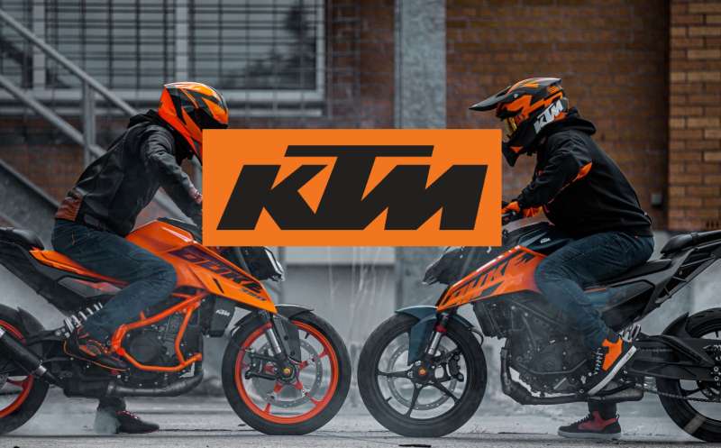
The KTM logo? Man, it’s more than just orange and black swirls. Think of it as an emblem, an emblem that speaks ruggedness, speed, and innovation. Have you ever seen a KTM bike zipping past you? That logo encapsulates the essence, the sheer power of that machine.
Three Letters to Rule Them All
KTM stands for “Kronreif, Trunkenpolz, Mattighofen”. A mouthful, right? But these three words are the cornerstone of KTM’s legacy. The logo encompasses the initials, crafting them into a symbol that stands for Austrian engineering brilliance.
The Design Lingo
Okay, to all of us non-designer folks, the KTM logo may look simple. But, listen, every curve and line in that design is meticulously planned.
The lines are crisp, like a well-tailored suit; they give the whole thing a modern, edgy look. This ain’t your grandma’s vintage logo; it’s a looker designed for the adrenaline junkies!
The History of the KTM Logo
The Humble Beginnings
Listen up, because this is where the action starts. The brand started in 1934. Yeah, that far back! They started off making metal stuff, not bikes. But as the years rolled on, KTM decided they were destined for faster, dirtier things. And oh boy, did they embrace it!
The Evolution, Baby
Now let’s talk about the logo journey. It’s been through changes, man. The first KTM logos were as basic as you can imagine.
As the brand evolved, so did its logo. It started getting sharper, edgier, and yes, ORANGER. The essence remained the same, but the aesthetics? They went from zero to hundred, real quick!
The Modern Shebang
Today, the KTM logo screams modernity, but it’s got that old-school charm. It tells you it’s ready to take on the world but respects where it came from. That’s how you keep it real while moving with the times!
The Colors of the KTM Logo
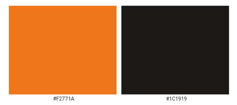
It’s All About That Orange
No messing around here, orange is the soul of the KTM logo. It’s energetic, it’s vibrant, and it shouts “Look at me!” It’s basically the visual equivalent of a revving KTM bike. Makes you feel alive, doesn’t it?
The Black Factor
Don’t forget the black. It’s like the sidekick that makes the hero look good. Adds contrast, brings in some gravity, and balances out the electric orange. Together, they’re the dynamic duo of the visual world.
The Font Used in the KTM Logo
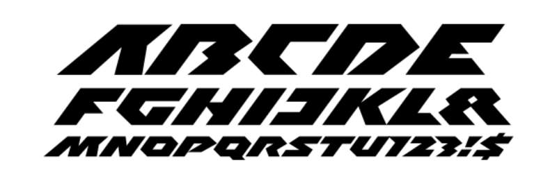
It’s All in the Typeface
Alright, typeface may seem boring, but it’s the unsung hero. The KTM logo uses a custom, proprietary font. It’s bold but not in-your-face. Clean lines, no-nonsense – perfectly aligns with what KTM stands for.
The Message in the Text
See, fonts have personality too. This one? It’s like that serious guy at the party who doesn’t talk much but when he does, you listen. The font conveys authority, strength, and oh boy, it has got charisma.
The Anatomy of the Logo
Symmetry and Proportions
Ever thought about why the KTM logo looks so balanced? That’s because the designers have carefully played with proportions and symmetry. Every element complements the other, creating a harmonious look that grabs attention without screaming for it.
The Subtle Details
Look closely, and you’ll notice tiny elements that make a big difference. There’s meticulous attention to detail, from the spacing between the letters to the angles of the lines. Tiny stuff, but oh-so-important!
The KTM Logo and Brand Identity
An Extension of Brand Personality
The KTM logo isn’t just a separate entity; it’s a crucial part of KTM’s brand identity. When you see that logo, you should instantly think of speed, adventure, and a machine that’s built to perform. It’s like the brand’s fingerprint, unique and telling.
Across Various Platforms
From merchandise to billboards to social media, the KTM logo maintains its vibe everywhere. It’s versatile yet consistent, making sure the brand message is loud and clear, irrespective of where you see it.
FAQ About the KTM Logo
What’s the history behind the KTM logo?
Oh, dive into the past, and you’ll see KTM has had quite a journey! Originating from Austria, this motorcycle brand has had several logo iterations over the years.
While the current one flaunts the brand’s name with its iconic orange, it’s a symbol of the brand’s passion for racing and adventure. It’s a reflection of their ‘Ready to Race’ ethos.
How has the KTM logo changed over the years?
Change, man, it’s inevitable. Over time, KTM has revamped its logo multiple times. From simple text-based designs in the early days to the modern, sleek, and sharp versions now, it’s been about evolving with time.
The essence of edginess, speed, and class remains intact, but with a touch of modern flair. The orange color, though? That’s been a consistent vibe!
Why did they pick orange for their logo?
Alright, here’s the juicy part! Orange is not just a color for KTM; it’s an identity. This shade screams energy, excitement, and youthfulness.
It sets KTM apart from the crowd, making their bikes instantly recognizable on the roads and dirt tracks. I mean, if you were to stand out, why not pick a color that does the job, right?
Is there a symbolic meaning to the KTM logo?
You bet there is! Beyond the aesthetics, the KTM logo carries the brand’s spirit. The sharp design elements reflect speed, agility, and precision.
While the bold lettering? That’s all about strength and confidence. Every time you see that logo, think of a brand that’s ‘Ready to Race’. It’s not just about motorcycles; it’s a lifestyle.
Why does the KTM logo look so modern?
Modern times call for modern designs. KTM, being the forward-thinking brand they are, wanted a logo that resonates with the current generation of riders.
The edgy design, sharp lines, and vibrant color palette give it a fresh and contemporary look. They wanted it to scream ‘now’, and boy, did they nail it!
Has the logo’s design been influenced by any cultural or design movements?
Oh, absolutely! Like any piece of art or design, cultural and design movements shape it. Over the years, minimalism, sharp geometric designs, and contrasting color palettes have played their role in the KTM logo’s evolution.
It’s a blend of European design aesthetics and a global appeal. It’s like a nod to the past while riding into the future.
What’s the significance of the letters ‘KTM’ in the logo?
So, let me break it down for ya. KTM stands for Kronreif, Trunkenpolz, Mattighofen. Quite a mouthful, right? It’s named after the founders and the city of its origin in Austria.
Each letter holds a piece of the brand’s legacy, reminding us of its rich heritage and the people behind those badass bikes.
How important is branding and logo design for a company like KTM?
Mega important! In the world of motorcycles, where competition is fierce, branding can make or break you. The KTM logo is not just a visual element; it’s an embodiment of the brand’s philosophy and values.
It tells stories, builds trust, and creates an emotional connection with the riders. It’s like the face of the brand, always leading the charge.
Are there any controversies or interesting stories linked with the KTM logo?
There’s always a bit of spice in any brand’s journey. While KTM has largely had a smooth sail, some die-hard fans have had their reservations about logo changes in the past.
Logo evolutions, right? They’re like the “New Coke” of the design world sometimes. But in the end, what matters is the spirit and the machines, and KTM has stayed true to that.
Can we expect the logo to evolve in the future?
If history has taught us anything, it’s that change is the only constant. While the KTM logo is pretty iconic right now, who knows what the future holds? Brands evolve, designs get revamped, and logos transform.
So, while I don’t have a crystal ball, I’d say, stay tuned! The roads of the future are full of surprises.
Ending Thoughts on the KTM logo
So, KTM logo, right?
You ever notice how sometimes, a logo just pops? Like, you’re scrolling through Instagram or walking past a store, and BOOM – there it is? That’s the power of design, my friend.
The KTM logo is one of those. Let’s break it down.
- Bold Colors: Bright orange, giving you that rush, that energy.
- Sleek Design: That motorbike vibe just oozes off it. Speed. Power. Precision.
- Typography: Not too flashy, but it doesn’t need to be. It’s confident in its simplicity.
Okay, so wrapping it all up? When you look at the KTM logo, you’re not just seeing some random shapes and letters. Nah. You’re diving headfirst into a world of adrenaline, of the open road, of adventures waiting just around the bend.
It’s the essence of biking, distilled into a single emblem. Talk about art! So, next time you spot that logo, give a little nod to the creative brains behind it. They nailed it.
If you enjoyed reading this article about the KTM logo, you should read these as well:
Renowned for his expertise in logo design and visual branding, Bogdan has developed a multitude of logos for various clients.
His skills extend to creating posters, vector illustrations, business cards, and brochures. Additionally, Bogdan's UI kits were featured on marketplaces like Visual Hierarchy and UI8.
Recommend
About Joyk
Aggregate valuable and interesting links.
Joyk means Joy of geeK