

Readable by Design: The 11 Best Fonts for Dyslexia
source link: https://www.designyourway.net/blog/best-fonts-for-dyslexia/
Go to the source link to view the article. You can view the picture content, updated content and better typesetting reading experience. If the link is broken, please click the button below to view the snapshot at that time.

Readable by Design: The 11 Best Fonts for Dyslexia
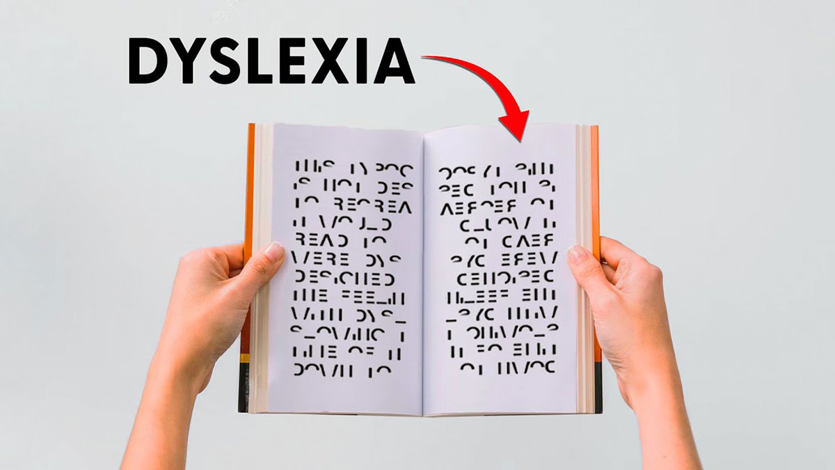
Picture this: You’ve crafted the perfect article, buzzing with invaluable insights. Yet, despite your efforts, a segment of your audience struggles to soak in the brilliance of your words. It’s like serving a gourmet meal to guests who can’t quite savor the flavors. This is the reality for readers with dyslexia, unless of course, we talk about the superpower of typography!
Here’s the deal: selecting the best fonts for dyslexia is more than a design choice; it’s a bridge to clarity and comprehension. And folks, I’m not just spinning a yarn. Research-backed facts are my pals, and inclusive design is my playground.
By the end of this discourse, you’ll be equipped with a treasure trove of knowledge – from dyslexia-friendly typefaces that ensure readability, to the role of OpenDyslexic font in enhancing visual accessibility. We’ll travel through the nuances of user interface considerations and emerge with practical, accessible web design tactics for the ever-evolving digital landscape.
Ready to transform lives with a handful of font choices? Let’s dive into the realm of letters that cater to neurodiversity like never before.
The Best Fonts for Dyslexia
| Font Name | Design | Spacing | Distinguishability |
|---|---|---|---|
| OpenDyslexic | Sans-serif, Weighted bottoms | Moderate | High |
| Arial | Sans-serif | Fairly tight | Moderate |
| Verdana | Sans-serif | Wide | Good |
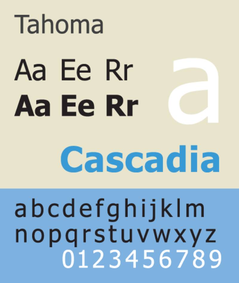
| Tahoma | Sans-serif | Moderate | Moderate |
| Century Gothic | Sans-serif, Geometric | Wide | Good |
| Calibri | Sans-serif | Moderate | Good |
| Helvetica | Sans-serif | Tight | Moderate |
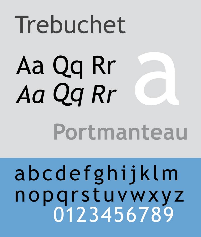
| Trebuchet MS | Sans-serif, Humanist | Moderate | Good |
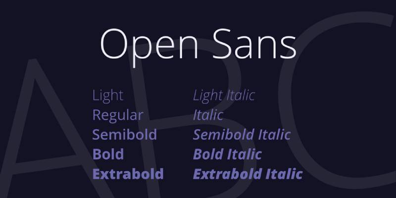
| Open Sans | Sans-serif | Moderate | Good |
| Comic Sans | Sans-serif, Handwriting-like | Uneven, whimsical | High |
| Courier | Serif, Monospaced | Fixed | Moderate |
Fonts Specifically Designed for Dyslexia
Now, these fonts? They’re like the superheroes of the dyslexia world. Designed with dyslexic readers in mind, they’re here to save the day.
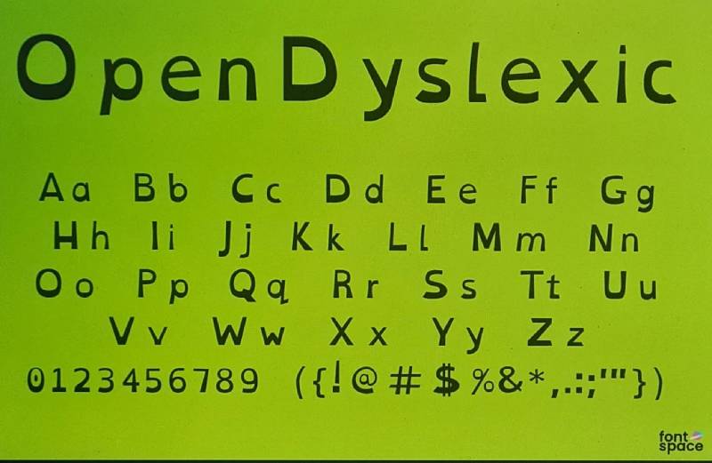
This one’s got a unique style. Think of weighted bottoms on letters to prevent flipping and mix-ups.
Standard Accessible Fonts
First up, let’s talk about the usual suspects. These are the fonts that, while not specifically designed for dyslexia, still rock at making reading more accessible.
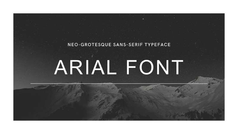
It’s like the friendly neighbor of fonts. Clean, simple, and familiar. It doesn’t try too hard, and that’s why we love it.
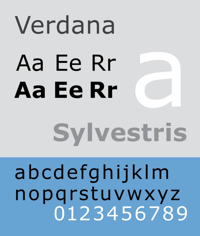
A bit wider, giving each letter some breathing room. It’s like Arial’s chill cousin.
Similar to Verdana but with a slightly tighter hug around each letter. Cozy, right?
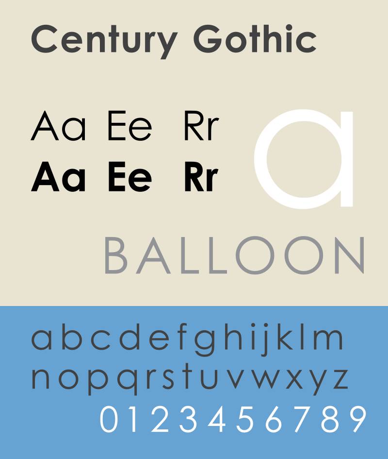
This one’s a bit more on the stylish side. It’s got a modern vibe and some nice, open shapes.
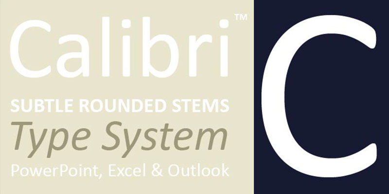
The default font in a lot of places for a reason. It’s straightforward and easy on the eyes.
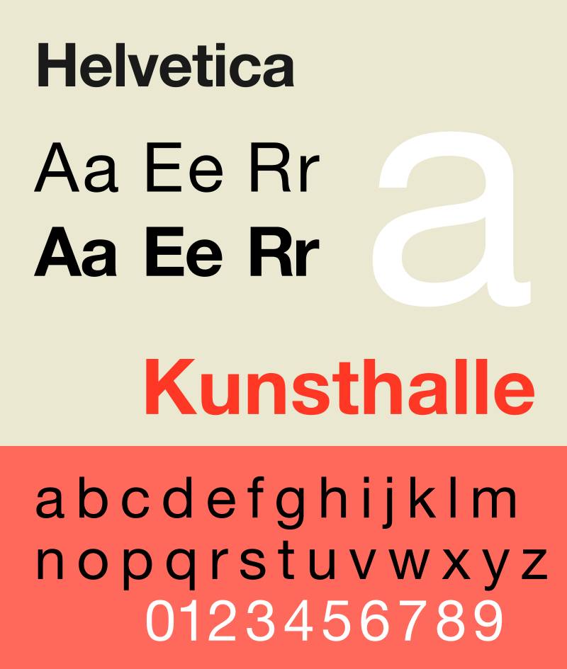
Classic. It’s like that old song you never skip. Timeless and super legible.
A bit more personality than some of the others, but still super clear.
It’s open, friendly, and just a tad rounder than your average font.
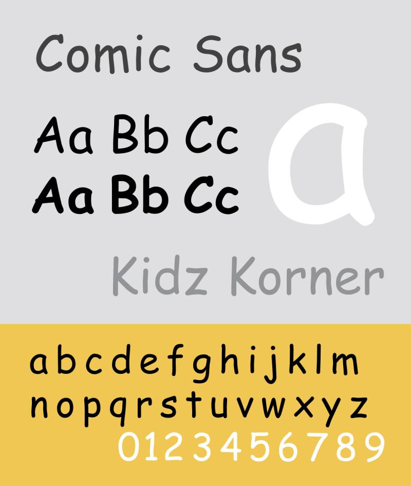
Yeah, yeah, we all joke about it. But guess what? It’s actually pretty dyslexia-friendly. Who knew?

Old school, typewriter vibes. It’s monospaced, which can really help with letter distinction.
The Importance of Font Choice in Dyslexia
Ever noticed how some texts are just easier to read than others? It’s not just you. For folks with dyslexia, the type of font used can make a world of difference. Let’s talk about why the best fonts for dyslexia matter so much.
Impact of Fonts on Readability
Here’s the deal: dyslexia affects the way people process written words. So, the right font can help make reading less of a struggle. It’s not just about picking a pretty typeface; it’s about choosing fonts that increase readability and reduce visual confusion. Think of it as typography meeting accessibility.
How font choice affects dyslexic readers
Dyslexic readers often face challenges like letter swapping and mirror-image confusion. The best fonts for dyslexia tackle these issues head-on. They have features that make each letter distinct, reducing the likelihood of mix-ups. It’s like giving each character its own personality, so it stands out.
General characteristics of dyslexia-friendly fonts
We’re talking sans serif fonts, generous letter spacing, and more. These are like the secret ingredients that make text more digestible for readers with dyslexia. It’s all about creating an environment where letters don’t jumble or blur together.
Characteristics of Dyslexia-Friendly Fonts
So, what exactly makes a font dyslexia-friendly? Let’s break it down.
Font Style
Fonts are like clothes for words. The right style can make a big difference.
Sans serif vs. Serif
Sans serif fonts are like the casual tees of the font world: simple and straightforward. They lack the little feet (serifs) that serif fonts have, making them clearer and more legible for dyslexic readers.
Non-italic and upright fonts
Ever tried reading italicized text for a while? It’s a bit of a strain, right? For dyslexic readers, it’s even more challenging. Upright, non-italic fonts are the way to go.
Letter Spacing and Sizing
Just like people need personal space, letters do too.
Adequate spacing between characters (kerning)
Too close, and they blend into each other. Too far, and they lose their flow. The right spacing (or kerning) keeps each character distinct and readable.
Optimal font size and line spacing
Bigger isn’t always better, but in the case of fonts for dyslexia, size does matter. Along with the right line spacing, it can significantly enhance readability.
Unique Font Features
These are the special touches that set dyslexia-friendly fonts apart.
Distinct letter shapes to prevent confusion
Each letter in the best fonts for dyslexia has its own unique shape, avoiding confusion between similar letters like ‘b’ and ‘d’.
Weighted bottoms in letters
This nifty feature gives letters a ‘gravity’, anchoring them visually and helping to orient them correctly in the reader’s mind.
Implementing Dyslexia-Friendly Fonts
So, you’ve got a list of the best fonts for dyslexia in hand. What’s next? It’s time to put them into action. Making your digital space dyslexia-friendly isn’t just a nice-to-have; it’s a game-changer for inclusivity. Let’s break down how to do this right.
Application in Digital Content
Digital content is everywhere – websites, e-books, apps. Making them accessible means everyone gets to join in, no one’s left squinting or struggling.
Web design considerations
When designing a website, think beyond colors and layouts. The font is a big deal. Go for sans serif fonts like Arial or OpenDyslexic. They’re clearer and less cluttered. Keep your font size and spacing generous. It’s like making your website a comfy couch, everyone fits in just right.
Document formatting tips
Writing a report, an e-book, or just a simple doc? The same rules apply. Choose one of those dyslexia-friendly fonts. Avoid tight spacing and tiny letters. Think of it as giving your words room to breathe. It’s not just about looking good; it’s about being readable and accessible.
Practical Tips for Font Usage
It’s the little things that count. A tweak here, a nudge there – it all adds up to make your content more dyslexia-friendly.
Avoiding condensed or italicized fonts
Condensed and italic fonts are like a crowded subway – overwhelming and hard to navigate. Stick with straightforward, upright fonts. They’re like a peaceful walk in the park: no rush, no fuss.
Aligning text for easier reading
Alignment matters. Justified text can create weird spaces between words, making it harder to read. Go for left-aligned or centered. It’s like following a clear, straight path, no unexpected bumps.
Broader Accessibility Considerations
Choosing the best fonts for dyslexia is just the start. Think bigger! Accessibility in the digital realm is like a multi-layered cake – every layer adds more flavor, more inclusivity. Let’s explore what else we can do to make our digital content friendlier to everyone.
Beyond Font Choice
Font choice is key, but it’s part of a bigger picture. Think of it as one piece of the puzzle in creating an accessible digital environment.
Color contrast and background
Ever tried reading text on a super bright or super dark background? Not fun, right? High contrast between text and background is crucial. It’s like making sure everyone can see the path they’re walking on, clear and sharp.
Simplified language and clear instructions
Ever bumped into a word that made you go, “Huh?” We’ve all been there. Using simple, straightforward language is like having a friendly chat. No fancy jargon, just clear, concise communication. It’s all about making sure everyone gets the message, loud and clear.
Importance of Inclusive Design
Inclusivity isn’t just a nice-to-have; it’s essential. It’s about making sure everyone feels welcome in the digital world.
Benefits for all readers
Here’s the thing: designing for accessibility doesn’t just help folks with dyslexia or other challenges; it makes everyone’s experience better. It’s like opening doors wide – everyone finds it easier to walk through.
Aligning with accessibility guidelines
There’s a whole world of guidelines out there, like the ADA (Americans with Disabilities Act) and WCAG (Web Content Accessibility Guidelines). Following them is like having a roadmap to inclusivity. It guides us to create content that’s accessible to all, no matter their needs or abilities.
FAQ On The Best Fonts For Dyslexia
What makes a font dyslexia-friendly?
Fonts crafted with the intention to ease the reading experience for those with dyslexia often sport unique characteristics like heavier baselines, varied letter shapes, ample spacing, and minimal stylistic flairs. These tweaks aim to reduce the common letter-flipping and merging that can trip up dyslexic readers.
Can dyslexic readers benefit from certain typefaces?
Absolutely, typography wields the power to transform reading into an accessible activity. Fonts like OpenDyslexic and Dyslexie have been carefully engineered to offer dyslexic readers letters with distinctive shapes, reducing confusion and enhancing the overall readability of the text.
Are there standard fonts that are good for dyslexia?
You bet. While specialized fonts exist, widely available options like Arial, Verdana, and Helvetica also come recommended. Their straightforward, sans-serif characters and generous letter spacing do wonders for legibility.
What’s the deal with serif vs. non-serif fonts for dyslexia?
The simplicity of non-serif fonts typically wins here. The clean lines and unadorned shapes of letters are less visually demanding, making them more readable for those with dyslexia. Serif fonts, with their extra strokes, can obscure letter recognition.
Is color contrast important in fonts for dyslexic readers?
It’s paramount. High contrast between text and background can greatly reduce visual stress. A dark font on a light background—or the reverse, depending on personal preference and visual processing requirements—is key for readability.
How does font size impact readability for dyslexic individuals?
Bigger often equates to clearer. A larger type size can improve legibility, allowing each character’s form to stand out more distinctly. This reduces the work of decoding the text, making the reading less laborious.
Can the spacing of letters and words affect dyslexic readers?
Spacing is vital—it’s a game-changer, really. Sufficient spacing between letters and words helps to prevent the melding of characters into indecipherable blocks, clearly demarcating where one ends and another begins, aiding quick identification and comprehension.
What role does font weight play for readers with dyslexia?
Font weight makes a difference. A medium or bold font weight can often be preferable, adding definition and creating a clear visual demarcation that helps distinguish individual letters, facilitating a smoother reading journey.
Is it true that italicized text is harder for dyslexic readers to process?
Indeed. Italicized text tends to slant and compress letters, creating visual distortions that can complicate letter recognition for those with dyslexia. Best to avoid it and stick to upright, standard fonts for the sake of clarity.
How do I choose the best font for a dyslexic reader?
Consider personal comfort and the specific challenges faced. What suits one may not suit another. Experimentation with a range of dyslexia-friendly typefaces and attentive observation of the reader’s response can lead to discovering what truly works best for them.
Conclusion
We’ve spun through the orbit of typefaces, landed on solid ground, and now, well-anchored in the knowledge, the best fonts for dyslexia stand clear against the backdrop of text-rich realms. Text is terrain, every character a landmark, and for some among us, legibility is key to navigating the wilds of written word jungles.
- OpenDyslexic and Dyslexie, like trusty guides, help chart a course through texts that might otherwise seem dense and impenetrable. These are your safe harbors, where reading doesn’t have to be an upstream swim.
- Arial, Helvetica—they’re the everyday heroes without capes. Sans-serif, supersized, and spaced in just the right rhythm, they strike a chord with straightforward simplicity.
As the curtain falls on our odyssey, keep the essence snug in your virtual toolkit: access to information shouldn’t be an obstacle course. So, let’s pitch the tents of inclusivity, armed with the right fonts, creating spaces where letters become stepping stones, not stumbling blocks. Here’s to text crafted not just to stand out, but stand up – for clarity, for ease, for every reader.
If you enjoyed reading this article on the best fonts for dyslexia, you should check out these articles also:
Renowned for his expertise in logo design and visual branding, Bogdan has developed a multitude of logos for various clients.
His skills extend to creating posters, vector illustrations, business cards, and brochures. Additionally, Bogdan's UI kits were featured on marketplaces like Visual Hierarchy and UI8.
Recommend
About Joyk
Aggregate valuable and interesting links.
Joyk means Joy of geeK