

Ad Appeal: The 21 Best Fonts for Facebook Ads
source link: https://www.designyourway.net/blog/best-fonts-for-facebook-ads/
Go to the source link to view the article. You can view the picture content, updated content and better typesetting reading experience. If the link is broken, please click the button below to view the snapshot at that time.

Ad Appeal: The 21 Best Fonts for Facebook Ads

In a world where every scroll is a highway of endless billboards, snagging eyeballs on Facebook is akin to catching fireflies at dusk—ephemeral, yet magical. It’s not just the words that weave this spell; the best fonts for Facebook ads are silent conjurers, lifting brands from the commonplace to the sublime.
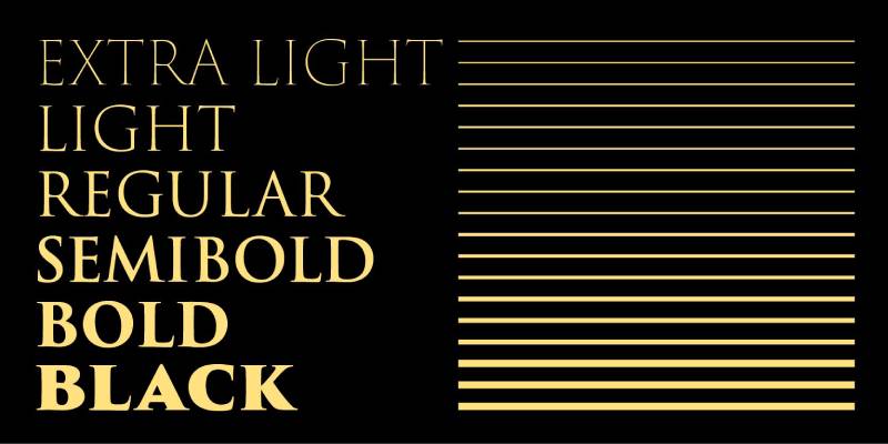
Imagine fonts as fashion; what dresses our messages shapes the conversation. Typefaces convey more than tone; they craft identity and dictate attention spans.
In the dance of pixels and click-thrus, readability and visual hierarchy aren’t just design jargon—they’re the pulse of Facebook advertising typography.
By article’s end, you’ll be equipped with knowledge—choosing fonts like a seasoned digital marketing agency selects a tie for the big pitch.
Step past the velvet rope of aesthetics into the psychology behind typeface choices that drive engagement. Let’s decode the DNA of high conversion typefaces and sculpt words into actions with every ad you craft.
The Best Fonts for Facebook Ads
| Font Name | Legibility at Small Sizes | Attention-Grabbing | Aesthetic Style | Versatility |
|---|---|---|---|---|
| Trajan | Poor | Good | Classic/Serif | More formal |
| Playfair Display | Moderate | Good | Elegant/Serif | Suited for headlines |
| Bodoni Moda | Moderate | Moderate | High-contrast/Serif | Less versatile |
| Merriweather | Good | Good | Readable/Serif | Good for body text |
| Sentinel | Good | Good | Slab-serif | Versatile |
| Helvetica | Excellent | Good | Neutral/Sans-serif | Highly versatile |
| Raleway | Good | Moderate | Elegant/Sans-serif | Good for text/headings |
| Oswald | Moderate | Good | Modern/Sans-serif | Good for headlines |
| Avenir | Good | Moderate | Modern/Sans-serif | Versatile |
| Calibri | Excellent | Moderate | Neutral/Sans-serif | Common in body text |
| Univers | Good | Moderate | Neutral/Sans-serif | Versatile |
| Montserrat | Good | Good | Geometric/Sans-serif | Good for headlines |
| Open Sans | Excellent | Good | Neutral/Sans-serif | Highly versatile |
| Lobster | Poor | Excellent | Decorative/Script | Less versatile |
| Fredoka One | Moderate | Excellent | Bold/Friendly | Good for short text |
| Alfa Slab One | Moderate | Good | Slab-serif | Suited for headlines |
| Abril Fatface | Moderate | Good | High-contrast/Serif | Suited for headlines |
| Josefin Sans | Good | Moderate | Elegant/Sans-serif | Suited for headlines |
| Paytone One | Moderate | Excellent | Bold/Sans-serif | Suited for headings |
| Brush Script | Poor | Good | Script | Suited for accents |
Serif Fonts Recommendations
Trajan for a traditional and authoritative look
Think about those epic movie posters. That’s Trajan for you. It’s all about bringing that classic, authoritative vibe to your ad. When you want to say, “Hey, we’re experienced, and we know our stuff,” Trajan’s your guy. It’s great for ads that aim to inspire trust and a sense of established credibility.
Playfair Display for elegance and sophistication
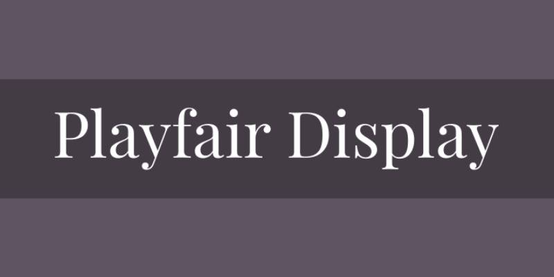
Now, imagine a font that’s like a black-tie event. That’s Playfair Display. It’s got this elegant, high-end feel that’s perfect for luxury products or services. When your ad needs to whisper sophistication and class, Playfair Display steps up.
Bodoni Moda for a sleek, contemporary style
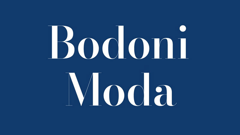
Bodoni Moda is like that sleek, modern apartment in the city. It’s got style, it’s got flair, and it definitely turns heads. Perfect for fashion or lifestyle brands, this font adds a contemporary touch to your Facebook ads, making them look fresh and modern.
Merriweather for readability in longer texts
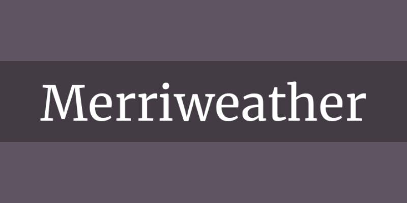
Got a bit more to say in your ad? Merriweather’s your friend. It’s designed for easy reading on screens. When you need your audience to stick around and read every word, Merriweather ensures they don’t squint or scroll away.
Sentinel for a professional and polished appearance

Sentinel is like that well-dressed professional who walks into the room and commands respect. It’s strong, it’s reliable, and it looks darn good in a business ad. If you’re aiming to project a professional, polished image, Sentinel is the way to go.
Sans Serif Fonts Recommendations
Helvetica for versatility and modern appeal
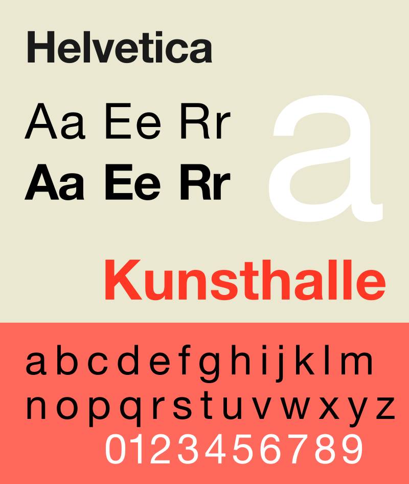
Let’s start with a classic – Helvetica. It’s the Swiss Army knife of fonts. Versatile? Check. Readable? Double-check. Helvetica is like that pair of jeans that goes with everything. It’s a safe bet for almost any kind of Facebook ad, bringing a clean, modern vibe without stealing the show.
Raleway for clean lines and modern touch
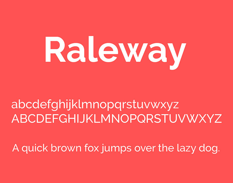
Next up, Raleway. It’s sleek, it’s stylish, and it screams sophistication. Think of Raleway as the minimalist, chic decor that makes a room look like a million bucks. It’s perfect for brands aiming for a high-end, contemporary feel in their ads.
Oswald for contemporary and impactful designs
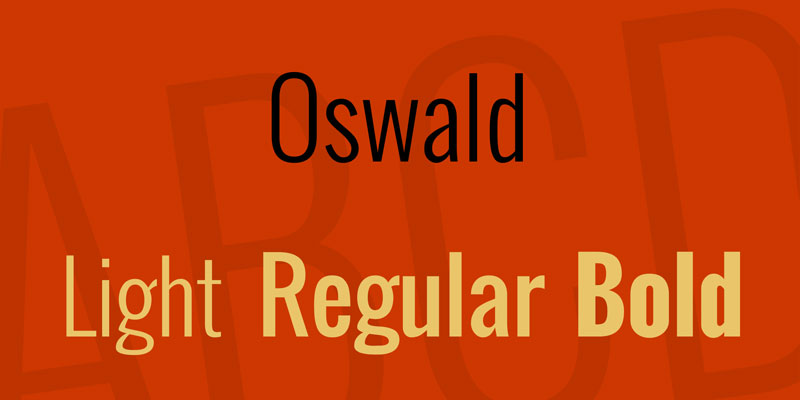
Oswald is the bold voice in a quiet room. It takes the classic style of traditional fonts and gives it a modern twist. Great for headlines that need to make an impact, Oswald is your go-to for ads that need to be noticed in a sea of content.
Avenir for a modern classic look
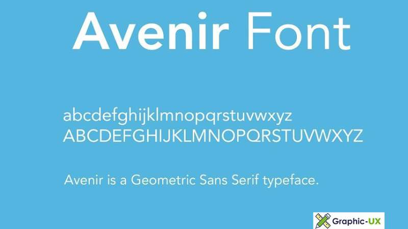
Imagine a font that balances classic and modern like a pro. That’s Avenir. It has this timeless elegance that feels fresh yet familiar. Ideal for brands that want their ads to feel modern but not too trendy.
Calibri for digital readability and familiarity
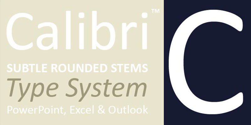
Calibri is like that friendly face in a crowd. It’s comfortable, familiar, and super easy on the eyes. Designed for clarity on computer screens, it’s a solid choice for long ad copy that needs to stay readable.
Univers for its large family and easy readability
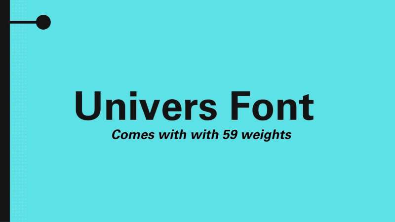
Univers is like the big, versatile family that has someone for every occasion. With a wide range of styles, it’s super adaptable for different ad moods and messages. Plus, its readability is top-notch, making it a smart pick for diverse Facebook ad campaigns.
Montserrat for a geometric and urban feel
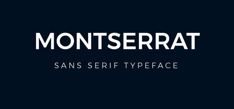
Picture a font that’s as cool and urban as a city skyline. That’s Montserrat. Its geometric design gives it a modern, edgy vibe. It’s perfect for brands looking to make a statement and stand out.
Open Sans for a friendly and legible appearance
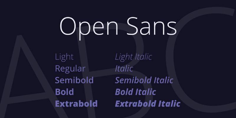
Lastly, Open Sans. It’s like the friendly neighbor who’s always there to help. Approachable and legible, it’s a great all-rounder for Facebook ads, ensuring your message is read and remembered.
Unique and Specialized Fonts
Lobster for creative and engaging ads
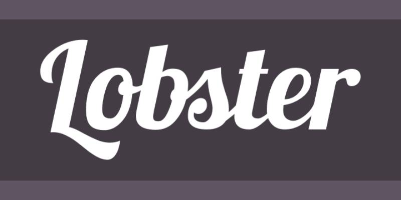
Imagine a font that’s as fun and quirky as a day at the beach. That’s Lobster for you. It’s got personality for days and works like a charm when you want your ad to feel lively and engaging. Perfect for brands that want to come off as approachable and fun.
Fredoka One for a fun and friendly vibe

Fredoka One is like that bubbly friend who’s always the life of the party. It’s rounded, it’s friendly, and it just makes you smile. Use it when your ad needs to feel warm and welcoming.
Alfa Slab One for bold, modern headlines

Bold. Strong. Unmissable. Alfa Slab One is the font you turn to when you want your headlines to pack a punch. It’s modern with a hint of vintage, great for making a statement while keeping things stylish.
Abril Fatface for a modern take on heavy titling fonts

Abril Fatface is like that sleek, retro car that still turns heads. It’s got a bold presence that’s perfect for ads that need a touch of drama and sophistication. Think high-fashion or luxury brands.
Josefin Sans for combining geometry and elegance

Josefin Sans is the epitome of elegance meeting modernity. It’s geometric, yet soft. It’s the kind of font that makes your ad look like it’s dressed in a designer suit. Ideal for brands aiming for a chic, upscale look.
Paytone One for modern sans-serif display headings

Paytone One is all about being seen. It’s contemporary, it’s strong, and it’s just right for those big, bold headings that need to stand out.
Brush Script for a casual, nostalgic touch
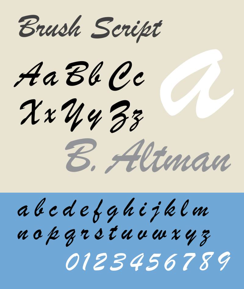
Want to add a personal, handcrafted feel to your ad? Brush Script is your go-to. It’s like a handwritten note that adds a touch of nostalgia and warmth. Great for brands with a more personal, artisanal message.
Petunia for a delicate and whimsical style

Last but not least, Petunia. It’s whimsical, it’s delicate, and it adds a sprinkle of magic to your ads. Perfect for when you want to add a touch of fantasy or playfulness.
Criteria for Selecting the Right Font
Alright, let’s chat about choosing the perfect font for your Facebook ads. It’s not just about picking the prettiest one. It’s a bit like matchmaking – finding that perfect font that aligns with your ad’s vibe and message. So, what should you consider to nail the best fonts for Facebook ads? Let’s dive in.
Alignment with Brand Identity
Matching font style with brand image and values
First things first, your font needs to sync with your brand’s personality. Is your brand more laid-back or super formal? Artsy or straightforward? The font you pick should be a reflection of these traits. Like, if your brand is all about adventure and outdoor fun, a rugged, bold font might be your best bet. On the flip side, a luxury brand might lean towards something more elegant and refined.
Readability and Visibility
Importance of clean lines and legible design
This one’s a biggie. If your audience has to squint to read your ad, you’re in trouble. Your font needs to be crystal clear, especially considering how quickly people scroll through their Facebook feeds. Fonts with clean lines and good spacing, like sans serifs, often work wonders for readability. But hey, don’t shy away from serifs if they fit your brand – just make sure they’re legible even on smaller screens.
Audience Consideration
Choosing fonts that resonate with the target demographic
Who are you speaking to with your ad? Different fonts resonate with different people. A funky, quirky font might be a hit with a younger crowd, but a more traditional, straightforward font could work better for a more mature audience. It’s all about understanding who you’re talking to and what makes them tick.
Combining Fonts Effectively
Okay, let’s talk about mixing and matching fonts. It’s like putting together an outfit. You want it to look coordinated, not like you got dressed in the dark. When you combine fonts in your Facebook ads, you’re setting the tone, creating harmony, and highlighting the right parts of your message. Here’s how to blend the best fonts for Facebook ads without making your ad look like a typographic salad.
Pairing Different Font Types
Strategies for combining serif and sans serif fonts
Mixing serif and sans serif fonts is classic. It’s like peanut butter and jelly – they just work together. The trick is balance. Use a serif for your headline to bring elegance and tradition, and then hit ’em with a sans serif for the body copy to keep things clean and readable. This combo works because it creates a visual hierarchy and contrast, guiding the viewer’s eyes where you want them to go.
Using multiple fonts sparingly for cohesive design
The golden rule? Less is more. Stick to two, maybe three fonts max in a single ad. More than that, and you risk turning your ad into a carnival. The idea is to select fonts that complement each other, not compete for attention. Think about contrast, like a bold font for your headline and a lighter, simpler font for your body text. It’s all about creating a clear, cohesive look that tells your story without visual clutter.
Font Pairing Examples
Combinations that work well for Facebook ads
Let’s lay down some real examples. Picture this: Playfair Display for your headline – it’s sophisticated, stylish. Then, pair it with Open Sans for your body text – it’s clean, modern, and super legible. This combo is like a smart, tailored suit – it just looks put together.
Or maybe you want something more playful? Try Montserrat for your headline – it’s geometric, contemporary. Then, go with something like Calibri for your body text – it’s familiar, friendly. This pairing feels like a trendy, casual outfit, perfect for more laid-back, approachable brands.
Trends and Innovations in Typography
Typography is like fashion; it’s always evolving. What’s hot today might be old news tomorrow. But don’t worry, I’ve got you covered. Let’s dive into the latest trends and innovations in typography, especially when it comes to choosing the best fonts for Facebook ads. Staying ahead of the curve can make your ads not just current but cutting-edge.
Current Trends in Font Styles
Popular font choices and emerging styles in advertising
Right now, it’s all about fonts that stand out but are still super easy to read. Big, bold sans serifs are having a moment. They’re clean, modern, and they pop on small screens. But there’s also a resurgence of retro-inspired fonts – think 70s and 80s styles with a modern twist. These fonts bring a touch of nostalgia, which can be a big hit depending on your audience.
And don’t forget about the rise of minimalism. Fonts that are simple yet elegant are huge. They’re like the plain white tee of the font world – simple, but they go with everything. This trend aligns with the whole less-is-more vibe that’s really resonating with people these days.
The Future of Font Design
Innovations and predictions in typography for digital ads
Looking ahead, we’re going to see fonts getting even more tailored for digital spaces. Think fonts that are not just screen-friendly but specifically designed for social media platforms like Facebook.
There’s also a big push towards inclusive and accessible design. Fonts that are easy to read for everyone, including people with visual impairments, are going to be key. It’s not just about looking good; it’s about being good for everyone.
And let’s talk tech. With advancements in AI and machine learning, we might start seeing fonts that adapt based on user behavior. Imagine a font that changes slightly to improve readability based on how people interact with your ad. Wild, right?
Practical Tips for Font Selection
Alright, let’s get down to the nitty-gritty of choosing the best fonts for Facebook ads. It’s not just about picking what looks cool. There’s a method to the madness, a way to make sure your font choices hit the mark every time. Let’s walk through some practical tips that can take your ad game to the next level.
Testing and Iteration
Importance of A/B testing with different fonts
Ever heard of A/B testing? It’s like having a bake-off between fonts to see which one cooks up the best results. You take two versions of your ad, each with a different font, and see which one performs better. This isn’t just guesswork; it’s about getting real data on what resonates with your audience. Maybe that sleek sans serif beats the classic serif, or perhaps it’s the other way around. You won’t know until you test it.
Keeping Up with Changing Preferences
Adapting font choices based on audience feedback and trends
Tastes change, trends evolve, and so should your fonts. Keep an ear to the ground. What are people responding to? What’s falling flat? This is where keeping tabs on your ad performance comes in handy. Maybe your audience is digging the bold, modern look these days, or perhaps they’re leaning towards something more understated and classic. Stay flexible, stay observant, and be ready to switch things up as preferences shift.
FAQ On The Best Fonts For Facebook Ads
What Makes a Font Effective for Facebook Ads?
Typography in marketing is all about balance. The key is legibility and emotional resonance. Fonts that are clear and easy on the eyes tend to perform well. Think about how the font reflects your brand’s personality—whether it’s professional, friendly, or edgy. Effective fonts for ads align with the brand’s identity and the audience’s expectations.
How Do I Choose the Right Font Size for Readability?
Font size matters, especially on mobile. For Facebook ads, readability is top-tier priority. It’s about nailing that sweet spot—generally, starting with 14 pixels for body text. For headlines, you’ll go bigger, but ensure words are scannable with a glance. Factor in display sizes across devices to keep your ad’s message crisp.
Are There Fonts I Should Avoid in Facebook Ads?
Flashy fonts can be a visually loud no-go. Anything too ornate or hard to read quickly, like comic sans or papyrus, is risky business. Your aim is clarity—fonts that are too stylized might distract rather than attract. Stick to web-safe choices proven to maintain their form and function across all user interfaces.
What Are the Best Free Fonts for Facebook Ads?
Hit up Google Fonts. They’ve got a library of web-safe options that are mobile-responsive. You can’t go wrong with Open Sans, Roboto, or Lato. They’re designer darlings for a reason—readable, versatile, and they vibe with almost any ad design. Plus, zero cost means more budget for your actual ad spend.
Can the Font Color Impact Ad Performance?
Oh, for sure. Color psychology isn’t just for interior designers. You want your font color to pop but not scream. Contrast your text with your ad background to make it stand out. Stick to your brand’s color scheme if you have one—it reinforces recognition and keeps things cohesive.
Is It Okay to Use Multiple Fonts in One Ad?
Visual hierarchy, friend. Multiple fonts can guide viewers through your ad, but beware the chaos. Limit to two—three max. Choose a display font for the headline and something more understated for the details. Ensure they complement each other and serve the ad’s structure, guiding the user’s eye naturally.
Should I Consider Mobile-First When Selecting Fonts?
Absolutely! With most scrolling done on phones, your fonts must pass the small screen test. If your ad looks fabulous on desktop but a jumbled mess on mobile, you’ve lost the game. Mobile responsiveness of your fonts secures readability and user engagement where it matters most.
How Does Font Choice Influence Brand Identity in Ads?
Your font is your ad’s outfit—it introduces your brand’s style. Think of it as the visual voice of your company. A consistent typeface choice that aligns with your brand’s values reinforces identity and aids recall. It can differentiate you in the cluster of ads; it’s your brand’s non-verbal handshake.
Can Changing Fonts Affect Ad Conversion Rates?
It sure can. Fonts carry the vibe of your message. Ever seen an upscale brand using comic sans? Didn’t think so. High conversion fonts blend readability with just enough character to lead eyes and clicks to the CTA. It’s about creating an aesthetic flow that nuditates action.
What’s the Process for A/B Testing Different Fonts in Facebook Ads?
Start by crafting two versions of your ad, each with a different font. Keep every other element the same to isolate the impact of the typeface. Let them duke it out in the Facebook Ads arena. Measure, analyze, and watch closely which ad pulls in the clicks and conversions. That’s your champ.
Conclusion
Wrapping up, we’ve navigated the typographic jungle, uncovering the best fonts for Facebook ads—our secret sauce for that digital je ne sais quoi. We know too well the lure of a font speaks volumes before a reader digs into the message. It’s the silent ambassador of your brand, mingling first with the eyes before the mind makes sense of the ad copy.
The takeaways? Stick to simplicity and clarity for that sleek, professional gleam. Leverage the psychology behind your chosen typefaces, for they’re the silent players in your ad’s performance. Remember, whether it’s about eye-catching typefaces or mastering the subtle art of visual hierarchy, the font dance is all about rhythm—finding the flow that guides users from headline to call-to-action without missing a beat.
Catch the beat, keep viewers hooked, and watch as the right fonts convert curiosity into action, one well-dressed word at a time.
If you enjoyed reading this article on the best fonts for Facebook ads, you should check out these articles also:
Renowned for his expertise in logo design and visual branding, Bogdan has developed a multitude of logos for various clients.
His skills extend to creating posters, vector illustrations, business cards, and brochures. Additionally, Bogdan's UI kits were featured on marketplaces like Visual Hierarchy and UI8.
Recommend
About Joyk
Aggregate valuable and interesting links.
Joyk means Joy of geeK