

The Husqvarna Logo History, Colors, Font, and Meaning
source link: https://www.designyourway.net/blog/husqvarna-logo/
Go to the source link to view the article. You can view the picture content, updated content and better typesetting reading experience. If the link is broken, please click the button below to view the snapshot at that time.

The Husqvarna Logo History, Colors, Font, and Meaning

That slick symbol on a chainsaw or a well-designed lawnmower, so subtle yet distinct? Yup, that’s the Husqvarna logo.
In a world dominated by a whirlwind of graphics, this one has its own tale. And trust me, it’s not just another pretty symbol. There’s depth, history, and some seriously cool design talk behind it.
A Bit About Me
Jumping back a step, I’m a web designer. I live and breathe visuals. Fonts, colors, and yes, logos, they’re my jam. When I stumble upon a design element that resonates, I dive deep. I need to know its story.
So, Why Should You Stick Around?
Good question. Here’s the thing: by the time you scroll to the end of this article, you’ll walk away with:
- A newfound appreciation for that familiar Husqvarna emblem.
- The low-down on its roots (spoiler: it’s more than just a modern design).
- A peek into what makes a logo tick in the vast digital sea.
What’s Coming Up?
- The Genesis: Where did the Husqvarna symbol sprout from?
- The Evolution: Yup, like every superhero, our logo’s had its makeovers.
- The Impact: It’s not just a looker, it’s a worker. How does it influence branding?
In the design world, some icons are a dime a dozen. But every once in a while, there’s one, like the Husqvarna logo, that stands out and demands our attention. Let’s dive into its depths, and I promise, you’ll never look at it quite the same way again.
The Meaning Behind the Husqvarna Logo
Dude, have you ever taken a deep dive into a brand’s logo and tried to decode its story? Like, what even? Well, strap in ’cause we’re about to do just that with the Husqvarna logo.
An Emblem of Craftsmanship
Now, let’s break this down. The Husqvarna logo is more than just a neat design. It signifies a deep-seated value for craftsmanship.
When you gaze at that emblem, think of a craftsman, pouring blood, sweat, and tears into each product, ensuring it’s top-notch.
The Gun Barrel Origin
Back in the day, Husqvarna started as a weapons foundry. Yep, you read that right!
And the circular design? That’s reminiscent of a gun barrel’s cross-section. A nod to their heritage, showing where they started but also how far they’ve evolved.
The History of the Husqvarna Logo
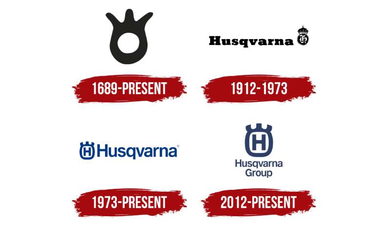
History, man, it’s like a rollercoaster, and the Husqvarna logo has had its share of loops and turns.
From Weapons to Modern Machines
They kicked things off with muskets. As time soared, Husqvarna branched into diverse products like motorcycles, sewing machines, and garden tools. The logo evolved alongside, always keeping a hint of its origin.
The Modern Era
Fast forward to today, and the Husqvarna logo stands as a testament to their legacy while embodying their modern ethos. Still deep-rooted in quality and innovation, just with less gunpowder and more horsepower.
The Colors of the Husqvarna Logo

The visual identity of Husqvarna is encapsulated in a blue and white color scheme, signifying a shield of protection, a promise of reliability, and the assurance of superior quality.
The Font Used in the Husqvarna Logo
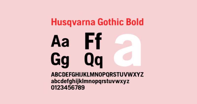
Texts, man! They speak even when they seem silent.
Sleek yet Bold
The Husqvarna typography is a blend of modern sleekness with a touch of boldness. It’s like the brand is both shouting and whispering its identity, making sure we remember them, but in the coolest way possible.
Evolution Over the Years
We’ve touched on history, but how about the logo’s actual evolution?
Early Beginnings
Starting with a simple, circular badge, the logo was a basic representation of their weapon-making phase.
The Progressive Era
With diversification came a more refined and streamlined look, retaining the circular essence but adding more elements to reflect their broader product range.
Cultural Impact of the Logo
Symbol of Quality
Around the globe, when people see that iconic logo, it spells Q-U-A-L-I-T-Y. It’s like a universal language.
Influences in Popular Culture
From featuring in motorbike races to being flaunted by gardening enthusiasts, the Husqvarna logo’s impact can be seen far and wide.
FAQ About the Husqvarna Logo
What’s the history behind the Husqvarna logo?
Well, here’s a fun tidbit! The Husqvarna logo has its roots in the company’s origin as a musket factory back in the 1600s.
The iconic gun sight logo is an homage to those beginnings. It’s like they wanted to have a piece of where they started with them as they evolved.
Did the logo change over time?
Oh, absolutely! Like many brands, Husqvarna’s logo has gone through some tweaks and refinements over the years. However, the essence – that iconic gun sight – has remained. It’s like a nod to their heritage while staying modern.
What’s the significance of the colors in the logo?
The colors, mainly blue and yellow, draw inspiration from the Swedish flag. After all, Husqvarna originated in Sweden. It’s their way of wearing their national pride on their sleeve, or, well, on their products!
How has the logo influenced the brand’s identity?
The Husqvarna logo isn’t just a symbol. It’s an embodiment of their heritage, craftsmanship, and innovation. Over time, that logo has become synonymous with quality and resilience, just like the products they craft.
Are there any hidden symbols in the logo?
While not exactly “hidden”, the gun sight in the logo is a less obvious nod to their history as a musket factory. It’s one of those things where once you see it, you can’t unsee it.
Is the logo recognized globally?
You bet! Husqvarna is a global brand, and its logo is instantly recognizable in many corners of the world. It’s amazing how a simple design can resonate across cultures, isn’t it?
Why did Husqvarna choose a gun sight for their logo?
Well, it ties back to their origins. Husqvarna began as a musket factory in the late 1600s. The gun sight is a symbolic throwback to those early days, and it speaks volumes about the brand’s long-standing history.
Have there been controversies associated with the logo?
Not that I’m aware of. Husqvarna has always been about quality products and craftsmanship. The logo, while stemming from their musket-making days, is more about honoring their past than anything controversial.
How does the logo compare to competitors’ logos?
It’s quite unique, to be honest. While other brands might have abstract symbols or initials, the Husqvarna logo stands out with its gun sight symbol and distinct colors, making it instantly recognizable.
What does the future hold for the Husqvarna logo?
While I don’t have a crystal ball, I’d reckon the essence of the logo will stay. Brands like Husqvarna, with rich histories, often retain core elements of their logos. But who knows? Maybe some modern twists are on the horizon!
Ending Thoughts on the Husqvarna logo
The Husqvarna logo! It’s one of those iconic designs that just sticks in your brain. Know what I’m talking about?
- First off, the balance in it? Chef’s kiss.
- Then there’s the color palette, super distinct and so on brand.
- And don’t even get me started on its historical significance. It’s been around, and every revamp only makes it cooler.
You see, logos aren’t just pictures. They tell stories. They’re like the flashy tattoos of the corporate world.
The Husqvarna logo? It’s not just a design—it’s a legacy, a memory, an emblem of trust. It’s like a flag in the ground, screaming: “We’re here, and we’ve been at the top of our game.”
In wrapping this all up, let’s just give a round of applause for logos that truly stand out. Because in a world brimming with brands, the Husqvarna logo doesn’t just exist—it thrives. Mad respect.
If you enjoyed reading this article about the Husqvarna logo, you should read these as well:
Renowned for his expertise in logo design and visual branding, Bogdan has developed a multitude of logos for various clients.
His skills extend to creating posters, vector illustrations, business cards, and brochures. Additionally, Bogdan's UI kits were featured on marketplaces like Visual Hierarchy and UI8.
Recommend
About Joyk
Aggregate valuable and interesting links.
Joyk means Joy of geeK