

在WPF应用中,结合阿里矢量图标库使用Geometry图标
source link: https://www.cnblogs.com/wuhuacong/p/17987022
Go to the source link to view the article. You can view the picture content, updated content and better typesetting reading experience. If the link is broken, please click the button below to view the snapshot at that time.

在我们的SqlSugar开发框架的WPF应端中,有时候我们需要在按钮或者其他界面元素上使用一些图标,框架中我们可以使用 lepoco/wpfui 项目的图标库,也可以使用Font-Awesome-WPF 图标库,另外我们如果喜欢阿里矢量图标库的,也可以通过使用Geometry图标来实现图标的展示,本篇随笔介绍在WPF应用中,结合阿里矢量图标库使用Geometry图标。
1、回顾lepoco/wpfui 项目的图标库,也可以使用Font-Awesome-WPF 图标库
在我们之前介绍过的随笔《循序渐进介绍基于CommunityToolkit.Mvvm 和HandyControl的WPF应用端开发(7) -- 图标列表展示和选择处理》,介绍了lepoco/wpfui 项目的图标库和Font-Awesome-WPF 图标库,两种都在集成在了菜单选择上的图标设置操作中,可以根据需要选择其中一种。
1)lepoco/wpfui 项目的图标库,列表选择界面
lepoco/wpfui 项目的图标库来源于Fluent System Icons,项目地址是:https://github.com/microsoft/fluentui-system-icons
这些图标映射到枚举对象 SymbolRegular 和 SymbolFilled,一个是常规的,一个是填充的图标。我们封装的选择图标界面如下所示。
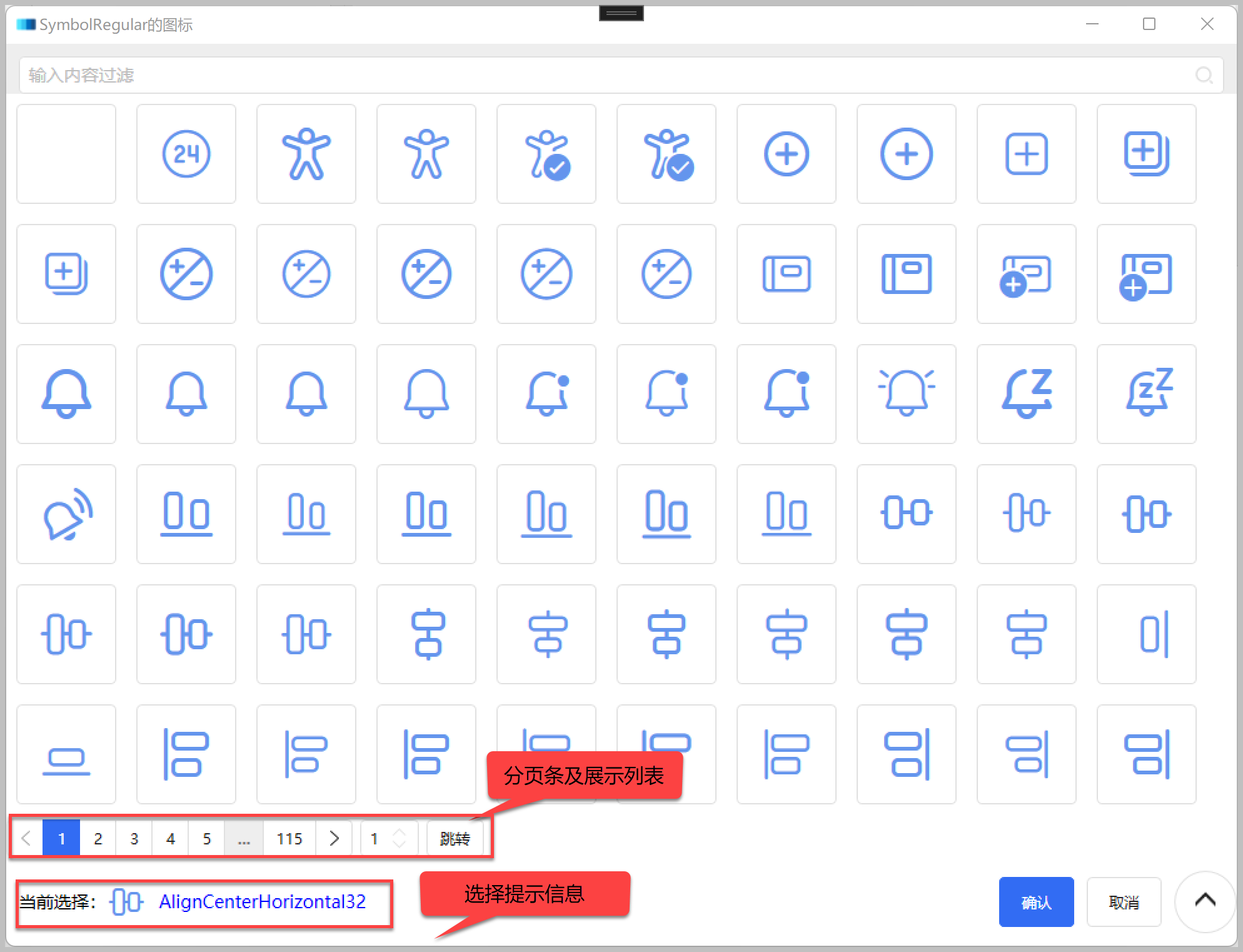
界面展示的图标代码如下所示。
<ui:SymbolIcon
    FontSize="48"
    Foreground="CornflowerBlue"
    Symbol="{Binding Text}"
    Tag="{Binding}"
    ToolTip="{Binding Text}" />
2)使用Font-Awesome-WPF 图标组件
在WPF中使用Font-Awesome-WPF 图标组件的很多,它的项目地址:https://github.com/charri/Font-Awesome-WPF/blob/master/README-WPF.md。
我们也可以用类似的方式来整合这个图标组件到项目中进行使用。图标选择界面运行效果如下所示,由于图标不是很多,所以一次性加载了(没有分页)。
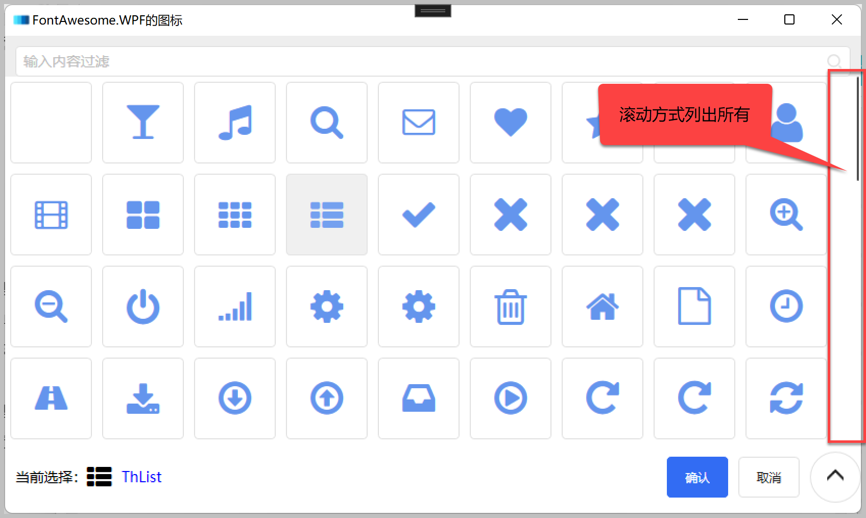
界面展示的图标,代码如下所示。
<fa:ImageAwesome
    Width="32"
    HorizontalAlignment="Center"
    VerticalAlignment="Center"
    Foreground="CornflowerBlue"
    Icon="{Binding Text}"
    Tag="{Binding}" />
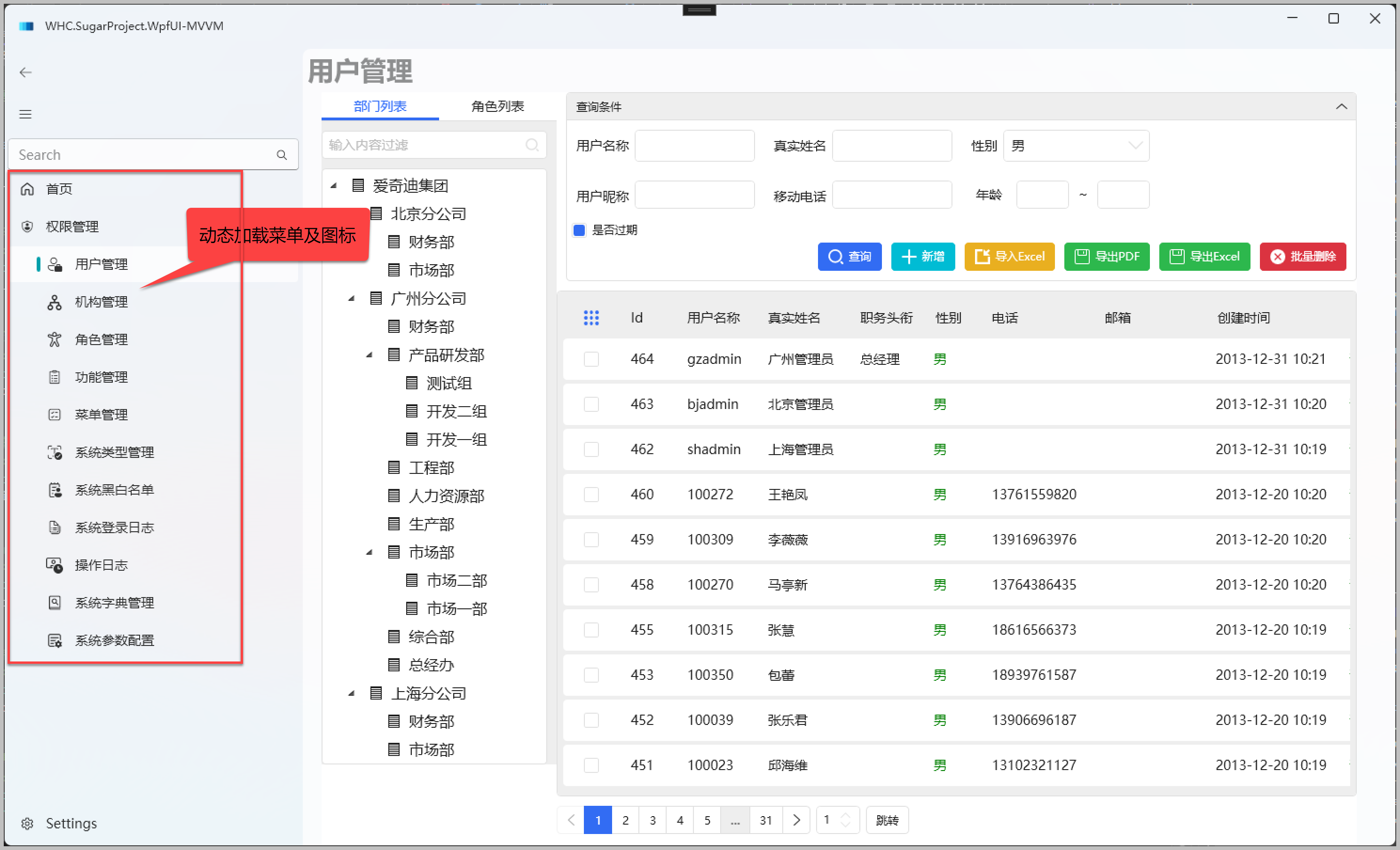
系统运行,动态从后端获取菜单及图标展示如下所示。
2、结合阿里矢量图标库使用Geometry图标
前面介绍了两种图标的应用方案,我们再来介绍一下Geometry图标的场景。
由于我们框架整合了HandyControl的一些组件的展示。HandyControl的控件 的
官方地址:https://github.com/HandyOrg/HandyControl
中文文档地址:https://handyorg.github.io/handycontrol/
通过它的控件扩展属性,我们可以很容易绑定按钮图标的展示。

部分按钮的定义如下所示。
 <Button
     Margin="5"
     hc:IconElement.Geometry="{StaticResource AddGeometry}"
     Command="{Binding EditCommand}"
     Content="新增"
     Style="{StaticResource ButtonInfo}" />
 <Button
     Margin="5"
     hc:IconElement.Geometry="{StaticResource t_import}"
     Command="{Binding ImportExcelCommand}"
     Content="导入Excel"
     Style="{StaticResource ButtonWarning}" />
通过 hc:IconElement.Geometry 的绑定,我们就可以自定义图标的展示,第一个AddGeometry 是HandyControl的内置Geometry,而第二个t_import 是我们用户扩展自定义导入的Geometry几何图形。
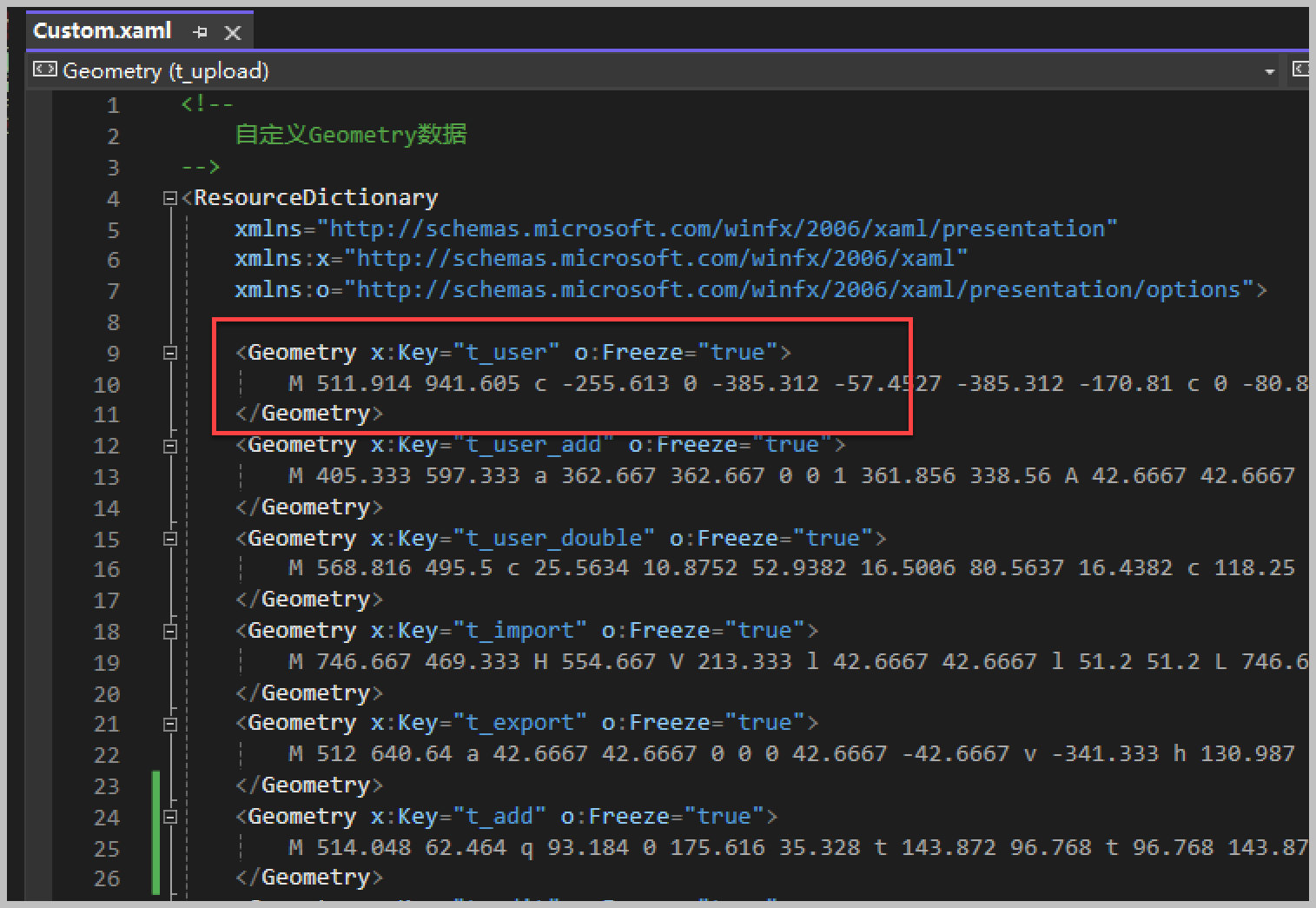
我们在项目定义一个 Geometries\Custom.xaml 文件,用来放置用户自定义的图标几何图形。
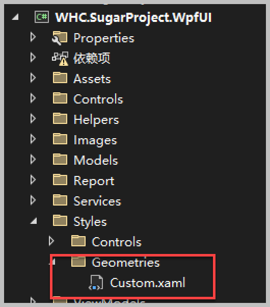
其中文件就是一个XML的文件定义。
该文件里面的集合图形,会在WPF应用的App中进行导入,如下代码所示。
<Application
    x:Class="WHC.SugarProject.WpfUI.App"
    xmlns="http://schemas.microsoft.com/winfx/2006/xaml/presentation"
    xmlns:x="http://schemas.microsoft.com/winfx/2006/xaml"
    xmlns:helpers="clr-namespace:WHC.SugarProject.WpfUI.Helpers"
    xmlns:ui="http://schemas.lepo.co/wpfui/2022/xaml"
    DispatcherUnhandledException="OnDispatcherUnhandledException"
    Exit="OnExit"
    Startup="OnStartup">
    <Application.Resources>
        <ResourceDictionary>
            <ResourceDictionary.MergedDictionaries>
                <ui:ThemesDictionary Theme="Dark" />
                <ui:ControlsDictionary />
                <!--  Geometries  -->
                <ResourceDictionary Source="/Styles/Geometries/Custom.xaml" />

                <!--  HandyControl  -->
                <ResourceDictionary Source="pack://application:,,,/HandyControl;component/Themes/SkinDefault.xaml" />
                <ResourceDictionary Source="pack://application:,,,/HandyControl;component/Themes/Theme.xaml" />
            </ResourceDictionary.MergedDictionaries>
        </ResourceDictionary>
    </Application.Resources>
</Application>
导入文件后,这些几何图形就可以在静态资源中使用了,类似上面的代码,其中的t_import就是我们声明的图形key。
 <Button
     Margin="5"
     hc:IconElement.Geometry="{StaticResource t_import}"
     Command="{Binding ImportExcelCommand}"
     Content="导入Excel"
     Style="{StaticResource ButtonWarning}" />
为了更加直观的展示我们所有的自定义几何图标集合,我们可以通过也列表页面进行加载进行展示。动态加载所有自定义的图标集合,如下逻辑代码所示。
            var appResourceDictionary = ((App)Application.Current).Resources;
            var mergedDictionaries = appResourceDictionary.MergedDictionaries;

            // 指定的 source
            var source = "/Styles/Geometries/Custom.xaml";
            var sourceUri = new Uri(source, UriKind.Relative);

            var specifiedDictionary = mergedDictionaries.FirstOrDefault(dictionary => dictionary.Source == sourceUri);
            if (specifiedDictionary != null)
            {
                var sortedList = ToSortedList(specifiedDictionary.Keys);
                foreach (string key in sortedList.Keys)
                {
                    if (specifiedDictionary[key] is Geometry geometry)
                    {
                        this.AllItems.Add(new CListItem<Geometry>(key, geometry));
                    }
                }
            }
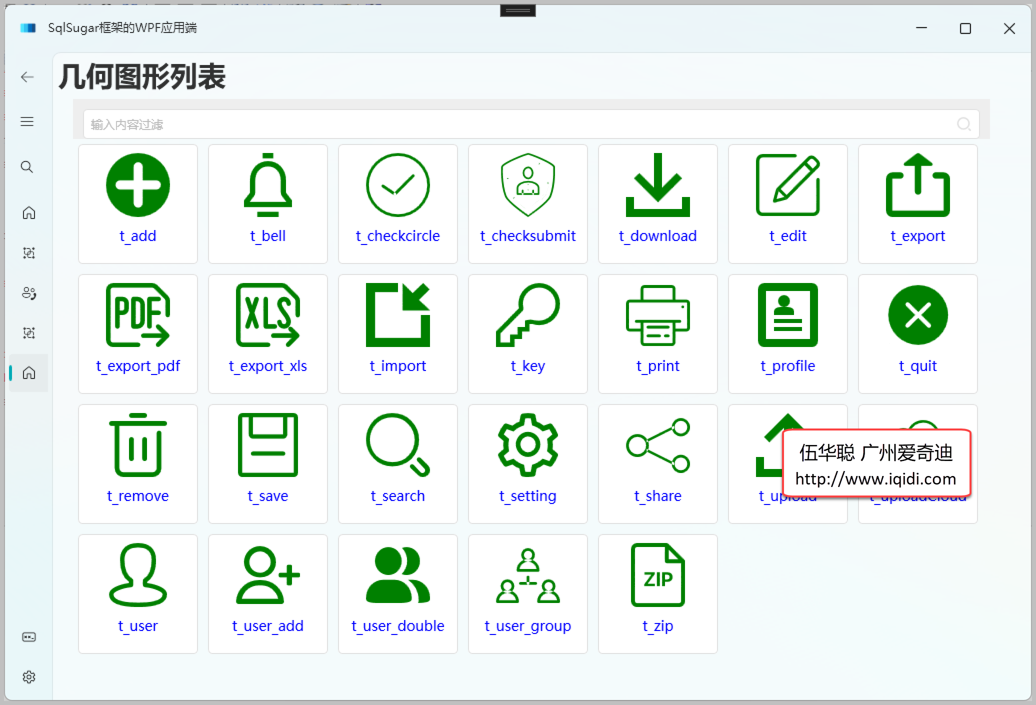
然后我们把它的数据整合到视图模型ViewModel中,并创建一个几何图形的显示列表界面,用来展示所有的图标显示,如下部分代码所示。
<ItemsControl
    x:Name="chkIcons"
    Grid.Row="1"
    Height="580"
    VerticalAlignment="Top"
    HorizontalContentAlignment="Left"
    VerticalContentAlignment="Top"
    ItemsSource="{Binding ViewModel.IconItems}"
    ScrollViewer.CanContentScroll="True"
    VirtualizingPanel.CacheLengthUnit="Item"
    VirtualizingStackPanel.IsVirtualizing="true"
    VirtualizingStackPanel.VirtualizationMode="Recycling">
    <ItemsControl.ItemsPanel>
        <ItemsPanelTemplate>
            <WrapPanel
                VerticalAlignment="Top"
                hc:ScrollViewer.IsInertiaEnabled="True"
                hc:ScrollViewerAttach.Orientation="Vertical"
                Orientation="Horizontal" />
        </ItemsPanelTemplate>
    </ItemsControl.ItemsPanel>
    <ItemsControl.ItemTemplate>
        <DataTemplate>
            <Button
                Width="120"
                Height="120"
                Margin="5"
                HorizontalAlignment="Stretch"
                VerticalAlignment="Stretch"
                Click="Button_Click"
                Tag="{Binding}"
                ToolTip="{Binding Text, Mode=OneTime}"
                ToolTipService.InitialShowDelay="240">
                <Button.Content>
                    <StackPanel>
                        <Path
                            Width="64"
                            Height="64"
                            Data="{Binding Value}"
                            Fill="Green"
                            Stretch="Uniform" />
                        <TextBlock
                            Margin="0,10,0,10"
                            FontSize="14"
                            FontWeight="Normal"
                            Foreground="Blue"
                            Text="{Binding Text}"
                            TextAlignment="Center" />
                    </StackPanel>
                </Button.Content>
            </Button>
        </DataTemplate>
    </ItemsControl.ItemTemplate>
    <ItemsControl.Template>
        <ControlTemplate TargetType="ItemsControl">
            <ScrollViewer
                Width="Auto"
                CanContentScroll="True"
                VerticalScrollBarVisibility="Visible">
                <ItemsPresenter />
            </ScrollViewer>
        </ControlTemplate>
    </ItemsControl.Template>
</ItemsControl>
最终我们可以获得下面的界面效果。
介绍了大致的加载和显示的界面代码,我们来看看如何增加 Geometry图标,我们前面介绍到可以结合阿里矢量图标库使用的,那么我们如何下载那些线上的图标库为我们所用呢。
阿里矢量图标库的地址:https://www.iconfont.cn/
我们打开官网,如下界面所示。
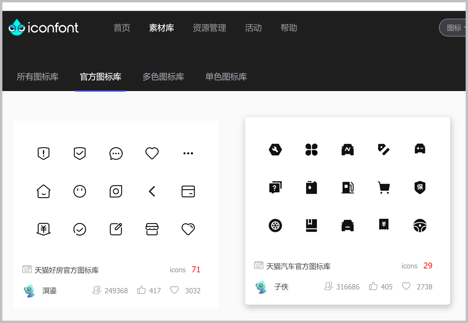
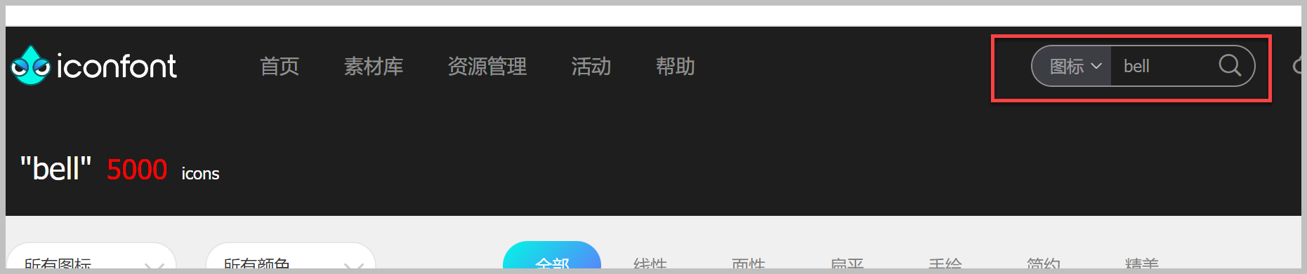
首页会列出一些新图标,我们也可以根据关键字查询指定的图表来定位处理。
按住CTRL+ShIFT+I 键进入开发者模式,查看元素的定义,找到对应的图标位置,打开代码获得Path的内容,如下操作所示。
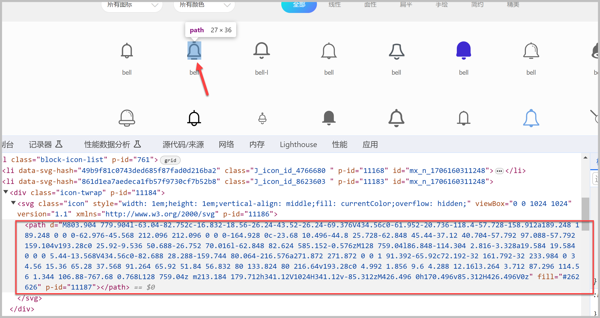
注意在元素代码中切换位置,同时在UI上获得具体的图标选中提示,通过提示确定Path的位置即可。
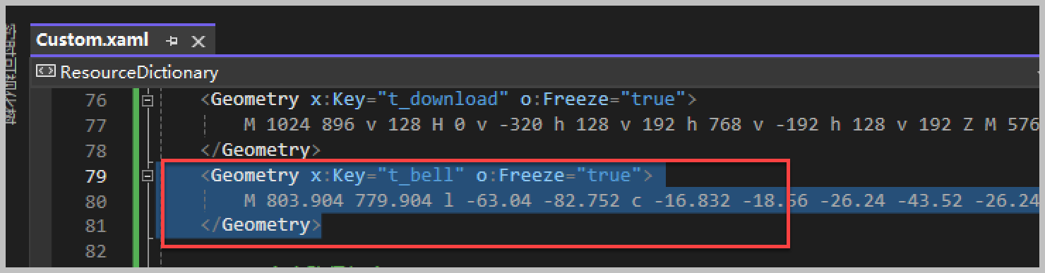
然后把这段Path的值复制到我们的 Geometries\Custom.xaml 文件中,如下所示。
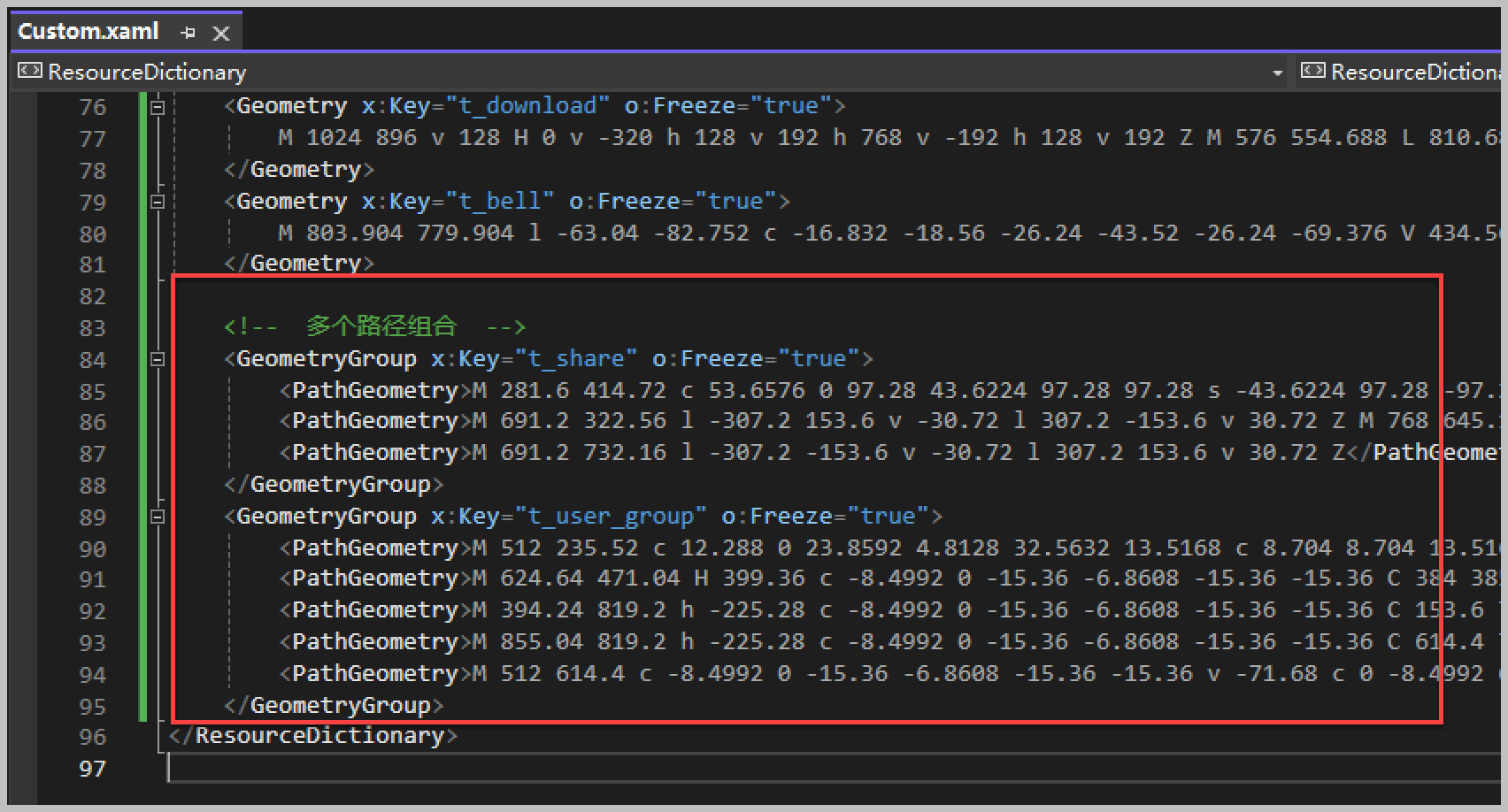
上面的图表Path只有一个,有时候 阿里矢量图标库使用Geometry图标有多个Path的组合,我们如果也要采用,那么定义稍微调整一下。
通过GeometryGroup来定义父级,然后添加多个PathGeometry集合即可,如下代码所示。
通过这样的添加,我们就可以运行UI,看到加载的Geometry图标集合了。
以上通过介绍lepoco/wpfui 项目的图标库、Font-Awesome-WPF 图标库以及阿里矢量图标库的几种方式,实现了不同场景下的图表显示和处理。
Recommend
About Joyk
Aggregate valuable and interesting links.
Joyk means Joy of geeK