

SwiftUI Button Styles And Shapes
source link: https://useyourloaf.com/blog/swiftui-button-styles-and-shapes/
Go to the source link to view the article. You can view the picture content, updated content and better typesetting reading experience. If the link is broken, please click the button below to view the snapshot at that time.

Each time I need to style a SwiftUI button I find myself struggling to remember which view modifier I need. Here’s a quick recap of the most common options.
Creating A Button
You create a button with a label, an optional role, and an action to run when the user clicks or taps on the button. There are many ways to create the button depending on what you use for the label view. First the full initializer:
Button(role: .destructive, action: deleteAll, label: {
  Label("Delete All", systemImage: "trash")
})

The possible roles are .cancel, .destructive, or .none, which is the default if you omit the role. If you use a trailing closure you can also drop the label parameter name:
Button(action: start) {
  Label("Start", systemImage: "play.circle")
}

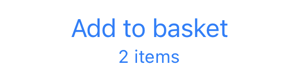
The label doesn’t have to be a Label it can be any kind of view:
Button(action: start) {
  Button(action: add) {
    VStack {
      Text("Add to basket")
      Text("2 items")
        .font(.caption)
    }
  }
}
There are convenience initializers for the common cases. For a text-only label:
Button("Start", action: start)

For a button with a text and image:
Button("Start", image: .star) {
  start()
}

The previous example assumes you have an image in the asset catalog named “star” and that you have the Generate Swift Asset Symbol Extensions build setting enabled. Xcode 15 enables it by default for new projects, you need to turn it on for existing projects.
A text string with a system image (SF Symbol):
Button("Start", systemImage: "play.circle") {
  start()
}

These convenience initializers all end up creating a Label that knows how to adapt in containers, toolbars, and menus, and provide an accessibility label, see adapting SwiftUI label style.
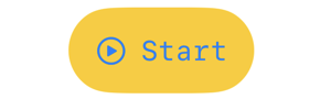
There’s also nothing stopping you applying styling to the button label. For example, to change the background and text color:
Button(action: start) {
  Label("Start", systemImage: "play.circle")
    .padding(12)
    .foregroundColor(.black)
    .background(.yellow,
       in: RoundedRectangle(cornerRadius: 12))
}

If you’re targeting at least iOS 15 you can use the bordered button styles to achieve the same effect as we’ll see next.
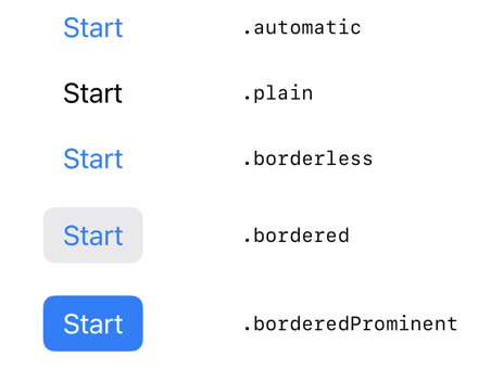
Button Styles
Apple added the buttonStyle modifier back in iOS 13, but it became more useful in iOS 15 when it gained the bordered and borderedProminent styles:
Button("Start") {}
  .buttonStyle(.automatic)         // iOS 13

Button("Start") {}
  .buttonStyle(.plain)             // iOS 13

Button("Start") {}
  .buttonStyle(.borderless)        // iOS 13

Button("Start") {}
  .buttonStyle(.bordered)          // iOS 15

Button("Start") {}
  .buttonStyle(.borderedProminent) // iOS 15
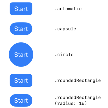
Button Border Shape
The .bordered and .borderedProminent button styles can be combined with a button border shape modifier (iOS 15) to change the shape of the button:
VStack {
  Button("Start") { start() }
    .buttonBorderShape(.automatic)

  Button("Start") { start() }
    .buttonBorderShape(.capsule)

  Button(action: start) {
    Text("Start")
      .padding()
  }
  .buttonBorderShape(.circle)  // iOS 17

  Button("Start") {}
    .buttonBorderShape(.roundedRectangle)

  Button("Start") {}
    .buttonBorderShape(.roundedRectangle(radius: 16))
}
.buttonStyle(.borderedProminent)
The .circle button border shape is new in iOS 17. I find it needs some padding added to the text label.
Control Size
The controlSize view modifier overrides the default size of the button. It ranges from mini to extra large:
VStack {
  Button("Start", systemImage: "play.circle") {
   start()
  }
  .controlSize(.mini)

  Button("Start", systemImage: "play.circle") {
   start()
  }
  .controlSize(.small)

  Button("Start", systemImage: "play.circle") {
   start()
  }
  .controlSize(.regular)

  Button("Start", systemImage: "play.circle") {
   start()
  }
  .controlSize(.large)

  Button("Start", systemImage: "play.circle") {
   start()
  }
  .controlSize(.extraLarge)
}
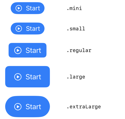
Note that the effect of the control size is platform and context specific. On iOS, there’s no noticeable difference between mini and small.
Custom Button Styles
As with labels, if there’s a set of view modifiers you want to apply repeatedly to buttons you can create your own custom button styles:
struct MonospacedButtonStyle: ButtonStyle {
  func makeBody(configuration: Configuration) -> some View {
    configuration.label
      .padding()
      .foregroundStyle(.tint)
      .background(.yellow, in: Capsule())
      .fontDesign(.monospaced)
  }
}
Applying our custom style to a button:
Button("Start", systemImage: "play.circle") {
  start()
}
.buttonStyle(MonospacedButtonStyle())
Recommend
About Joyk
Aggregate valuable and interesting links.
Joyk means Joy of geeK