
9

Creating Ridgeline Plots: From Pulsars To Pop Culture
source link: https://blogs.mathworks.com/graphics-and-apps/2024/01/10/creating-ridgeline-plots-from-pulsars-to-pop-culture/
Go to the source link to view the article. You can view the picture content, updated content and better typesetting reading experience. If the link is broken, please click the button below to view the snapshot at that time.
Creating Ridgeline Plots: From Pulsars To Pop Culture » MATLAB Graphics and App Building
In 1979, an English rock band produced what Rolling Stone would describe as one of the best albums of all time with an album cover that would become iconic in data visualization. Joy Division's album Unknown Pleasures (1979) features a stack of wavy lines that depict activity emanating from the first pulsar star discovered, PSR B1919+21. Starting with the death of a star, we'll look at the timeline of events that led to this pop culture classic and then we'll learn how to create ridgeline plots in 2D, 3D, and polar coordinates in MATLAB.

Joy Division - Unknown Pleasures album cover.
Factory Records
The backstory
Collapse of a supergiant
Millions of years ago a star within the Milky Way galaxy exploded into a supernova leaving behind an extremely compressed, densely packed neutron star with a diameter of about 19 km (12 mi) containing more than 466,000 times the mass of Earth. As a result of the quick collapse and extreme compression, the star’s rotation accelerated in the same way an ice skater spins faster by pulling their arms toward their body. The star formed a magnetic field a quadrillion times stronger than Earth’s with magnetic dipoles offset from its rotation axis. With every rotation of the star, every 1.337 seconds, a beam of electromagnetic radiation emitting from its magnetic poles sweeps across space at the speed of light like a lighthouse beacon waiting to be discovered.
Discovery of a 1000-year-old signal
In 1967 Jocelyn Bell Burnell, a postgraduate student at the University of Cambridge, was studying radio signals from quasars using a custom-built radio telescope. The telescope happened to intercept pulsating beams of electromagnetic radiation that departed PSR B1919+21 one thousand years prior and the radiation happened to be within the radio frequency range of the telescope. As the radio waves reached the telescope’s antennas, the signal was amplified and converted to a voltage signal that moved a pen along a continuously scrolling sheet of paper producing the strip chart shown below. The power and regularity of this recurrent extraterrestrial signal with a fixed period of ~1.3 seconds seemed artificial at first, earning it the nickname LGM (little green men), but it was soon realized that Bell and her team had discovered pulsar stars and the world had its first visualization of a pulsating neutron star.

A strip chart showing the first confirmed observation of PSR B1919+21, initially named CP1919.
Churchill Archives Center and the Hewish family, ref. HWSH Acc 355.
A creative leap into digital data visualization
Around the time Bell published her work (1968, Nature), data visualization was entering the digital revolution. Harold Craft, Jr, a graduate student at Cornell University, set out to investigate whether there were patterns in the variation of pulsar waveforms. Craft recorded radio signals from PSR B1919+21 using the most sensitive radio telescope available at the time, located at the Arecibo Observatory in Puerto Rico. Rather than creating analog strip charts in real-time, the radio signals Craft recorded were digitized and stored to disk providing the flexibility to apply digital transformations to the data and to create visualizations that were not previously possible.
To visually analyze the underlying structure of the pulsar’s radio signal, Craft segmented the continuous radio signal into ~120 ms temporal windows centered at each pulse and plotted each segment as black lines in a vertical stack, bottom to top, at a fixed vertical interval. The proximity of the curves caused the lines from different segments to overlap making it difficult to distinguish between each segment of data, so Craft wrote a program to fill the area under each curve. This visualization is known today as a ridgeline plot or a joyplot (hmmm, I wonder why). Craft also considered plotting the filled curves in 3D by orienting each curve upward which, he noted, was aesthetically pleasing but unsuitable for visual analysis. Craft didn’t find a pattern to the varying waveforms but published his findings, along with his ridgeline plots, in his PhD thesis (Craft Jr, 1970).

A photo of Craft's original ridgeline plot on pg. 215 of this thesis.
I've created an animation that illustrates what makes a pulsar signal 'pulse', depicting the star's electromagnetic beacon sweeping across a receiver. The data used to produce the ridge lines are simulated with random variation that mimics the characteristics of real pulsar radio signals. The source of this variation, potentially interstellar plasma or solar wind, remains a topic of debate.
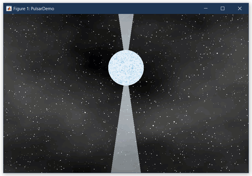
Animation of a pulsar star's electromagnetic signal.
A scintillating visualization gone viral
Four months after Craft submitted his thesis, his ridgeline plot of PSR B1919+21 was published on a full page in Scientific American (1971). It appeared again in 1974 in the book Graphis Diagrams: The Graphic Visualization of Abstract Data with white lines against a black background and again in 1977 in the Cambridge Encyclopedia of Astronomy in its original form, with black lines against a white background.
A copy of the Cambridge Encyclopedia of Astronomy was at a cafe at the Manchester Central library where Joy Division’s guitarist Bernard Sumner happened to be taking a work break. Sumner found the article and immediately felt a connection with the stacked wavy lines in Craft's ridgeline plot. He sent the image to Peter Saville, the graphics artist for the band’s record label, who imprinted the lines in white against a black album cover with no other graphics or text.
Nearly immediately after the release of Unknown Pleasures in 1979 the image acquired a cult following and continues to make its way through graphic designer and data visualization circles. It has appeared on t-shirts, knitted sweaters, leather jackets, other album art, Disney apparel, and tattoos. Versions of Craft’s ridgeline plot have even appeared in MathWorks’ Mini Hack competition and in the MATLAB Central File Exchange!
Creating ridgeline plots in MATLAB
Acquire the data
I couldn't track down Harold Craft, Jr.'s original PSR B1919+21 data. However, creative coder Michael Zoellner extracted the data from an svg image of the ridgeline plot. The data file, pulsar.csv, is available in a number of places (Mike Bostock's blog, Veli's blog, borgar's GitHub). Since the data were extracted from an image without a y-axis, it is an approximation of the original data, and the scale is arbitrary.
datasource = 'https://github.com/MATLAB-Graphics-and-App-Building/matlab-gaab-blog-2024/raw/3eb648f40f1ba8e5517138f34d23567ab3af6d29/RidgelinePlotsJoyDivision/pulsar.csv';
pulsardata = readmatrix(datasource).';
pulsar.csv contains an 80x300 matrix of values from 80 pulses with 300 samples each. I prefer working with data that are organized such that each column is a variable and each row is an observation or sample from that variable. I transpose the data to fit this description so that pulsardata has 80 columns, one for each pulse, and 300 rows, one for each sample. Column n is data from the nth curve from the top of Craft's image.
[nSamples,nPulses] = size(pulsardata)
nSamples = 300
nPulses = 80
2D Ridgeline plot (aka Joyplot)
We'll start by recreating Craft's original 2D ridgeline plot. The 80 lines need to be vertically stacked at a fixed interval by adding vertical offsets to each pulse. I selected an interval that approximates the space between lines in Craft's original image.
interval = 8;
vertOffsets = (nPulses-1)*interval : -interval : 0;
ydata = pulsardata + vertOffsets;
Create x coordinates for the 300 samples with a range that reflects the scale of the pulsar data. I chose to center the x values at x=0.
xdata = linspace(-220,220,nSamples);
Ridgeline without fill. Let's take a look at Craft's first version before he decided to fill the ridge lines (figure below, left).
figure(Color='w')
tiledlayout(1,2,TileSpacing='Tight',Padding='tight')
nexttile
plot(xdata,ydata,'k-');
axis equal tight off
title('Ridgeline without fill')
Ridgeline with fill. Now we add the fill. It may seem as easy as plotting each pulse as a filled region using polyshape or patch but in both cases, the region would be closed so each pulse would have a straight horizontal baseline connecting the two endpoints. We don't want that. Instead, I'll fill the curves using a white edgeless patch and will plot black lines on top of the otherwise invisible patches. We also have to be careful about the order in which the lines are plotted. We'll plot them from top to bottom to get the right overlap (figure below, right).
nexttile()
hold on
for i = 1:nPulses
patch(xdata, ydata(:,i),'w',EdgeColor='none')
plot(xdata,ydata(:,i),'k-')
axis equal tight off
title('Ridgeline with fill')

Invert colors. For the final step to recreate the Joy Division album cover, we'll invert the colors by setting the figure and patch colors to black and the line color to white, and increase the line width.
figure(Color='k')
hold on
for i = 1:nPulses
patch(xdata, ydata(:,i),'k',EdgeColor='none')
plot(xdata,ydata(:,i),'w-','LineWidth',1)
axis equal tight off

3D ridgeline plots
Recall that Craft considered displaying the pulses in 3D rather than overlapping 2D lines. Here are two ways to recreate that idea.
3D waterfall plot
A waterfall plot adds a third dimension to the ridgeline plot. Instead of overlapping filled curves like a flat collage of paper cutouts, each curve is oriented upward in the z direction.
figure(Color='k')
axes(Units='normalized',Position=[0 0 1 1])
h = waterfall(xdata,vertOffsets,pulsardata');
h.EdgeColor = 'w';
h.FaceColor = 'k';
axis equal tight off

Note that each vertical slice created by waterfall is a closed polygon. You could hide the vertical and horizontal edge lines by setting axis limits that clip those edges.
xlim(xlim()*.99)
minZ = min(pulsardata,[],'all');
zlim([minZ*.99, inf])
3D line plot
Instead of using waterfall, 3D lines could be plotted using plot3 and filled using patch, adhering to the same principles employed in the filled ridgeline plot.
figure(Color='k')
axes(Units='normalized',Position=[0 0 1 1])
hold on
for i = 1:nPulses
yvec = vertOffsets(i) .* ones(nSamples,1);
patch(xdata, yvec, pulsardata(:,i),'k',EdgeColor='none')
plot3(xdata,yvec,pulsardata(:,i),'w-')
axis equal tight off
view(3)

Here's another version of this plot I developed for the MathWorks office in Cambridge, UK, just 6.5 miles (~10.5 km) from the Mullard Radio Astronomy Observatory where Jocelyn Bell Burnell discovered PSR B1919+21! For this piece, I smoothed the data, increased the amplitudes, and added perspective projection.

A wall at the MathWorks office in Cambridge, UK featuring a 3D ridgeline plot of data from PSR B1919+21
Polar plot
There are many other ways these data could be visually inspected and analyzed. Let's bring this full circle by wrapping each line to polar coordinates using polarplot. I've plotted the pulse waves with and without radial offsets. Amusingly, the first image resembles a vinyl record!
theta = linspace(-pi,pi,nSamples);
f = figure(Color='k');
f.Position(3) = 800;
tiledlayout(1,2,TileSpacing='None',Padding='tight')
nexttile()
polarplot(theta, ydata, '-w');
set(gca,'ThetaZeroLocation','top','ThetaDir','clockwise');
axis off
rlim([-10 650])
title('With radius offsets',Color='w')
nexttile()
polarplot(theta, pulsardata, '-w',Clipping='off');
set(gca,'ThetaZeroLocation','top','ThetaDir','Clockwise');
axis off
rlim([-70,50])
title('Without radius offsets',Color='w')

To see the polar axes,
pax = gca();
axis(pax,'on')
pax.Color = 'k';
pax.ThetaAxis.Color = 'w';
pax.RAxis.Color = 'w';
Next steps
We've reviewed a variety of methods to visualize cyclical data, from ridgeline plots to waterfall plots, 3D line plots, and even polar plots. I invite readers to unleash your creativity by producing unique visualizations using these data or these techniques. I'd love to see what you produce.
What would the album cover look like if the producers had MATLAB back in 1979?
What signals have you received from Little Green Men?
Recommend
About Joyk
Aggregate valuable and interesting links.
Joyk means Joy of geeK