

The Portland Trail Blazers Logo History, Colors, Font, and Meaning
source link: https://www.designyourway.net/blog/portland-trail-blazers-logo/
Go to the source link to view the article. You can view the picture content, updated content and better typesetting reading experience. If the link is broken, please click the button below to view the snapshot at that time.

The Portland Trail Blazers Logo History, Colors, Font, and Meaning

Did you ever notice how some symbols, some designs, just… stick with you? Out of all the iconic emblems in the sports world, the Portland Trail Blazers logo just has this thing about it, right?
Here’s the deal.
I’ve been lost in the digital world, designing stuff for the web for as long as I can remember. And man, every now and then, there’s this logo or image that makes me go, “Whoa, that’s rad.”
Now, the Portland Trail Blazers logo?
It’s one of those.
But why? What makes it stand out from the maze of other sports team emblems?
That’s what I’m diving into today.
- The Story: Beyond just the lines and curves, there’s a tale it tells.
- The Aesthetics: Colors, shapes, and why it works the way it does.
- Cultural Impact: Blazers’ fans, city vibes, and the essence it’s come to represent.
By the end, you’ll get why this isn’t just another piece of branding. It’s a piece of history, an art, and a reflection of its city and its people.
The Meaning Behind the Portland Trail Blazers Logo
Have you ever glanced at a logo and thought, “Woah, what’s the story here?” Well, let’s dive deep into the Portland Trail Blazers’ insignia.
The Five-on-Five Vibe
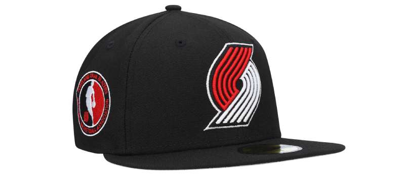
Ever noticed those five lines on each side of the Blazers’ logo? They aren’t just funky streaks for aesthetics. Nah, they’re way deeper.
Those lines represent two teams of five players duking it out on the basketball court. It’s all about the thrill of the competition, folks.
Spinning Like a Top
I’ve heard a couple of peeps say that the swirling pinwheel looks like it’s spinning. And yup, it’s all about speed and motion. Basketball’s all about that dynamism, that ebb, and flow.
The design kinda throws it back to the rapid transitions and heart-stopping moments we all live for on the court.
The History of the Portland Trail Blazers Logo
Alright, pals, let’s time-travel a bit and uncover the roots of this epic logo.
The Birth of the Icon
Back in the ’70s when flared jeans and disco balls were the rage, the Portland Trail Blazers embarked on a journey to find their identity. The result? This quirky, dynamic pinwheel that we’ve all come to love and recognize.
The Evolution Saga
Like all things legendary, this logo has had its share of makeovers. Minor tweaks here and there, but through decades, the essence remains the same: that emblem of competition and the spirit of the game.
The Colors of the Portland Trail Blazers Logo
Colors, peeps, aren’t just… colors. They carry vibes, emotions, feels.
Red and Black – More Than Just a Palette
Red screams passion, intensity, and energy. Black? Timeless, powerful, a tad mysterious. Combine the two? You get the fiery and fierce spirit of the Blazers, ready to take on any challenge.
The Font Used in the Portland Trail Blazers Logo

Typography nerds, this one’s for y’all!
Sleek and Modern
The font used in the Blazers’ logo is all about modernity. Clean lines, sharp edges, and an unmistakable boldness. It’s like that power suit you wear for big meetings – making a statement without saying a word.
Pop Culture and the Portland Trail Blazers Logo
This logo’s not just confined to basketball jerseys. Nope, it’s got a life of its own in the world of pop culture.
Streetwear and Beyond
Stroll down a street, and you might just see a kid rocking a Trail Blazers cap or a backpack with the emblem. It’s become a symbol of coolness, of belonging to the basketball cult.
Tattoos and Art
Yup, fans love the team so much that they’re inking the logo on their skin. Plus, contemporary artists are drawing inspiration, creating paintings and sculptures, all paying homage to the Trail Blazers’ legacy.
Critiques and Appreciation
Every masterpiece has its lovers and haters.
Standing Out in the Crowd
While some logos in the NBA tend to lean towards the conventional side, the Blazers’ insignia has always stood out. It’s avant-garde, fresh, and unmistakably unique.
Some Raised Eyebrows
Of course, with uniqueness, comes critique. Some say it’s too abstract, too far from traditional basketball symbols. But hey, what’s art without a dash of controversy?
FAQ About the Portland Trail Blazers Logo
What’s the history behind the Portland Trail Blazers logo?
Ah, man, a trip down memory lane! So, the Blazers logo has always been about representing that competitive spirit. It’s basically a modern take on the classic 5-on-5 basketball formation.
There are five lines on one side, five on the other, representing two teams facing off. The swirling design hints at the dynamism of the game. There’s more to a logo than just colors and shapes, you know?
Why does the logo have that particular color scheme?
Well, here’s the thing. The Blazers have been rockin’ the red, black, and white since day one. Red? It’s fierce, and passionate, just like the game itself. Black adds a touch of class and toughness.
White’s all about purity and clarity. Combined? You’ve got a color scheme that’s instantly recognizable and just screams “Trail Blazers.”
Has the logo undergone any significant changes?
Over the years, yeah, there have been tweaks here and there. The foundational concept, those two interlocking swirls, has pretty much stayed consistent.
But in terms of refining the design, making it sleeker, or updating the font? Sure thing. Teams evolve, and so do their logos. But the Blazers have kept that iconic spirit intact. No drastic overhauls, just some touch-ups.
Why the name “Trail Blazers” and how does it relate to the logo?
The name’s a nod to the pioneers who blazed trails through the American West. It’s like carving a path, showing leadership, setting trends.
The logo, with its dynamic swirls and competitive clash, encapsulates the energy and trailblazing spirit of the team. They’re not just playing ball; they’re setting the pace.
What’s the significance of the five-on-five design?
Basketball, at its core, is a 5-on-5 game, right? The logo cleverly showcases this by having those five lines facing another set of five lines.
It’s like an abstract portrayal of a game in action. Two teams, head-to-head, giving it their all. The essence of competition.
Is there any hidden symbolism in the logo?
Deep dive time! Beyond the obvious 5-on-5 setup, the swirl in the center could also be seen as representing a tornado or vortex.
It captures the whirlwind intensity of a basketball match, where everything’s in motion and anything can happen. But honestly, sometimes a cool design is just a cool design.
Why did they choose a pinwheel design?
The pinwheel, or swirl, whatever you call it, captures motion and energy. Basketball is a fast-paced, dynamic game, and this design mirrors that. Players moving, ball zipping around, strategy constantly shifting – that’s the essence of the game. The pinwheel brings that vibe to life.
How does the logo differ from other NBA team logos?
What sets the Blazers logo apart is its abstract nature. Many NBA logos lean into mascots, initials, or city symbols. But Portland? They’ve gone with a more symbolic representation of the game itself.
It’s distinctive, and stylish, and once you know what it represents, it makes perfect sense.
Are there any controversies related to the logo?
As with anything popular, you’ll hear some murmurs and whispers. Some fans over the years have wanted more radical changes or a return to a past version.
Others have debated over hidden meanings in the design. But controversy? Nah, it’s mostly just passionate fans having passionate opinions.
Who designed the original Portland Trail Blazers logo?
The original gem was the brainchild of the cousin of one of the team’s founders. The guy’s name is Frank Glickman, and he hit it out of the park with this design.
Just goes to show, that sometimes the best inspiration comes from close to home.
Ending Thoughts on the Portland Trail Blazers logo
So, have you ever stared at that logo and felt like it’s whispering a visual poem right to your heart? Because, man, I sure have. It’s like a blend of historical basketball vibes and the edginess of Portland street art.
- First off, those swirling lines?
- Mind. Blown.
- The bold red and black combo?
- A literal fire on the court.
- And don’t even get me started on the symmetry.
- It’s like, ‘Hello, perfect balance in a chaotic game!’
To wrap this wild ride up, the Portland Trail Blazers logo ain’t just a design, folks. It’s a story. A vibe. A mood. It’s the past meeting the present, dancing on the very lines of the court. It’s the city’s heartbeat in graphic form.
So next time you spot it, give a nod to the artistry, the history, and all the groovy feel it brings. Logo game? Undeniably strong.
If you enjoyed reading this article about the Portland Trail Blazers logo, you should read these as well:
Renowned for his expertise in logo design and visual branding, Bogdan has developed a multitude of logos for various clients.
His skills extend to creating posters, vector illustrations, business cards, and brochures. Additionally, Bogdan's UI kits were featured on marketplaces like Visual Hierarchy and UI8.
Recommend
-
16
Milwaukee Bucks di Pratinjau Taruhan Portland Trail Blazers 30-17 Milwaukee Bucks menuju Portland untuk menghadapi Trail Blazers 29-18 Jumat dalam taruhan NBA favorit saya malam itu. Sebelum kita sa...
-
4
Nike founder Phil Knight makes $2 billion bid for NBA's Portland Trail Blazers team
-
5
The Commonwealth B...
-
16
The JP Morgan Chase Log...
-
37
The Barclays Logo...
-
21
The BNP Paribas Logo...
-
9
The UBS Logo History,...
-
4
The Standard Charte...
-
5
The UniCredit Logo...
-
8
The HSBC Logo Hist...
About Joyk
Aggregate valuable and interesting links.
Joyk means Joy of geeK