

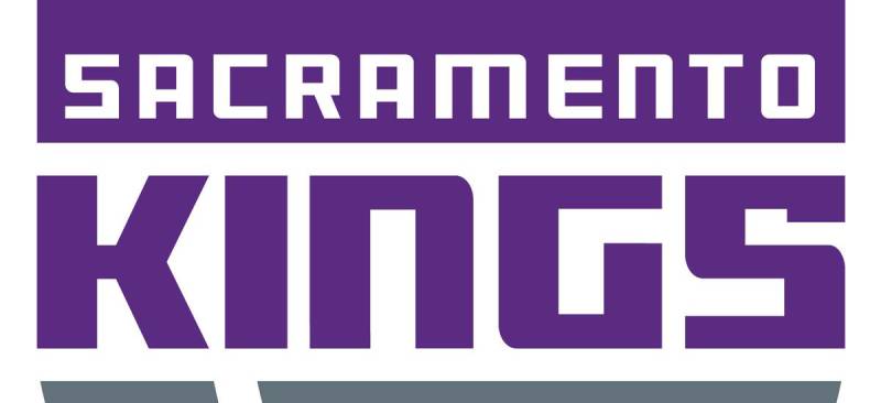
The Sacramento Kings Logo History, Colors, Font, and Meaning
source link: https://www.designyourway.net/blog/sacramento-kings-logo/
Go to the source link to view the article. You can view the picture content, updated content and better typesetting reading experience. If the link is broken, please click the button below to view the snapshot at that time.

The Sacramento Kings Logo History, Colors, Font, and Meaning

When I see the Sacramento Kings logo, it’s like flipping through a visual history book. So much more than just colors and shapes – we’re talking about branding, basketball, and a legacy that’s seeped into the very fabric of the NBA.
You might wonder, “Why the fuss over a logo?”
Well, in my years as a web designer, I’ve learned that logos are the silent ambassadors of brands. Think about it. Nike’s swoosh. Apple’s apple. These designs have stories, evolution, and purpose behind them.
And so does the Sacramento Kings logo.
By the time you get to the end of this piece, you’ll not just see a logo. You’ll understand the tales it tells, the shifts in design thinking, and the nuances that make it iconic.
We’ll dive into:
- The evolution and transformation of the Kings’ emblem.
- The symbolism behind the design choices.
- The impact of the logo on fans and basketball culture.
Trust me, by the end, you’ll look at every logo with new eyes. And the Sacramento Kings? You’ll appreciate that piece of art like never before.
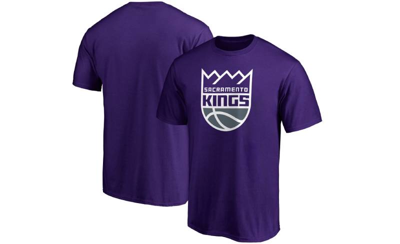
The Meaning Behind the Sacramento Kings Logo
Deep Dive into the Crown
Alright, let’s break it down. That crown on top? It’s not just for show.
It represents royalty, strength, and leadership. The Kings, by name alone, have always pushed that regal vibe, and it’s quite fitting for a team looking to dominate the NBA.
Ball & Blades
Ever noticed the basketball? It’s subtly merged with the crown, symbolizing the essence of the game. But wait, there’s more.
Those little blades or spikes jutting out? It’s about defense and offense – the double-edged sword of basketball. The Kings are here to play, both in offense and defense, and their logo screams that.
The History of the Sacramento Kings Logo
From Royals to Kings
Back in the day, our Kings weren’t always the Kings. They started as the Rochester Royals. The logo then? Way different. As the team evolved, so did their visual identity.
The Evolutionary Timeline
There’s a rich tapestry here, people. From the ’50s to now, the logo has seen several revisions. The transition from the Royals to the Kings brought about bolder colors, sharper design, and that iconic crown we all recognize today.
The Colors of the Sacramento Kings Logo
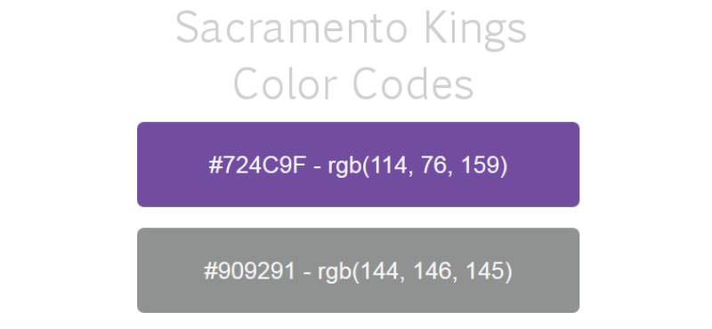
Purple Reign
No, not a typo. We’re talking about the color purple. It symbolizes royalty, power, and ambition. And boy, do the Kings own it. It’s vibrant, it’s loud, and it stands out – just like a King should.
Silver Lining
The addition of silver? It’s not just because it looks cool (even though it does). Silver is about refinement, dignity, and a touch of mystery. It complements that regal purple like peanut butter does with jelly.
The Font Used in the Sacramento Kings Logo
Bold and Decisive
Ever looked at that font and felt a sense of urgency? That’s by design. The font is thick, bold, and quite assertive. It’s like the team’s saying, “We’re here, we’re clear in our intentions, and we’re going for the win.”
Simplicity in Style
While it’s bold, it’s also simple. No crazy curls or twirls. It’s straightforward and effective, which kind of sums up basketball when you think about it.
Symbolism in Placement
The Ball’s the Star
You might’ve noticed, the basketball is dead center, right? That’s no accident. It’s the heart of the game, the heart of the team, and the heart of the logo. Everything revolves around it, and rightfully so.
Crowning Glory
The crown, loftily placed on top, isn’t just about royalty. It’s a testament to aspirations, the team’s goals, their drive to be at the pinnacle of the NBA universe.
Pop Culture and the Sacramento Kings Logo
Sneakerheads Rejoice
This logo hasn’t just stayed on the court. It’s made its way into the streets! On caps, tees, and especially sneakers. The color combo and the design make for some fire streetwear.
Influencing Art
You’d be surprised how often the logo finds its way into murals, tattoos, and digital art. Its unique design and color palette make it an interesting subject for creative expression.
FAQ About the Sacramento Kings Logo
Who designed the Sacramento Kings logo?
Oh man, I remember when the Kings unveiled their fresh new look. The current Sacramento Kings logo, which they introduced in 2016, is a modern take on their retro designs. It’s a fusion of the past and the present.
I think the simplicity of it is what makes it so striking. There’s been a couple of design teams involved over the years, but this one really captures the essence of the team’s history and the city’s spirit.
What’s the symbolism behind the colors?
Alright, so color symbolism in sports is always pretty rad. The Sacramento Kings’ primary colors are purple, silver, and black. Purple? It’s all about royalty, man.
Kings, right? As for silver, it’s reflective of strength and persistence. Lastly, the black throws in that intense and competitive vibe. Together, they paint a picture of a team that’s both noble and fierce.
Has the logo changed over the years?
Totally! Teams like to keep things fresh, you know? The Sacramento Kings’ logo has seen various transformations since they moved to Sacramento in 1985.
Earlier versions had a more classic touch, but the 2016 refresh brought back some of that old-school charm. It’s been a journey of evolving branding while still giving a nod to the legacy.
What was the inspiration behind the logo?
So, diving a bit into history here. The logo inspiration primarily centers around the idea of royalty, which is, duh, obvious given the team’s name.
The lion with a basketball and the crown elements scream monarch vibes. Combine that with the sleek modern design, and you’ve got a bridge between the rich history of the franchise and its dynamic future.
How does the logo represent Sacramento?
Sacramento, baby! The heart of California! The logo doesn’t just represent the team, but it’s also a nod to the vibrant community of Sacramento.
The city is all about rich history, cultural diversity, and a deep-seated love for basketball. When you look at the logo, you can feel the energy and passion of the city reflected back.
Why is there a lion in the design?
Ah, the mighty lion! It’s not just there to look cool. The lion is a symbol of leadership, strength, and courage. It complements the “Kings” theme, emphasizing the regal and dominant nature of the team.
Plus, lions are just awesome, right? Adds a bit of that raw power vibe to the mix.
Are there alternative or secondary logos for the Kings?
You bet there are! Teams usually have a few tricks up their sleeves. The Kings have secondary logos that they use on various merch, court designs, and promotional stuff.
These typically have variations of the lion, the basketball, or the crown, but in a simpler or more stylized form. Keeps things spicy!
How has fan reception been to the logo changes?
Change can be tough, right? Fans are passionate, and they get attached. When the 2016 logo dropped, there was a mix of reactions.
Some folks absolutely loved the throwback elements, while others, well, they kinda missed the old one.
But as with all things, over time, the logo has found its place in the hearts of the Kings’ faithful.
Can we expect any logo changes soon?
Ah, the million-dollar question! Teams tend to keep this stuff under wraps. But, based on the general pattern of sports branding, teams usually stick with a design for a decent chunk of time before considering another revamp.
As of now, the Kings seem pretty settled with their current design, but who knows? Maybe in a few years, they might surprise us.
How does the logo compare to other NBA team logos?
A bit of a subjective one, huh? I mean, every NBA logo has its own flavor. The Kings’ logo stands out with its royal theme and colors.
Some might argue it’s more minimalistic than other logos, while some feel it perfectly balances modernity and legacy. If you ask me? I think it holds its own pretty darn well in the sea of NBA team logos!
Ending Thoughts on the Sacramento Kings Logo
It’s like visual poetry in the world of sports design. It’s got this slick combo of royal and modern vibes. A nod to the kings of the past, but a firm foot in today’s court.
- First, that shade of purple? Dope. Straight up, it’s royal without being snobbish.
- The crown? It’s got a kind of, “We’re here to play and reign” attitude.
- And the lion? A regal touch. Nature’s king meeting the court’s king. Perfect mesh.
To wrap this jam up: The Sacramento Kings logo is more than just ink on jerseys. It’s a story.
It’s the hustle of yesterday and the promise of tomorrow, all wrapped up in one emblem. Keep your eyes peeled, folks, ’cause designs like this? They don’t just define a team; they define an era.
If you enjoyed reading this article about the Sacramento Kings Logo, you should read these as well:
Renowned for his expertise in logo design and visual branding, Bogdan has developed a multitude of logos for various clients.
His skills extend to creating posters, vector illustrations, business cards, and brochures. Additionally, Bogdan's UI kits were featured on marketplaces like Visual Hierarchy and UI8.
Recommend
About Joyk
Aggregate valuable and interesting links.
Joyk means Joy of geeK