
同样是佳明手表,为什么你开发的表盘图片很糊,高手的清晰很多呢
source link: https://www.daozhao.com/10986.html
Go to the source link to view the article. You can view the picture content, updated content and better typesetting reading experience. If the link is broken, please click the button below to view the snapshot at that time.

同样是佳明手表,为什么你开发的表盘图片很糊,高手的清晰很多呢
同样是佳明手表,为什么你开发的表盘图片很糊,高手的清晰很多呢
在佳明的开发者论坛无意中发现有个开发者分享了自己开发的表盘(原文地址Github of Garmin WatchFaces for New Programmers),从宣传图看感觉页面效果还是很清晰的,实际安装到手表上也感觉效果不错。于是特意留言询问开发者其中的奥秘。
Great !
I'm curious why your pictures look sharp on the watch but mine are blurry, since you did not upload your resource images to github, I do not know the magic, can you help me? Thanks.
就这么个简单的评论没想到她很快就回答了,并且回答的很详细,小姐姐真是个好人。
大致的意思是她使用的是一个叫Vectornator(现在叫Curve)的软件来做图,它能够导出矢量图,很适合一次创作导出不同的分辨率供不同的平台使用;其次她根据官网了解到不同手表的分辨率以及哪些颜色能在这些手表上显示的更清晰,她在做图的时候尽可能的使用这些颜色来创作。
她还分享一些她的案例和小技巧。
Thanks!! I do have my image resources on some of the watches - Look at the side of Github to download the whole zip file and then open it up in Visual Studio Code. Here's an example of a full program you can play around with : https://github.com/SarahBass/VirtualPetMonkey.
Here is my super comprehensive answer:
I am using Visual Studio Code and the simulator to take screenshots. I use my Macbook Pro to screen record the simulator at the resolution of my screen. I take screen recordings of my simulation tests, as I have to run the program doing different things on different size watches. After doing this and having a good 10 minutes of video recording, I then take snapshots from the video and use that as my promo art. I also like to edit a little video together and post it, so users can see what the watch looks like on different devices.
I think it is best to use a high resolution watch for promo pics. I took a look at my diagnostics (Look at statistics page after you publish) , and saw that a majority of people downloading my app were using a Venu 2S and a Vivioactive 4S. I used the higher resolution Venu 2S for my promos, with the Venu 2S watch showing to attract more users who have one.
All my in program images are .PNG files not .jpeg , and I do not use dithering. The PNG files are made in a free Art Vector program called Vectornator, now called Curve. (A super nice guy runs that app, and if you ever post your work on Instagram and link it to him, he probably will promote your art or watch.)
The benefit of Vectornator is that all the art can actually be downloaded as a javascript, as it is using vectors not pixels. Nice for me because I use my art for multiple platforms including Apple Watch, Fitbit, and Wear OS. You can export the images in any resolution you want because they are not pixel based, but running entirely on Javascript.

Although most of my art looks like it was drawn by a child, it actually has a lot of thought behind it!
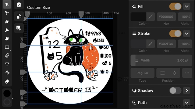
If you look at my program, I specifically use colors that appear sharply on Garmin watches, hand programming the values into the Vector Art Program. See picture above - I control the Fill and Stroke with Hex Codes.
Read this page about optimizing bitmaps : https://developer.garmin.com/connect-iq/connect-iq-faq/how-do-i-optimize-bitmaps/
In my Halloween Watch (Which I am currently working on) I am only using Transparent, 0xFFFFFF , 0x000000, 0x00AA00, and 0xFF5500? There are only 4 colors in the whole watch, no blending, no dithering, no pixelization.
So I always generate my background as a vector circle and fill with a clean color, in this case 0xFFFFFF (By the way, White drains the battery significantly. Use a darker color for better battery management - Many of my watches have a 0x000000 black background for this reason and don't drain the battery at all)
The Cat is a animated .png, and the background grave and moon is a separate .png behind it.
This is going to come out crystal clean on the display! The colors will look the same on every device because I used 16 bit colors.
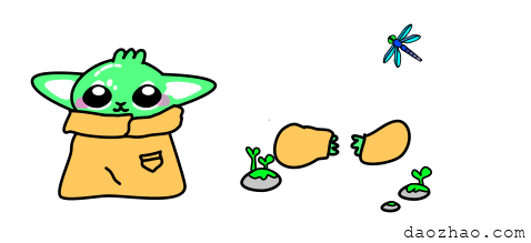
Here is another example where I did not optimize colors as much:

So for this image.
The bright teal color 0x54FF82 of the alien will appear great on AMOLED screens like Venu 2S, but will be translated to 0x00FF00 on 16 bit devices and 0x00FFAA on a 64 Bit Screen.
Now there are different looks on different screens.
Also, although my final product looks like one image, there are multiple .png files being drawn at once and layered together using a transparent color enabled.
My watches never get the highly desired "Animated" seal because I don't use the official animation Toy Box Library. I am just flashing 2 images using a single line of code to keep the memory usage down. My code probably looks different from other developers - so keep in mind that people are probably better optimizing their code for each model. You might want that official Animation Seal because it will get you more downloads.
You should have clean bitmap images for the following sizes:
216x216
240x240
360x300
360 x360
390x390
416x416
454 x454
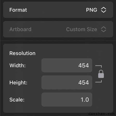
This is why using Vectornator works great for me, I make one image and then export it in any size I need quickly and the resolution is always 100% crystal clear because it came from a clean javascript vector and isn't getting re-pixalated or stretched. Below is a picture of me choosing a PNG format and exporting it at a 454x454 size. I can change what size I want and even the format (If i want it to be a svg, png, jpeg and so on) because it is a vector run on javascript.

For more help, Look at this guideline for 64 bit colors and watch resolutions: https://developer.garmin.com/connect-iq/reference-guides/devices-reference/
I hope that helps!
新世界的大门要打开了吗?
Recommend
About Joyk
Aggregate valuable and interesting links.
Joyk means Joy of geeK