

24 Fonts Similar To Oswald You Could Try In Your Designs
source link: https://www.designyourway.net/blog/fonts-similar-to-oswald/
Go to the source link to view the article. You can view the picture content, updated content and better typesetting reading experience. If the link is broken, please click the button below to view the snapshot at that time.

24 Fonts Similar To Oswald You Could Try In Your Designs
Picture this: A world where every word on your screen is a carbon copy, no flare, no diversity—a digital monotony. But here’s the game changer, fonts have personalities, and Oswald? Well, Oswald’s got character in spades. Yet, you’re scouting for a twist in the tale, a flavor unique to your palette. Ah, the quest for fonts similar to Oswald begins.
Dive deep into the universe of sans-serif fonts, those pristine, uncomplicated marvels of typography design.
Feel your words leap off the page with an ensemble cast of Oswald’s typographic cousins. By journey’s end, expect to unravel those alternative typefaces to Oswald, the secret ingredients that make your content pop, your designs snap, and your messages crystal clear.
Anticipate the reveal of Oswald font family members that harmonize with your vision, and the typeface pairings that sing in silent symphony.
A curated scroll of free Oswald-like fonts — your toolkit of text to elevate web design without the usual dollar dents.
Fonts similar to Oswald
- Alternate Gothic
- Atrament
- Trade Gothic
- Akzidenz-Grotesk
- Impact
- Compacta
- Trump Soft
- Neographik
- Formula Condensed
- Franklin Gothic
- Univers
- Titling Gothic FB
- DF Korolev
- Tungsten Rounded
- Greta Sans
- Cervo Neue
- Garage Gothic
- Solido
- Coign
- Forza
- Halyard
- National
- Maple
Alternate Gothic
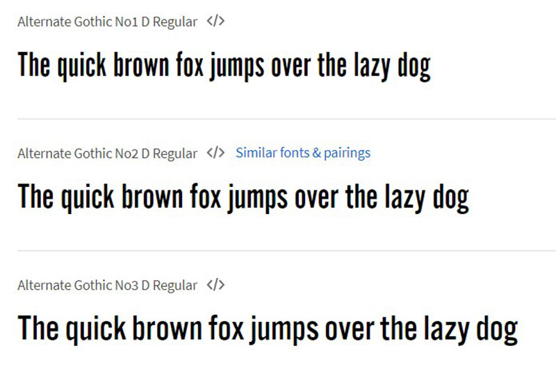
Kicking off, we’ve got the typographic stalwart from 1903, Morris Fuller Benton’s Alternate Gothic. This one’s a neat, condensed sans-serif, predating its cousin, the Franklin Gothic. You’ve seen it; picture the boldness of the YouTube logo. It’s that sort of punchy presence that brands covet.
Atrament
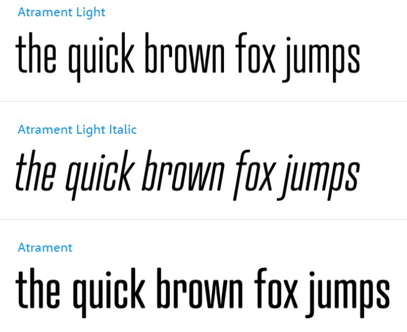
Then there’s Atrament, stunning in its balanced act. Each glyph, a small marvel, is etched with detail and typographic intuition reminiscent of semi-condensed designs from the ’60s. Note those vertical stems; they’re eye-catchers, accentuating the tall, commanding aura of the type.
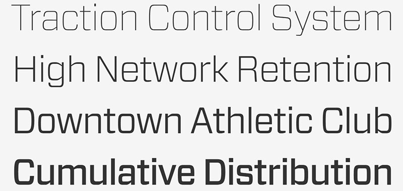
Trade Gothic
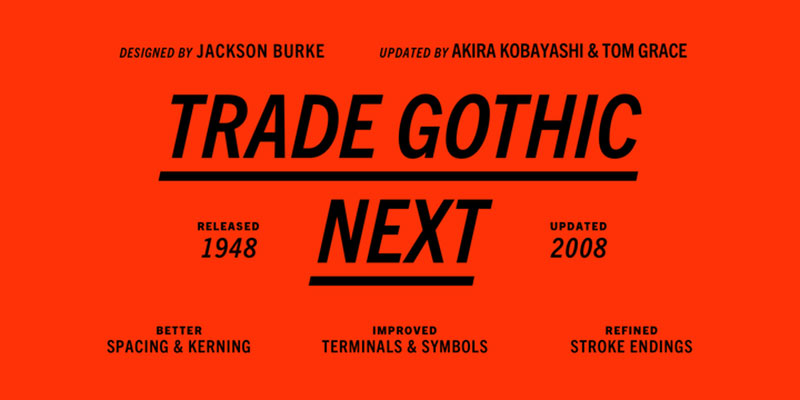
Trade Gothic stands tall, a grotesque sans serif favorite since the ’50s. Linotype later fine-tuned it into Trade Gothic Next, offering a more condensed version with various weights, making it a dream for responsive design — remarkably adaptable for web applications.
Akzidenz-Grotesk
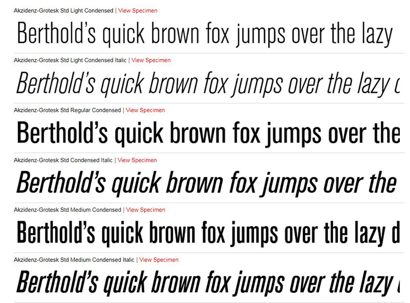
Looking for authenticity? Akzidenz-Grotesk is your ticket back to 1898, a foundational grotesque typeface that’s been the backbone for modernism in typography, influencing countless sans-serif designs, including Helvetica. Part of the revered Berthold Types Collection, it spans several weights with a timeless feel.
Impact
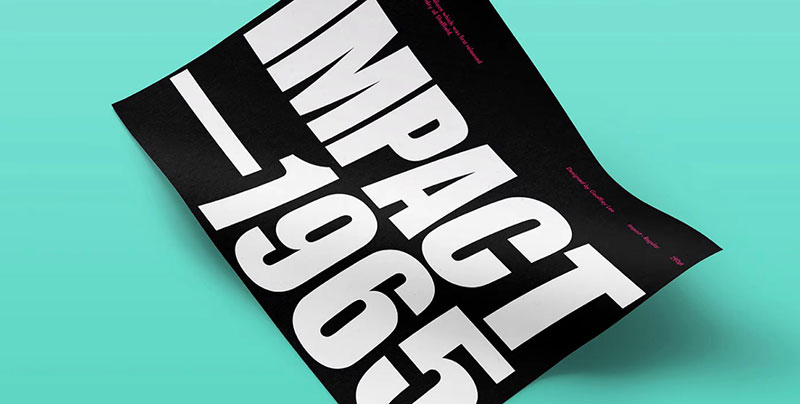
Impact does exactly what you’d think — delivers a heavyweight punch with its narrow apertures and bold letterforms. Ever since 1965, it’s made a mark across Mac and Windows OS, and, oh yes, those unforgettable internet memes.
Compacta
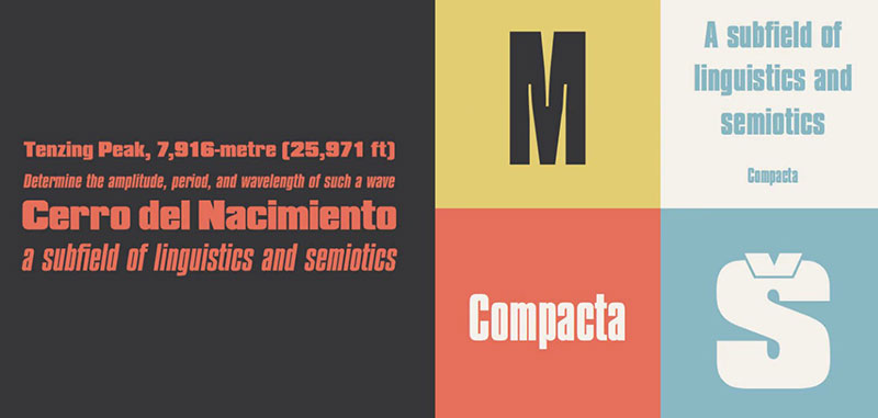
Compact in name and in nature, Compacta is the go-to for squeezing big ideas into small spaces. Think space-saving, flat-sided characters that leave room to breathe while maximizing impact, perfect for sleek, modern layouts where space is premium.
Trump Soft
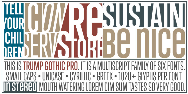
Trump Soft rounds out the edges of its predecessor Trump Gothic, offering a humanist touch to the versatile font family. Conceived by Patrick Griffin, this type’s mellow vibes make it a match for softer messages yet carry the authority of its Gothic roots.
Neographik
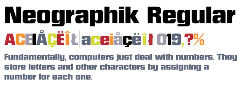
Dial ‘N’ for Neographik, where Monotype’s geometric sans serifs meet a twist of warmth. The letters are tidily arranged blocks, with tight apertures giving it that modern, yet approachable tenor — sophisticated yet surprisingly inviting.
Formula Condensed
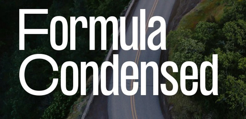
Formula Condensed is the edgy outsider of the pack. This 2018 Pangram Pangram strut is all about condensed proportions that catch the reader off-guard and keep them locked in. It’s like Oswald went on a space-saving spree.
Franklin Gothic
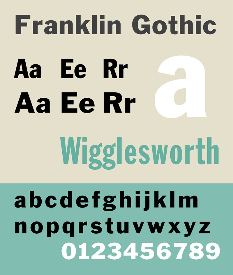
Franklin Gothic, another gem from Morris Fuller Benton, soldiers on with its sturdy grotesque framework. The strong editorial presence makes it a go-to for web content creators looking to emulate that classic newspapery flavor in a digital format.
Univers
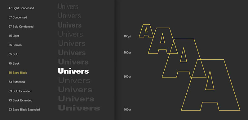
Swiss design is epitomized by Univers; Adrian Frutiger’s tour de force is diversity within unity. Ranging from ultra condensed to wide, its systematic approach gives you a toolbox for just about any typographic conundrum.
Titling Gothic FB
For variety in your type diet, Titling Gothic FB is the pick. With over 50 styles on offer, inspired by ATF Railroad Gothics, this family exudes a modern touch while tipping its hat to its historical roots. It’s class dressed casually.
Druk
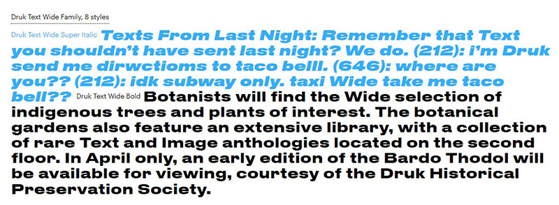
Meet Druk, the brawny beast of sans serifs, born from a non-traditional vow of heterogeneity. Nestled comfortably in Commercial Type’s portfolio, it marries extensive weights with dynamic widths — an entertainer that breaks the gridlock of spacing woes.
DF Korolev
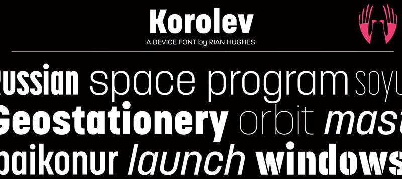
DF Korolev is a sturdy throwback to 1930s Soviet propaganda, landing a modern twist on the style. With an impressive 72 weights, it’s as robust in choices as it is in historical sentiment, a solid pick for identity and branding projects.
Tungsten Rounded
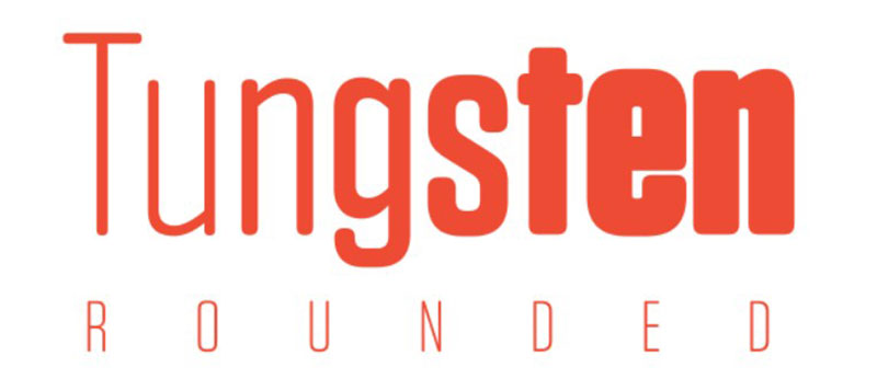
Tungsten and its sibling Tungsten Rounded balance functionality with style through Hoefler & Co.’s ‘collision detection’ innovation. Strategic design eliminates overlaps, even in the bold and packed spaces that these fonts excel at filling.
Greta Sans
Consider Greta Sans less a font, more an optical ensemble. It finesses styles for the pocket screens we peer into daily and stretches into Black and Hairline that can clench or sprawl as needed, making for an across-the-board toolkit minus the clunkiness.
Cervo Neue
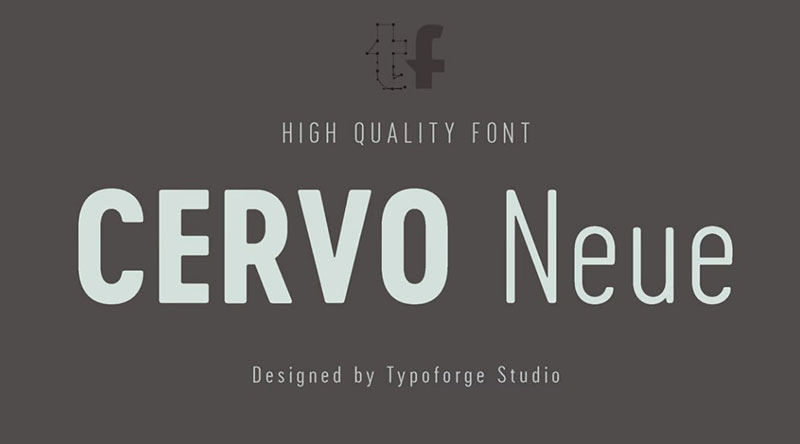
Cervo Neue polishes its predecessor, offering 18 variants for those who crave grotesque sans serifs with a flavor. It’s a dive into Polish ’70s typography, bringing a whiff of vintage magazines to the modern web canvas.
Garage Gothic
Ever hankered for type as raw as those parking garage tickets? Garage Gothic‘s got you covered. Its crude letterforms are a nod to the visceral feel of trade and logistics, and the grit of urban back alleys — all packed into legible type.
Solido
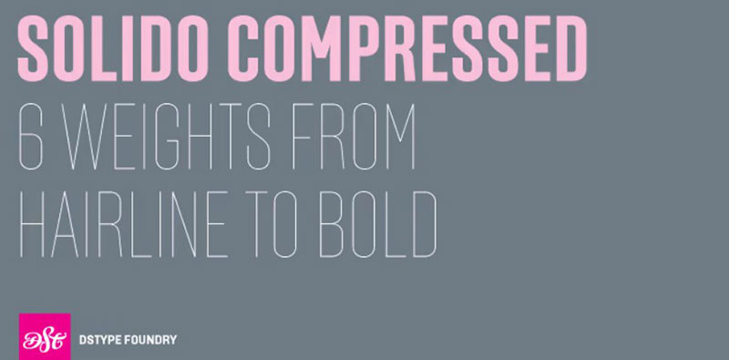
Talking utility, Solido is the MVP. A family of 35 fonts stretching over five adaptable weights — from Compressed to Constricted. Its versatility and usability stretch further than the eye can see, making scaling across devices and layouts as cool as a cucumber.
Coign
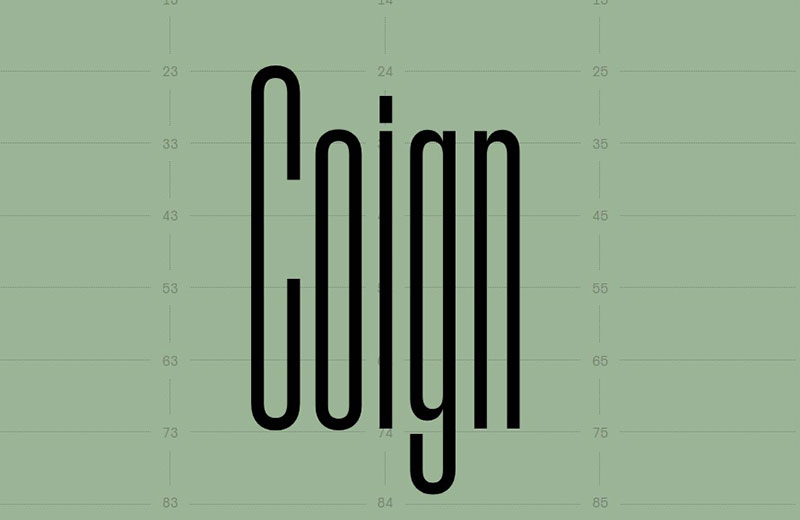
And then, there’s Coign — a high-flier with 19th-century roots that’s surprisingly legible, sleek yet roomy. In four widths and seven weights, this Colophon debut stretches across touchpoints, bringing clarity to every tale told, no matter the space.
Forza
Flexibility shines through in Forza, a mate to Vitesse slab serif under the H\&FJ (Hoefler&Co.) banner. With a range of six weights and companion italics, its usability skims across various interfaces and platforms, a reliable player in the typography team.
Halyard
Halyard stitches together best elements from the 18th and 19th centuries in a contemporary cloth. It opens up to Micro, Text, and Display options, bringing eight weights and italics on board. Its commercial prowess stands tested and true.
National
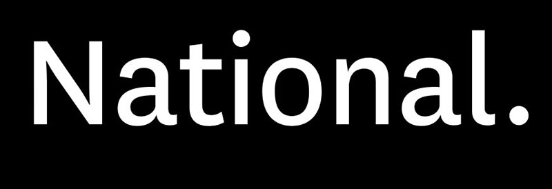
In a league with Oswald, National steals some limelight as a twentieth-century case study. Kris Sowesby’s craft comes in a buffet of nine weights with matching Romans and italics, ideal for making a digital imprint with that old-school gravitas.
Maple
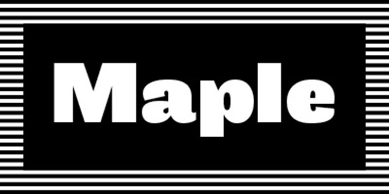
Last in line but way ahead in character is Maple. With its definitive Process Grotesque roots, it presents itself as both quirky and highly versatile. Since 2005, its four weights and italics have offered a breath of fresh air in a crowded grotesque field.
When aiming to pamper visitors with a pleasant user interface, opt for accessibility, breezy font weights, and consider hosting fonts locally for a snappy, seamless experience.
FAQ on Fonts Similar to Oswald
What exactly makes fonts similar to Oswald stand out?
Fonts in Oswald’s league sport that clean, modern vibe. Sans-serif is the name of the game – no frills on these letters. Especially ideal for headers, they’re crisp, they get straight to the point, and boy, do they make on-screen reading a breeze. Like a well-tailored suit, they just fit.
Can I use fonts like Oswald for free?
Absolutely. You hit the jackpot with Google Fonts. Loads of similar fonts up for grabs without spending a dime. Just make sure to peek at the licensing. Whether it’s for a personal blog or a bustling online store, there’s a good chance you’ll find a cost-free gem.
How do I pick the right Oswald alternative for my project?
Think about your project’s personality. Need something professional? Look for something like Open Sans. Feeling artsy? Roboto might be your jam. Each typography design has a voice. The key is pairing the font’s character with your project’s tone. Always contemplate readability, especially for those longer chunks of text.
Are there Oswald-like fonts that work well for printing?
Sure, some fonts transcend the digital realm. Look for ones with beefier lines, like PT Sans or Lato. They’ll stand the test of print, where clarity is king, and smudges are the jokers. Remember, what shines on-screen might need some oomph to dazzle on paper.
Where can I find typography inspiration?
Inspiration’s all over. Behance and Dribbble are bustling with design wizards showcasing their magic with type. Plus, typography blogs? Packed with ideas that’ll make your neurons dance. It’s not just looking; it’s seeing how these typeface characteristics play in various arenas.
What’s the deal with font licensing?
Well, licensing is the rulebook for font use. Some are open-source, some need buying. Missteps could lead to legal tangles. So, scout those font licensing details like a hawk. When in doubt, free font libraries are goldmines with clear guidelines.
How does typography affect user experience?
Here’s the lowdown: typography is a silent conductor of user experience. It guides eyes, evokes emotion, and sets the mood. Get it right, and it’s smooth sailing for users. Botch it, and you’re sending them on a one-way trip to squint city.
What are the best practices for typeface pairing?
Pairing typefaces is like mixing your favorite cocktail. Balance is crucial. Mix a neutral font with a punchy one for contrast. Keep in mind the vibes – formal, casual, screams-for-attention. For perfect harmony, ensure they share a few design traits. Think of font pairings as a dance; you don’t want anyone stepping on toes.
How can I ensure my text is readable on all devices?
Responsive design’s your friend. Test, adapt, and repeat. Use scalable units for font sizes, like ’em’ or ‘rem’. Check your work on different screens, from smartphones to big-screen monitors. Your mantra should be ‘legibility across the board’.
Is it important to consider accessibility in typography?
More than ever. Your words should reach everyone, no exceptions. High contrast, adjustable sizes, and clear font legibility go a long way. Remember, designing for accessibility standards isn’t just nice — it’s downright necessary. Doing so means you’re not just a designer; you’re an advocate for inclusivity.
Conclusion on Oswald Alternatives
So, we’ve zipped through the avenues of fonts similar to Oswald, those sans-serif fonts that make our digital spaces shine. It’s clear, right? Each typeface, with its own quirks and perks, tells a unique story — your story.
- Your takeaways are not just names on a list. They’re typographic tools tailored for cutting through the noise.
- Fancy a font that’s no-fuss, all clarity? Booyah, you’ve got a roster now.
- Looking for a Google Fonts doppelganger that saves you pennies? Bingo.
- Got an itch for that perfect font pairing? Scratch away with our curated matches.
Remember, typography design isn’t just about looking pretty. It’s about making every word count, every sentence sing, and every paragraph pop. So crank up those designs with your newfound font squad, and let those letters loose where they belong — front, center, and unapologetically bold.
If you enjoyed reading this article on fonts similar to Oswald, you should check out these articles with fonts similar to Roboto, Gotham, Calibri, Trajan, Rockwell, Baskerville, Montserrat, and Brandon Grotesk.
Renowned for his expertise in logo design and visual branding, Bogdan has developed a multitude of logos for various clients.
His skills extend to creating posters, vector illustrations, business cards, and brochures. Additionally, Bogdan's UI kits were featured on marketplaces like Visual Hierarchy and UI8.
Recommend
About Joyk
Aggregate valuable and interesting links.
Joyk means Joy of geeK