
5

如何实现抽屉式导航(ArkUI)
source link: https://www.51cto.com/article/776222.html
Go to the source link to view the article. You can view the picture content, updated content and better typesetting reading experience. If the link is broken, please click the button below to view the snapshot at that time.

如何实现抽屉式导航(ArkUI)
作者:野生菌君 2023-12-11 17:20:36
当导航栏的空间放不下过多页签时,可以采用抽屉式导航,本例将为大家介绍如何通过SideBarContainer组件实现抽屉式导航。

由于用户所需功能逐渐增多,传统的标签式导航在个别场景已经无法满足用户需求。当导航栏的空间放不下过多页签时,可以采用抽屉式导航,本例将为大家介绍如何通过SideBarContainer组件实现抽屉式导航。
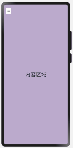
本例最终实现效果如下:
- IDE:DevEco Studio 3.1 Beta1
- SDK:Ohos_sdk_public 3.2.11.9 (API Version 9 Release)
- 通过SideBarContainer组件提供容器,通过子组件定义侧边栏和内容区,第一个子组件表示侧边栏,第二个子组件表示内容区。
- 调用showSideBar属性来设置不显示侧边栏,controlButton属性来控制完成侧栏的展示/收起。
创建内容区域文本组件。
首先创建内容区,具体代码块如下:
...
//  内容区
Column() {
  Text("内容区域")
    .width("100%")
    .height("100%")
    .fontSize(30)
    .textAlign(TextAlign.Center)
}
.width("100%")
.height("100%")
.backgroundColor("#bbaacc")
...
通过SideBarContainer所支持的showSideBar属性来设置不显示侧边栏,controlButton属性来控制完成侧栏的展示/收起。
具体代码块如下:
...
.showSideBar(false) //默认不展示侧边栏,展示icon,用户点击调出
.controlButton({
left: 10, // 图标距离左侧宽度
top: 20, // 图标距离顶部高度
height: 30, // 图标高度
width: 30, // 图标宽度
icons: {
shown: $r('app.media.back'), // 侧边栏展示时图标
hidden: $r('app.media.sidebar_shown'), // 侧边栏收起时图标
switching: $r('app.media.sidebar_shown') // 侧边栏切换过程图标
}
})
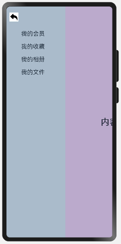
...创建侧边栏文本组件。
具体代码如下:
...
struct SideBarContainerExample {
@ State navList: Array<string> = ["我的会员", "我的收藏", "我的相册", "我的文件",]
  build() {
    SideBarContainer(SideBarContainerType.Embed) {
    //  侧边栏内容
      Column() {
        ForEach(this.navList, (item) => {
          Text(item)
            .width("100%")
            .fontSize(20)
            .textAlign(TextAlign.Start)
            .padding({ top: 20 })
        })
      }
    .height("100%")
    .padding({ top: 60, left: 50 })
    .backgroundColor("#aabbcc")
    }
...
  }
}
示例完整代码如下:
@Entry
@Component
struct SideBarContainerExample {
  @State navList: Array<string> = ["我的会员", "我的收藏", "我的相册", "我的文件",]

  build() {
    // Embed:侧边栏占据内容空间 Overlay:侧边栏悬浮于内容之上
    SideBarContainer(SideBarContainerType.Embed) {
      // 侧边栏内容
      Column() {
        ForEach(this.navList, (item) => {
          Text(item)
            .width("100%")
            .fontSize(20)
            .textAlign(TextAlign.Start)
            .padding({ top: 20 })
        })
      }
      .height("100%")
      .padding({ top: 60, left: 50 })
      .backgroundColor("#aabbcc")
      // 内容区
      Column() {
        Text("内容区域")
          .width("100%")
          .height("100%")
          .fontSize(30)
          .textAlign(TextAlign.Center)
      }
      .width("100%")
      .height("100%")
      .backgroundColor("#bbaacc")
    }
    // 默认不展示侧边栏,展示icon,用户点击调出
    .showSideBar(false)
    .controlButton({
      // 图标距离左侧宽度
      left: 10,
      // 图标距离顶部高度
      top: 20,
      // 图标高度
      height: 30,
      // 图标宽度
      width: 30,
      icons: {
        // 侧边栏展示时图标
        shown: $r('app.media.back'),
        // 侧边栏收起时图标
        hidden: $r('app.media.sidebar_shown'),
        // 侧边栏切换过程图标
        switching: $r('app.media.sidebar_shown')
      }
    })
    // 侧边栏宽度
    .sideBarWidth(200)
    .width('100%')
    .height('100%')
  }
}注意:模拟机与真机的预览有区别,在SideBarContainerType.Embed情况下,真机中内容区域是压缩,模拟器中内容区域是缺失。
Tabs组件: 适用于导航栏固定在页面上下左右侧,入口分类数目不多,可以控制在5个以内,且用户需要频繁切换每一个页签的应用,比如微信、QQ等。
Navigation组件: 同样可以实现Tabs组件中导航栏位于底部的场景,根据需要显示隐藏导航栏,提供标题,菜单,返回等选项,使用户是使用时更加灵活。
sideBarContainer组件:主要的功能和内容都在一个页面里面,只是一些低频操作内容需要显示在其他页面里,可以把这些辅助功能放在抽屉栏里。屏幕较小时导航栏不占用空间。比如QQ,开发指导文档等。
责任编辑:jianghua
来源:
51CTO 开源基础软件社区
Recommend
About Joyk
Aggregate valuable and interesting links.
Joyk means Joy of geeK