

iPhone兼容性修复:吸顶效果的Tabs标签页组件的完美自定义
source link: https://www.51cto.com/article/769370.html
Go to the source link to view the article. You can view the picture content, updated content and better typesetting reading experience. If the link is broken, please click the button below to view the snapshot at that time.

iPhone兼容性修复:吸顶效果的Tabs标签页组件的完美自定义
当我们开发Web应用或移动应用时,经常需要使用标签页(Tabs)组件来切换不同的内容或功能模块。标签页在用户体验中扮演着关键角色,但有时候,我们需要更多的控制和自定义来满足特定项目的需求。在近期的开发中,我实现了一个强大而实用的功能——吸顶效果的Tabs标签页组件。
在这篇文章中,我将与大家分享我的实际开发经验,重点关注如何自定义实现吸顶效果的Tabs标签页组件。通过本文,您将了解到如何充分发挥前端开发的灵活性和创造力,以满足项目的特定要求。无论您是一个有经验的前端工程师还是一个刚刚入门的新手,我相信这篇文章都会为您提供有价值的见解和灵感。
让我们开始探索如何打造完美的自定义吸顶效果的Tabs标签页组件,为您的项目增添更多的魅力和功能!
1. 交互主要功能和交互简介
在我们深入探讨如何自定义实现吸顶效果的Tabs标签页组件之前,让我们先来了解一下这个组件的主要功能和交互,以便更好地理解我们将要进行的优化和改进。这个组件通常包括以下核心功能和交互特性(效果如下):

页面顶部呈现车系名称和车系图片,您可以选择不同的车型以查看相关权益。在头部以下,我们有两级导航。当您滚动页面到顶部时,导航会自动吸附在顶部。当切换二级选项卡时,选中的选项卡会高亮显示,并且页面内容自动滚动到顶部以显示相关内容。如果手动滚动页面,例如将付费服务内容滚动到顶部,那么付费服务选项卡将高亮显示。
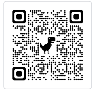
您还可以打开汽车之家 app,扫描以下二维码来查看演示效果。
整体代码移步:https://code.juejin.cn/pen/7264502984589967396
2. 吸顶效果 - 技术方案及实现
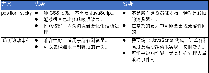
► 最终选择方案
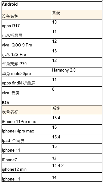
该页面需要兼容的机型有,以上机型都能兼容position: sticky,无兼容问题。所以采用了实现起来较为简单的设置position: sticky的方式。
position: sticky 代码实现:
.tab-container {
  position: sticky;
  top: 0px;
  z-index: 9;
}
► 监听滚动事件代码实现:
import React, { useState, useEffect } from 'react@18';
import { createRoot } from 'react-dom@18/client';

const Test = function () {
  useEffect(() => {
    // 回到顶部
    function handleScrollChange() {
      const selHtml = document.getElementById('sel');
      const scrH: number =
        document.documentElement.scrollTop || window.pageYOffset || document.body.scrollTop || 0;
      if (selHtml) {
        if (scrH >= 105) {
          selHtml.style.position = 'fixed';
          selHtml.style.top = `0px`;
          selHtml.style.zIndex = '20';
        } else {
          selHtml.style.position = 'absolute';
          selHtml.style.top = `0px`;
        }
      }
    }
    window.addEventListener('scroll', handleScrollChange);
  }, []);
  return <div>
    <div className="header"></div>
    <div className='tab-container-box'>
      <div id="placeholder" style={{ height: '100%', backgroundColor: '#fff' }} />
      <div className={`tab-container`} id="sel">
        .....吸顶块
      </div>
    </div>
    <div className="footer"></div>
</div>;
};
const app = document.getElementById('app');
const root = createRoot(app!)
root.render(<Test />);
3. tab 点击效果 - 技术方案及实现
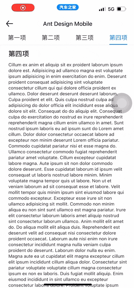
首先想到“Ant Design Mobile Tabs标签页组件”(https://mobile.ant.design/zh/components/tabs/) 能够实现新能源车主权益中的切换tab滚动定位、手动滑动页面相应tab高亮的功能,但是通过兼容性测试,发现该组件在一些iPhone机型上切换,tab,tab抖动。以下是iphone 14机型交互效果:
那就自定义一个组件吧。
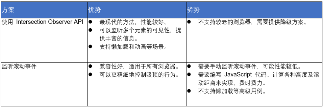
►Intersection Observer API 代码实现
import React, { useState, useEffect,useRef } from 'react@18';
import { createRoot } from 'react-dom@18/client';

const Test = function () {
  const nextKey = useRef(null);
  const [activeIdx,setActiveIdx]=useState<number>(0);
  const [inView, setInView] = useState<string[]>([]);
  const tabs=[
    {
      "key":"mianfei",
      "value":"免费权益",
      "type":1
      },
    {
      "key":"fufei",
      "value":"付费服务",
      "type":2
    }
  ];
  const onTabClick = (idx: number) => {
    nextKey.current = idx;
    const element = document.getElementById(tabs[idx]?.key);
    const h=document.getElementById('sel').clientHeight;
    const offset = element.getBoundingClientRect().top-h;
    window.scrollTo({
      top: offset,
      behavior: 'smooth'
    });
};
const scrollhandle = () => {
    const targets = document.querySelectorAll('.tab-content');
    const headerH = Number(document.getElementById('sel')?.clientHeight) ;
    const options = {
      rootMargin: `-${headerH}px 0px`,
    };
    const callback = (entries) => {

      const arr = inView;
      entries.forEach((entry) => {

        const dataUi: string = entry.target.getAttribute('data-service');
        console.log(entry.target)
        if (entry.isIntersecting) {
          if (!arr.includes(dataUi)) {
            arr.push(dataUi);
          }
        } else {
          if (arr.indexOf(dataUi) > -1) {
            arr.splice(arr.indexOf(dataUi), 1);
          }
        }
      });
      arr.sort((a, b) => Number(a) - Number(b));
      setInView(arr);
      if (nextKey.current == -1 || nextKey.current == Number(arr[0])) {
        nextKey.current = -1;
        setActiveIdx(Number(arr[0]));
      }
    };

    const observer = new IntersectionObserver(callback, options);
    targets.forEach((target) => {
      observer.observe(target);
    });
    return observer;
  };
  useEffect(()=>{
   let observer = null;
    if (tabs.length) {
      observer = scrollhandle();
      setActiveIdx(0);
    }
    return () => {
      observer?.disconnect();
    };
  },[])

  return (<div>
    <div id='sel'>
      <div className="tab-container">
      {
          tabs?.map((tab, idx) => (
            <button
              className={`tab ${idx == activeIdx ? 'active' : ''}`}
              key={`${tab.key}_tab`}
              onClick={() => {
                onTabClick(idx);
              }}
            >{tab.value}</button>))
        }
      </div>
      <div className='h-[50px]'></div>
    </div>
    <div className="content-box">
      {tabs?.map((tab,idx) => (
        <div key={tab.key} data-service={idx} className="tab-content" id={tab.key} style={{ minHeight:idx==tabs.length-1?'100dvh':'auto' }}>
        <p>{tab.value}</p>
        </div>
      ))}
    </div>
  </div>);
}
const app = document.getElementById('app');
const root = createRoot(app!)
root.render(<Test />);
► 监听滚动事件代码实现
import React, { useState, useEffect } from 'react@18';
import { createRoot } from 'react-dom@18/client';

const Test = function () {
  const [activeIdx,setActiveIdx]=useState<Number>(0);
  const tabs=[
    {
      "key":"mianfei",
      "value":"免费权益",
      "type":1
      },
    {
      "key":"fufei",
      "value":"付费服务",
      "type":2
    }
  ];
  const onTabClick = (idx: number) => {
    setActiveIdx(idx);
    const element = document.getElementById(tabs[idx]?.key);
    const h=document.getElementById('sel').clientHeight;
    const offset = element.getBoundingClientRect().top-h;
    window.scrollTo({
      top: offset,
      behavior: 'smooth'
    });
};
const onscroll = () => {
    const h=document.getElementById('sel').clientHeight;
    tabs.forEach((tab, idx) => {
      const el = document.getElementById(tab?.key);
      const rect = el?.getBoundingClientRect() || { top: 0, bottom: 0 };
      if (rect?.top <= h && rect?.bottom > h || (idx === 0 && rect?.top >= h)) {
          setActiveIdx(idx);
        }
    });
  };
  useEffect(()=>{
    window.addEventListener('scroll', onscroll, true);
    return ()=>{
      window.removeEventListener('scroll', onscroll);
    }
  },[
  ])

  return (<div>
    <div className="tab-container-box" id='sel'>
      <div className="tab-container">
      {
          tabs?.map((tab, idx) => (
            <button
              className={`tab ${idx == activeIdx ? 'active' : ''}`}
              key={`${tab.key}_tab`}
              onClick={() => {
                onTabClick(idx);
              }}
            >{tab.value}</button>))
        }
      </div>
    </div>
    <div className='mt-[20px]'>
      {tabs?.map((tab, idx) => (
        <div key={tab.key} className="tab-content" id={tab.key} style={{ minHeight:'100dvh' }}>
        <p>{tab.value}</p>
        </div>
      ))}
    </div>
  </div>);
}
const app = document.getElementById('app');
const root = createRoot(app!)
root.render(<Test />);
► 最终选择实现方案
给 tab 添加点击事件执行 onTabClick 方法,在 onTabClick 方法里计算需要滚动的高度,利用 scrollTo 方法设置滚动距离。通过 IntersectionObserver 方法监听权益内容模块的滚动情况,当权益内容滚动到权益内容可视区头部时,当前 tab 添加高亮效果。
需要注意的点:
定义 nextKey 变量,用来判断 tab 点击后页面本次滚动是否结束,结束后在给当前 tab 添加高亮效果,防止高亮效果在 tab 上来回切换
给最后一个权益内容模块设置最小高度,保证内容能滚动到权益内容可视区域头部
4. 服务介绍的收起与展开
封装TextCollapse 组件,组件中添加两个 div,其内容都是要展示的权益内容,一个 div 正常展示,设置最大高度超出隐藏。两外一个不设置高度,设置绝对定位及透明度为 0,通过第二个div判断文字实际高度。文字实际高度大于最大高度,则展示展开按钮;反之,则隐藏。
►需要注意的点
引用组件时 key 值不能只用权益内容 id。因为相同的权益内容可能出现在不同权益类型下,这时如果使用 id 做为 key 值,切换权益类型 tab 时,TextCollapse 内容不会重新渲染,被展开的内容不能恢复收起状态。这里我使用了 item.id+activeKey 做为 key 值。
<TextCollapse key={item.id+activeKey} text={item.content} maxLines={8} />►代码实现
import React, { useState, useEffect, useRef  } from 'react@18';
import { createRoot } from 'react-dom@18/client';

type TextCollapseT = {
  text: string;
  maxLines: number;
};
const TextCollapse = ({ text, maxLines }: TextCollapseT) => {
  const [expanded, setExpanded] = useState(false);
  const [shouldCollapse, setShouldCollapse] = useState(false);
  const textRef = useRef(null);

  useEffect(() => {
    if (textRef?.current?.clientHeight) {
      setShouldCollapse(textRef.current.clientHeight > maxLines * 20);
    }
  }, []);

  const toggleExpand = () => {
    setExpanded(!expanded);
  };

  const textStyles = {
    display: '-webkit-box',
    WebkitBoxOrient: 'vertical',
    overflow: 'hidden',
    overflowWrap: 'break-word',
    wordBreak: 'break-word',
    WebkitLineClamp: expanded ? 'unset' : maxLines,
    whiteSpace: 'pre-wrap',
  };
  return (
    <div className="text-collapse">
      <div style={textStyles} className="article">
        {text}
      </div>
      <div
        style={{ ...textStyles, WebkitLineClamp: 'unset' }}
        className="article hide-art"
        ref={textRef}
      >
        {text}
      </div>
      {shouldCollapse && !expanded ? (
        <button onClick={toggleExpand} className="btn">
          展开查看更多
        </button>
      ) : null}
    </div>
  );
};
const app = document.getElementById('app');
const root = createRoot(app!);
const cnotallow="9月4日,茅台与瑞幸推出的联名咖啡“酱香拿铁”正式上架销售了。9月4日,茅台与瑞幸推出的联名咖啡“酱香拿铁”正式上架销售了。9月4日,茅台与瑞幸推出的联名咖啡“酱香拿铁”正式上架销售了。9月4日,茅台与瑞幸推出的联名咖啡“酱香拿铁”正式上架销售了。9月4日,茅台与瑞幸推出的联名咖啡“酱香拿铁”正式上架销售了。9月4日,茅台与瑞幸推出的联名咖啡“酱香拿铁”正式上架销售了。"
root.render(<TextCollapse key={123} text={content} maxLines={6} />);►兼容机型及系统
 王晶
王晶
■ 客户端研发部-前端团队-C端组
■ 2015年加入汽车之家,目前主要负责汽车之家搜索以及新能源相关h5页面的前端开发工作。
Recommend
About Joyk
Aggregate valuable and interesting links.
Joyk means Joy of geeK