

The Carolina Panthers Logo History, Colors, Font, and Meaning
source link: https://www.designyourway.net/blog/carolina-panthers-logo/
Go to the source link to view the article. You can view the picture content, updated content and better typesetting reading experience. If the link is broken, please click the button below to view the snapshot at that time.

The Carolina Panthers Logo History, Colors, Font, and Meaning

You know, the fierce feline with its sharp lines and stark contrasts. Ever wonder about its story? If you’re anything like me, you’ve marveled at how a simple graphic can capture so much spirit and energy.
When I first dove into the world of web design, logos like the Carolina Panthers‘ had me hooked. They’re more than just images. They’re the essence of a brand, the vibe of a team, and the identity of a community.
Why should you care?
Well, logos shape perceptions. A well-designed logo can turn heads, spark conversations, and inspire loyalty. Conversely, a misstep in design can create an entirely different narrative.
By the end of this read, you’ll:
- Grasp the nuances behind the Carolina Panthers logo design.
- Understand why its evolution matters in the grand scheme of brand identity.
- Get a sneak peek into the design thought processes.
Let’s embark on this journey through colors, lines, and the magic of web design. And yeah, the next time you’re at a game or spotting some merch, you’ll see that logo with fresh, enlightened eyes.
The Meaning Behind the Carolina Panthers Logo
Honestly? Logos are like the silent storytellers of a brand. They whisper secrets that only the keenest of eyes can catch. So, let’s dive deep into what the Carolina Panthers logo is trying to say, shall we?
Silent Roar
The first thing you’ll notice? The fierce panther in the logo. It’s not just there to look cool (although, let’s be real, it does). Panthers symbolize power, stealth, and strength.
It gives a shoutout to the agility and determination of the team. Every time the players wear that logo, they’re embodying that fierce panther spirit. Roar.
The Forward Stance
Notice how the panther is lunging forward? This is not by accident. The forward stance shows a readiness, an eagerness to move ahead, always striving for the next touchdown.
The History of the Carolina Panthers Logo
Humble Beginnings
When the Panthers burst onto the scene, they needed an identity—a look that would capture the spirit of the Carolinas. The panther, being both ferocious and graceful, was a fitting choice. But the logo has evolved since then.
The Evolution
The logo underwent a significant redesign. Sharp lines, a sleeker look, all to keep pace with the modern vibes. But through every change, the panther’s essence remained, always reminding us of where it all began.
The Colors of the Carolina Panthers Logo
Ever looked at a canvas and felt something? Colors do that. They evoke feelings, moods, memories. So, what’s the Carolina Panthers logo throwing down?
Black: The Backbone
Black stands for strength, power, and determination. It’s the dominant color in the logo and symbolizes the robust foundation of the team.
Electric Blue: The Flash
That vibrant blue? It’s not just there for aesthetics. Blue stands for depth, trust, and loyalty. It adds that spark, that energy which resonates with the Panthers’ spirit.
The Font Used in the Carolina Panthers Logo
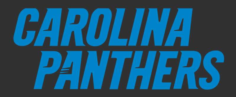
Typography is a world of its own. The right font speaks volumes, right? So, when you gaze upon the words “Carolina Panthers”, what story is unfolding?
Bold and Proud
The thick, bold letters scream confidence. The Panthers are here, and they mean business.
Modern Touch
The sleek design of the font marries beautifully with the modern aesthetic of the logo. It’s all about making a statement while staying rooted in tradition.
Artistry and Design: Beyond the Basics
Let’s chat about the artistic side of things. Design isn’t just about slapping together some shapes and colors.
Symmetry and Balance
The logo’s got this harmonious balance. Everything feels just right, doesn’t it? That’s no accident. Designers ensured that there’s symmetry, so your eyes feel at ease when you’re checking it out.
The Hidden Details
Good designs have layers. Like an onion… or maybe a cake? Whatever analogy floats your boat. Point is, every time you look at the logo, there’s a chance you’ll spot something new. A curve here, an angle there. It’s intricate and yet so seamlessly put together.
Fan Love and Pop Culture
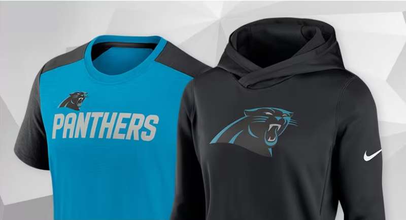
Ever seen fans with the logo tattooed on them? Or maybe on T-shirts, mugs, and, heck, even car decals?
A Symbol of Pride
For many fans, the logo isn’t just a design. It’s a symbol of pride, of belonging. It’s a beacon that says, “Hey! I belong to this awesome tribe!”
Pop Culture Moments
With the rise of the team’s popularity, the logo’s been spotted in movies, TV shows, and even music videos. It’s become a part of the broader cultural landscape, echoing the love and passion of its fans.
FAQ About the Carolina Panthers Logo
What’s the story behind the Carolina Panthers logo?
Well, man, the Carolina Panthers logo is a representation of a fierce black panther, which embodies the team’s spirit and determination. It’s a head-on look at a panther, giving the idea of facing challenges headfirst.
The team wanted a symbol that’s both aggressive and sleek – you know, just like a panther in the wild.
Why was the logo updated in 2012?
So, here’s the thing. In 2012, the Carolina Panthers decided they needed a slight refresh. Not a massive overhaul or anything, but they updated the logo to give it a more modern and three-dimensional appearance.
The tweaks were subtle: enhanced blue hues, sharper lines, and the panther’s eyes. A new decade, a more refined look!
Does the logo represent both North and South Carolina?
Totally! Though the team is based in Charlotte, North Carolina, the “Carolina” in their name (and by extension, their logo) represents both North and South Carolina. It’s like a nod to the fans and people of both states. It’s all about regional pride and unity.
What do the colors in the logo symbolize?
Ah, good question! The primary colors of the logo are black, blue, and silver. Black for power and mystery, blue represents loyalty and trust, while silver?
That’s all about sophistication and modern vibes. Together, they capture the essence of a panther – mysterious, loyal, and sleek.
Has the logo faced any controversies?
Alright, so while there have been debates and discussions about various sports logos over the years, the Carolina Panthers logo has been relatively controversy-free.
Most folks seem to appreciate its design and what it stands for. But like anything, opinions will vary, and not everyone’s gonna be a fan.
Is there a meaning to the logo’s shape?
The shape? Well, it’s mostly about aesthetics. The panther’s head is angular and streamlined. It gives off an aggressive vibe while also being smooth and modern. It’s like capturing the movement of a panther ready to pounce. Very dynamic, if you ask me.
How different is the helmet logo from the primary one?
Well, they’re actually pretty similar. The helmet logo is basically a variation of the primary logo. It’s just adapted to fit well on the helmet.
There might be minor tweaks here and there for visibility purposes when you’re watching them on the field, but the essence? Totally the same.
Who designed the original logo?
You might find this interesting. The original logo, way back when the team was first established in the mid-’90s, was designed by the NFL Properties’ in-house design team. They put their heads together to come up with something iconic, and I’d say they nailed it.
Are there any hidden symbols in the logo?
As much as I’d love to share some secret, Da Vinci Code-level mystery about the logo, there really aren’t any hidden symbols. The design is straightforward – a powerful, sleek panther. But who knows, maybe there’s a fun fan theory out there waiting to be discovered!
How has fan reception been to the logo over the years?
Overall, fans have shown a lot of love for the logo. Especially after the 2012 update, many felt it was a good evolution that kept the spirit of the original.
Of course, you’ll have folks nostalgic for the OG design, but that’s the thing with change. Can’t please everyone! But most? They’re repping that logo with pride.
Ending Thoughts on the Carolina Panthers Logo
Carolina Panthers logo, right? Ah, man. That logo? Pure fire. It’s not just some sketch on a napkin. It’s more than that.
Story Time:
- First off, that fierce panther? Whew. It’s like catching a bolt of lightning, freezing it, and boom! Panther!
- The color choice? Not just a dab of blue and black. Nope. That’s the heartbeat of every fan, every player, wrapped up in shades of passion and energy.
It’s almost like this logo, it’s…a song. Imagine the wind rustling, the sound of cleats on grass, and the roar of the crowd. It’s an anthem that screams, “We’re here, and we’re unstoppable!”
In wrapping up, the Carolina Panthers logo isn’t just about aesthetics. It’s the spirit, the fire, and the undeniable heartbeat of the team. When fans see that logo, it’s a promise – of unity, passion, and relentless drive. A visual symphony that resonates with more than just the eyes, but the soul too.
So, here’s to logos that do more than just look good. Here’s to those who feel amazing.
If you enjoyed reading this article about the Carolina Panthers logo, you should read these as well:
Recommend
About Joyk
Aggregate valuable and interesting links.
Joyk means Joy of geeK