
Ray Bizarre: an alternate approach to typography
source link: https://uxdesign.cc/ray-bizarre-an-alternate-approach-to-typography-7c7523c9e8ed
Go to the source link to view the article. You can view the picture content, updated content and better typesetting reading experience. If the link is broken, please click the button below to view the snapshot at that time.

Ray Bizarre: an alternate approach to typography
On the texture of Satyajit Ray’s graphic design

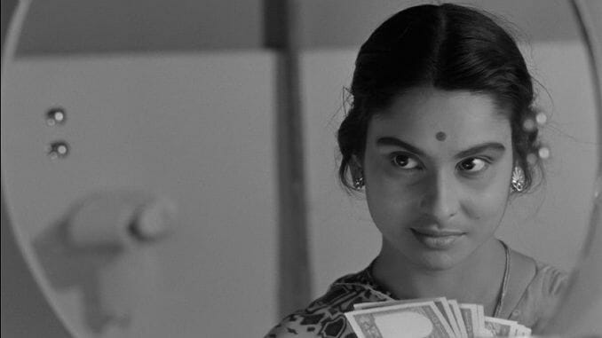
From Satyajit Ray’s Charulata. Described as his most “ornate” film.
Pinaki De, a graphic designer and expert on Satyajit Ray, writes of the artist’s career as a commercial illustrator (which includes thousands of sketches, logos, posters, magazine art, film credits, costume sketches and such works):
“Ray’s contribution to graphic design has always eluded proper critical attention outside Bengal, probably eclipsed by his towering presence as a filmmaker.”
Among Satyajit Ray graphic design cultists, four conceptual sketches for typefaces have come to occupy a special place: Daphnis, Holiday Script, Ray Roman and Bizarre. They were probably drawn by hand in the 1960s on commission from a Florida-based design agency. Andrew Robinson mentions in his biography of Satyajit Ray, The Inner Eye, that Ray Roman and Ray Bizarre were considered worthy of awards.

The Ray typefaces. From: https://www.getbengal.com/details/on-his-birth-anniversary-not-the-director--but-calligrapher-satyajit-ray
For a few years, I developed an obsession with Ray Roman. Off-late, this obsession has grown to include Ray Bizarre. To me, the two typefaces make up opposing faces of the same coin. They represent something I’ve long scratched my head about concerning what I feel is the contradictory nature of Bengali culture. That it can simultaneously be insular and universal; functional and dysfunctional; progressive and orthodox; and, frenetic yet slothful.
Ray’s typeface designs appear to me as rooted in the visual landscape of Calcutta. Typography and architecture are often intimately connected. Adrian Frutiger writes:
“Script forms are often compared with styles of architecture and we agree that the spirit and intellectual climate of each age find expression both in the corresponding style of building and in the lettering style of manuscripts and subsequently of printed books”.
Calcutta’s skyline blends ancient Indian, Victorian, modern and contemporary structures. This cityscape has inspired countless other artists, from Gaganendranath Tagore’s cubist paintings to R.K. Laxman’s cartoon sketches. Its streetscapes — the spires, domes, bridges, arches, verandahs, flat-roofs…
Recommend
About Joyk
Aggregate valuable and interesting links.
Joyk means Joy of geeK