

The Puma Logo History, Colors, Font, and Meaning
source link: https://www.designyourway.net/blog/puma-logo/
Go to the source link to view the article. You can view the picture content, updated content and better typesetting reading experience. If the link is broken, please click the button below to view the snapshot at that time.

The Puma Logo History, Colors, Font, and Meaning
- BY Bogdan Sandu
The Puma Logo – a symbol, but so much more. Picture this: a sleek, powerful cat leaping into action. It’s the embodiment of speed, agility, and strength. That’s the spirit you feel when your eyes meet the Puma Logo, right?
Now, let’s take a step back.
Rewind.
Imagine the canvas – blank. Untouched.
You’re holding the brush, ready to create magic.
Let’s dive into the genesis of the Puma Logo. How it got its teeth, its claws… its grace.
We’ll look at
- the conception,
- the birth,
- the evolution.
Lean in, grab your cup of creativity, and let’s get inspired.
In this journey, we won’t just be observers. We’ll be participants.
Welcome, my fellow design enthusiasts, to the wonderful world of visual storytelling. A realm where the Puma Logo isn’t just a logo. It’s a legend.
So, buckle up. This is going to be one hell of a ride!
The Meaning Behind the Puma Logo
Unleashing the Beast
Picture the Puma logo. It’s a cat, right? But not just any cat. It’s a puma. A creature known for its speed, agility, and strength. These are not just arbitrary qualities; they’re the heartbeat of the brand.
This isn’t just about selling sportswear. It’s about empowering folks to harness their inner puma. It’s like a visual pep talk. Put on the gear, and you’re not just wearing a logo. You’re embodying the spirit of the puma.
The Jump
Notice how the puma’s caught mid-leap? That’s intentional. It’s a shout-out to those who aren’t afraid to take risks, to dive headfirst into the challenge. It’s a nudge to those on the sidelines, an invitation to jump into the game.
The History of the Puma Logo
Inception
The Puma logo we know and love didn’t just pop out of nowhere. Back in 1948, the puma was just a twinkle in Rudolf Dassler’s eye.
A leap of faith, a leap into the unknown. The brand was born from a family feud that split the Dassler brothers, and with it, their shared company.
Out of that split, Puma was born, and with it, a logo that embodied everything Rudolf wanted his brand to be. A symbol of agility, strength, and ambition.
Evolution
The logo has evolved over the years, but the core symbol, the leaping puma, has remained constant. There have been tweaks, and refinements. You could say the puma has grown with us, adapting to the times while staying true to its roots.
The Colors of the Puma Logo
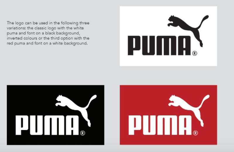
A Statement in Black and White
The Puma logo is a study in contrasts. Stark black on a white backdrop. It’s bold. It’s clear. It stands out.
Black is power. It’s decisive. It’s confident. It doesn’t just whisper; it roars. Just like a puma. And white? That’s a blank canvas. It’s potential. It’s a challenge to fill that space, to make your mark.
A Splash of Red
Every now and then, you might catch a glimpse of a Puma logo in red. That’s not an accident. Red is passion. It’s intensity. It’s the burning desire to push limits, to redefine boundaries.
It’s a promise that Puma isn’t just a passive observer. It’s a key player, always on the move, always ready to shake things up.
The Font Used in the Puma Logo
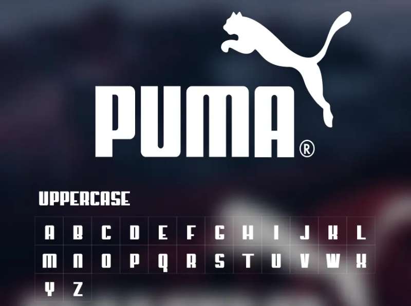
Simplicity Speaks Volumes
The Puma wordmark is as simple as it gets. It’s a sans-serif font, clean and unpretentious. It doesn’t need to shout. It’s confident in its message. It’s not about the frills; it’s about the substance.
Consistency is Key
The wordmark has been consistent over the years. Just like the puma itself, it’s a symbol of the brand’s commitment to its vision. Even as trends come and go, the Puma font remains, a testament to the brand’s unwavering focus on quality and performance.
The Impact of the Puma Logo
The Power of Recognition
Logos are a language all their own. And in that language, the Puma logo is a powerful word. It’s instantly recognizable, a symbol that’s become synonymous with athletic excellence.
Inspiring Loyalty
But it’s more than just a logo. It’s a banner. A symbol of belonging. It’s a bond that ties together people across the globe, a shared love for the spirit that the puma represents.
The Role of the Puma Logo in Modern Culture

Fashion Statement
Over the years, the Puma logo has transcended the world of sports. It’s entered the realm of fashion. It’s a style statement, a marker of cool. It’s a way of identifying yourself with a tribe that values both performance and aesthetics.
Influence in Music and Entertainment
The Puma logo has found a place in pop culture too. It’s been embraced by musicians, actors, and influencers, further cementing its status as a symbol of modern cool. It’s not just a brand. It’s part of a lifestyle.
FAQ on the Puma Logo
What’s the history behind the Puma logo?
Oh, it’s a fascinating story! The logo has been pretty much the same since the 1960s. It was created by cartoonist Lutz Backes, who used a pouncing puma for the design.
The leaping animal was perfect because it represented agility, strength, and speed – all things Puma wanted to be associated with. The logo has slightly evolved over the years, but the essence has remained the same. That’s the power of great branding!
Why did they choose a Puma?
You know, the choice of a Puma wasn’t random. The brand’s founder, Rudolf Dassler, wanted an emblem that reflected the qualities of his athletic products. Pumas are agile, powerful, and swift – just like a great athlete!
So, you see, it was a strategic choice that perfectly encapsulated the brand’s philosophy. And it certainly stuck!
What does the Puma logo symbolize?
Well, the logo is rich in symbolism. It represents power, agility, and speed – characteristics of the puma animal itself. But there’s more to it! It also signifies the aspiration of athletes to always aim for top performance.
The leaping puma is poised, ready to pounce, showing the determination and readiness that Puma wants their athletes to embody. It’s a potent symbol, isn’t it?
Has the logo changed over the years?
You bet! But it’s been more of a subtle evolution than a drastic change. The initial Puma logo was a simple illustration of a puma jumping through a D (for Dassler). Over the years, it has become more stylized and dynamic, and the “D” was dropped.
The current logo, refined in 2003, has a sleeker look and feel, yet it still retains the core element – that leaping puma.
Who designed the Puma logo?
Ah, the artist behind the iconic logo! It was Lutz Backes, a German cartoonist. It’s pretty cool to think that the logo of a major global brand was designed by a cartoonist, isn’t it? But Backes did an amazing job, giving Puma a logo that’s not only visually striking but also powerfully symbolic. Hats off to him!
What color is the Puma logo?
Generally, the logo is rendered in black and white, which gives it a timeless and versatile appeal. However, it can be adapted to different colors depending on the context.
For instance, you might see it in gold on a pair of special edition sneakers, or in team colors on sportswear. The brilliance of the design is that it works well in any color!
Is the logo copyrighted?
Absolutely, it is! Just like any other logo of a major brand, the Puma logo is protected by copyright laws. That means you can’t use it for your own purposes without getting permission from Puma.
It’s crucial to respect these laws to avoid legal issues. Always remember: if it’s not yours, don’t use it without permission!
What is the font used in the Puma logo?
The font used in the Puma wordmark is a custom typeface designed specifically for the brand. It’s clean, modern, and instantly recognizable.
It complements the puma image perfectly, creating a balanced and cohesive logo. It just goes to show that every element of a logo, right down to the font, is carefully considered!
Is there a hidden meaning in the Puma logo?
As I was saying, not exactly a “hidden” meaning, but there’s depth to it. The puma in the logo not only symbolizes strength, speed, and agility, but also the brand’s commitment to athletic excellence.
The puma’s pose, ready to pounce, suggests an athlete’s readiness and determination. It’s a powerful message of motivation, ambition, and resilience.
How has the logo influenced the brand’s identity?
Oh, in a massive way! The Puma logo has become synonymous with the brand and its values. It’s a visual representation of Puma’s dedication to quality, performance, and the spirit of athleticism.
The leaping puma has become an iconic symbol in the world of sportswear, helping to shape the brand’s identity and recognition globally. It’s proof that a well-designed logo can truly define a brand.
Ending Thoughts
We’ve dissected every line, every curve, the daring dynamism of that leaping cat. The logo, a testament to the spirit of the brand. That abstract silhouette – a puma in mid-leap, frozen in time but just a hair’s breadth from movement.
Almost feels alive, doesn’t it?
- Simplicity: So simple, yet so powerful.
- Fluidity: Like a puma itself – sleek, strong, swift.
- Identity: Pure embodiment of Puma – the brand, the ethos.
A logo, not merely a design, but a story. A story of strength, agility, and style. That’s what we’ve unraveled today, in the heart of the Puma Logo. We’ve run with the puma, and we’ve made it to the finish line, together.
So, here’s to the chase! To the thrill of design, and to the Puma Logo, a masterstroke in the art of visual storytelling.
Until our next design adventure, folks!
If you enjoyed reading this article about the Puma Logo, you should read these as well:
Recommend
About Joyk
Aggregate valuable and interesting links.
Joyk means Joy of geeK