

Use of color. Use colors, but never rely solely on… | by Lara Stumpf | Aug, 2023...
source link: https://uxplanet.org/use-of-color-ea8c10861674
Go to the source link to view the article. You can view the picture content, updated content and better typesetting reading experience. If the link is broken, please click the button below to view the snapshot at that time.

Use of color
Use colors, but never rely solely on colors, as some people might not be able to distinguish them.
This is the essence of success criterion WCAG 1.4.1 (A) for accessible design. While the first association with accessibility might not include them – this criterion focusses on people with visual impairments without assistive technology.
So please, use colors. Just don’t rely solely on colors. Always add visible alternatives.
Visible alternatives can be icons, typography, symbols, patterns, contrast and text. Even though text is very convenient and it also applies for screen readers, we shouldn’t skip the other possibilities.
Let’s check out a few examples about how we can upgrade our colors!
Form verification
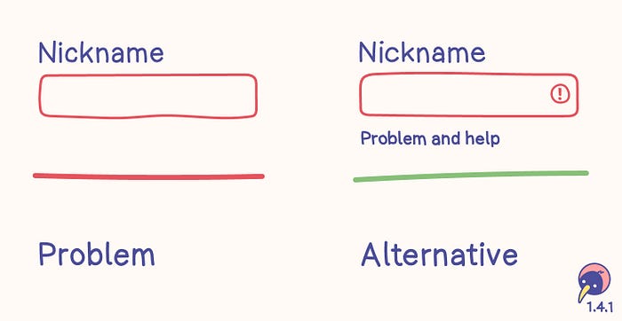
Form verification
Problem
- Some people have difficulty distinguishing between the neutral and red borders.
- Problems can’t be identified and no help is offered.
Alternative
- Symbols are hints without relying on color.
- Text is a clear definition without relying on color. It supports clarifying the problem and helps solving it.
- The text color needs enough contrast.
Disabled elements
This criterion doesn’t mention disabled elements. Even though disabled input fields shouldn’t be used at all, they would need more than just a lighter color.
Inactive components are also mentioned in 1.4.3 Contrast (minimum), increasing the recommendation of avoiding disabled elements.
Links within text
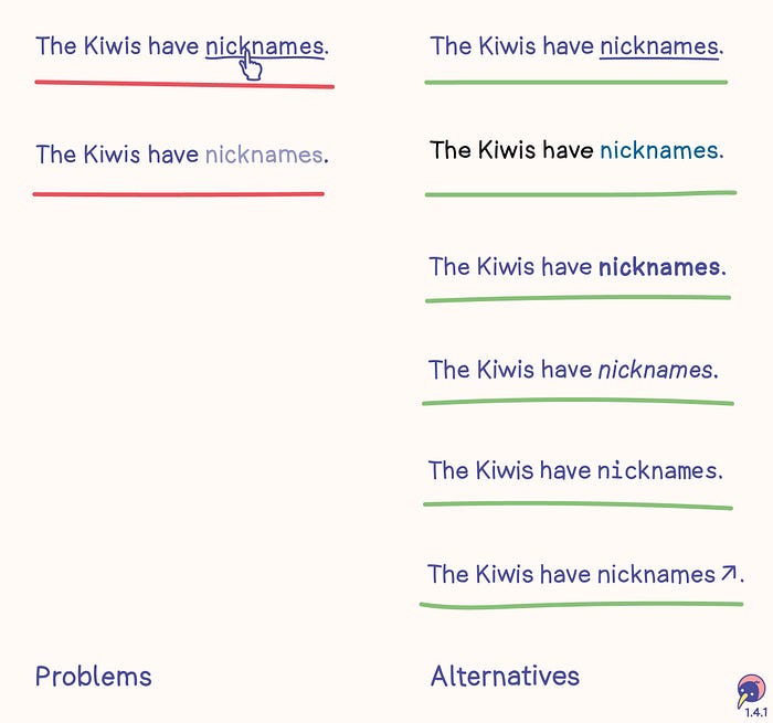
Links within text
Problems
- Limiting the difference between text and links to a hover effect basically makes links invisible. They can only be found by hovering with the assumption it might be a link.
- Changing the color of links without sufficient contrast may make them difficult to identify for some users.
Alternatives
- The common way of visualizing links is setting an underline which is always visible.
- If the design would like to focus on a different color, the color needs to have a contrast of 3:1 to the text color and 5:1 to the background color. Since it relies on contrast, only two states are possible, for example “normal text” and “link”. More details are in Technique G183.
- typographic options, for example bold, italic or a clearly visible alternative font
- symbols aligned with the link, for example an arrow
Links outside text
This example doesn’t include links outside text. They don’t necessarily adhere to these alternatives, as they can be identified based on their page context, for example header or navigation.
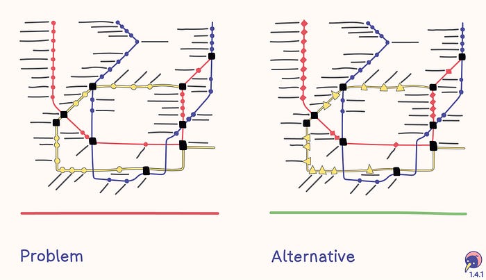
Map
Problem
- The map of a transportation system only displays each route in a different color.
- Each stop is marked with a circle.
Alternative
- Each route has a color and a symbol.
- Each stop is marked with the symbol of the route.
Chart
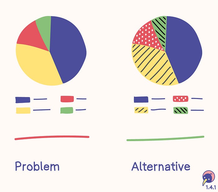
Chart
Problem
- A chart with four bars differentiates them solely based on colors
- The labels of the charts are associated only with the colors.
Alternative
- Each bar is filled with a unique pattern.
- The labels of the charts are associated with the patterns.
Users
Some tools originally designed for supporting accessibility evolved into functions used by a wide variety of people every day. Voice input and auditive output can be quite comfortable, can’t they?
This doesn’t mean every person with a visual impairment is necessarily using a tool. Therefore we should include:
- people who can’t distinguish colors and don’t use assistive technology
- people with limited technology, for example monochromic displays
- people who benefit from colors
- Around 8 % of men are colorblind — this should convince everyone in the boardrooms to invest into accessibility.
Tools
Recommend
About Joyk
Aggregate valuable and interesting links.
Joyk means Joy of geeK