
3

Hugo 多图排版这样来
source link: https://immmmm.com/about-images-gird/
Go to the source link to view the article. You can view the picture content, updated content and better typesetting reading experience. If the link is broken, please click the button below to view the snapshot at that time.

之前采用的是 waterfall.js 和 imgStatus.js 方案,明显的一个弊端是得所有图片完全加载之后才会显示为瀑布流布局。
现已改用 column-count 和 p:has(> img:nth-child) 的纯 CSS 方案,代码少得不得了!
缺点呢,图片是从上往下、从左往右顺序排列,会导致各列高度明显不一致。试用之后,可以接受!


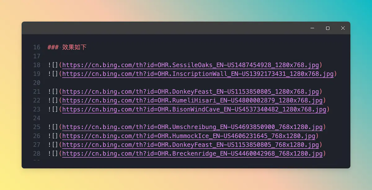
更多图片横竖随机
同样会出现各列高度不一致的情况,但可以接受。
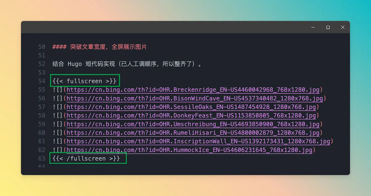
突破文章宽度,全屏展示图片
结合 Hugo 短代码实现(已人工调顺序,所以整齐了)。
折腾三步曲
编辑器内如下格式插入图片即可
图片之间 可以换行但不空行 ,这样 CSS 会匹配到 p 元素内有几个 img 标签,就显示几列一行。
提醒,图片少的时候一般都是横的和横的一行,竖的管竖的。当然,如果多了,也可以不管不顾,随便排。
相关 CSS 丢入主题
其中 .post-content 需匹配自己主题。
.post-content p:has(> img:nth-child(2)){column-count:2;column-gap:8px;margin:6px 0;}
.post-content p:has(> img:nth-child(3)){column-count:3;}
.post-content p:has(> img:nth-child(4)){column-count:4;}
.post-content p:has(> img:nth-child(5)){column-count:5;}
.post-content p:has(> img:nth-child(6)){column-count:4;}
.post-content p:has(> img:nth-child(2)) img{display:inherit;}
.post-content p:has(> img:nth-child(6)) img{margin-bottom:8px;}
进阶全屏图片短代码模版和 CSS
可跳过。因为仅适合单栏主题。
其中的 490px 是这样计算出来的,主题的文章宽度为 960px,所以:960/2 + 10。
短代码模板:shortcodes/fullscreen.html
相关 CSS:
.fullscreen{margin-left:calc(490px - 50vw);width:calc(100vw - 20px);column-count:4;column-gap:6px;}
.fullscreen img{display:inherit;margin-bottom:8px;}
@media (max-width: 980px){
	.fullscreen{margin-left: 0;width:auto;column-count:3;}
}
文章内容调用格式如图:
Recommend
About Joyk
Aggregate valuable and interesting links.
Joyk means Joy of geeK