

Why data visualization is at the forefront of business intelligence
source link: https://itwire.com/business-it-news/data/why-data-visualization-is-at-the-forefront-of-business-intelligence.html
Go to the source link to view the article. You can view the picture content, updated content and better typesetting reading experience. If the link is broken, please click the button below to view the snapshot at that time.

Wednesday, 23 August 2023 06:57
Why data visualization is at the forefront of business intelligence
By Jeff Broth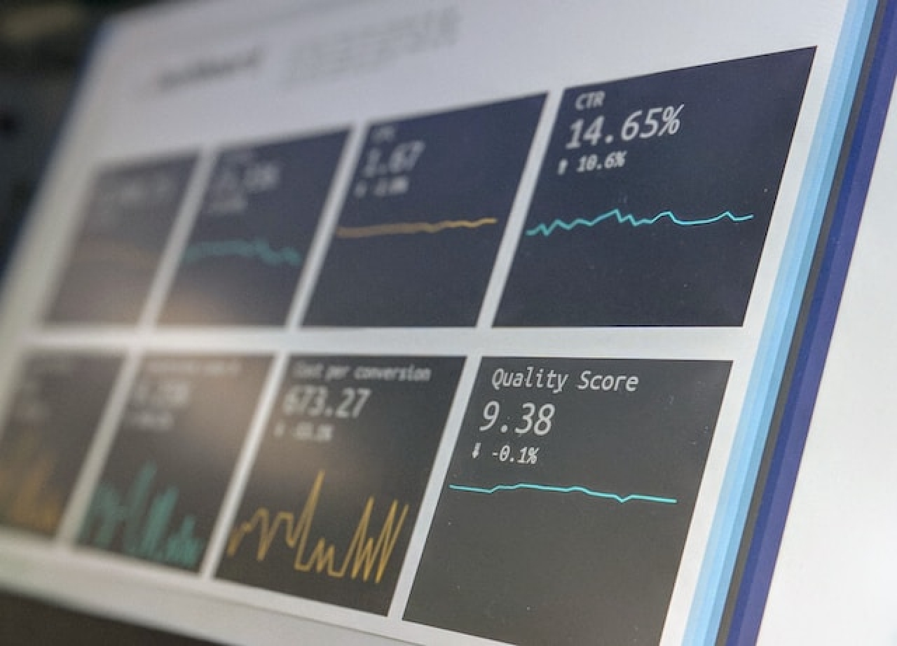
GUEST OPINION: Data is now a central force within business culture, powering every decision and charting the pathway that a company will follow. As time has gone on and people have continued to produce more data than ever before, organizations now have an inexhaustible stream of information. Those businesses that utilize this information will succeed, while those that stand idly by will fall behind.
The stark difference between companies that use data and those that do not cannot be overestimated. According to McKinsey, data-driven businesses are around 23x more likely to acquire new customers, and 19x more likely to be profitable each year. Yet, data analysis technologies are not the only factor when it comes to making good use of data.
Although data analytics is the core engine that provides the insights that businesses use in their decision-making, it is not the raw numbers they turn to. On the contrary, a different form of interacting with data has risen to vital importance – data visualization. Business intelligence is unable to function without a continual stream of precise visualization tools and systems.
Let’s dive into the power of data visualization, demonstrating why it has become the most pivotal part of the data analytics process and is powering innovation in the business sector.
What is Data Visualization?
Data visualization is the practice of transforming numbers and patterns into graphical representations of that data. Instead of just showing executives a table with numbers in it, analysts can use data visualization graphs, charts, maps, or other formats to more impactfully demonstrate the meaning of a set of data.
While most that have some form of foundation in data are able to understand the core meaning of data, even if in a base table, many in leadership positions don’t have these same skills – or only have them to a lower standard. Instead of presenting data and hoping that your audience understands the core of what you’re discussing, data visualization will bridge the gap.
The human brain is incredibly powerful when it comes to recognizing patterns and is drawn to differences in colour, shape, and form. Even someone with no understanding of the underlying data that forms a representation will be able to notice the difference in the size of two bars or the shades on a map.
At its core, data visualization is all about making things easier for the user. Understanding trends, differences, and outliers is easier than ever when made into highly-readable and graphic content. Equally, these graphic representations can be great starting points for additional commentary, as we’ve seen with consultancy firms like PwC and Mckinsey – each of which publishes industry insights and commentaries several times a year.
Why Is Data Visualization Vital for Businesses?
Without a clear understanding of the underlying data from senior executives, there is a need for analysts to create visuals to break down the core ideas behind data. There are numerous forms that these visualizations can take, each one better suited to certain circumstances.
There are a number of reasons that data visualization is now vital for businesses:
- Simplification - Especially at the higher end of analytics, the data that analysts are working with is not as simple as drawing connections between two fixed data sets. With the rise of AI and ML processing, analysts are able to create complex webs of data that may be incomprehensible to an untrained individual. Data visualization overcomes this problem, presenting complex information in the simplest way possible. In this new format, absolutely anyone can discern the underlying meaning.
- Improved Decision-Making - Following on from the above point, if senior leaders are able to readily understand the information in front of them, they’ll then be able to use it to a greater extent. Instead of struggling to find the meaning and why that information is useful for them, they’ll instantly see the direct benefit. This allows them to make more purposeful data-driven decisions that drive their company to success.
- Rapid Outlier Deduction - In large-scale data sets, spotting numbers that are not representative or don’t correlate to the whole may be difficult. However, in a visual format, it becomes much easier to pinpoint errors, outliers, and poor data that may be skewing results. This ensures that all data-led decisions are more effective as you can plan to include or disallow certain parts of the story to make your case more apparent.
Data visualizations are one of the most impactful deployments of data analytics and one that is continually overlooked. Without effective data visualization, many companies would miss out on core insights and make incorrect decisions that would ultimately harm their bottom line.
How Have Data Visualization Tools Expanded Over the Past Few Years?
Data visualization has seen several core trends over the past few years. With the expanding quantity of data that people have access to, there is now more to focus on, leading to the production of several subsets of data visualization. Some people prefer to act as detectives, exploring the connection between datasets, while others act as communicators that depict trends within single sets.
Alongside the diverging methods and approaches people use within data visualization, tools have become available that streamline the creation of new graphic elements. When comparing Steamlit vs Dash, two analytics frameworks, there are a countless variety of visualization libraries, fast prototyping capabilities, and customizability that support analysts.
Another core change that this industry has experienced is its common utility in other sectors. While the world of business has always embraced data and its representations, other fields like academia and non-profits now use graphics as a core way of communicating their messages.
Data visualization has gone through a period of rapid innovation, its central utility in various sectors leading to increased investment and a need to evolve.
Final Thoughts
The world of business needs a continuous stream of information in order to derive insights and make effective decisions around them. However, without data visualization, the vast majority of business personnel are unable to access the core insight garnered from the data. The low level of data literacy in many organizations leads only the data analytics and management departments to be able to engage to the fullest extent.
Data visualization technologies are the key to bridging this gap, delivering insight to absolutely anyone. Equally, data visualization techniques and strategies are much easier to train and educate others on, creating a more accessible way of connecting with data-driven insights. As businesses continue to rely on data, these data visualization technologies will only become more impactful – growing in utility, use, and impact.
Read 416 times
Please join our community here and become a VIP.
Subscribe to ITWIRE UPDATE Newsletter here
JOIN our iTWireTV our YouTube Community here
BACK TO LATEST NEWS here
GARTNER MARKET GUIDE FOR NDR 2022
You probably know that we are big believers in Network Detection and Response (NDR).Did you realise that Gartner also recommends that security teams prioritise NDR solutions to enhance their detection and response?
Picking the right NDR for your team and process can sometimes be the biggest challenge.
If you want to try out a Network Detection and Response tool, why not start with the best?
Vectra Network Detection and Response is the industry's most advanced AI-driven attack defence for identifying and stopping malicious tactics in your network without noise or the need for decryption.
Download the 2022 Gartner Market Guide for Network Detection and Response (NDR) for recommendations on how Network Detection and Response solutions can expand deeper into existing on-premises networks, and new cloud environments.
PROMOTE YOUR WEBINAR ON ITWIRE
It's all about Webinars.Marketing budgets are now focused on Webinars combined with Lead Generation.
If you wish to promote a Webinar we recommend at least a 3 to 4 week campaign prior to your event.
The iTWire campaign will include extensive adverts on our News Site itwire.com and prominent Newsletter promotion https://itwire.com/itwire-update.html and Promotional News & Editorial. Plus a video interview of the key speaker on iTWire TV https://www.youtube.com/c/iTWireTV/videos which will be used in Promotional Posts on the iTWire Home Page.
Now we are coming out of Lockdown iTWire will be focussed to assisting with your webinars and campaigns and assistance via part payments and extended terms, a Webinar Business Booster Pack and other supportive programs. We can also create your adverts and written content plus coordinate your video interview.
We look forward to discussing your campaign goals with you. Please click the button below.
Recommend
About Joyk
Aggregate valuable and interesting links.
Joyk means Joy of geeK