
The ideal viewport doesn’t exist
source link: https://viewports.fyi/
Go to the source link to view the article. You can view the picture content, updated content and better typesetting reading experience. If the link is broken, please click the button below to view the snapshot at that time.
The ideal viewport doesn’t existSkip to content
The ideal viewport doesn’t exist
Before you settle on basing design decisions on a handful of strict breakpoints, make sure you consider the vast fragmentation of screen sizes and browser viewports.
Here at Set Studio, we conducted a little casual experiment to answer “how fragmented are viewport sizes?”. We gathered over 120,000 datapoints with over 2,300 unique viewport sizes. The data mainly came from users in the USA and Europe, therefore it is not necessarily representative of a global audience, but still useful for this article.
The experiment only ran for 48 hours, but the data we got was pretty interesting. Let’s dive in and take a look.
What does 120,000 datapoints represent?
It's important to understand just how many 120,000 is in relative terms. For comparison, let’s presume each datapoint is a person.
Wembley stadium has a capacity of 90,000, so our datapoints could fill Wembley once and still fill another third of the available capacity.
The population of our home town, Cheltenham, is around 116,000 so our datapoints could almost populate the entire town!

-

In safari
-

In-app browser
-

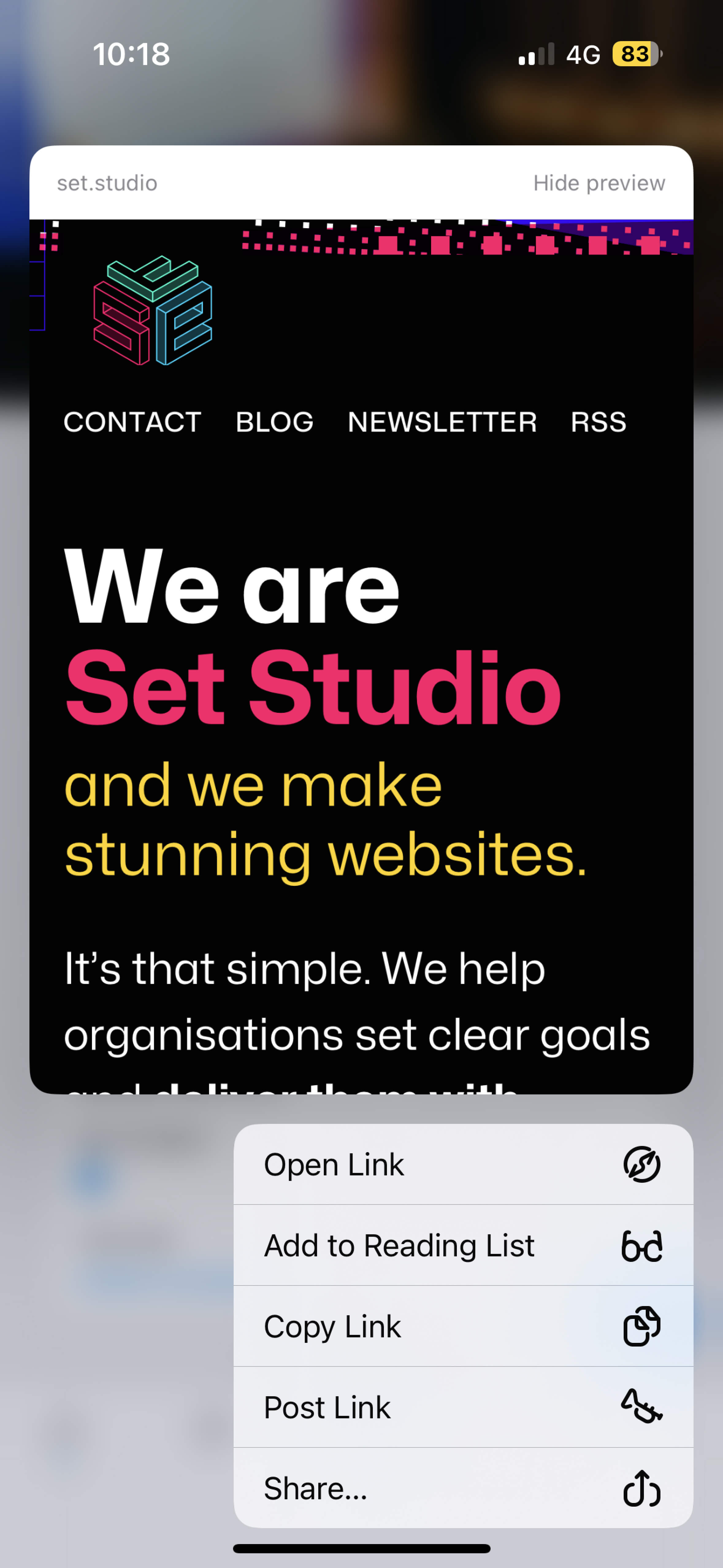
3d touch preview
This isn't a problem if you build in a fluid, flexible manner. That is illustrated in this diagram. If however, you tend to build with very specific breakpoints and hard values for typography, sizing and spacing, you might find that even with the best intentions, you’re not providing the optimal user experience.
Let's take an example of a “pixel perfect” UI with a fixed header and/or footer. It might look great when you shrink your development browser down, but how does it look in the conditions outlined earlier? How does it look when you visit from a tiny viewport like a smart watch? How does it look when you visit from a landscape phone?
Based on some of the combinations of aspect ratio and dimensions, we're confident those cases were represented in our data. Also, people told us too.
Before you commit to fixed headers and/or footers, consider how much content your users will actually be able to see in less than ideal conditions
"Mobile" vs "Desktop"
We've only captured width and height for each datapoint for this experiment and these dimensions were gathered using window.innerWidth and window.innerHeight. We decided to treat any width greater than 800px as “desktop”, or as we prefer to call it, a large viewport.
You might be thinking “800px is way too small for desktop”, which if we were measuring screens, you would be right. We’re measuring viewports here though. A viewport is the window size of the browser, not the screen size.
If you’re on a desktop device reading this, how many windows are filling the entire screen? How much screen space does the browser you’re reading from take up?
It’s safest to presume that users on desktop or laptop devices are not filling their entire screen with a browser. Heck, even tablet users don't fill the screen with a browser, so make sure you consider that when figuring out your larger viewport designs — especially if you’re concealing content for small screens and showing it for “desktop users”. Ask yourself if needing to hide content for small screens and not larger screens means that content is as necessary as you initially thought.
Also consider the sheer fragmentation of “desktop” viewports when working with layouts. Yes, configuring layouts and font sizes using media queries might make sense if you’re using the classic 768px, 1024px and 1280px breakpoints, but what about the vast array of sizes in between?
Let’s see all the viewports
Ok, we've passed on our advice but really, you're here to see a visualisation of the viewports aren't you? Your wish is our command.
Taking inspiration from the 2015 Open Signal report on Android screen fragmentation, we've laid the top 150 in a masonry layout. You can see all 2,300 too.
- Width Height Count
- Width Height Count
- Width Height Count
- Width Height Count
- Width Height Count
- Width Height Count
- Width Height Count
- Width Height Count
- Width Height Count
- Width Height Count
- Width Height Count
- Width Height Count
- Width Height Count
- Width Height Count
- Width Height Count
- Width Height Count
- Width Height Count
- Width Height Count
- Width Height Count
- Width Height Count
- Width Height Count
- Width Height Count
- Width Height Count
- Width Height Count
- Width Height Count
- Width Height Count
- Width Height Count
- Width Height Count
- Width Height Count
- Width Height Count
- Width Height Count
- Width Height Count
- Width Height Count
- Width Height Count
- Width Height Count
- Width Height Count
- Width Height Count
- Width Height Count
- Width Height Count
- Width Height Count
- Width Height Count
- Width Height Count
- Width Height Count
- Width Height Count
- Width Height Count
- Width Height Count
- Width Height Count
- Width Height Count
- Width Height Count
- Width Height Count
- Width Height Count
- Width Height Count
- Width Height Count
- Width Height Count
- Width Height Count
- Width Height Count
- Width Height Count
- Width Height Count
- Width Height Count
- Width Height Count
- Width Height Count
- Width Height Count
- Width Height Count
- Width Height Count
- Width Height Count
- Width Height Count
- Width Height Count
- Width Height Count
- Width Height Count
- Width Height Count
- Width Height Count
- Width Height Count
- Width Height Count
- Width Height Count
- Width Height Count
- Width Height Count
- Width Height Count
- Width Height Count
- Width Height Count
- Width Height Count
- Width Height Count
- Width Height Count
- Width Height Count
- Width Height Count
- Width Height Count
- Width Height Count
- Width Height Count
- Width Height Count
- Width Height Count
- Width Height Count
- Width Height Count
- Width Height Count
- Width Height Count
- Width Height Count
- Width Height Count
- Width Height Count
- Width Height Count
- Width Height Count
- Width Height Count
- Width Height Count
- Width Height Count

Interesting comparisons
-
Commonly 768px width.
Count: 501
Percent: 0.42%
-
Commonly 1024px width.
Count: 367
Percent: 0.31%
-
Commonly between 1200px and 1300px width.
Count: 2566
Percent: 2.14%
-
Default "desktop"
1440px x 1024px
-
iPhone 14
390px x 844px
-
iPhone 13 mini
375px x 812px

Hey there, we are Set Studio.
We help organisations set clear goals and deliver them with confidence, by helping them produce stunning websites that work for everyone.
We would love to help you produce stunning websites, too, so why not see what we're all about?
By Leanne Renard, Liridon Hasani and Andy Bell, for Set Studio
Recommend
-
 23
23
H ow do I allow Linux processes to bind to IP address that doesn’t exist yet on my Linux systems or server? You need to set up net.ipv4.ip_nonlocal_bind , which allows processes to bind() to non...
-
 6
6
Sometimes when writing Swift code you want to reference an instance before its creation. It's not a very common, which is why I'm writing this post so I can easily remember it next time it happens.To have an example to work with, let's...
-
 5
5
Uncoupled code is good, but doesn't exist Wed, Nov 19, 2008Code should try to be as decoupled from the code it depends as possible, I want me C++ to work with any compiler, I want my web framework to work with any ORM, I want...
-
 5
5
The page you were looking for doesn't exist (404) This page does not exist Return to Home Page
-
 6
6
Executive Checklist5 Ways to Build A Successful Business in an Industry That Doesn’t ExistAdam Olalde, CEO & Founder at Xtreme Xperience
-
 3
3
Company comments on Android plans in lawsuit docs iMessage is one rather popular messaging platform, but unfortunately for almost everybody, it’s only available on Apple’s ecosystem, so technically,...
-
 7
7
The $149 Smartphone That Could Bring The Linux Mobile Ecosystem to LifeThe low-cost PinePhone isn’t a perfect device, but the nuanced ecosystem it’s going to build for Linux-based smartphones is going to be ama...
-
 6
6
Face palm: When the emoji you want doesn't existBy Sarah Treanor and Vivienne NunisBusiness reporters Published2 days agoimage copyrightGetty Imagesimage captionFor man...
-
 5
5
Conversation@andreif7 read the M1 Pro/Max investigation, in a scenario where a normal M1 would use all and exclusively the E-cores what does the Pro/Max do? Are those 2 E-cores clocked higher...
-
 3
3
Company Loyalty Doesn’t ExistIf you want loyalty, hire dogs. Humans can come and go as they please
About Joyk
Aggregate valuable and interesting links.
Joyk means Joy of geeK