
1

网站装修笔记20120406
source link: https://jiongks.name/blog/website-building-diary-20120406
Go to the source link to view the article. You can view the picture content, updated content and better typesetting reading experience. If the link is broken, please click the button below to view the snapshot at that time.

网站装修笔记20120406 | 囧克斯
今天为我的新网站做了两件事情:
- 第一件事是为我的主题皮肤加入了侧边栏显示,并使用了css3 media queries技术进行了响应式设计,并借鉴了一些metro ui的思路
- 第二件事是加入了友情链接插件,可以在侧边栏显示一些自定义的链接,方便将来和博友们交换链接
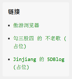
友情链接
先说友情链接插件的事情吧,我在Typecho的插件站找到了一款友情链接的插件,名字就叫Links,非常方便实用。我现在随便放了3个链接,看看样子。大家希望跟我交换链接的,可暂时留言至此,回头我会另外做个交换链接的页面。
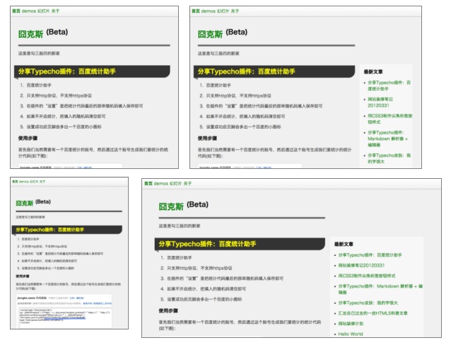
响应式侧边栏
然后是侧边栏,我把最近文章和最近评论两个侧边栏的widget加入了名为large的css class。这类widget会在条件允许的情况下占用更大的空间。一般情况下宽度是普通widget的两倍。在一些特殊的界面宽度下,widget的宽度是一样的,大家没有什么分别。
对于css3 media queries的利用,我这里按窗口宽度分了5档1400px+/1050px+/650px+/400px+/400px-,进行响应式设计。每一档的内容宽度、侧边栏宽度和布局都不太一样。以适应不同的终端。举其中一个例子(1050px~1400px之间):
@media all and (min-width: 1050px) and (max-width: 1400px) {
    #wrapper {
        position: relative;
        padding-right: 280px;
    }
    #sidebar {
        position: absolute;
        width: 260px;
        top: 160px;
        right: 0;
    }
    #sidebar .widget,
    #sidebar .large {
        width: 98%;
    }
}
最终效果如图:
这款皮肤我会稍后更新共享在这里。
另外我最近抽空研究过了SAE Storage,接下来的事情是做一些有趣的侧边栏小控件出来,比如投票、相册、之类的。
先记下这么多
Recommend
About Joyk
Aggregate valuable and interesting links.
Joyk means Joy of geeK