

Common Pitfalls in Design Systems: Overcoming Grid Challenges, Semantic Naming,...
source link: https://blog.prototypr.io/common-pitfalls-in-design-systems-overcoming-grid-challenges-semantic-naming-accessibility-ba37f93f9940
Go to the source link to view the article. You can view the picture content, updated content and better typesetting reading experience. If the link is broken, please click the button below to view the snapshot at that time.

Common Pitfalls in Design Systems: Overcoming Grid Challenges, Semantic Naming, Accessibility
Some of us remember when there were no smartphones and the only monitor had a 4x3 aspect ratio and a resolution of 1280x1024. The main problem back then was cutting round corners in Photoshop to make a button with rounded corners in CSS. Those days are thankfully over, but the age of complex systems has arrived. Modern Design Systems can be more complex than the product they are designed for. This leads to a wrong structure of the Design System and as a consequence, to a weak design of all the company’s products. In this article I will briefly discuss the most common design mistakes of Design Systems in 2023.
Grids
Let’s talk about grids first. At this point in time, mid 2023, almost anything can be built on Flexbox + Grid + Media Queries + Container Queries in the Web. Any layout we want, no restrictions. Nonetheless, this flexibility creates a few challenges, some of which we’ll break down below.
The most painful thing for me is when designers just arm themselves with Figma and start designing layouts and components separately. And then stretch one on top of the other. What’s wrong with the picture below?
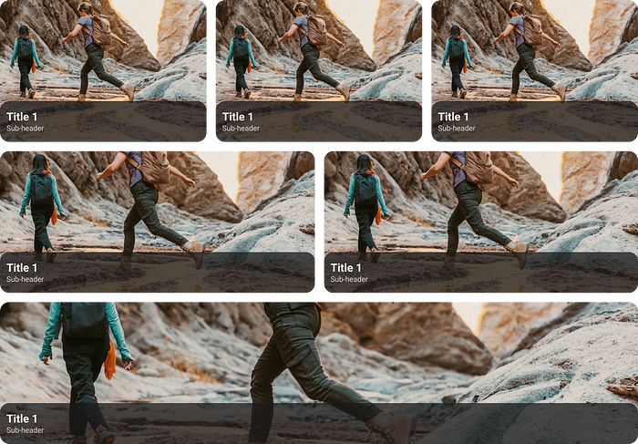
The component at the bottom is stretched to an obscene horizontal width. If we have a photo in the component, and we do, it will also become unsightly. You might argue that “the card should have a max-width property”. Yes, but the problem is at a different level: we need a simple product card for desktop web and mobile web as one component. If the screen width is 375, the card looks one way, and if it’s 640, it’s resized. Well, at the borderline (639px) the card rarely looks acceptable.
There’s the another problem when we design a component for our 1440px and publish it to the Design System as a take-and-use component. Another team takes the component from the DS and… adds it to their product at 1920 screens, and the component always looks bad. After all, it was designed it for 1440!
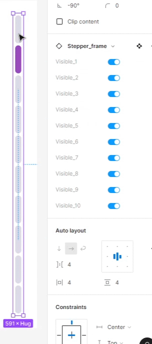
How to solve this. So I came up with the idea that component adaptability should depend on the environment, not the screen size. In the Figma, if we design 375pt wide layouts for iOS, there should be a mandatory requirement before it’s “Ready for Dev”: check the design at 320pt width to cover the iPhone 5S. All components should have constraints and auto layout, so that the layout can be scaled up or down in width and nothing breaks or looks unacceptable. If the layout behaves properly at 320–375pt, it will looks properly at 360. If necessary, the developer should be able to copy the design mockup to his/her Figma and set the necessary width.
There are other solutions on the developer side, but almost all of them are bad. One way was suggested by my backend developer, it is called “backend driving container queries”. When the correct size is calculated on the backend. It’s just crap, duplicates a lot of code, takes a lot of time to introduce changes, and doesn’t solve the problem of incorrectly sized and components’ correct positioning in the layout. Let’s throw this solution in the dustbin under the desktop.
We find another solution on the table: Resize observer polyfill — and it solves the problem, but JS has to deal with the logic.
The most efficient solution so far is to use grid auto-fill. This allows us to build the grid automatically by fractions. And remember the golden rule: Grids are for general layout, Flexboxes is for something small.
Wait, we still have different platforms… same old same old. Let’s discuss it anyway. Is it even realistic to combine Android and iOS components in one Library in a Design System? Is it even worth combining them? And what should we base it on? Leaving aside the nerdy answer “it depends”… I came to the conclusion that I shouldn’t just combine different platforms in one design library. Desktops rely on a mouse cursor, smartphones stick to a finger, and that’s the basis for the platform guidelines. Android also uses a 4px grid, and iOS still uses 5px in places. Even with light and dark themes, Apple’s guidelines don’t recommend using shadows, and in Android, shadows are very common. To avoid such complications, it seems easier and safer to have 2 sets of components for iOS and Android for now, as long as the underlying codebase is different.
We follow a simple rule: everything needs to work perfectly, otherwise it will make it harder to scale.
Naming Tokens
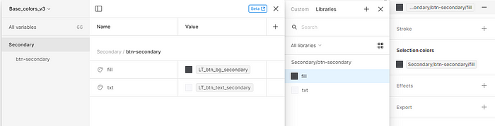
Separate libraries for different platforms… this can lead to inconsistencies! Yes, but I have a solution. We should bring into the common Design System something that is common to all platforms, like tokens. The Brand color is usually the same on all platforms, so that’s a token. The height of a table cell is fixed, so that is also a token. The main thing is to know how to work with tokens, and that’s what I’m going to devote the rest of this article to.
At the moment, designers think of tokens as a set of constants rather than variables. Roughly speaking, they are const, not the let inJS. A constant is defined once and never redefined again (yes, yes, yes, I know that even const can be redefined in JS, but that’s not the point). Hence the correct naming of tokens is crucial, we don’t have to give tokens names only from semantics, i.e. we don’t have to put the name like -spacert-card-medium on the padding, xl is enough in some cases. The value or semantic may change in the future, it’s fine. And yes, the name as the brand_blue token is also wrong. Instead of the semantic $kaspersky-color-text-disabled-on-dark, we use the generic $kaspersky-color-palette-neutral-60. This way, we can easily make changes in the future without loss of semantic context.
Tokens are just a technical layer under the hood to limit variables and manage light/dark themes etc. Here comes another problem for designers in Figma, they are always looking for or trying to write a plugin to export variables from Figma for development. I think the right way is not to export, but to import. Since tokens shouldn’t live in Figma, it’s not a suitable environment. The source of truth is JSON. Even more, tokens can not only be stored in JSON, there is something even cooler: Common JS. In this file format it will be possible to unleash the full power of JS and compute some logic for colors that is not yet available in Figma. And then tokens will stop being constants and start coming alive. If you want, you can start exploring this topic with the Material Design plugin.
Conceptually, I see the designers of a Design System as the developers of a tool. The tool is used by other designers, so they are end users. More practically, should Design System users up to middle+ level have access to tokens? Or just components? Let’s take the Progress Bar component as an example, it is a single organism. It can have either 2 steps or 20 steps, with complex logic. Technically, such a component can be created, but it’s harmful to try to cover all cases with variants. It over-complicates the component unnecessarily, which is exactly what I’m trying to avoid. So designers have the right to detach the component and change it to fit their cases, at least in my team.
Some people in this kind of pain
The question remains what can and can’t be detached. Can designers introduce their own button for just one product? At the moment, I think it should be decided on a case-by-case basis with the Design System Leader. As an analogy, up to now the verdict is made by a judge in court, because laws are not perfect and situations are quite different, and the quality of the defense (the work of a lawyer) also affects the result. If the case goes to court, logic and prudence should prevail, not strict rules. Same for us, if the designer wants to do something custom instead of using ready-made components from the Design System.
Idea: Components should be a convenience to designers, not a punishment.
Readability
The principle is identical for all platforms, but I’ll take Android as an example. On Android, the text that should scale depending on the system settings is specified in sp (supporting Accessibility settings). In my product, this is all texts up to size 22. Non-scalable texts start with sizes larger than 22, and the units for them are dp (accessibility settings do not affect). Because these are headlines, which are big enough themselves and can be seen easily even by people of determination. But the probability that after applying Accessibility settings the header will not fit even in the screen width is high. Consequently, it may get cropped and no one will be able to read the text, not only people of determination. You might ask, why keep fonts scalable based on system settings? We can just design all text with maximum contrast and gigantic sizes by default, right?
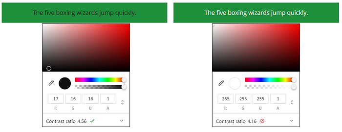
Think about it: if a person has trouble reading text because of a disability, it starts much earlier than visiting our site. Therefore, the person already has a solution to the problem, it just needs to be supported by our site/application. It is the operating systems that take care of this. You may have noticed that when you activate a new iPhone, you are immediately prompted to enable the accessibility settings used by about 43% of users. These settings provide many tools, including contrast enhancement, color inversion, font magnification, and more. Our responsibility is simply to support these OS features in out code base. We don’t need to add a separate version of the site for the visually impaired, just support the necessary settings in the code, and OS will do everything by itself in a better way. So, we certainly don’t need to make the text in the placeholder so contrasting that it’s identical to the filled field, just to blindly follow the old version of WCAG.
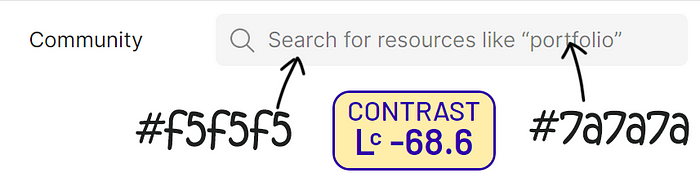
Contrast of the placeholder in Figma community, according to APCA
Great, but how do we get such a result in Figma? The same principle applies to text style sets in tokens: for non-scalable elements the font size is fixed, it’s all clear. But for scalable fonts, the font size refers to the base unit + multiplier.
When a designer prepares a layout for production, he/she should do the following: first, check the layout at 320pt width; play with accessibility by scaling fonts. In case of any visual problems, there is time to redesign or comment the problematic place for the developers.
As a result, we get an adaptive layout that checks for accessibility settings, and even a beautiful design because we don’t increase the size of the text unnecessarily. You know, increasing all the fonts in a row sometimes makes for an ugly UI. Sometimes, not always. And an interface should be beautiful, and there is no excuse for an ugly UI.
I would also like to make an interesting point. All designers have memorized what WCAG is, but there is a catch: WCAG 2.1 introduced an algorithm for determining contrast, on the basis of which many services and plug-ins have been created. But it turns out that the algorithm is far from perfect. For example, the algorithm said that black text on a dark green background was normal. The use of this algorithm can be identified by a contrast index such as 4.5:1. Of course, WCAG was aware of this problem, and in the new version of WCAG3, they released a new algorithm that takes many parameters into account and is much more accurate and humane. Unfortunately, not all services have switched to the new algorithm so far, and I’m still told in interviews that a contrast 4.5:1 for normal text and 3:1 for large text match is sufficient. To which I can only say AAAAAA…
Semantic naming
Names in a huge project are better set via semantic. For example, in Carbon Design System only semantic spacing is used.
For color names… of course you can limit yourself to simple primary, secondary, tertiary, neutral, negative, positive, attention, info. And that’s semantic. As you work, new components will appear, such as Rating component with stars. If there is a need to manage this color separately, it means that we define a separate semantic color graphic.raiting-ui-200 only for Rating component. The main thing is to understand whether the new UI-component is a new entity or part of existing ones. Colors at the component level are only assigned from semantic.
Remember, the more products there are, the simpler the Design System should be, and the semantic naming works decently here. Even if there is only one product, but a large team of designers, it is better to use the semantic approach. Less mistakes. But keep a balance: over-simplification is just as harmful as overcomplication.
For instance, for paddings it may be fine to use quite simple 8px = md, 16px = lg, 24px = xl, 32px = xxl. Because we usually want to avoid a variety of different paddings and font sizes, this way of naming has a right to live. To answer the most popular question: what if we need to add a new variable 20px between lg and xl? Since this is a rather rare case, we can always think of a suitable name. It’s fine if it’s once per year.

I won’t hide the fact that “color naming” is a very controversial topic and that every design team will have different needs. But it’s always helpful to have a reference for how other teams implement the Design System structure. For example, I also recommend looking at an example
Buttons
Use Bootstrap’s custom button styles for actions in forms, dialogs, and more with support for multiple sizes, states…
Colors are more painful than they look
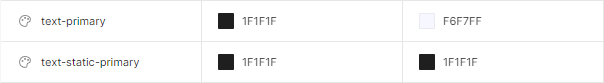
Not all colors are changed when changing themes from light to dark. Design System should has a separate section of static colors, it’s normal and helpful. These do not change depending on the theme. For instance, we can have text-primary and text-static-primary for dark theme with the same values.
I’m sure you’ve had the idea, or even come across a color naming system in the format:
lightest
lighter
light
superlight
medium-light
medium
medium-dark
dark
darker
heavy-darker
darkest
superheavy-darkest
I always have a question for this author’s of this system, what if I need to add an intermediate color between dark and darker? Can you tell me exactly which color is brighter: lighter or light, without looking at the color itself? As I wrote in a few sections above, I allow designers to detach components from Design System, and I give them full access to tokens. This means that the naming of color tokens should be clear enough to minimize the chance of mistakes when they design something custom. How I prefer to name colors? Well, semantic naming is quite appropriate in this case, as I said before.
And now time for hardcore. There are many ways to define a color scheme. From very primitive Gradient Palette, to complex promts to ChatGPT. Another interesting concept is sequential color detection based on the background color. In other words, you set the main color, and the token system automatically calculates new values for cards, text, and so on. Each color token has not a fixed value, but an expression: the base value of “lightness” multiplied by a coefficient of required contrast. As a result, to create a new theme (light or dark, or many), you only need to replace the base “lightness” value.
While trying to implement this approach, I ran into limitations of modern tools. I tried to implement this using Tokens Studio. I defined a variable for the color in HSL format and added the condition L + n. n is a number that provides the required contrast level in lightness. But beyond that I have to consider additional conditions like WCAG, which makes the task more difficult. It just got so complicated that it’s no longer necessary. After all, everyone knows that complex systems break easily and don’t scale, so they should be avoided, right?
But suppose you disagree with me and you succeed in solving this problem (I did). The second problem is the imperfection of HSL as such. It is based on the mechanics of RGB monitors, not human perception. In other words, it is a system for machines, not people. The most obvious problem with this approach is the unevenness of luminosity when changing the H parameter, which leads to a number of contrast problems. And here there is a solution as well, it’s to switch to OKLCH or LCH color spaces. But of course they are not available in Figma or Tokens Studio right now. So, we need to wait for a couple more years… and so far we can still use naming for colors as 100–500–900.
Bottom line, it’s cool to be an inquisitive geek, and I am one. I encourage you to experiment with new ways of dealing with Design Systems structure and naming, to play with creative ideas all the time. But never forget that the primary goal of every designer is to make the service convenient for the users. The users of the Design System are also users, and we must take care of their convenience.
Recommend
About Joyk
Aggregate valuable and interesting links.
Joyk means Joy of geeK