

Striking the Balance: The Intersection of Common Sense and User Research in UX D...
source link: https://uxplanet.org/striking-the-balance-the-intersection-of-common-sense-and-user-research-in-ux-design-8efd21a70276
Go to the source link to view the article. You can view the picture content, updated content and better typesetting reading experience. If the link is broken, please click the button below to view the snapshot at that time.

Striking the Balance: The Intersection of Common Sense and User Research in UX Design

In this essay I’ll be exploring a thought-provoking statement that touches on the fine balance between intuition and empirical data in the world of UX design.
While I was online I stumbled in a statement that incorporated:
- Design Patterns
- Common Sense
- Research
If you are a researcher, you probably already know where we are going, it’s just that when you read “common sense” and “research” together, you have that shiver down your spine isn’t it? You damn rare beast of these dark days!
That statement, with thousands of likes, that in line of principle I found correct but that in practice, I personally find over generic, was saying:
You don’t need to validate every small design choice to get the confidence to proceed with it.
You don’t need a usability study to test straightforward functionality like basic forms.If you use software intentionally and develop a good general understanding of how people interact with software, you should be able to design universal interactions without asking users if they make sense.
Research is complex and expensive. Keep research for challenging systemic problems.
Don’t waste your effort and time on testing stuff that should be obvious to design if you have ever used any popular piece of software.
Use your common sense and avoid over-complicating interactions.
There are consumer apps serving millions of users effectively, and they do it with well-established interaction patterns. Emulate those. Don’t reinvent the wheel.
There was also a funny comment from a Senior Product Designer that I wanted to recall because I found it quiet symbolic, it was saying:
The opinion you hold will get you a lot of hate from ux purists. I’m not one of them.
What is a UX purist? It made me imagine these hate filled purists living in Gilead and keeping poor Product Designers and UI Designers as servants while preaching them the Bible of Usability 😅
But then, what would be a non purist UX? the one that skip research and simply follows common sense for basic things? (which basically was me in 2000 doing web design 😁) and who/what define what are small things? and straightforward? and what is common sense?
Because normally, striking the right balance between thorough research and practical implementation is often one of the keys to succeed and often… balance is missing within us.
That’s why I recalled that comment and decided to include it. Besides the fact that it has that vintage clichéd flavor where UX Designers are labeled as purists, with a negative connotation, as soon as they try to express a “UXerly Thinking.”😅
Now let’s go back to the statement I was referring:
1. “You don’t need to validate every small design choice to get the confidence to proceed with it.”
What is a small design? in what context? is it small for you, for me, for us or for them?
Ok, yes in line of principle is true, I mean there’s a validity to some extent, but how many, would actually understand it as a line of principle? and how many kidnapped by confirmation bias would fall for it without first thinking at 360°?
It is true that not every small design choice requires validation, especially if it aligns with established design patterns and best practices. However, some level of validation and user feedback is still essential to ensure that the design meets the specific needs and preferences of the target users.
Not only, we are not machines and we are not infallible, testing, design critique etc serve as a litmus test.
Incorporating user feedback and validation, even for seemingly minor design elements, can lead to valuable insights that help refine the overall user experience.
Moreover, user behavior and preferences can vary significantly across different contexts and user groups and what might seem like a minor design decision to a us, could have a substantial impact on the user’s experience.
2. “You don’t need a usability study to test straightforward functionality like basic forms.”
Ok, in line of principle is true, but there is the usual “it depends” which doesn’t make this sentence valid, but partially valid.
Basic forms may seem straightforward, but they can still impact the user experience significantly.
This statement also assume that on the other side there’s “someone” who knows what he is doing, which is not necessarily true.
“Ah Erik what the hell, come on, if someone is working in the field he/she certainly know how to implement a straightforward functionality like a basic form”
Well no, not necessary. I may simply mention the fact that from the early 2002–2003 more or less, UX, which started as a “terminology extension/evolution” of usability, has been progressively engulfed by professions that were already established in that time, like Web Designers, UI Designers, Product Designers and Visual Designers.
Furthermore, from the year 2013 starting with General Assembly, all major Bootcamps, and some master I saw, have built “UX” around a web design core, totally neglecting psychology (eg name a Bootcamp that explain the stages of cognition or cognitive heuristics or in vivo coding in qualitative research) and minimizing usability teachings, rather than build UX around a psychology/usability core which would have anyway naturally led to including web design aspects.
The reality is that the ability to design and implement a user-friendly form is not always a given, even for experienced designers.
Designing a seemingly simple form that meets user expectations and is easy to use requires one of these three things:
- A. You didn’t study but you have absorbed this knowledge by osmosis, being exposed to forms that were correctly crafted, being exposed to colleagues that passed you the correct information.
- B. You have studied and you understand various usability principles, best practices, and the psychological aspects of user behavior.
- C. None of the above, but you are proactive, you understand that everything on the screen should be there for a reason, crafted in a certain way, so you have questions and you do some quick secondary research.
Objectively, the validity of the statement depends on the individual designer’s expertise. While experienced designers might have a better intuition about form design, it doesn’t eliminate the need for usability testing.
Some example?
Well there are a lot of forms that continue to use a label as placeholder, not accessible forms and forms that let the user guess what fields are mandatories or does not clearly communicate the mistakes the user made while filling up the form itself.
Even straightforward functionality like basic forms can have usability challenges that might not be immediately apparent and even if in principle usability studies might not be necessary for simple forms, conducting some level of usability testing or user feedback is beneficial to identify any potential issues.
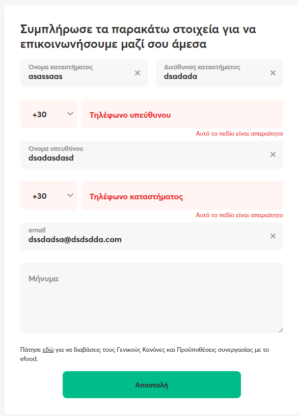
Let’s see some example of forms that I guess, would be defined as straightforward:

The first thing you see here, is a label used as placeholder. We already know that this is not recommended and we know it thanks to… well research! 😁 and if you personally didn’t do that specific research, there’s still NNgroup that inform you about this.
Labels should be placed outside of the placeholder, because when you type in the text field, the label disappears and the memory aid function is lost, furthermore some users could get confused and think that the field is already filled in.
In this case though the form uses a floating label, which is an alternative, but this is typically a mobile design solution. We use a floating label because we need to save room on mobile viewports and mobile app, here I was on a desktop.
Once the floating label is triggered, I have two problem now, the characters are too small and the contrast ratio is too low.
Let’s move on, do you see anything else? Well there’s a bit of work around the hyperlinks, isn’t?
Best, would be to underline hyperlinks, this indicate people that they can click on them, instead of guessing they can, which would also be an heuristic mistake.
Of course, hovering over the hyperlink and displaying the underline:

it’s an acceptable alternative, but the hyperlink should also be different from the body text which is not

and when you click on “Need Help” you get this:

where you can see that the hyperlink part of the body text is actually underlined, while “need help” wasn’t.
However if we go back we see that we have an hyperlink indicated in white (sign up) one without indication (need help) and one “learn more” which however it’s not in blue, but in grey and also underlined, pointing out there’s also a certain lack of congruence.
Last but not least, people who cannot perceive color differences cannot identify links.
But there’s something more, if you click on “learn more” in the first form, you get this:

“learn more” disappear and a new text unfold below. This can be confusing for the user, and doesn’t really look as a common pattern in response to an hyperlink.
Here instead there’s another problem and a heuristic breach:

You only know there’s a rule for the password (between 4 and 60 characters), only once you make a mistake, instead we should be informed in advance.
“Don’t set users up for failure with secret rules” — Kathryn Whitenton, NNGroup
This is another form with similar problems:

mandatory fields are not indicated, moreover it seems that only the red fields are mandatory, yet when you fill them up and you click on the CTA button, this is what you get:
Aha! so also the telephone/mobile fields were mandatory, but we only found it later. So I fill up the missing fields and I click the CTA and this is what happens:

I simply got this error message telling me “please try again” but what’s the problem?
It doesn’t help me to correct any mistake I may have done and because I cannot find a work around, it’s a high level heuristic error.
You may think that it’s because I didn’t type in anything in the message box, but it’s not the case, also because this form when I’ve took the screenshot was able to send a message without actually writing something in the text box, after all, it’s not a mandatory field.
3. “If you use software intentionally and develop a good general understanding of how people interact with software, you should be able to design universal interactions without asking users if they make sense.”
How far does this sentence go? are we in the MVP realm?
I mean, if I was still a web designer yeah, go for it, but as UXer, to me it doesn’t look entirely true.
Having a good understanding of user behavior is important, but it doesn’t replace the need for user research and usability testing.
Users might have diverse needs and preferences, and designing without involving them can lead to assumptions that may not hold true in practice. Also, can research be synthetized in simply asking users if the interactions make sense?
Designing universal interactions that cater to a broad range of users is undoubtedly a “cool” goal, however, and it seem so by what I’m understanding, assuming that a good general understanding of how people interact with software is enough to achieve this without involving users in the design process can be risky.
This because it’s the same cognitive psychology that teaches us that individuals process information differently based on their experiences, backgrounds, and cognitive abilities and so accommodating this diversity can only be achieved through direct involvement and feedback from users.
Are we here still in the realm of skipping research under the above so far stated situations? Can research be skipped by simply using established design patterns? :/
4. “Research is complex and expensive. Keep research for challenging systemic problems.”
“Research is complex and expensive” well… first a moment of silence for those UX Researchers that may have landed here and now crying in a corner.
Most of the times I’ve heard that research is complex and expensive, was from people opting for qualitative research, writing questions that could potentially trigger bias and getting away with the final results without calculating the statistic value of such data: “yeah! let’s do surveys they are cheap🥰”…😒
Also, doesn’t sound like one of those clichéd and hackneyed phrases born in the past and repeated over time like a justifying mantra that no longer finds correspondence with reality?
All in all, yes, general speaking it is true that some research efforts can be complex and expensive, but it’s essential to recognize that user research is not a one-size-fits-all approach. The level of complexity and resource allocation for research should be tailored to the specific project’s needs and objectives, moreover it’s 2023 and with advancements in technology and research methodologies, user research doesn’t always have to be prohibitively expensive.
I saw managers crying at the idea of just 10 user interviews saying ”it would take too long”, I heard a CEO telling me “so what do you want? that I allow you to do research? and then what? bringing me the results in three years?” and I saw managers allocating one month of generative research for an MVP and getting a high quality result with dozens of interviews and qualitative data analysis annexed.
5.“Don’t waste your effort and time on testing stuff that should be obvious to design if you have ever used any popular piece of software.”
Eh, ok sure again, generally speaking yes, do not waste effort and time, but:
Who says what should be obvious?
What is obvious?
Obvious for who? for us? for business people that may read this sentence in a dogmatic way and victim of confirmation bias get back in their offices and start to cut on research? ’cause actually it often happen in this way😅
This sentence raises an essential point about not assuming that what is obvious to a designer will also be evident to users.
I had to cancel an advertise in FB marketplace in order to republish it. I did it and FB without informing me, deleted all the conversations I had in my messenger with the buyers that asked me about the deleted product I was giving away.
Beside failing an heuristic audit, it has also broken a mental model, the one for which the messages in my messenger stays there, unless I do not go to delete that messages, and I didn’t.
Was for the well paid super expert design team in FB an obvious action to take without inform the end user? Well was not obvious for me.
Curiously, if the delete process you indicate the item was given away through FB marketplace, you will get a pop up informing you that the user messages you received, will be deleted.
Even if certain design choices seem obvious to us, they might not align with the mental models or behaviors of the actual users. Users come from diverse backgrounds and have varying levels of digital literacy, so we cannot assume that everyone will approach the product in the same way.
Hence, relying solely on personal assumptions about what is obvious in design can be a pitfall.
While we may have a deep understanding of popular software and common interaction patterns, it’s important to remember that each product or application has its unique context and user base.
Any popular piece of software, may be popular, but still have a wrong design either because everybody copied everybody, or because nobody did research.
Relying solely on personal assumptions can lead to blind spots in the design, and user testing is there right to uncover issues that we may not have anticipated, leading to a more refined and user/human-centered product, or in another scenario, service.
6.”Use your common sense and avoid over-complicating interactions.”
Has common sense to be used in general?
Has to be used to identify the obvious “stuff” mentioned in the sentence 5, or it has to be used to avoid over-complicating interactions?
In line of principle it’s valid, but the above forms example were designed by businesses with more than a designer and as well with a director/head, yet the design had basic problems.
This because common sense is:
- Subjective
Our thought processes, cognitive biases, and mental models all influence how we interpret and make sense of the world around us. These factors can affect our perceptions, decision-making, and understanding of various situations, including user interactions with digital interfaces. - Knowledge based
Besides the lines in the previous point, common sense it’s also knowledge based. Our capability to assess a situation using common sense rely on what we know, and what we know does not necessary match the seniority of our job title, even when it’s just about basics things. - Also intuition based
Common sense is also based on our intuition.
If we design relying only on common sense for what we think are basic things, beside being at risk of bias, we are also saying that we assume about people behavior, in another terms how people will behave interacting with the system we have designed.
Intuition about people behavior, often turns wrongs, and that’s why science does not rely on it, and that’s why all we know today about usability, it comes from scientific research methods.
So while common sense has its place in design, it should be complemented by research to ensure the design choices.
7. “There are consumer apps serving millions of users effectively,
This is partially valid, we have all around example of consumer app serving millions of users, yet they have basic mistakes.
Do they serve them effectively? according to who?
- The person with a motor impairment that struggle to click on the CTA because it’s too small or too close to another one?
- The color blind person for which you have designed a dashboard that uses colors that makes the chart bars unreadable?
- The one unaware of having a cognitive disorder for which you have designed a page overwhelmed by extraneous cognitive elements and that now think to be too stupid because can’t sort it out?
and they do it with well-established interaction patterns. Emulate those. Don’t reinvent the wheel.”
Well, in 2005 Amazon was not someone anymore someone to emulate according to this article on NNGroup
While well-established interaction patterns can serve as valuable guidelines, blindly copying them without considering the unique context and user needs of a specific product can lead to missed opportunities for innovation and customization. User research plays a vital role in understanding the target audience and their specific preferences, behaviors, and pain points.
Moreover, cognitive psychology teaches us that user behavior is influenced by factors beyond just familiarity. Factors like cognitive load, visual hierarchy, and the user’s mental state also impact how users interact with interfaces. Therefore, while emulating established patterns is a solid starting point, designers should also consider the underlying psychological principles that drive effective user interactions.
In conclusion
Even if in principle and pour parler many part of the statement can make sense, once analyzed with a critical spirit, we realize that there is a sea between saying and doing and that they cannot be applied in a 100% safe way without having some research backed up.
Recommend
About Joyk
Aggregate valuable and interesting links.
Joyk means Joy of geeK