

Top UI Component Libraries for Rapid Prototyping
source link: https://www.designyourway.net/blog/ui-component-libraries/
Go to the source link to view the article. You can view the picture content, updated content and better typesetting reading experience. If the link is broken, please click the button below to view the snapshot at that time.

Top UI Component Libraries for Rapid Prototyping

UI component libraries? Think of them as the ultimate cheat codes in the web design universe. It’s like having a pre-made pizza base when you’re starving – just throw on your toppings and bam, dinner!
Here’s the scoop:
- Designing UI from scratch? Imagine carving a spoon every time you wanna eat cereal. Tiresome, right?
- These libraries? They’re the cereal-saving spoons. Quick, efficient, and super handy.
Why go gaga over them?
- Speedy Gonzales! 🚀 They save you heaps of time.
- No need to reinvent the wheel. Ready-to-rock components like buttons and forms? Got ’em.
- Spend more time on the cool parts of your project.
Dive into the UI component galaxy with me. 🌌
- Discover the magic types.
- Unearth the treasure of top libraries.
- See them in action in the real web world.
Understanding React UI Component Libraries
What is a React UI Component Library?
A React UI Component Library, in essence, is like a buffet for your web design. It offers a variety of pre-made, reusable components that you can select and use in your projects.
Think of it like going to a buffet and having an array of dishes at your disposal, ready to devour.
Why Use a React UI Component Library?
As to why you should use one? Well, they are incredibly handy. When you’re building a web application, it’s easier to start with components that have already been designed, tested, and optimized.
This way, you can focus on building unique features for your application, rather than spending time on creating basic UI elements.
Pros and Cons of Using a React UI Component Library
Sure, like everything else in life, using React UI component libraries has its pros and cons.
The goodies are many. These libraries help speed up the development process, ensure consistency in design, and often provide accessibility support right out of the box.
They also come with built-in responsiveness, meaning your UI will look good on all screen sizes without extra effort.
But we can’t ignore the downsides. Some libraries may not suit your project’s specific needs.
They can also become bulky and slow down your application if not used judiciously.
You might find yourself wrestling with the library’s code style or structure, which may be different from your own.
Get 300+ freebies in your inbox!
Subscribe to our newsletter and receive 300+ design resources in your first 5 minutes as a subscriber.
Remember, it’s all about choosing the right tool for the job. And that’s our next destination in this exploration.
Choosing the Right React UI Component Library
Factors to Consider When Choosing a React UI Component Library
Choosing the right UI component library might feel like standing in a candy store with endless shelves. Sweet, but overwhelming, right?
Here’s a little guide to simplify things:
Scope: Check what the library has to offer. Does it cover all the components you need, or does it focus only on specific parts of the UI?
Customization: How much can you tweak the components? Some libraries give you a lot of freedom, while others prefer to keep you on a specific design path.
Size: How much space does it take up? Larger libraries can slow your application down, so consider your performance requirements.
Documentation: Look at how well the library is documented. Good documentation can save you from a lot of headaches down the line.
Community: Is there an active community around the library? A larger community often means more resources, tutorials, and quick help when you run into problems.
Understanding Your Project Requirements
Before we even step into that candy store, we need to know what kind of candy we want. Or in our case, what we need for our project.
Are we building a small, one-page website, or are we venturing into the realm of complex, data-heavy applications? Do we want a consistent look across different projects, or are we aiming for a unique, one-of-a-kind design? All these questions help us understand our project requirements and guide us towards the right library.
Evaluating the Community and Support for the Library
Last but not least, let’s look at the people. Yup, the ones behind the libraries, and the ones using them. A vibrant, active community can be a strong indicator of a good library. It means people are using it, improving it, and are there to lend a hand when you hit a snag.
Check out forums, GitHub issues, Stack Overflow. See if the library’s creators are active, if bugs are being fixed, if questions get answered. This can give you a glimpse into the level of support you can expect.
Choosing the right UI component library might feel like a task, but it’s worth every minute spent on it. After all, this library is going to be the backbone of your application’s UI. You’d want to make sure it’s strong, reliable, and fits your needs, wouldn’t you?
Detailed Review of Top React UI Component Libraries
MUI (formerly Material-UI)

Overview
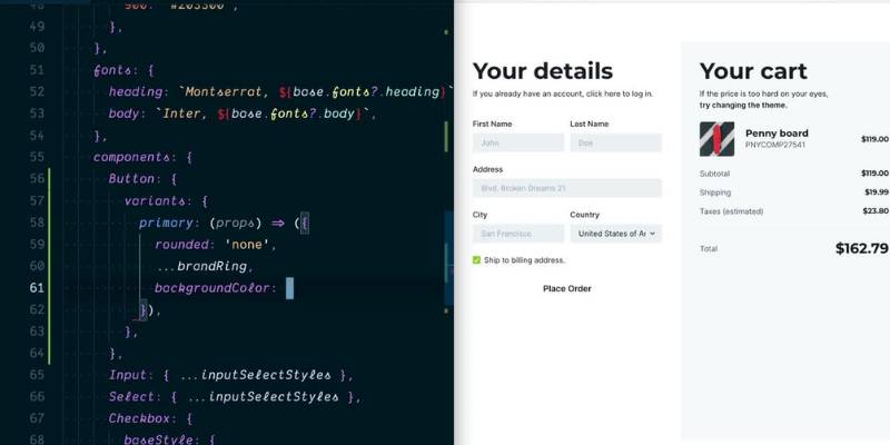
Welcome to MUI, one of the heavyweights in the React UI component libraries arena. The library, known previously as Material-UI, was born out of Google’s Material Design philosophy. It aims to provide a polished, sophisticated, and accessible suite of components, straight out of the box.
Features
MUI packs a whole load of features in its toolkit. You get pre-designed components that follow Google’s Material Design. You’ve got buttons, cards, dialogs, forms – pretty much anything you might need for your UI. And the best part? MUI is highly customizable. You can tweak components to suit your style, without losing the Material Design feel.
Pros and Cons
While MUI is a fantastic toolkit, it’s not without its pros and cons. On the plus side, you get a sleek design, a broad range of components, and flexibility. It has excellent documentation and a large, active community to back you up.
But on the downside, MUI can be a bit heavy. The size of the library might slow things down, especially for smaller projects. Also, if you’re not a fan of Material Design, MUI might not be your cup of tea.
React-Bootstrap
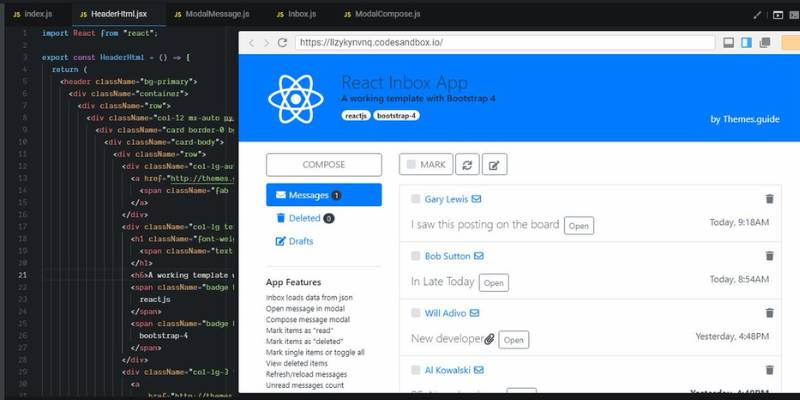
Overview
Say hello to React-Bootstrap, the React version of the beloved Bootstrap framework. Bootstrap’s been around in the web development world for quite a while, and React-Bootstrap carries on the legacy, but with a React twist.
Features
React-Bootstrap offers a set of responsive, accessible components right from the Bootstrap framework, but re-imagined with React. You have the familiarity of Bootstrap combined with the power of React, giving you the best of both worlds.
Pros and Cons
React-Bootstrap brings the tried-and-tested reliability of Bootstrap to your React projects. It’s lightweight, flexible, and plays well with React. However, if you’re looking for a more modern or unique design, React-Bootstrap might not be the best fit. It could also feel limiting if you want more customization options.
Ant Design
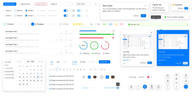
Overview
Next up is Ant Design. A design system hailing from China, with an impressive set of high-quality components and a modern aesthetic. It’s a library that values usability and accessibility, providing a consistent and engaging user experience.
Features
Ant Design comes with a plethora of components, each with a multitude of properties you can adjust. It also offers a design kit for several popular design tools, allowing for design and development cooperation.
Pros and Cons
Ant Design stands out with its modern, professional-looking designs and a vast range of components. However, its extensive customization options can also be a drawback, making it more complex and slightly overwhelming for beginners.
There’s a lot more to explore in the world of React UI component libraries, but that should give you a taste of what’s out there. Remember, the right library for you depends on your project’s needs and personal preferences.
Reactstrap
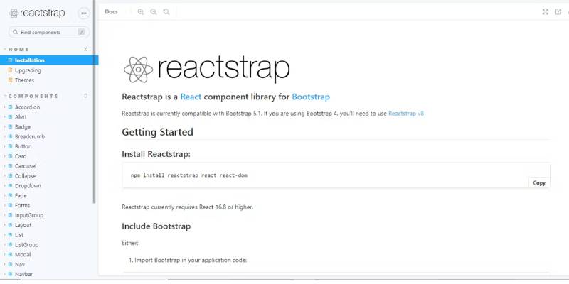
Overview
Reactstrap stands as a beautiful bridge between Bootstrap and React. It’s all about simple, stateless Bootstrap 4 components. If you’ve been a fan of Bootstrap but crave the simplicity and power of React, this might be your match.
Features
Reactstrap provides a buffet of Bootstrap 4 components, reimagined for a seamless integration with React. It offers a set of responsive, accessible components that can quickly take the shape of what you need. Flexibility is the name of the game here.
Pros and Cons
On the positive side, Reactstrap inherits Bootstrap’s wide adoption and extensive documentation. It’s simple, easy to use, and you can create a clean, functional UI in no time. However, the library is somewhat basic. If you’re looking for something more extensive, with unique components, Reactstrap might feel a bit limited.
Semantic UI React
Overview
Semantic UI React, as the name suggests, is the official React integration for Semantic UI. It’s all about bringing the power of words to UI component design.
Features
Semantic UI React prides itself on its intuitive, human-friendly approach to naming conventions. The idea is to create a language around the UI that applies clear, meaningful names to components and their parts. It’s like a straightforward dictionary for your UI component needs.
Pros and Cons
Semantic UI React is user-friendly and intuitive, with a smooth learning curve, making it an excellent choice for beginners. It offers a wide range of components, and the semantic naming approach makes the code more readable. However, it’s not as widely adopted as other libraries, and some users find it less customizable and flexible.
Chakra UI
Overview
Chakra UI steps on the stage with its belief in simplicity, modularity, and performance. It’s a newcomer compared to others, but it has quickly gained popularity in the React community.
Features
Chakra UI provides a set of accessible, reusable, and composable React components that you can use to craft your UI. It’s a library that values accessibility and theming, allowing you to adjust the design to your needs while ensuring a high-quality user experience.
Pros and Cons
The shining points of Chakra UI include its focus on accessibility, the ease of theming, and a clean, modern design. It’s also relatively lightweight, which can help keep your app’s performance on point. However, as it’s newer, it may lack some components you can find in more mature libraries.
Theme UI
Overview
Let’s now meet Theme UI. Its key selling point? A robust theming specification for the UI. If you’ve got a project where you anticipate style changes or want to provide theming options, you’ll want to have a look at Theme UI.
Features
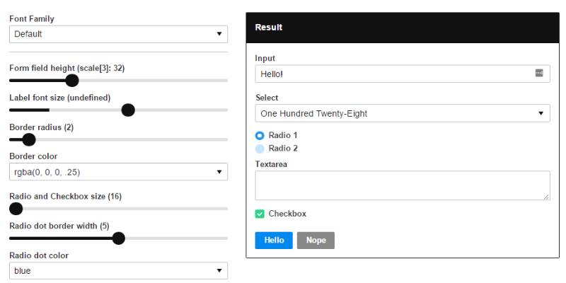
Theme UI brings a tight theme specification that works with the system-ui theme specification. It comes with a set of primitive components that accept values from your theme. It also boasts a “sx” prop, allowing you to style any component quickly.
Pros and Cons
On the upside, Theme UI provides an excellent system for creating themeable components, making it perfect for design systems. It’s lean, fast, and offers excellent performance. However, it’s a bit less comprehensive compared to others when it comes to pre-built components. So, you might need to pair it with another library if you need a full suite of components.
Rebass
Overview
Rebass is a library that embraces minimalism. It provides a small selection of flexible, themeable primitives that you can use as a base for a design system.
Features
Rebass provides eight primitive components based on the Styled System library, all of which accept theme-based style props. Each component comes with a handful of style variants, and you can customize them as much as you want.
Pros and Cons
The plus points of Rebass include its lean and fast nature, excellent theming capabilities, and ease of customization. It’s perfect for creating a custom design system from scratch. On the flip side, Rebass is not for you if you’re looking for a broad range of ready-to-use components.
Blueprint
Overview
Lastly, we have Blueprint, a UI toolkit built specifically for building complex, data-dense web interfaces. If your project revolves around data and requires a professional-looking UI, Blueprint could be a good fit.
Features
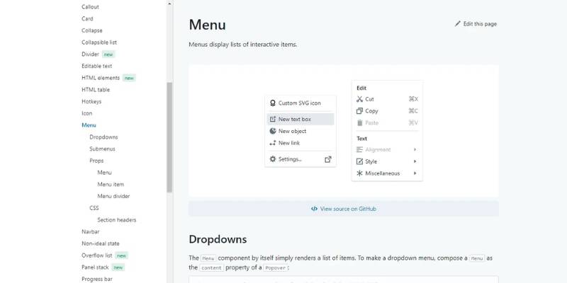
Blueprint excels at providing components specifically tailored for data-heavy applications. Think tables, menus, sliders, time pickers, and so on. It also includes icons and typography, maintaining a consistent look and feel across your application.
Pros and Cons
The advantage of Blueprint lies in its specialized components, a modern look, and its focus on desktop applications. However, it’s not as versatile for other types of projects and might be overkill for simpler apps.
Comparison of React UI Component Libraries
Comparison Based on Usage Statistics
Roll up your sleeves and let’s dive into the world of statistics for a moment. Yep, it’s not the most glamorous part of web design, but trust me, it’s essential. In the world of UI component libraries, popularity can tell us a lot. Are lots of people using a library? Well, that probably means it’s doing something right. More users often mean more contributors, better support, and more collective knowledge you can tap into.
Now, if you look at npm downloads as an indicator, libraries like MUI, React-Bootstrap, and Ant Design are leading the pack. These libraries have wide usage and large communities, which can be a huge plus when you’re looking for help or resources.
Comparison Based on Features
Alright, moving on from the numbers, let’s talk features. If we put the libraries side by side, you’ll notice they offer different levels of functionality. Some, like MUI and Ant Design, are jam-packed with features and components. You’ll find almost anything you could ever need in there.
On the other hand, libraries like Rebass and Theme UI are more about providing a solid base that you can extend and customize. They give you a few powerful, flexible components, and then it’s up to you to build on top of that.
Comparison Based on Community Support
Last but not least, let’s talk about community support. As any web designer will tell you, having a supportive community can be a game-changer. When you’re knee-deep in code at 2 AM trying to squash a bug, sometimes the only thing that can save you is a forum post from someone who’s been there before.
Now, in terms of community support, the larger libraries like MUI and React-Bootstrap have a considerable advantage. They’ve been around longer, have more users, and thus, have more active communities. You’ll find tons of resources, from tutorials to Stack Overflow questions, for these libraries.
Use Cases of React UI Component Libraries
Use Cases for Web Development
Now that we’ve talked about the libraries themselves, let’s discuss where you might actually use these bad boys. First up, web development. UI component libraries are all about making your life easier when you’re developing a web app.
Need a button? Grab one from the library. Need a navbar? The library’s got you covered. No need to reinvent the wheel each time. Plus, because these libraries are built for React, they’re designed to work seamlessly with the way React handles state and components, which can seriously streamline your workflow.
Use Cases for Mobile App Development
But it’s not just about web apps. With technologies like React Native, you can use React and UI component libraries for mobile app development too. Libraries like Ant Design have components that are responsive and adapt to different screen sizes, making them a great choice for mobile apps.
Use Cases for Data-Dense Desktop Applications
Lastly, let’s not forget about data-dense desktop applications. If you’re building a complex app with lots of data and interactions, a library like Blueprint, which is specifically designed for these types of apps, can be a lifesaver. It provides specialized components like tables and date pickers, which can be tricky to implement from scratch.
FAQ about UI Component Libraries
What exactly is a UI component library?
Well, let’s break it down. A UI component library is a collection of reusable user interface elements—think buttons, forms, dropdowns, and so on.
These libraries help speed up development, create a consistent look and feel across an app, and make maintenance easier. They’re a bit like a set of Legos, each piece built to snap together seamlessly with the others.
How do UI component libraries work?
Now, you’re getting to the core of it! UI component libraries, at their heart, define the look and behavior of various UI elements. They encapsulate all the logic, styles, and markup required for these components.
When you use a component from the library, it’s like calling a function, passing in some properties or parameters, and getting a fully functional, styled UI element in return.
What are some popular UI component libraries?
Oh, there are a few! For React, you’ve got options like Material-UI, Ant Design, and Chakra UI. In the Angular world, Angular Material and NG Bootstrap are quite popular. Vue.js has Vuetify and Element.
And that’s just scratching the surface. There’s a rich world of UI component libraries out there to discover, each with its own strengths and nuances.
What is the advantage of using a UI component library?
It’s all about efficiency, baby! A good UI component library helps you speed up development time, maintain consistency in design, and reduce bugs.
You’re not reinventing the wheel each time you need a new UI element. Instead, you have a pre-tested, pre-styled component ready to drop into your app.
When should I not use a UI component library?
Great question! You see, while UI component libraries are super handy, they may not be ideal when you need a high level of customization.
Also, if you’re working on a small project or a prototype, a component library might be overkill. Lastly, if your project has performance constraints, the extra overhead of a library might be a problem.
How can I create my own UI component library?
Ah, the creator’s spirit! To build your own, you’d typically start by defining the common components you’ll need across your app(s). Then, you create each component with its associated CSS and JavaScript, ensuring it’s reusable.
To keep things organized, you might use a tool like Storybook. Remember, though, creating a library takes time and effort, so weigh it against the benefits of using an existing library.
What should I consider when choosing a UI component library?
Hmm, a few things to consider, mate. Think about the library’s compatibility with your tech stack, the community support, and the quality of the documentation. How customizable are the components? Does the library’s design align with your aesthetics?
Lastly, consider the library’s size and performance impact. It’s a bit of a balancing act, but the right library can be a godsend.
Are UI component libraries responsive?
Most definitely, yes! Modern UI component libraries are typically designed with responsiveness in mind. They’ll automatically adjust to different screen sizes and orientations.
But remember, it’s always a good idea to check the library’s documentation or test it out to make sure it meets your specific needs.
How to maintain a UI component library?
Keeping a UI library up-to-date is crucial. Start by versioning your library so changes don’t unexpectedly break your apps. Use automated testing to catch issues early.
Documentation is vital too – keep it updated! Lastly, gather and act on feedback from those who use the library. It’s all about continuous improvement.
Can a UI component library improve collaboration?
You bet it can! A shared component library can serve as a common language between designers and developers. It makes it easier to understand each other’s work, maintain consistency across projects, and onboard new team members.
It’s a win-win situation, really. But remember, it’s not just about the library – communication is key.
Conclusion
We’ve been on this wild ride, unpacking UI component libraries. They’re like those grab-n-go meals for React – all prepped, waiting for ya!
Key things to note:
- Selection criteria: Think about your project vibes, community feels, and that helping hand you might need.
- Big players? MUI, React-Bootstrap, Chakra UI…and the list goes on. All with their perks and quirks!
Heart of the matter?
- Picking YOUR perfect library ain’t a one-size-fits-all game. Big and flashy or slim and flexible? Your call.
- Building a snazzy mobile app or a chunky desktop one? Different strokes for different folks.
- And hey, changing lanes is cool! If a library’s vibe isn’t jiving with ya, swap it. That’s the cool part about open-source.
If you enjoyed reading this article about UI Component Libraries, you should read these as well:
Recommend
About Joyk
Aggregate valuable and interesting links.
Joyk means Joy of geeK