

WPF 入门笔记 - 07 - MVVM示例
source link: https://www.cnblogs.com/BoiledYakult/p/17626936.html
Go to the source link to view the article. You can view the picture content, updated content and better typesetting reading experience. If the link is broken, please click the button below to view the snapshot at that time.

滴咚,大家好久不见💖。好就没写东西了,鸽着鸽着就无了😭。。。
回到正题,上篇文章说完命令提了一嘴MVVM模式直接就上MVVMLight这些程序的框架了,虽然也没说多少,但还是有点不好过渡,这篇对MVVM做一些系统学习,同时复习一下前几篇博文中的内容,完成一个采用MVVM模式的示例Demo。
🎶 小插曲
给N早之前文章中的可能混淆的内容做下说明 - 关于WPF 入门笔记 - 04 - 数据绑定 - OneWayToSource 文本框爆红现象:
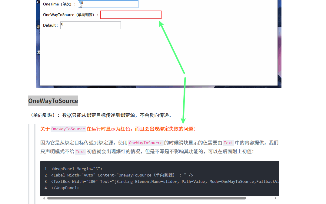
- 在那篇文章一开始给初值是没问题的,因为
OneWayToSource是将数据从绑定目标传递到绑定源,所以不给初值一定会出现绑定失败的问题 - 文本框爆红我觉得和绑定模式没有关系,我猜测和文本框绑定的数据类型有关,假设文本框绑定的是支持为空的
string类型的字符串,它是空的话是不会爆红的,因为空会转化成"",但如果绑定的数据类型是不能为空的int类型,就会在文本框没有内容时出现爆红现象,同时会出现绑定失败
应该是这样,不对的话记得在评论区实现INotifyPropertyChanged接口教教我噢🛫
🎨 什么是MVVM
MVVM 是 Model-View-ViewModel 的缩写,是一种用于构建用户界面的设计模式,由微软 WPF 和 Silverlight 的架构师 Ken Cooper 和 Ted Peters 开发,是一种简化用户界面的事件驱动编程方式。它在 WPF 和其他 XAML-based 技术中广泛应用,比如UWP、采用XAML的MAUI APP,在前端开发也比较常见。MVVM 的目标是实现用户界面和业务逻辑之间的彻底分离,以便更好地管理和维护应用程序,并提供更好的可测试性和可扩展性。
MVVM 模式包含以下三个核心组件:
Model(模型):Model代表应用程序的数据和业务逻辑。它负责存储和管理数据,并且通常不包含任何与用户界面相关的代码。Model可以是数据实体、数据库访问类、服务类等。View(视图):View是用户界面的可视化表示,通常由XAML文件定义。它负责展示数据给用户,并捕获用户输入。View并不处理业务逻辑,而是通过绑定和命令将用户操作传递给ViewModel。ViewModel(视图模型):ViewModel是View和Model之间的桥梁,负责处理View与Model之间的交互。它将Model中的数据转换为View所需的数据,并处理用户输入、命令和其他交互逻辑。ViewModel通常实现了INotifyPropertyChanged接口,用于通知View当数据发生变化时进行更新。
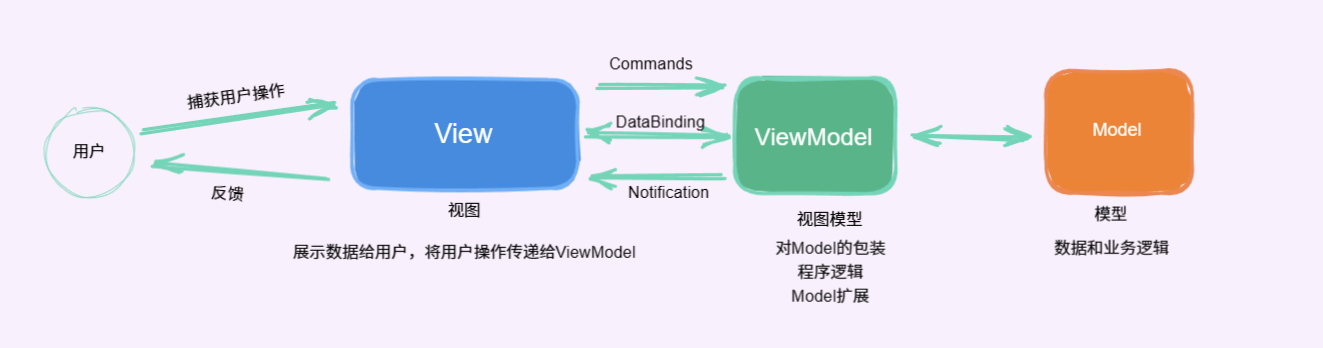
MVVM 的基本原则是让 View 和 Model 完全解耦,它们之间通过 ViewModel 进行通信。View 通过数据绑定将 ViewModel 中的数据展示给用户,通过命令绑定将用户的操作传递给 ViewModel。ViewModel 则通过数据绑定和命令绑定将用户输入转换为对 Model 的操作,从而实现业务逻辑的处理。
回到 WPF 里,View就是用xaml描绘的页面,负责与用户交互,响应用户操作,展示数据给用户;ViewModel负责收集需要绑定的数据和命令,通过 View 的 DataContext 属性绑定到 View,同时处理UI逻辑;Model 就作为系统中的对象,包含数据对象。
一个 View 对应一个 ViewModel ,一个 ViewModel 可以聚合多个 Model,ViewModel 可以对应多个 View,在 MVVM 下,所有事件和动作都转换成命令,如按钮的点击操作,不在是触发点击事件,而是绑定到命令,由命令去执行对应的逻辑。
MVVM 模式的优势包括:
- 分离关注点:
MVVM将用户界面逻辑和业务逻辑彻底分开,使代码结构更清晰,易于理解和维护。 - 可测试性:由于
View和ViewModel之间的解耦,可以更轻松地对ViewModel进行单元测试,而无需涉及到用户界面的操作。 - 可扩展性:
MVVM支持模块化开发,不同的View和ViewModel可以独立开发和组合,使应用程序更易于扩展。 - 可重用性:
ViewModel可以与不同的View进行重用,从而减少了重复编写代码的工作。
🧵 简单MVVM
学习一下 MSDN - .NET MAUI 数据绑定和 MVVM 中的 简单MVVM 章节,是一个.NET MAUI的 ContentPage,用来显示时间,Maui 和 WPF 在命名空间上是有点不一样的:
Part 1
<Window x:Class="OneShotDateTimeDemo.MainWindow" xmlns="http://schemas.microsoft.com/winfx/2006/xaml/presentation" xmlns:x="http://schemas.microsoft.com/winfx/2006/xaml" xmlns:d="http://schemas.microsoft.com/expression/blend/2008" xmlns:local="clr-namespace:OneShotDateTimeDemo" xmlns:mc="http://schemas.openxmlformats.org/markup-compatibility/2006" xmlns:sys="clr-namespace:System;assembly=mscorlib" Title="One-Shot DateTime Page" Width="800" Height="450" WindowStartupLocation="CenterScreen" mc:Ignorable="d"> <Grid> <StackPanel HorizontalAlignment="Center" VerticalAlignment="Center" DataContext="{x:Static sys:DateTime.Now}"> <TextBlock Text="{Binding Year, StringFormat='The year is {0}'}" /> <TextBlock Text="{Binding StringFormat='The month is {0:MMMM}'}" /> <TextBlock Text="{Binding Day, StringFormat='The day is {0}'}" /> <TextBlock Text="{Binding StringFormat='The time is {0:T}'}" /> </StackPanel> </Grid></Window>
这段 Xaml 在 StackPanel 的 DataContext 中设置了一个绑定到当前日期和时间的 DateTime 对象,然后通过数据绑定将 DateTime 对象的各个属性显示在不同的子元素 TextBlock 中,同时对显示内容进行了格式化。
运行程序,文本中的日期和时间只会在构造和初始化的时候设置一次,不会随时间的变化而变化。
示例中是
Label,我这里换成了TextBlock,因为Label在Binding中使用StringFormat不生效【哦,我用的方法不对,Label不能用StringFormat😅】:

Part 2
上面的页面写出来显然是没有意义的,我们想让它实时显示当前时间,这就需要有个东西在时间发生变化时一直更新页面上的时间,这个过程一般会通过后台代码完成,当然可以通过一个 Timer 搞定,但就和这篇文章的内容没关系了,用 MVVM 的模式怎么实现呢?
首先从 MVVM 三部分来看,View 就是标题为 One-Shot DateTime Page 的窗体,Model 是 DateTime 对象,需要 ViewModel 来处理时间数据同时通知页面响应更改。
创建一个ClockViewModel.cs类:
using System;using System.ComponentModel;using System.Runtime.CompilerServices;using System.Threading; namespace OneShotDateTimeDemo{ public class ClockViewModel : INotifyPropertyChanged { public event PropertyChangedEventHandler PropertyChanged; private DateTime _dateTime; private Timer _timer; public DateTime DateTime { get => _dateTime; set { if (_dateTime != value) { _dateTime = value; OnPropertyChanged(); } } } public ClockViewModel() { DateTime = DateTime.Now; _timer = new Timer(new TimerCallback((s) => DateTime = DateTime.Now), null, TimeSpan.Zero, TimeSpan.FromSeconds(1)); } ~ClockViewModel() => _timer.Dispose(); public void OnPropertyChanged([CallerMemberName] string name = "") { PropertyChanged?.Invoke(this, new PropertyChangedEventArgs(name)); } }}
ClockViewModel 类实现了 INotifyPropertyChanged 接口,并通过 Timer 定时更新时间并触发属性更改通知,提供实时的系统时间。完成 ViewModel 部分以后,将 ViewModel 绑定到视图 View - MainWindow 上:
<Window x:Class="OneShotDateTimeDemo.MainWindow" xmlns="http://schemas.microsoft.com/winfx/2006/xaml/presentation" xmlns:x="http://schemas.microsoft.com/winfx/2006/xaml" xmlns:d="http://schemas.microsoft.com/expression/blend/2008" xmlns:local="clr-namespace:OneShotDateTimeDemo" xmlns:mc="http://schemas.openxmlformats.org/markup-compatibility/2006" xmlns:sys="clr-namespace:System;assembly=mscorlib" Title="One-Shot DateTime Page" Width="800" Height="450" WindowStartupLocation="CenterScreen" mc:Ignorable="d"> <Window.DataContext> <local:ClockViewModel /> </Window.DataContext> <Grid> <Grid.RowDefinitions> <RowDefinition /> <RowDefinition /> </Grid.RowDefinitions> <StackPanel HorizontalAlignment="Center" VerticalAlignment="Center" DataContext="{x:Static sys:DateTime.Now}"> <TextBlock Text="{Binding Year, StringFormat='The year is {0}'}" /> <TextBlock Text="{Binding StringFormat='The month is {0:MMMM}'}" /> <TextBlock Text="{Binding Day, StringFormat='The day is {0}'}" /> <TextBlock Text="{Binding StringFormat='The time is {0:T}'}" /> </StackPanel> <StackPanel Grid.Row="1" HorizontalAlignment="Center" VerticalAlignment="Center"> <TextBlock Text="{Binding DateTime, StringFormat='The time is {0:T}'}" /> </StackPanel> </Grid></Window>
这样就可以得到一个 MVVM 模式下的时钟了:
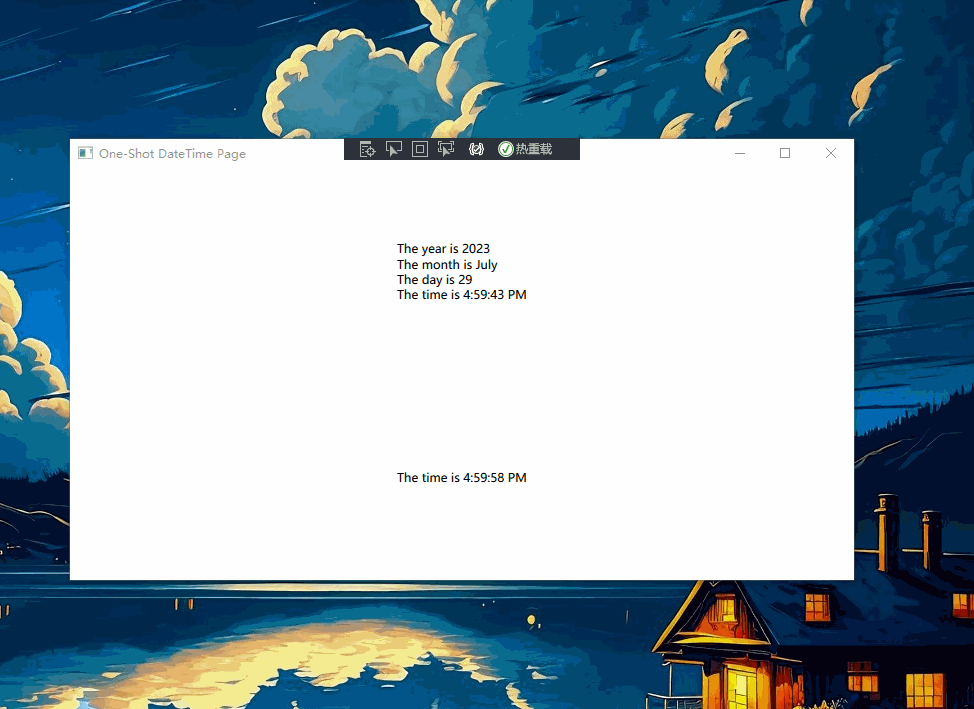
以上就是一个简单的MVVM的示例,功能比较简单,只涉及到了属性变动,无关乎用户操作。【时间更新肉眼可见的有问题👻】
🔮 完整MVVM
接下来完成一个完整的MVVM示例,内容参考自博主丑萌气质狗在B站发布的WPF入门视频,大家可以取搜一下找来看看。内容比较基础,但同时讲解也非常细腻,碎碎念教学,哈哈哈。有些基础但不多的小伙伴可以去看一下😇
登录页面UI
回到正题,示例是一个简单的登录页面的MVVM实现,用界面部分来回顾下之前学习的内容:
MainView.xaml -为了方便区分每部分扮演的角色,给MainWindow.xaml改了个名:
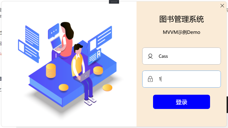
登录页面是这样设计的,窗体取消了默认的标题栏,调整为带阴影的圆角窗体,左侧放一张登录背景图,右边自绘了一个关闭按钮,文本框和按钮也做了美化。快速来看一下如何实现的。
窗口样式调整为None,不允许调整窗口大小,用Border包裹整个窗体实现圆角以及阴影效果,整体分两部分 - 左侧图片、右侧背景图:
<Window x:Class="MVVMDemo.MainView" xmlns="http://schemas.microsoft.com/winfx/2006/xaml/presentation" xmlns:x="http://schemas.microsoft.com/winfx/2006/xaml" xmlns:d="http://schemas.microsoft.com/expression/blend/2008" xmlns:local="clr-namespace:MVVMDemo" xmlns:mc="http://schemas.openxmlformats.org/markup-compatibility/2006" Title="MainView" Width="800" Height="450" AllowsTransparency="True" Background="{x:Null}" ResizeMode="NoResize" WindowStartupLocation="CenterScreen" WindowStyle="None" mc:Ignorable="d"> <Border Margin="5" Background="AntiqueWhite" CornerRadius="8"> <Border.Effect> <DropShadowEffect BlurRadius="5" Direction="0" Opacity="0.3" ShadowDepth="0" Color="Gray" /> </Border.Effect> <Grid> <Grid.ColumnDefinitions> <ColumnDefinition Width="6*" /> <ColumnDefinition Width="4*" /> </Grid.ColumnDefinitions> <Border CornerRadius="8,0,0,8"> <Border.Background> <ImageBrush ImageSource="./Assets/Images/LoginBackground.png" Stretch="Fill" /> </Border.Background> </Border> <Border Grid.Column="1" CornerRadius="0,8,0,8"> ... // 内容部分 </Border> </Grid> </Border></Window>
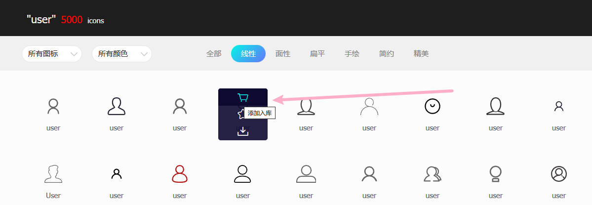
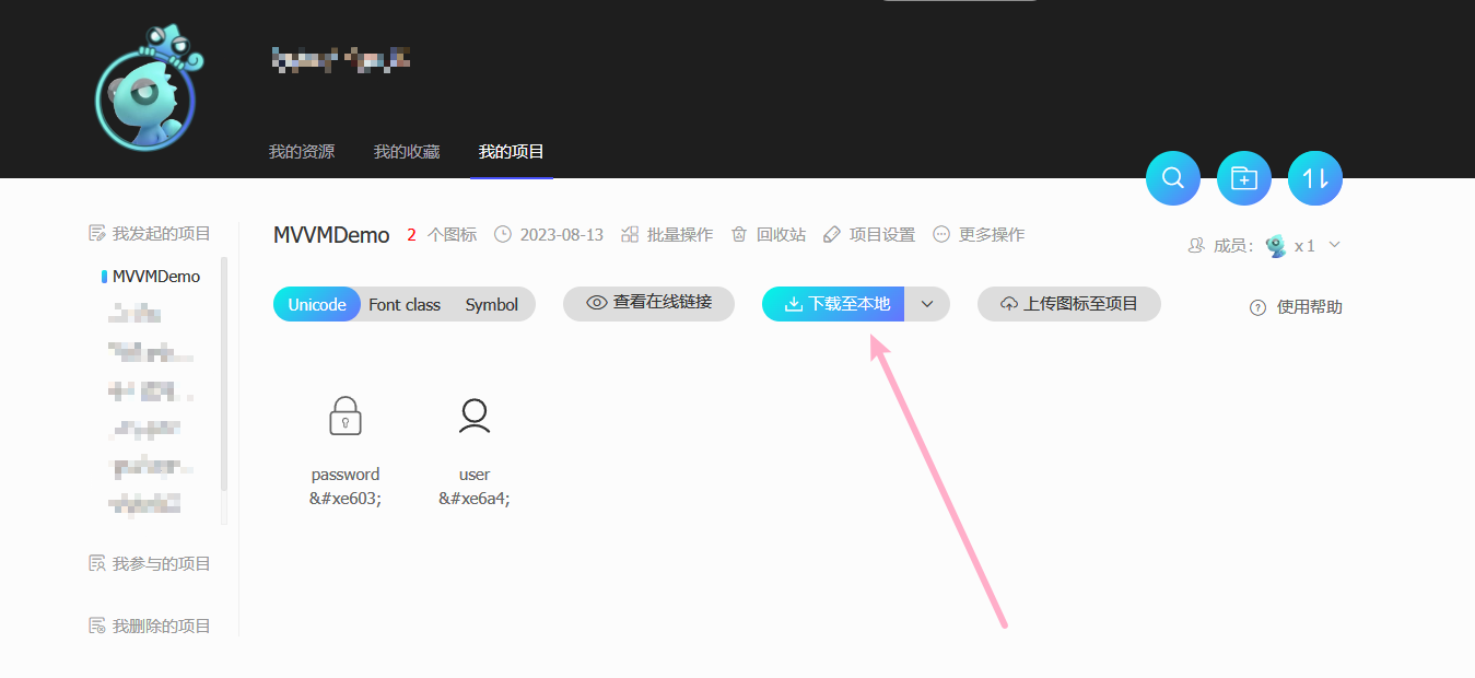
之前笔记中有说,这里复习以下。去阿里巴巴矢量图标库选好要用的图标,添加入库,然后从库里添加至项目:
下载到本地:
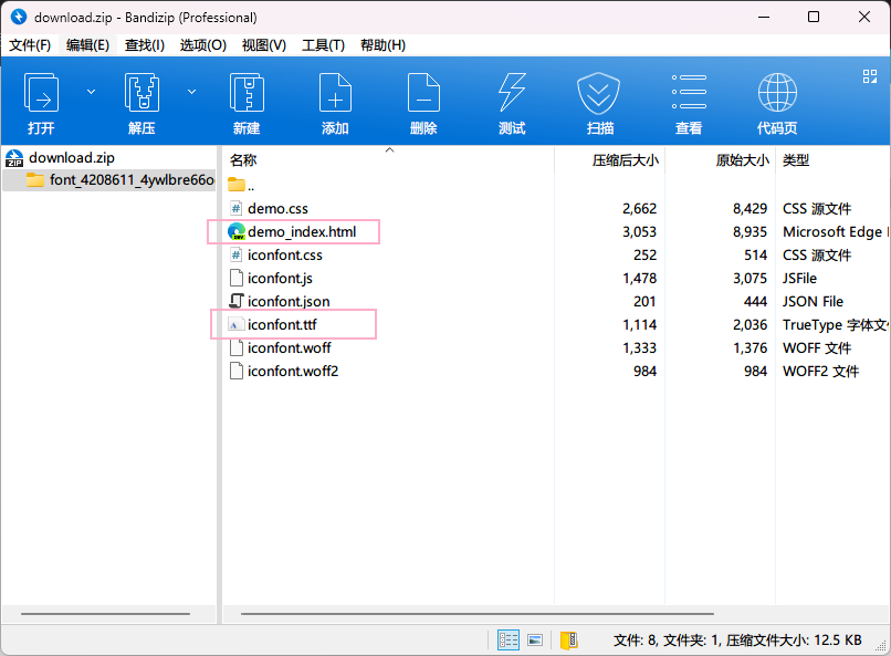
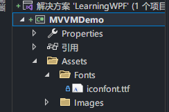
主要用上面勾选的两个文件,html文件是下载的图标演示,tff是程序中用到的字体文件了,把它放到新建的Assets资源文件夹下边:
之后就可以用了,Text内容可以从演示的html中找到,也可以在矢量图项目里面复制代码:
<TextBox Text="" FontFamily="./Assets/Fonts/#iconfont"/>

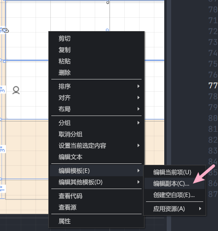
模板内容因为只在这一个登录窗体上使用,就都定义在车Window.Resources窗体资源里了,所以看上去页面内容有点多,大家也可以单独定义资源文件。先说按钮,两个按钮都是通过自定义控件模板来完成的,关闭按钮主要是定义了一个 Path 控件,用于绘制一个 "X" 形状,类似于关闭按钮的图标,等率按钮就直接用 TextBlock 代替的:
<ControlTemplate x:Key="CloseButton" TargetType="Button"> <Border Name="back" Background="Transparent" CornerRadius="0,8,0,0"> <Path HorizontalAlignment="Center" VerticalAlignment="Center" Data="M0 0 12 12M0 12 12 0" Stroke="Black" StrokeThickness="1" /> </Border> <ControlTemplate.Triggers> <Trigger Property="IsMouseOver" Value="true"> <Setter TargetName="back" Property="Background" Value="red" /> </Trigger> </ControlTemplate.Triggers></ControlTemplate> <ControlTemplate x:Key="LoginButton" TargetType="Button"> <Border Name="back" Background="{TemplateBinding Background}" CornerRadius="8"> <TextBlock Text="登录" VerticalAlignment="Center" HorizontalAlignment="Center"/> </Border> <ControlTemplate.Triggers> <Trigger Property="IsMouseOver" Value="true"> <Setter TargetName="back" Property="Background" Value="red"/> </Trigger> </ControlTemplate.Triggers></ControlTemplate>
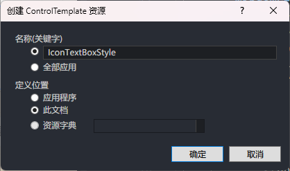
文本框也是通过自定义控件模板来完成的,只不过自己写东西有点多,所以是通过编辑模板给文本库框加的图标:
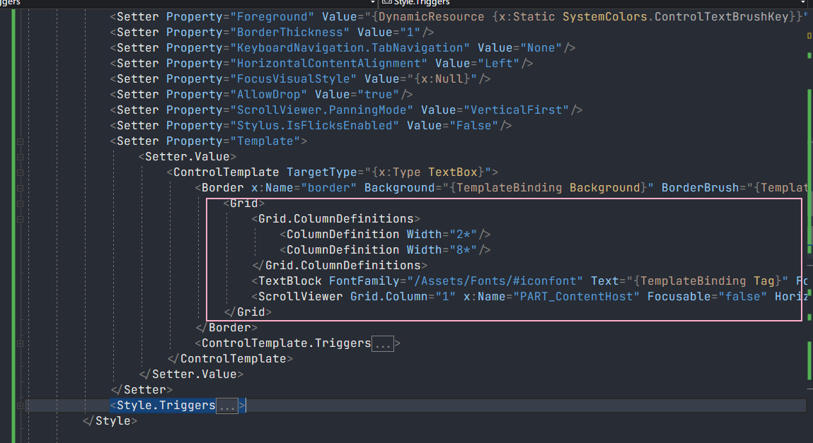
<Border x:Name="border" Background="{TemplateBinding Background}" BorderBrush="{TemplateBinding BorderBrush}" BorderThickness="{TemplateBinding BorderThickness}" SnapsToDevicePixels="True" CornerRadius="8"> <Grid> <Grid.ColumnDefinitions> <ColumnDefinition Width="2*"/> <ColumnDefinition Width="8*"/> </Grid.ColumnDefinitions> <TextBlock FontFamily="/Assets/Fonts/#iconfont" Text="{TemplateBinding Tag}" FontSize="20" VerticalAlignment="Center" HorizontalAlignment="Center" /> <ScrollViewer Grid.Column="1" x:Name="PART_ContentHost" Focusable="false" HorizontalScrollBarVisibility="Hidden" VerticalScrollBarVisibility="Hidden" VerticalAlignment="Center"/> </Grid></Border>
图标属性因为Text属性要获取输入的文本,所以改成了通过文本框的 Tag 属性绑定内容。
而后的控件布局就不解释了吧,直接看代码吧:
MainView.xaml
<Window x:Class="MVVMDemo.MainView" xmlns="http://schemas.microsoft.com/winfx/2006/xaml/presentation" xmlns:x="http://schemas.microsoft.com/winfx/2006/xaml" xmlns:d="http://schemas.microsoft.com/expression/blend/2008" xmlns:local="clr-namespace:MVVMDemo" xmlns:mc="http://schemas.openxmlformats.org/markup-compatibility/2006" Title="MainView" Width="800" Height="450" AllowsTransparency="True" Background="{x:Null}" ResizeMode="NoResize" WindowStartupLocation="CenterScreen" WindowStyle="None" mc:Ignorable="d"> <Window.Resources> <ControlTemplate x:Key="CloseButton" TargetType="Button"> <Border Name="back" Background="Transparent" CornerRadius="0,8,0,0"> <Path HorizontalAlignment="Center" VerticalAlignment="Center" Data="M0 0 12 12M0 12 12 0" Stroke="Black" StrokeThickness="1" /> </Border> <ControlTemplate.Triggers> <Trigger Property="IsMouseOver" Value="true"> <Setter TargetName="back" Property="Background" Value="red" /> </Trigger> </ControlTemplate.Triggers> </ControlTemplate> <ControlTemplate x:Key="LoginButton" TargetType="Button"> <Border Name="back" Background="{TemplateBinding Background}" CornerRadius="8"> <TextBlock Text="登录" VerticalAlignment="Center" HorizontalAlignment="Center"/> </Border> <ControlTemplate.Triggers> <Trigger Property="IsMouseOver" Value="true"> <Setter TargetName="back" Property="Background" Value="red"/> </Trigger> </ControlTemplate.Triggers> </ControlTemplate> <SolidColorBrush x:Key="TextBox.Static.Border" Color="#FFABAdB3"/> <SolidColorBrush x:Key="TextBox.MouseOver.Border" Color="#FF7EB4EA"/> <SolidColorBrush x:Key="TextBox.Focus.Border" Color="#FF569DE5"/> <Style x:Key="IconTextBoxStyle" TargetType="{x:Type TextBox}"> <Setter Property="Background" Value="{DynamicResource {x:Static SystemColors.WindowBrushKey}}"/> <Setter Property="BorderBrush" Value="{StaticResource TextBox.Static.Border}"/> <Setter Property="Foreground" Value="{DynamicResource {x:Static SystemColors.ControlTextBrushKey}}"/> <Setter Property="BorderThickness" Value="1"/> <Setter Property="KeyboardNavigation.TabNavigation" Value="None"/> <Setter Property="HorizontalContentAlignment" Value="Left"/> <Setter Property="FocusVisualStyle" Value="{x:Null}"/> <Setter Property="AllowDrop" Value="true"/> <Setter Property="ScrollViewer.PanningMode" Value="VerticalFirst"/> <Setter Property="Stylus.IsFlicksEnabled" Value="False"/> <Setter Property="Template"> <Setter.Value> <ControlTemplate TargetType="{x:Type TextBox}"> <Border x:Name="border" Background="{TemplateBinding Background}" BorderBrush="{TemplateBinding BorderBrush}" BorderThickness="{TemplateBinding BorderThickness}" SnapsToDevicePixels="True" CornerRadius="8"> <Grid> <Grid.ColumnDefinitions> <ColumnDefinition Width="2*"/> <ColumnDefinition Width="8*"/> </Grid.ColumnDefinitions> <TextBlock FontFamily="/Assets/Fonts/#iconfont" Text="{TemplateBinding Tag}" FontSize="20" VerticalAlignment="Center" HorizontalAlignment="Center" /> <ScrollViewer Grid.Column="1" x:Name="PART_ContentHost" Focusable="false" HorizontalScrollBarVisibility="Hidden" VerticalScrollBarVisibility="Hidden" VerticalAlignment="Center"/> </Grid> </Border> <ControlTemplate.Triggers> <Trigger Property="IsEnabled" Value="false"> <Setter Property="Opacity" TargetName="border" Value="0.56"/> </Trigger> <Trigger Property="IsMouseOver" Value="true"> <Setter Property="BorderBrush" TargetName="border" Value="{StaticResource TextBox.MouseOver.Border}"/> </Trigger> <Trigger Property="IsKeyboardFocused" Value="true"> <Setter Property="BorderBrush" TargetName="border" Value="{StaticResource TextBox.Focus.Border}"/> </Trigger> </ControlTemplate.Triggers> </ControlTemplate> </Setter.Value> </Setter> <Style.Triggers> <MultiTrigger> <MultiTrigger.Conditions> <Condition Property="IsInactiveSelectionHighlightEnabled" Value="true"/> <Condition Property="IsSelectionActive" Value="false"/> </MultiTrigger.Conditions> <Setter Property="SelectionBrush" Value="{DynamicResource {x:Static SystemColors.InactiveSelectionHighlightBrushKey}}"/> </MultiTrigger> </Style.Triggers> </Style> </Window.Resources> <Border Margin="5" Background="AntiqueWhite" CornerRadius="8"> <Border.Effect> <DropShadowEffect BlurRadius="5" Direction="0" Opacity="0.3" ShadowDepth="0" Color="Gray" /> </Border.Effect> <Grid> <Grid.ColumnDefinitions> <ColumnDefinition Width="6*" /> <ColumnDefinition Width="4*" /> </Grid.ColumnDefinitions> <Border CornerRadius="8,0,0,8"> <Border.Background> <ImageBrush ImageSource="./Assets/Images/LoginBackground.png" Stretch="Fill" /> </Border.Background> </Border> <Border Grid.Column="1" CornerRadius="0,8,0,8"> <Grid> <Grid.RowDefinitions> <RowDefinition Height="3*" /> <RowDefinition Height="7*" /> </Grid.RowDefinitions> <StackPanel> <Button Width="30" Height="30" HorizontalAlignment="Right" Template="{StaticResource ResourceKey=CloseButton}" /> <TextBlock Margin="15" HorizontalAlignment="Center" VerticalAlignment="Center" FontSize="26" Foreground="Black" Text="图书管理系统" /> <TextBlock Margin="5" HorizontalAlignment="Center" FontSize="16" Text="MVVM示例Demo" /> </StackPanel> <Grid Grid.Row="1" Margin="20,20"> <Grid.RowDefinitions> <RowDefinition Height="3*" /> <RowDefinition Height="3*" /> <RowDefinition Height="3*" /> <RowDefinition Height="1*" /> </Grid.RowDefinitions> <TextBox Style="{DynamicResource IconTextBoxStyle}" Tag="" Height="60" FontSize="15"/> <TextBox Grid.Row="1" Style="{DynamicResource IconTextBoxStyle}" Tag="" Height="60" FontSize="15" /> <Button Grid.Row="2" Width="200" Height="50" Template="{StaticResource LoginButton}" Background="Blue" Foreground="White" FontSize="20"/> </Grid> </Grid> </Border> </Grid> </Border></Window>
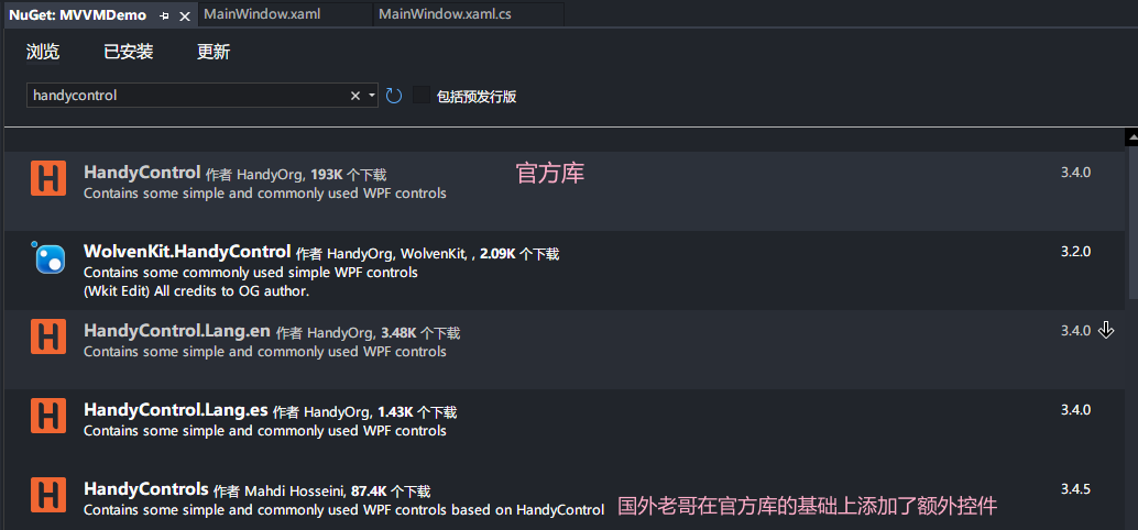
这是登录页面,登录成功后的页面随便写个吧:handyControlView,尝鲜一下HandyControl:
先安装HandyControl:
在App.xaml中添加HandyControl资源字典:
<Application.Resources> <ResourceDictionary> <ResourceDictionary.MergedDictionaries> <ResourceDictionary Source="pack://application:,,,/HandyControl;component/Themes/SkinDefault.xaml"/> <ResourceDictionary Source="pack://application:,,,/HandyControl;component/Themes/Theme.xaml"/> </ResourceDictionary.MergedDictionaries> </ResourceDictionary> </Application.Resources></Application>
引入命名空间: xmlns:hc="https://handyorg.github.io/handycontrol",之后使用引用对应样式就可以了:
HandyControl分原生控件和拓展控件,原生控件是在WPF原生控件的基础上做了美化,本质功能是一样的,拓展控件则是原生控件中没有的,比如可以播放Gif动图的GifImage,我就看看原生控件了,扩展控件等专门用的时候再研究:
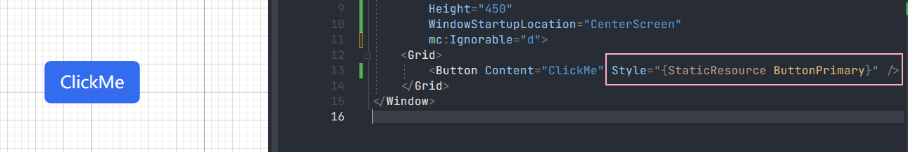
<Window x:Class="MVVMDemo.handyControlView" xmlns="http://schemas.microsoft.com/winfx/2006/xaml/presentation" xmlns:x="http://schemas.microsoft.com/winfx/2006/xaml" xmlns:d="http://schemas.microsoft.com/expression/blend/2008" xmlns:mc="http://schemas.openxmlformats.org/markup-compatibility/2006" xmlns:controls="https://handyorg.github.io/handycontrol" xmlns:local="clr-namespace:MVVMDemo" mc:Ignorable="d" Title="handyControlView" Height="450" Width="800"> <Grid> <StackPanel> <Label Content="LabelDanger样式" Margin="10" Style="{DynamicResource LabelDanger}"></Label> <Button Content="Button" Style="{StaticResource ButtonPrimary}"/> <Button Content="这是一个按钮" Margin="10,0,0,0" controls:BorderElement.CornerRadius="15"/> <CheckBox Content="CheckBox" IsChecked="True"/> <CheckBox Margin="0,16,0,0" Content="CheckBox" IsChecked="True" IsEnabled="False"/> <CheckBox Margin="0,16,0,0" Content="CheckBox" IsChecked="{x:Null}"/> <Slider VerticalAlignment="Center" Width="400" Value="40" Maximum="100"/> <TextBox Width="200" VerticalAlignment="Center"/> <RadioButton Content="默认样式"/> <RadioButton Margin="0,16,0,0" Content="不可编辑" IsChecked="True" IsEnabled="False"/> <StackPanel Margin="20"> <TextBlock Text="ProgressBarSuccess"></TextBlock> <ProgressBar Style="{DynamicResource ProgressBarSuccess}" Value="40"></ProgressBar> </StackPanel> <StackPanel Margin="20"> <TextBlock Text="ProgressBarInfo"></TextBlock> <ProgressBar Style="{DynamicResource ProgressBarInfo}" Value="40"></ProgressBar> </StackPanel> </StackPanel> </Grid></Window>

不使用MVVM
在不使用MVVM情况下实现点击登录:点击登录按钮获取输入的用户名密码,验证是否正确,正确则创建页面隐藏当前页:
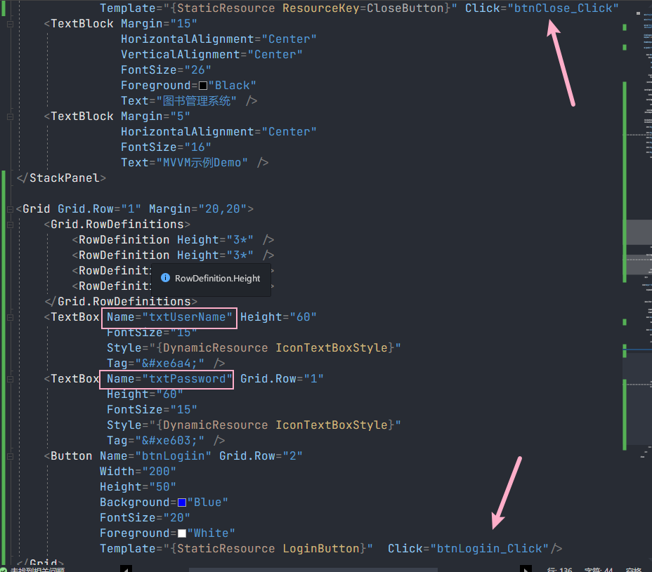
private void btnLogiin_Click(object sender, RoutedEventArgs e){ if (txtUserName.Text == "Cass" && txtPassword.Text == "12136") { handyControlView handyControlView = new handyControlView(); handyControlView.Show(); this.Close(); } else { MessageBox.Show("用户名或密码错误。"); }} private void btnClose_Click(object sender, RoutedEventArgs e){ this.Close();}

现在所有东西是耦合在一起的,虽然这样看起来实现起来比较快,但是在后期维护起来是非常麻烦的,尤其是💩⛰️工程,假如其中任何一个环节发生了变化,程序就会出问题,简而言之就是牵一发而动全身。
接下来看一下MVVM模式下的实现:

Model部分
这部分主要是登录页面的数据部分,涉及两个字段,用户名和密码:
LoginModel.cs:
namespace MVVMDemo{ public class LoginModel { private string _UserName; public string UserName { get { return _UserName; } set { _UserName = value; } } private string _Password; public string Password { get { return _Password; } set { _Password = value; } } }}
View部分
视图部分主要做数据的呈现,通过绑定和命令解耦图形界面和数据以及执行动作之间的关系,数据之间的交互在用户名和密码文本框:
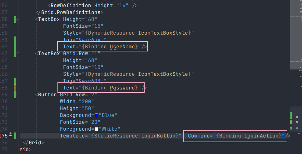
动作有两个,一个是关闭按钮,另一个是登录按钮。关闭按钮只是关闭当前窗体,不涉及业务交互,所以保留之前的Click事件即可,登录按钮就涉及到视图、数据以及业务逻辑了,这就需要通过命令来完成。
ViewModel部分
在这之前需要完成命令接口的定义,新建一个文件:RelayCommand.cs实现ICommand接口:
using System;using System.Windows.Input; namespace MVVMDemo{ public class RelayCommand : ICommand { private readonly Action _execute; // 需要执行的操作(命令体) private readonly Func<bool> _canExecute; // 命令是否可以执行的逻辑 public RelayCommand(Action action, Func<bool> canExecute) { _execute = action; _canExecute = canExecute; } public bool CanExecute(object parameter) // ICommand接口方法之一,用于判断命令是否可以执行 { if (_canExecute == null) { return true; // 命令始终可以执行 } else { return _canExecute(); // 调用 _canExecute() 获取判断结果 } } public void Execute(object parameter) // ICommand接口方法之一 用于执行命令体,调用 _execute 所存储的操作 { _execute?.Invoke(); } public event EventHandler CanExecuteChanged // ICommad接口中的事件,当命令的可执行状态发生变化时,触发此事件来通知界面元素更新 { add { if (_canExecute != null) { CommandManager.RequerySuggested += value; } } remove { if (_canExecute != null) { CommandManager.RequerySuggested -= value; } } } }}
这样就完成了命令接口的实现,接着来看ViewModel视图模型,视图模型作为沟通数据Model和视图View之间的桥梁,就得多干一些活了。首先是数据部分,为了更好的解耦,不让图形界面与数据产生直接交互,在ViewModel里嵌套一层在获取Model以及View部分的数据并完成验证处理、数据更新还有命令操作:
LoginViewModel.cs:
using System.ComponentModel;using System.Runtime.CompilerServices;using System.Windows;using System.Windows.Input; namespace MVVMDemo{ public class LoginViewModel : INotifyPropertyChanged { public event PropertyChangedEventHandler PropertyChanged; // INotifyPropertyChanged接口事件,用于在属性更改时发出通知 private LoginModel _loginModel; private MainView _mainView; public LoginViewModel(MainView mainView) { _loginModel = new LoginModel(); _mainView = mainView; } // 绑定到登录界面文本框的属性,用于获取和设置用户名和密码 public string UserName { get { return _loginModel.UserName; } set { _loginModel.UserName = value; OnPropertyChanged(UserName); } } public string Password { get { return _loginModel.Password; } set { _loginModel.Password = value; OnPropertyChanged(Password); } } protected virtual void OnPropertyChanged([CallerMemberName] string propertyName = null) // 触发属性更改通知的方法 { PropertyChanged?.Invoke(this, new PropertyChangedEventArgs(propertyName)); } private void LoginFunc() // 处理登录操作 { if (UserName == "Cass" && Password == "12136") { handyControlView handyControlView = new handyControlView(); handyControlView.Show(); _mainView.Close(); } else { MessageBox.Show("用户名或密码错误"); UserName = ""; Password = ""; } } private bool CanLoginExecute() { return true; } public ICommand LoginAction // 绑定到登录按钮的命令属性 { get { return new RelayCommand(LoginFunc, CanLoginExecute); //(执行体,判断条件) } } }}
完成了沟通部分的桥梁怎样,和其他两部分取得练习呢?数据部分,通过属性更新已经通知到了,视图部分就需要通过绑定数据上下文来完成了:
Mainview.xaml.cs
using System.Windows; namespace MVVMDemo{ /// <summary> /// MainWindow.xaml 的交互逻辑 /// </summary> public partial class MainView : Window { public MainView() { InitializeComponent(); this.DataContext = new LoginViewModel(this); } private void btnClose_Click(object sender, RoutedEventArgs e) { this.Close(); } }}
🎉完结撒花
以上一个简单的MVVM示例就完成了,怎么说呢,虽然看着很简单,代码也没多少,但是对初学者来说绝非易事。还有一件事想要告诉大家,学习过程中一定不要只看不写,在学习过程中,实践是非常重要的。阅读和理解代码的同时,动手编写代码是巩固知识的关键部分。即使在完成这篇博文的过程中,我仍有新的收获在里面,所以大家千万不要只看,纸上谈兵永远都是空谈😉。
希望可以给大家一点参考,有错误的部分还请在评论区指出。
Recommend
About Joyk
Aggregate valuable and interesting links.
Joyk means Joy of geeK