

Jell-O’s Retro Rebrand May Just be the Smartest… | Web Designer Depot
source link: https://www.webdesignerdepot.com/2023/07/jell-os-retro-rebrand-may-just-be-the-smartest-design-move-of-the-year/
Go to the source link to view the article. You can view the picture content, updated content and better typesetting reading experience. If the link is broken, please click the button below to view the snapshot at that time.

Jell‑O’s Retro Rebrand May Just be the Smartest Design Move of the Year
July 31, 2023
The new logo design aims to capture the nostalgia and inherent lightheartedness of America’s former favorite dessert product.
Jell‑O has been an American dessert staple for as long as we can remember — and we mean that literally. Pearle Bixby Wait trademarked the iconic brand name in 1897, and the product itself dates back to 1845. That’s right. You could buy a sample of Jell‑O before the American Civil War. Who knew?
Unfortunately, Jell‑O’s sales have been steadily declining since the brand’s peak in the 1960s. The brand’s accessibility and simplicity were once its biggest selling points. Now, with step-by-step digital baking tutorials available at the touch of a button, Jell‑O has lost its place as the king of weeknight desserts.
In an attempt to reclaim its crown, Jell‑O recently underwent its first rebrand in over a decade. The new logo (right) is bolder, brighter, and more exciting than its predecessor. Huge drop shadows help the new design stand out while bringing a much-needed element of nostalgia. It all feels very retro.
The Kraft Heinz Company’s ambition is to remind consumers of the origins of Jell‑O as a fun dessert option. Along with the logo redesign comes a complete packaging revamp that reinforces the brand’s return to its roots as a simple, lighthearted dessert for all the family.
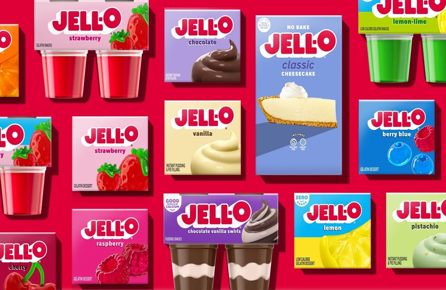
Jell‑O’s new look packaging is nostalgic and colorful. A serious upgrade (Credit The Kraft Heinz Company).
Whether this rebrand will impact Jell‑O’s falling sales remains to be seen. Connotations of school lunches, hospital meals, and TV dinners mean many consider America’s formerly most-popular dessert old-fashioned and dated.
Perhaps the new rebrand will remind the public of the nostalgic appeal of Jell‑O. Perhaps not. But it’s undeniable that this design change is a step in the right direction. A kitschy rebrand may be just what Jell‑O needs if it hopes to remind America why it was once the nation’s favorite dessert.
Robert Reeve
Robert is an experienced marketing professional with extensive experience working with brands to refine go-to-market plans, SEO campaigns, and content marketing strategies. A committed writer with a keen eye on the latest developments, Robert specialises in producing content across all things tech and marketing.
Recommend
About Joyk
Aggregate valuable and interesting links.
Joyk means Joy of geeK