

Creating A Newsletter Sign-up For Your Website Footer
source link: https://meganvwalker.com/creating-newsletter-sign-up-for-your-website/
Go to the source link to view the article. You can view the picture content, updated content and better typesetting reading experience. If the link is broken, please click the button below to view the snapshot at that time.

Creating A Newsletter Sign-up For Your Website Footer
A weekly issue covering features, functionality and news on the topic of Marketing, specifically covering Dynamics 365 Marketing and other interesting tools and tips for anyone interested in the subject.
Subscribe Here
*** NOTE: ALL INFORMATION IS ACCURATE AT DATE OF PUBLISHING ***
Many websites have a nice little form in the footer at the bottom of every page where you can sign up for a newsletter. If you are using D365 Marketing you might think you are stuck with how it looks out of the box, especially with the newer Real-time Marketing forms. Not true! Using some CSS and reshuffling things around, you can make a very nice newsletter subscription form that fits in to the look and feel of your site and sits nicely in the footer. Let’s take a look at how we can achieve this!
NOTE: You will need to be relatively comfortable with CSS and understanding how to inspect the elements while the form is on your website. If you are not sure, check with the person who designed your website.
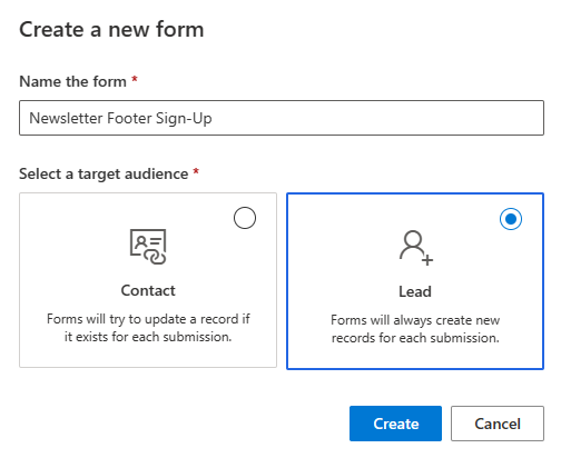
First, make sure you have your Compliance Profile set up and have a Newsletter topic. Once you’ve got that sorted, go to Realtime marketing and add a new form. I am going to create a Lead (or link to an existing Open one) if the form is submitted. Remember that compliance for topics is based on an email address, so if you qualify the Lead, or a Contact already exists with that email, they can be sent the content once they have Opted In.
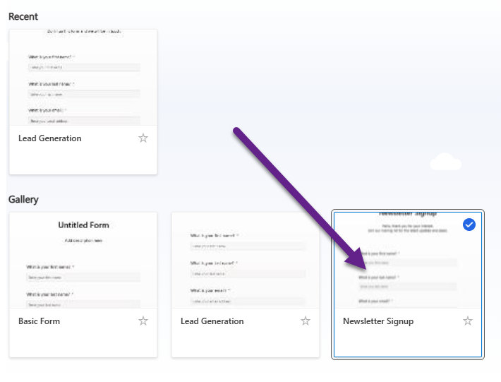
From the templates, pick the Newsletter Signup option.
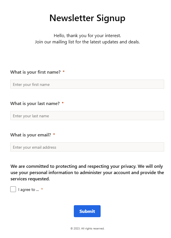
The template looks like this, but we are going to change it drastically!
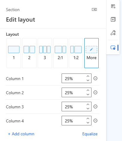
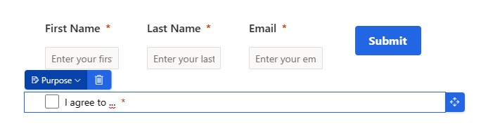
Add a new section to the form and click more to sort the layout and add 4 columns. We are going to capture first name, last name and email and want the submit button to all be on the same line. Set the column widths to all be equal at 25%.
Now drag the existing fields and submit button to put them in each column. Do not worry at all about what it currently looks like. Delete the top section of the form that has the text for Newsletter Signup, and the text that starts with ‘We are committed to….’. Now click on the ‘I agree to…’ where you have the tick box for the purpose.
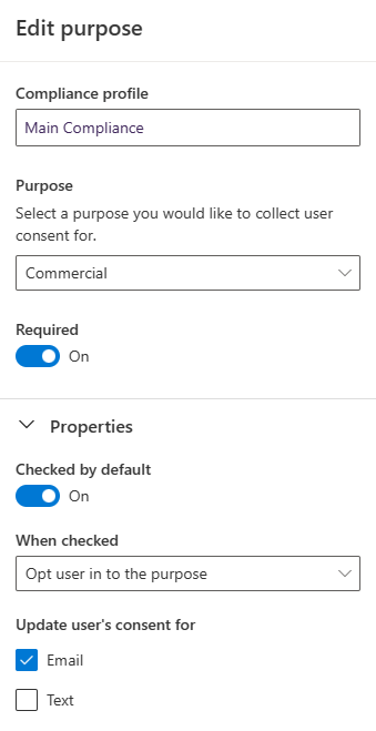
This is where we are going to link the purpose to the Compliance profile. We want to make sure when someone submits this sign up form, they are set as opted in overall for commercial emails. Set it as required, checked by default and make sure when checked the user is opted in to the purpose. We are just doing this for emails, so untick the Text box.
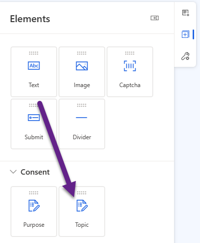
Now drag over a topic element and put it underneath the purpose we just edited.
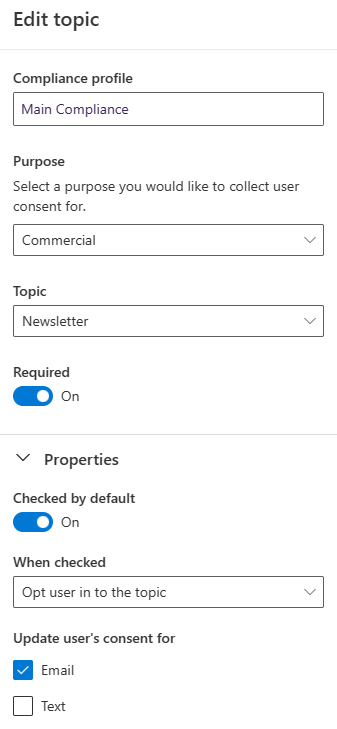
Link to the same Compliance profile, then pick Commercial as the purpose, then pick your Newsletter topic. Again, make required, checked by default and opt the user in to the topic when it’s checked. Also untick the text box.
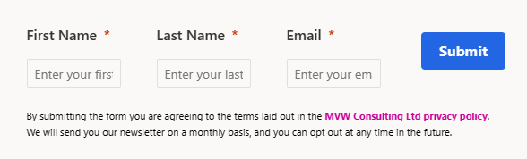
Your form should now look something like this…. ugly and not what we want the person on the website to see! You can rename the text for the main consent and the newsletter topic to make it easier to find in the next step.
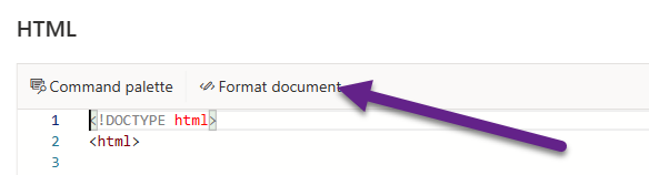
From the top right of the form, click on the HTML option. Once it opens, click on Format document from the top. This just reformats how the HTML looks and makes it easier to find things.
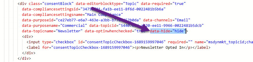
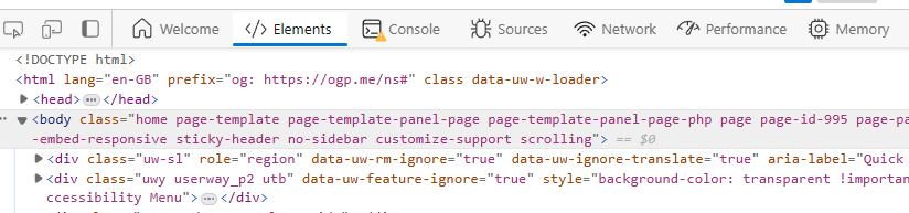
Do a search for the label you added to the main consent and the topic. This will be the input field. Right above it, you will have a string that ends with data-optinwhenchecked=”true”. Right after that add in data-hide=”hide”. This will make sure that the the section for the purpose is hidden. Do the same for the topic also.
When you view it in preview, the purpose and topic should now be hidden from view. You can add in additional text below your form to detail what happens when submitting the form and what the person is agreeing to.
Make sure you click on the form settings and indicate the message that should be displayed after submitting the form.
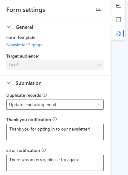
One last thing to do before publishing the form! Go back in to the HTML and find the entire block that starts with <style> and ends with </style>. Keep those two tags but delete everything in between. Your form will then look like this, as all of the main styling will have been removed. Now we can get to work making it pretty!
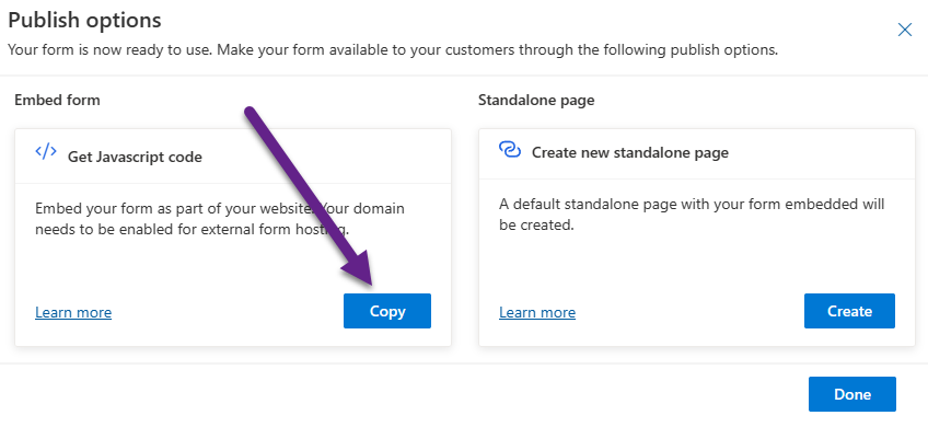
After publishing the form, get the Javascript and add it to the footer of your website. If you are not sure, check with your web designer, they might need to create a new spot for you on the website.
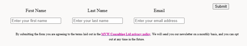
Now we can see what we are working with. Still ugly right?
This is where you need to start inspecting the elements on the form using the developer console (function and F12 while on a web page) and making changes to the CSS while reviewing how the form reacts. You can then take the new CSS components and add it back in to the HTML of the form. This might be easier than adding to the CSS files of the website so you don’t overwrite how the actual site looks. For example, I have CSS to format how tables look on my site, but the tables used in the Realtime Marketing forms I want to look different.
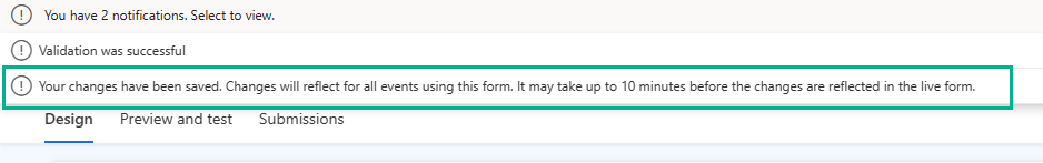
You can edit the form again, click on the HTML and add the CSS in between the two <style> tags. When you save the form you will see a notification that it might take up to 10 minutes before the changes are live on the form.
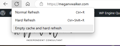
You can sometimes speed things up by right clicking on the refresh icon on the browser and clicking on Empty cache and hard refresh. This option is only available if you have already done function F12 and are in the developer console.
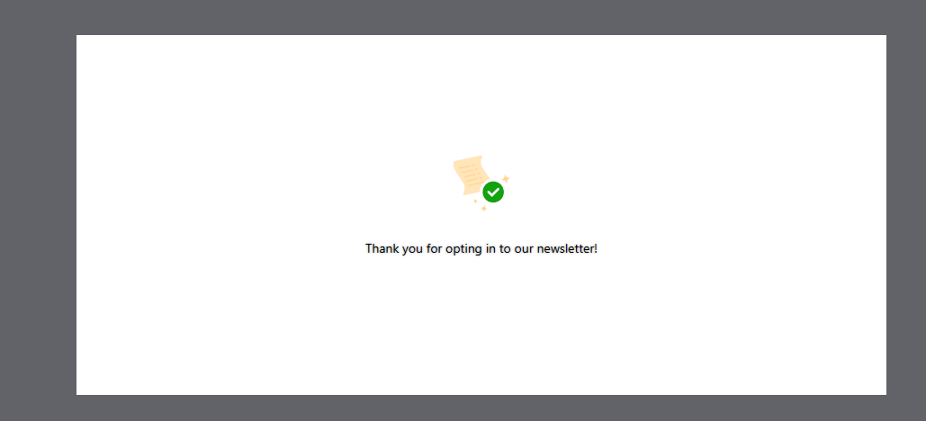
One other thing to keep in mind if you are displaying a message on the page after the form has been submitted, you might want to restyle it so it’s not this big white block. This will look a bit ugly on my site because I have a grey background, so we can reformat this to be the same.
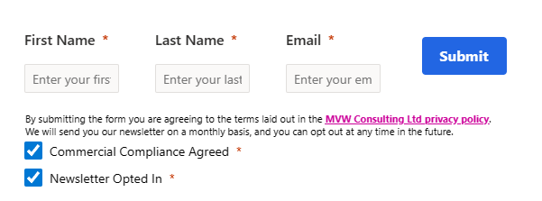
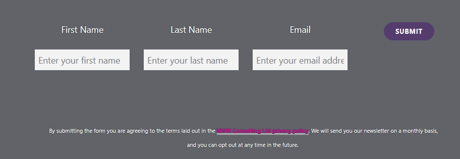
After making the CSS modifications, here is what my footer form now looks like. So much nicer than before! And all of this with some styling.
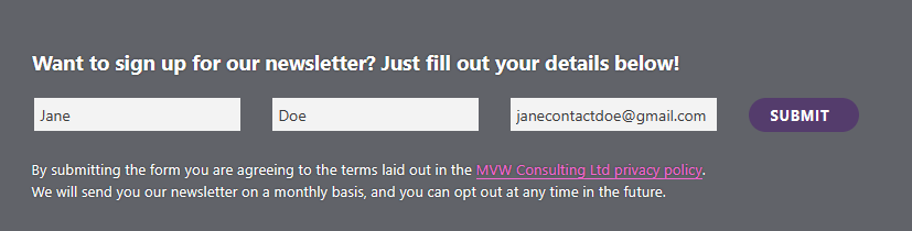
When the form is submitted, it’s much nicer and fits within the same size section on the footer rather than showing that big white block.

Your CSS will look different to mine, but just a few items that might help so you can see what I did. By all means start with this and then add or remove as needed. These first styles are fairly standard and also include some specific out of the box elements for aspects on the marketing form.
    table {
      margin: 0em !important;
      table-layout: inherit;
      width: 100% !important;
    }

    label {
      display: none;
    }

    input[type="text"],
    input[type="email"] {
      padding: 0.375em;
      width: 100%;
      font-size: 15px !important;
    }

    input[type="text"]:focus,
    input[type="email"]:focus {
      background: #fff !important;
      outline: 3px solid #6c547c !important;
      outline-offset: -2px;
    }

    .marketingForm * {
      font-family: "Segoe UI", Arial, sans-serif;
      border: none;
      font-size: 14p !important;
      text-align: left;
      line-height: 1px !important;
    }

    button.submitButton {
      line-height: 100% !important;
    }

    div[data-cached-form-url] button.submitButton {
      min-width: 100px;
      line-height: 100% !important;
    }
These ones are totally custom and are styles I am then adding to the text aspects on the form. So in the HTML where I have the ‘Want to sign up…’ text in the header, instead of it having <p> before that in the HTML, I have <p class=”cta-header”>. This means that block of text will take on the style from the .cta-header block below. Same with the bottom text about the privacy policy but that has <p class=”cta-footer”> instead. The styling of the privacy policy link includes a class like this – <a href=”https://meganvwalker.com/privacy-policy/” class=”terms”> so the styling of that link will use the a.terms style from below.
    .cta-header {
      margin-bottom: -30px !important;
      font-size: 14pt !important;
      margin-left: -12px !important;
      font-weight: bold;
    }

    .cta-footer {
      padding-bottom: 0px !important;
      margin-bottom: 0px !important;
      font-size: 10pt !important;
      line-height: 20px !important;
    }
    a.terms {
      text-decoration: dashed;
      color: #f567d2!important;
      font-weight: normal;
    }
These last three styles make sure that the confirmation message icon is hidden, the background is grey instead of white and the text is white and bold and slightly larger than out of the box.
 div[data-cached-form-url] .onFormSubmittedFeedback .onFormSubmittedFeedbackMessage {
      padding: 30px 10px 20px 10px;
      color: #fff;
      font-size: 18px;
      line-height: 20px;
      font-family: Segoe UI;
      text-align: center;
      font-weight: bold;
    }

    div[data-cached-form-url] .onFormSubmittedFeedback {
      display: flex;
      align-items: center;
      justify-content: center;
      background: #616369;
      margin: 0 auto;
      height: 10% !important;
    }

    div[data-cached-form-url] .onFormSubmittedFeedbackIcon {
      display: none;
      margin-left: auto;
      margin-right: auto;
      height: 0;
      size: 0;
    }
Once you get your head around the CSS, you can make your forms look the best possible for your website requirements. Off you go! 
A weekly issue covering features, functionality and news on the topic of Marketing, specifically covering Dynamics 365 Marketing and other interesting tools and tips for anyone interested in the subject.
Subscribe Here
This is just 1 of 400 articles. You can browse through all of them by going to the main blog page, or navigate through different categories to find more content you are interested in. You can also subscribe and get new blog posts emailed to you directly.
Recommend
About Joyk
Aggregate valuable and interesting links.
Joyk means Joy of geeK