

How new Twitter X logo fails
source link: https://pimpmytype.com/twitter-x/?ref=sidebar
Go to the source link to view the article. You can view the picture content, updated content and better typesetting reading experience. If the link is broken, please click the button below to view the snapshot at that time.
How new Twitter X logo fails
Rebranding Twitter to X removed the last bit of joy from this platform by butchering its visual identity. Is the new logo only a Unicode symbol, or probably just taken from an actual font? In this post, and video, I’ll dive into the details, while showing you what you should pay attention to, when choosing a font for your next logo.

Along with an emotional rant 🤬, we will dive into three major questions:
- What does this 𝕏 Unicode character stand for?
- Can you simply use a letter of a font for a logo?
- What about its execution? Is it any good?
How did this happen
Within a weekend, after Elon Musk’s call-out for a “good enough logo”, one random winner was liked and picked by the chief twit, sorry, chief X, starting a rushed and sloppy rebrand.
The tweet with winning X logo on the top right
The selected logo replaced the beloved bird within hours, the iOS app icon changed one week later.
The new Twitter X Logo
During this turmoil, comments came up that the logo was simply a Unicode character, or maybe just taken from an actual font? But let’s start with the first claim.
1. Is the Twitter X Logo just a plaintext character?
The claim that X is using a Unicode character as logo, is a bit misguiding. Because Unicode is not a font. The Unicode standard defines characters, assigning a unique number to each one. This makes sure a capital X is the same character in different fonts, across languages and scripts. But you need a font to access a Unicode character. And depending on the font’s design, the appearance of a character can vary.
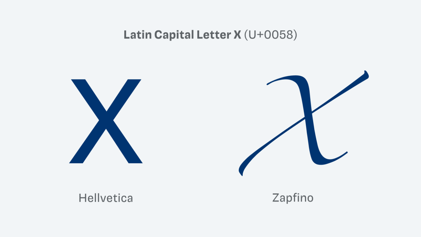
Same Unicode character, different look depending on the typeface
What is true though, is that the design looks very close to a character in this Unicode chart of Mathematical Alphanumeric Symbols, the Mathematical Double-Struck Capital X, or U+1D54F, to be exact.
Is the X logo based on this Unicode character?
But how this exact symbol now will be displayed depends on the font. And most fonts, like Roboto, Arial or Times New Roman, don’t even come with this specific character 😳.
If a font does not contain a character, fallback fonts will be shown
So if a certain character is not contained in a specific font, in many cases it will fall back to the default fonts on the operating systems of your device. On macOS or iOS, the character close to the X logo is shown in the system font STIX Two Math. On other platforms it can be a different one, or not be shown at all.
How the 𝕏 character is displayed depends on the fonts installed on the OS
It is no copy of the Unicode character
When it comes to the design, since the exact font will be different, depending on the circumstances, you can not say that it is a blunt copy. It definitely is rather unoriginal to base a logo in all its specifics on some random character from a chart – more on that later.
What does 𝕏 stand for in math?
But what does this character actually stand for, as a mathematical symbol? More familiar to you might be the double-struck ℙ used for primes, or the ℕ, used for natural numbers. The reminiscence of math classes brings a shiver down my spine 😬 … The double-struck 𝕏 however does not stand for anything specific, as far as I could find out.
2. Is the Twitter X logo taken from an actual font?
Another thing that was widely discussed, was that the logo is simply was a character from the an exact font, as Fontendo claimed. When looking at Monotype’s Special Alphabet 4, the capital X looks just like the new Twitter logo.
Is the X logo taken from Monotype’s Special Alphabet 4?
Can you use a letter of a typeface for a logo?
Is that allowed? This depends on the EULA, or the End User License Agreement, and varies from font to font. The majority of fonts can be used to create a logo when purchasing a desktop license, even if it’s not explicitly mentioned. But there are also foundries, like PangramPangram, that offer specific logo licenses.
Neutraface can not be use in a logo when purchasing a desktop license
However, at times it is specifically mentioned that it’s not allowed to use an individual glyph, symbol or any character from the font in a logo. For example, with gorgeous Neutra Face by House Industries, it is explicitly not permitted to use it in a logo with the desktop license. You need to contact them to get an additional license for that. So always read the license agreement first before falling in love with a typeface.
The X logo is not taken from this font
Special Alphabet 4 can be used as a logo, but the capital X is not identical with the new Twitter X logo. When directly comparing it, you can see that it slightly differs, mostly because the strokes of X logo are a bit thicker.
Comparing Special Alphabets 4 with the X Logo
It’s okay to use a font, if it’s interesting enough
Now you might wonder if it’s bad to use a letter from a font, out of the box, for a logo design? Not necessarily, if it is interesting enough. And there might be a nice font where the X is, like this one.
This X is also taken from the font Continuo, but way more interesting
But bear in mind, that it remains very replaceable, since anyone with that font can easily reproduce it. Brining us to the final question …
3. Is it a good logo?
What was good enough for a podcast cover, the original usage of that clusterFONT, is far not enough for a social network. The symbol feels unbalanced and uneven, too wide, and most of all, dull. It is poorly executed when it comes to type design standards, which is best explained in this video by Will Paterson.
The logo need optical corrections with the diagonals, as shown here.
But even if it was optically corrected, it would not help. A good logo should be simple enough to be memorable, but also interesting enough to be unique. And this logo is way too generic to meet the second criteria. Imagine Twitter would have simply used the initial, written out with a doubled vertical stroke. That’s just not enough for an appealing look, let alone for a logo worth trademarking.
This would also be a thoughtless crap logo for Twitter 💩.
But what about Facebook, the New York Times, or Netflix – they also only use one character in their app icon? Yes, but a whole brand, lies beneath that one character (which by the way is much better executed).
These apps also only use character in their icon, but there is more behind it.
With X that’s all there is. One little exciting white letter, on a black background. And in this way it also perfectly fits, the new stupid replaceable name! Leaving an uninspired, easy to copy and shallow impression of something that wants to be cool, but actually is just brand carnage! It’s so hard to be objective here, since Twitter meant a lot to me. To be fair, Elon posted that this is only a temporary solution, so it might evolve.
However, what I find most astonishing is, to see how much impact the visual design of a single letter can have. This all happened within one week, so sloppy, showing how thoughtless, and brutal the legacy of this platform was tossed away. Not even keeping the color or any other visual reference to its origin.
Saying farewell to Twitter
Making it easier to X-it after 15 years. Twitter was my favorite social network, I made a lot of great connections there. It is painful to see how it all goes south. But at least the logo now shows to the outside, how it has become on the inside since Musk took over. I can, and I won’t identify with this.
Tips for your next logo design
What can you take away from this rant for the font choices for logotypes? If the name of your project is super replaceable, the characters at least should have something special to it. If the name is interesting enough, it could be less striking characters, but still having something that’s unique. See this advice as a rule of thumb, or a starting point. You will and should adopt it for your specific scenario.
Showing Beatrice by Sharp Type
Showing SFT Schrifted Sans by Schrifteria with a modification of the F to have a littel more uniqueness
But don’t just reproduce a known symbol without any alterations. And when using a typeface for it, check if it granted in the license agreement.
If you want weekly inspiration for good fonts, subscribe to the Font Friday newsletter (below), don’t follow me on X, better read this article about pairing fonts next, that I recommend to you without any stupid algorithm prioritizing a billionaire committing corporate seppuku.
Typographic power to your inbox!
- Font Friday: I personally recommend one typeface per week and for what use case it’s best. Every second week I recommend a free font.
- Pimp my Type: Articles or videos from the YouTube channel that will help you to pimp up the type of your next design project.
- No Comic Sans, Open Sans 😅 or any other BS, like annoying ads. Your email will only be used for the newsletters, unsubscribe anytime.
Leave this field empty if you’re human:
Recommend
About Joyk
Aggregate valuable and interesting links.
Joyk means Joy of geeK